Graphical Perception in a Pandemic
Log Scales, Exponential Growth, and the Importance of User Testing
Outline

1918 Flu Pandemic
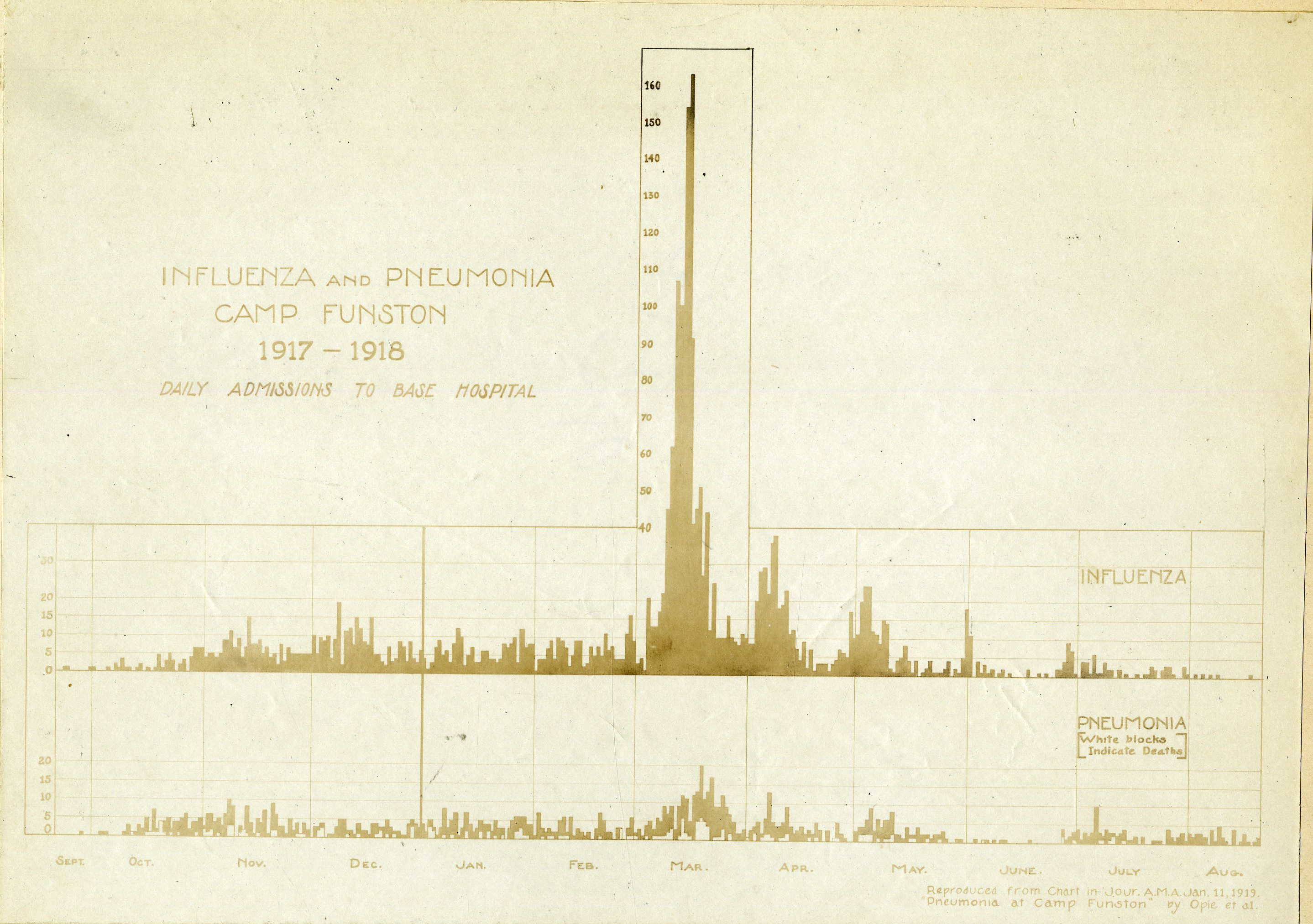
Reproduction from the Journal of the American Medical Association, Jan 11, 1919. Image source
1918 Flu Pandemic
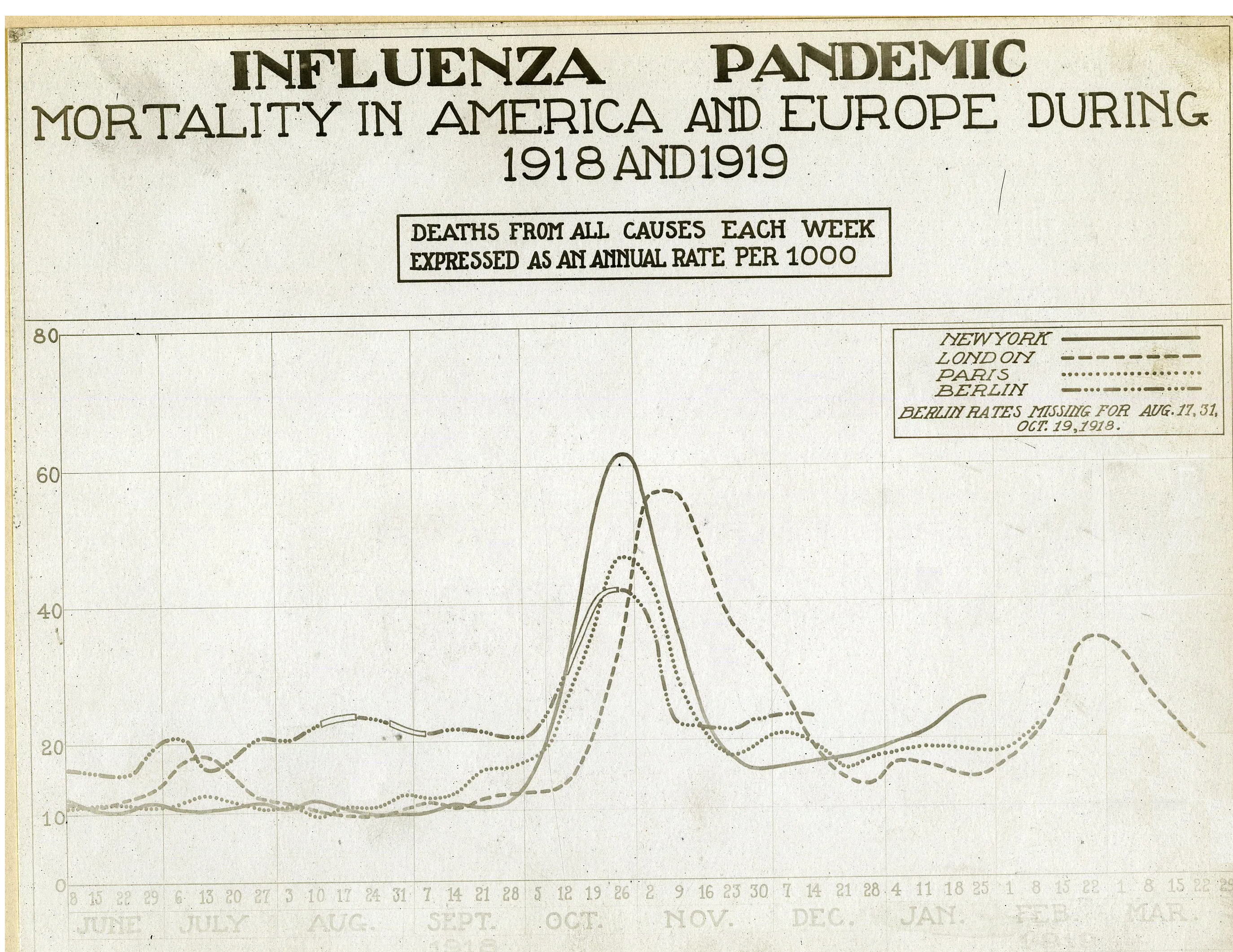
All-cause mortality in Major Cities, 1918-1919 Image source
1840s London:
Cholera Mortality and Temperature
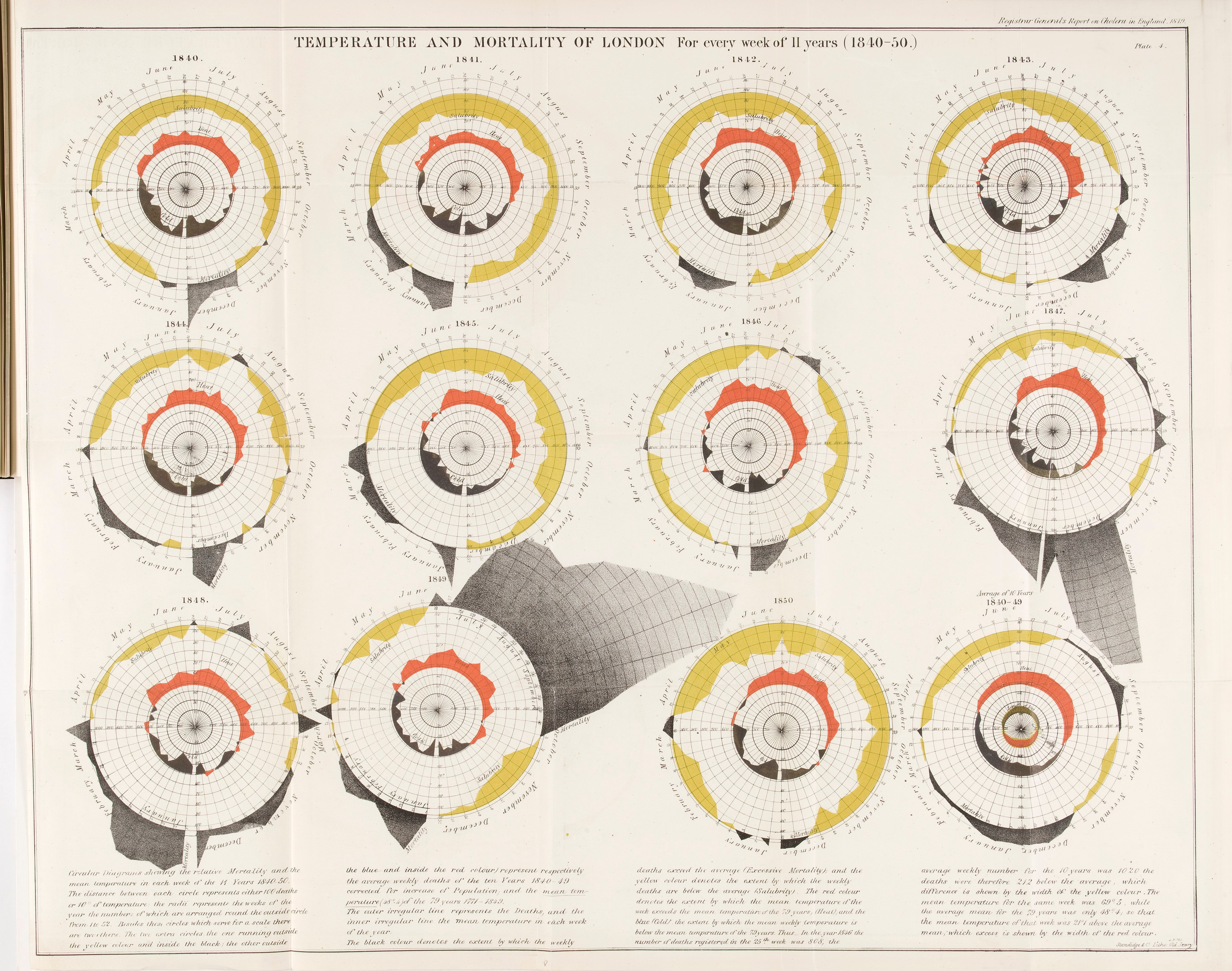
Excess Mortality and Temperature, 1840s London. From Report on the mortality of cholera in England, 1848-49, by William Farr (1952). Image Source
Cholera & Plague in London
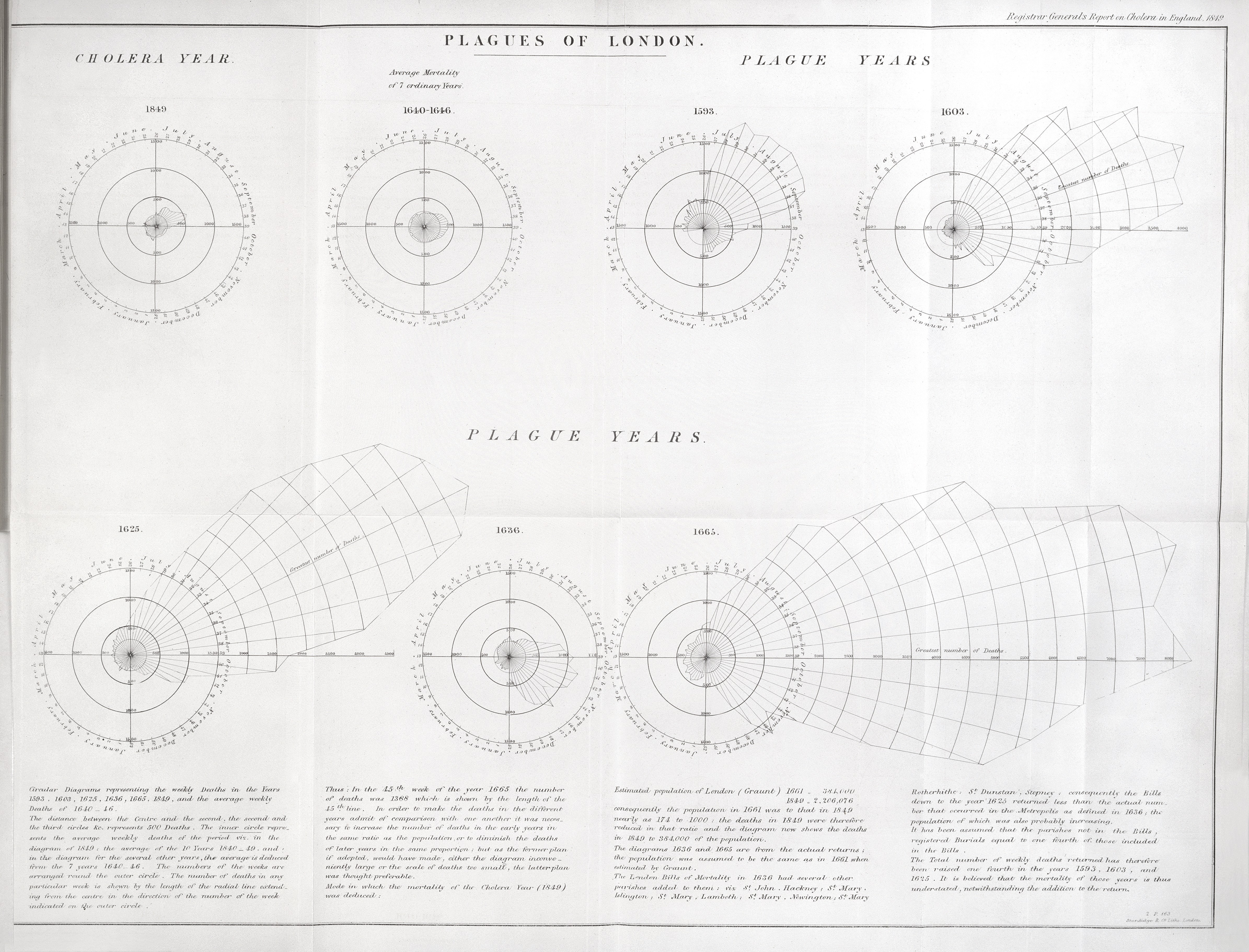
Cholera & Plague in London (Created 1852) Image source
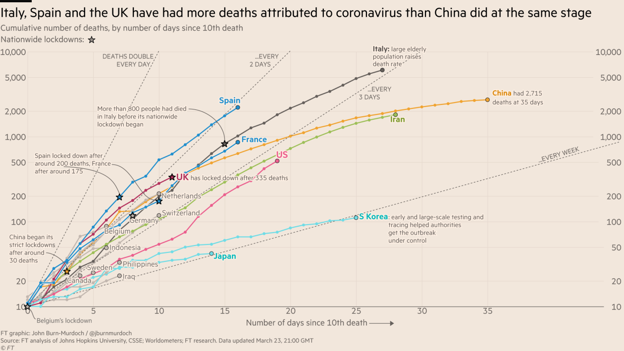
COVID-19 Graphics
May 6 2020: Three graphs that show a global slowdown in COVID-19 deaths, Image Source
COVID-19 Graphics
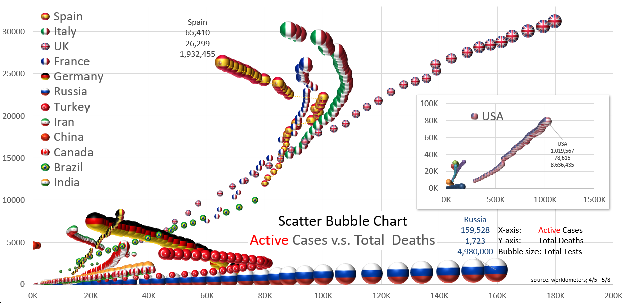
Active Cases vs. Total Deaths, Reddit, May 9 2020 Image source
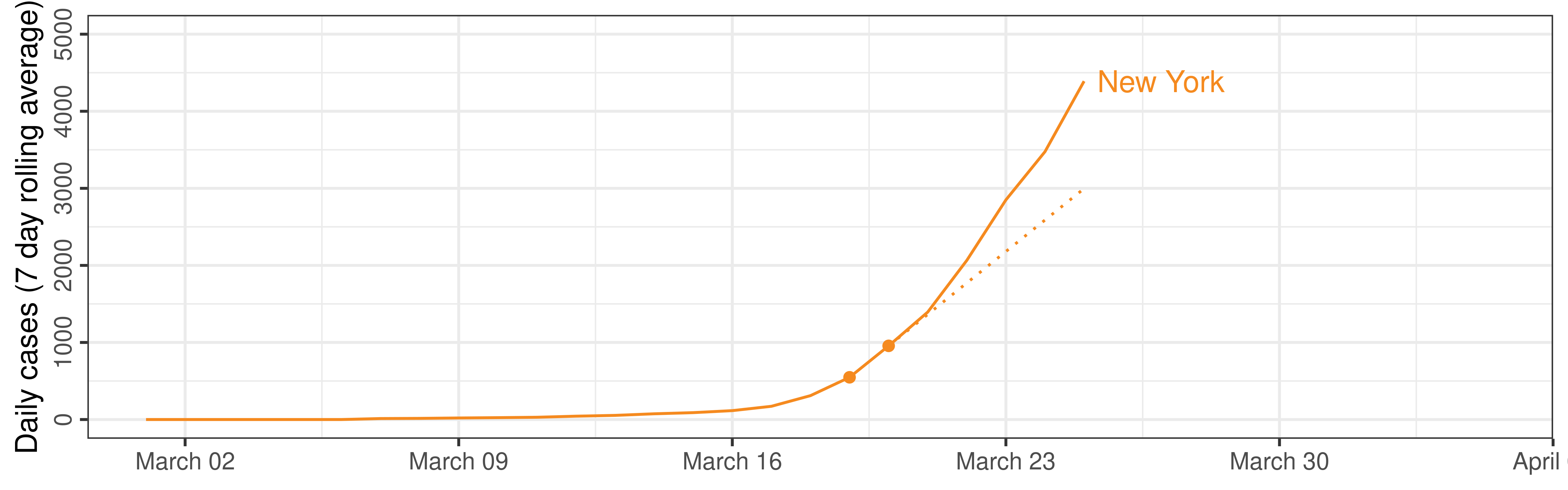
COVID-19 Graphics
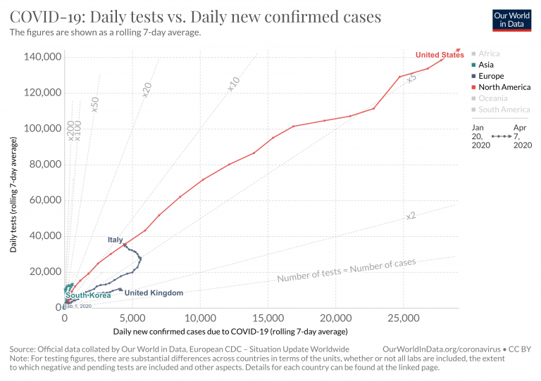
Tests vs. Cases, Our World in Data (May 19 2020)
COVID-19 Graphics

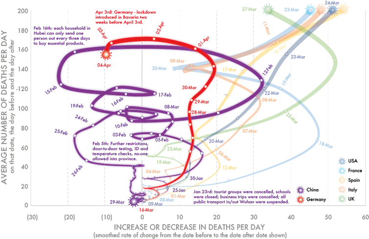
Rate of Death Change, March 28, 2020. Romain Vuillemot (@romsson) Image source
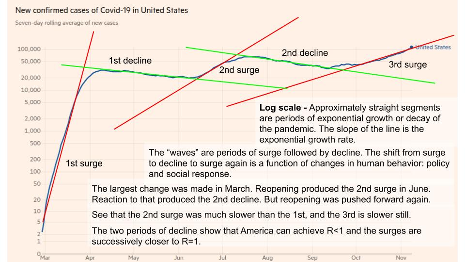
COVID-19 Graphics
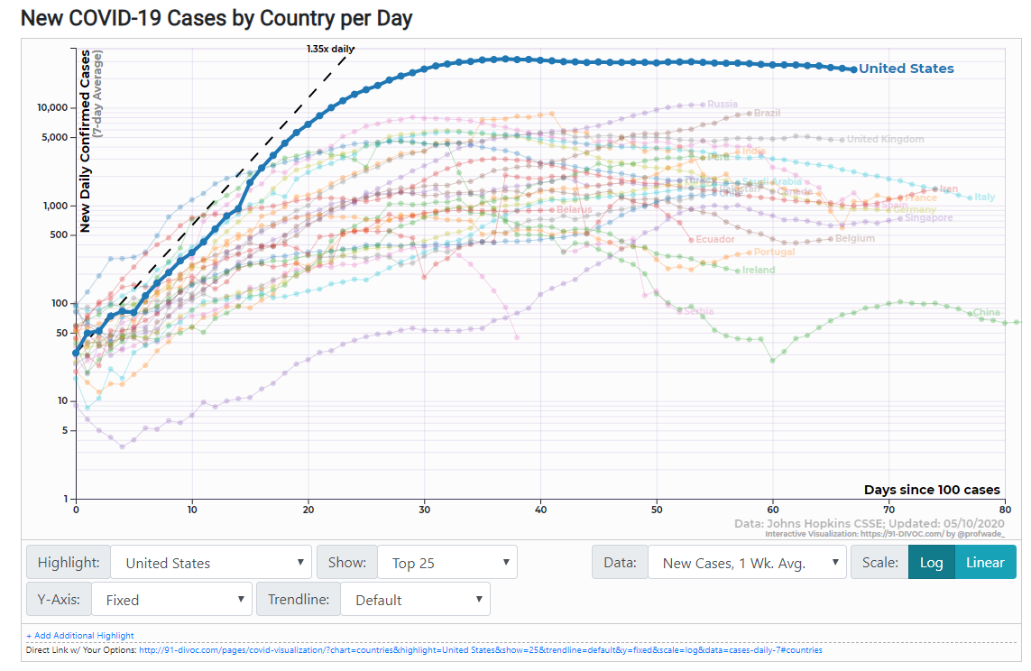
91-DIVOC Diagonal Reference Lines. May 11, 2020.
COVID-19 Graphics
COVID-19 Graphics
Exponential Growth

What is the purpose of this chart?
To help people predict what is likely to happen?
(It doesn’t do that very well)
Exponential Growth
What is the purpose of this chart?
To help people predict what is likely to happen?
Humans are awful at predicting exponential growth
Wagenaar and Sagaria (1975; Timmers and Wagenaar 1977)
Representing Exponential(ish) Data
Log or linear scales?
Reference lines?
Aligning x-axis to date? Days since ___ cases?
“Pace” of the case counts vs. raw counts?
Comparing across populations – size, policies, susceptibility…

How Do We Test Graphics?

The question is not What is the best chart?
but… What is the best chart for this purpose?
For an answer, we need to subject charts to a full spectrum of user tests.
Q1: Perception of Differences


Q1: Perception of Differences

Conclusion: It’s easier to spot a curve among lines than it is to spot a line among curves
Robinson, Howard, and Vanderplas (2023a)
Q2: Inspiration
Frederick Mosteller et al. (1981) Eye Fitting Straight Lines. The American Statistician
New York Times’ ‘You Draw It’ features:

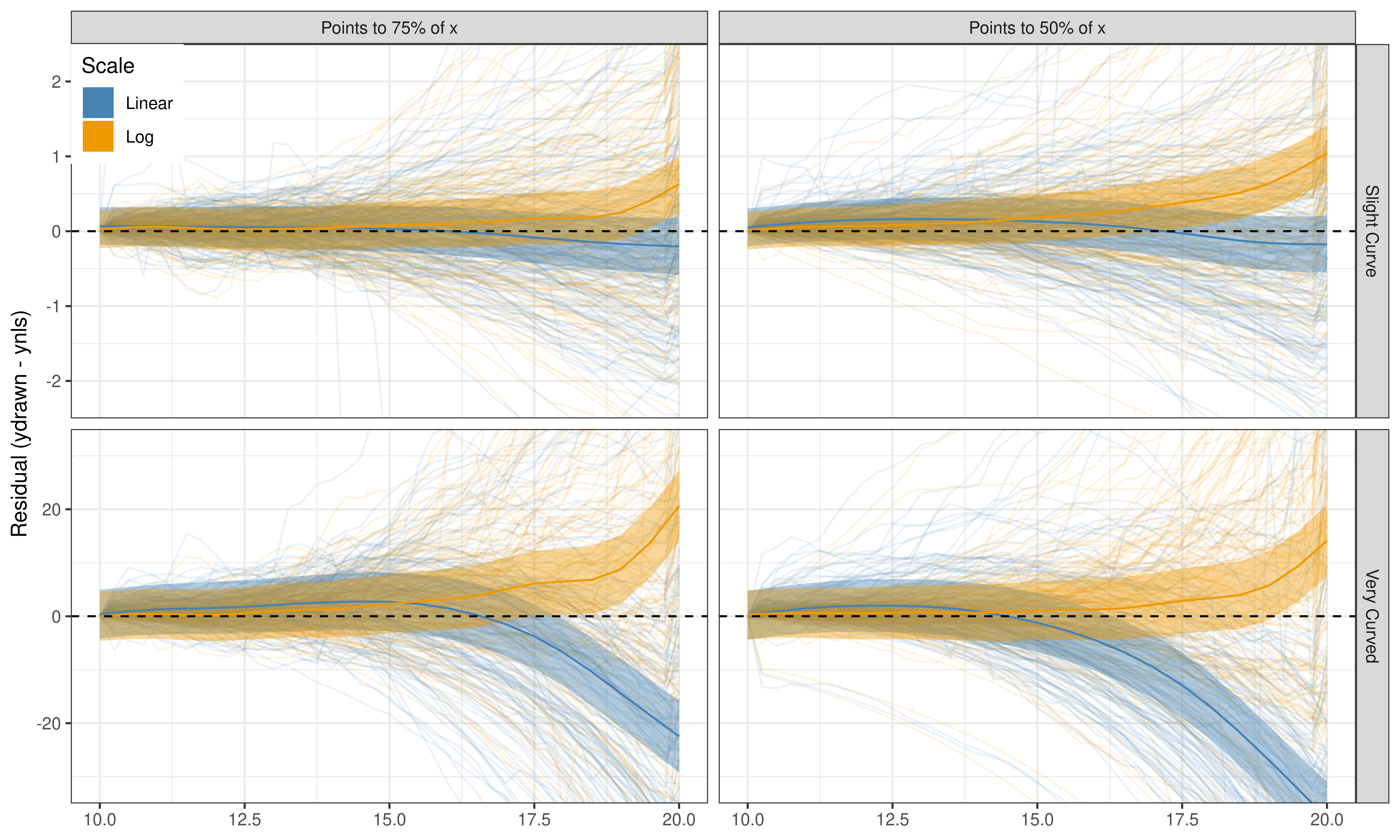
Q2: Forecasting (You-Draw-It)


Q2: Forecasting (You-Draw-It)
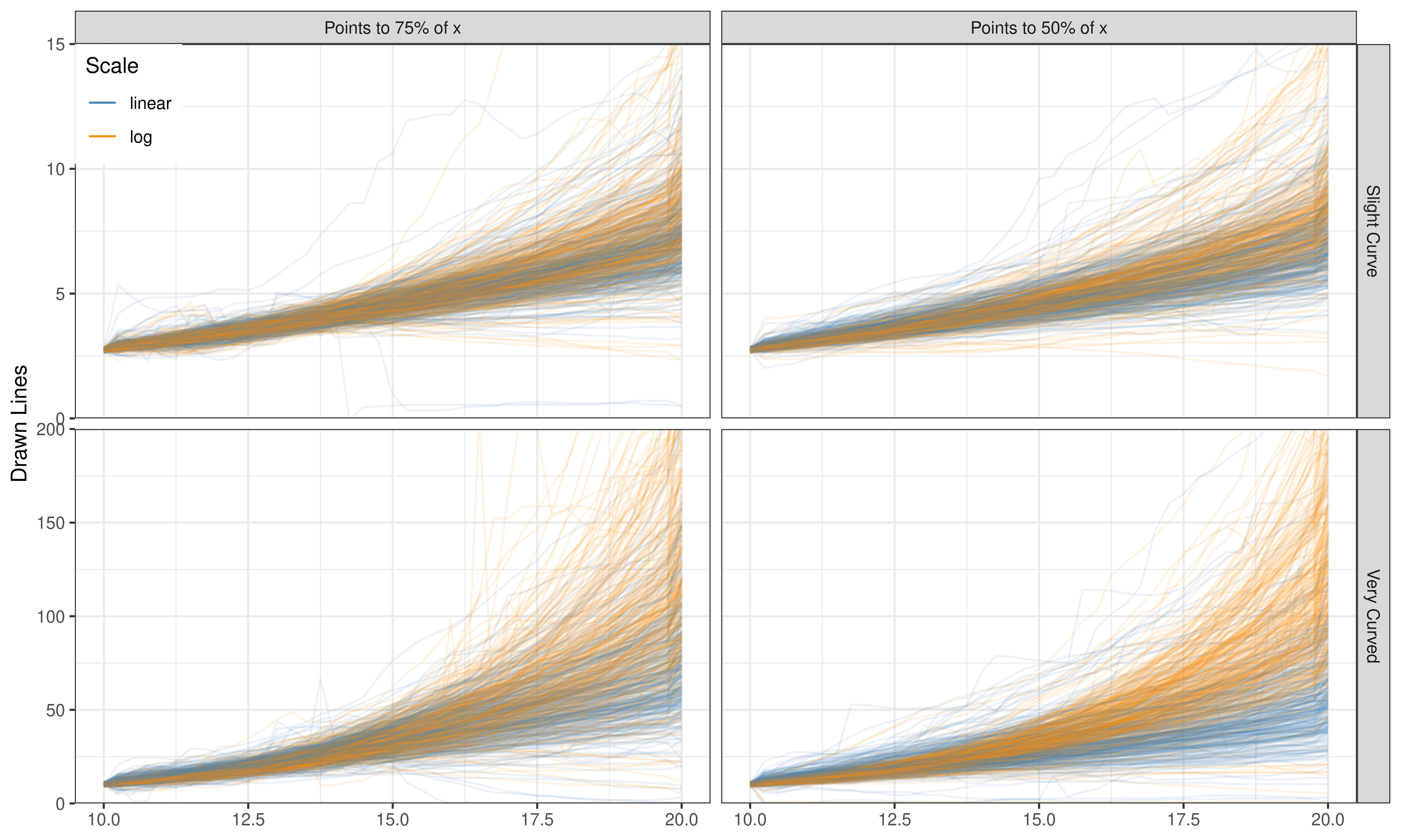
Q2: Forecasting (You-Draw-It)
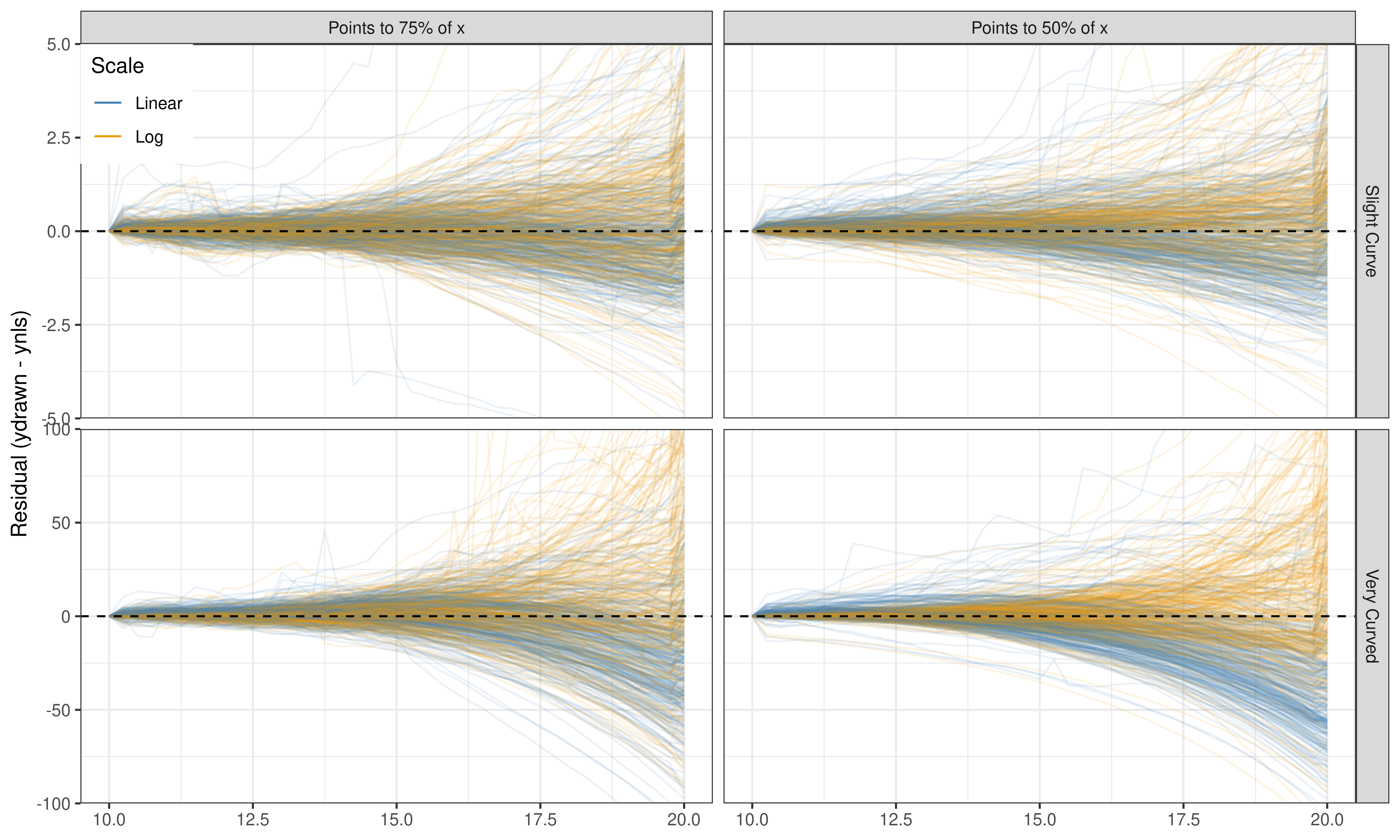
Q2: Forecasting (You-Draw-It)
Q3: Numerical Estimation
- Use Ewoks and Tribbles - creatures that might multiply exponentially
- One set on the linear scale, one set on log scale
- Underlying trend is the same (within transformed x axis)
- Different variability around the line

Q3: Numerical Estimation
Free response: Between \(t_1\) and \(t_2\), how does the population of \(X\) change?


Q3: Numerical Estimation
Estimating Population given a year
Process Sketch


Q3: Numerical Estimation
Estimating Population given a year

Q3: Numerical Estimation
From Year1 to Year2, the population increases by ____ individuals
Process Sketch


Q3: Numerical Estimation
From Year1 to Year2, the population increases by ____ individuals

Q3: Numerical Estimation
How many times more creatures are there in Year2 than Year1?
Process Sketch


Q3: Numerical Estimation
How many times more creatures are there in Year2 than Year1?

Q3: Numerical Estimation
How many times more creatures are there in Year2 than Year1?

Q3: Numerical Estimation
How many times more creatures are there in Year2 than Year1?

Q3: Numerical Estimation
How long does it take for the population in Year 1 to double?
Process Sketch


Q3: Numerical Estimation
How long does it take for the population in Year 1 to double?

Challenges & Benefits
Testing method needs to match level of engagement
Examine graphical choices across engagement levels
Packages

Lineups
A “Visual Hypothesis Test”
Embed the question in array of charts
Can people identify the different plot?
Null model can be tricky to create
Test statistic is the visual evaluation
Numerical Estimation


Forced Choice


Eye Tracking
Infer cognitive processes from directed (conscious) attention
May be accompanied by direct estimation or other protocols


Think Aloud and Free Response
Stream of consciousness narration Guan et al. (2006; Cooke 2010)
Reasoning to justify a decision

Direct Annotation

Have participants visually fit statistics
- Usually directly annotating the chart with e.g. a regression line
Compare visual statistics to numerical calculations
Differences tell us about our implicit perception of data
e.g. visual regression is more robust to outliersAlso useful as a teaching tool
How Do We Test Graphics?
Testing method needs to be matched to level of engagement
Need to examine graphical choices across levels of engagement
