Exploratory Data Analysis
“Far better an approximate answer to the right question, which is often vague, than an exact answer to the wrong question, which can always be made precise.”
— John Tukey
Guiding Questions
What does this data have to tell me about the topic?
Is the data reliable?
Is the data complete?
How are the variables distributed?
How are the variables related?
Question Generation
Does the structure of the data match your expectations?
Did the data read in correctly?
How does the data fit in context?
Do the observations make sense?
- scale
- missingness
- relationships with other variables
Numerical EDA
Basic summary statistics
Made easier with tools like
skimrandskimpythat tabulate summaries and sparkline charts
Numerical EDA
| Name | new_data |
| Number of rows | 2142 |
| Number of columns | 3 |
| _______________________ | |
| Column type frequency: | |
| character | 1 |
| numeric | 2 |
| ________________________ | |
| Group variables | None |
Numerical EDA
| var | n_missing | complete_rate |
|---|---|---|
| group | 0 | 1 |
| var | min | max | empty | n_unique | whitespace |
|---|---|---|---|---|---|
| group | 1 | 1 | 0 | 13 | 0 |
Numerical EDA
| var | n_missing | complete_rate | mean | sd |
|---|---|---|---|---|
| V1 | 150 | 0.9299720 | 54.24875 | 16.73711 |
| V2 | 146 | 0.9318394 | 47.87741 | 26.94546 |
| var | p0 | p25 | p50 | p75 | p100 | hist |
|---|---|---|---|---|---|---|
| V1 | 15.5607495 | 40.89041 | 52.52804 | 67.32513 | 98.28812 | ▂▆▇▆▁ |
| V2 | 0.0151193 | 22.19145 | 47.79891 | 71.97336 | 99.69468 | ▇▇▇▇▆ |
Graphical EDA
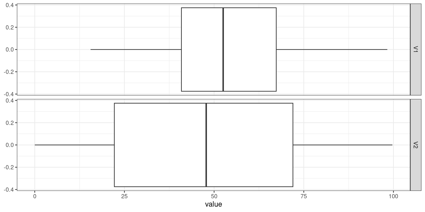
Start with single variables (1D summaries)
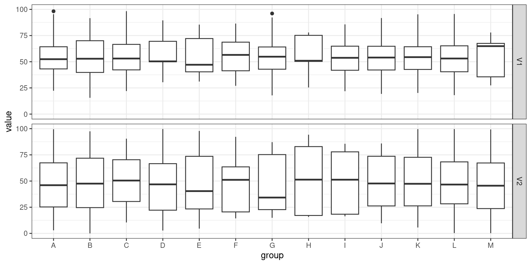
Add in factor variables (Conditional 1D summaries)
Move to 2D summaries and pairwise scatterplots
For high dimensional numerical data, consider dimension reduction techniques (PCA, t-SNE, UMAP)
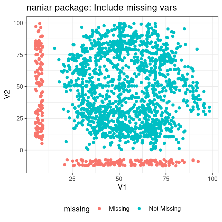
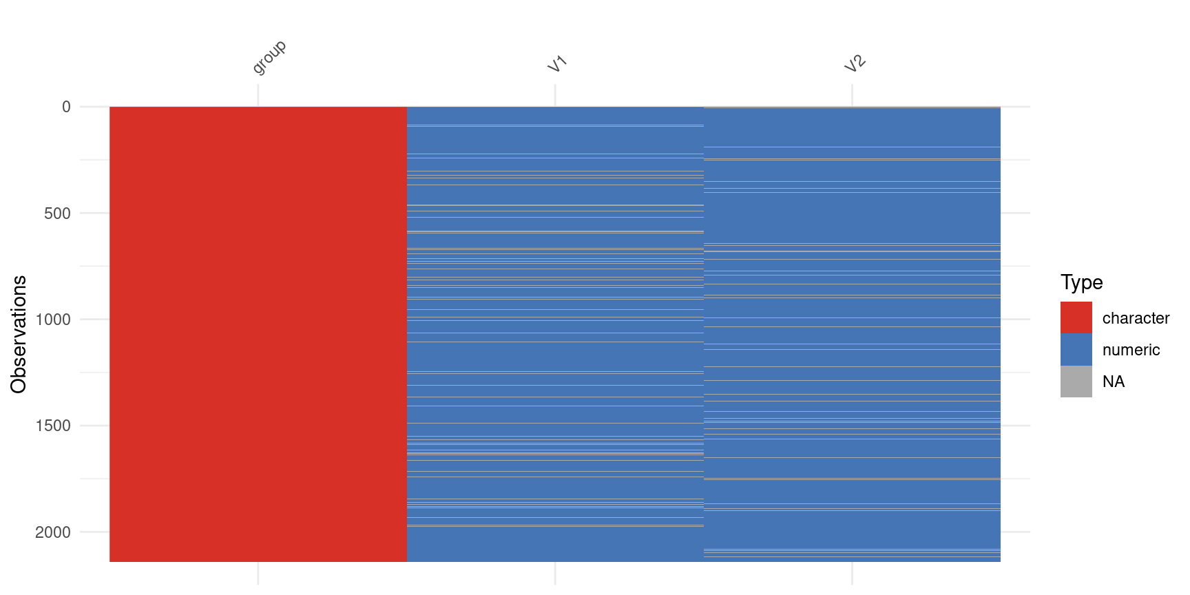
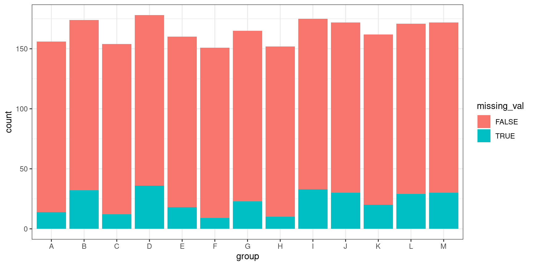
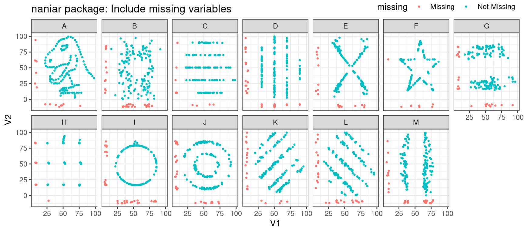
Be careful to notice/account for missing values
naniarandvisdatR packagesmissingnoin python
Graphical EDA
Graphical EDA
Graphical EDA
Graphical EDA
Graphical EDA
Graphical EDA
Your Turn
Your Turn
Note
Dataset: US County-level data, https://shorturl.at/U9KUO
About the data: https://github.com/evangambit/JsonOfCounties
Tasks
Read in the data in your favorite software and pick an interesting set of variables.
Generate some questions to explore using EDA skills.
Use numerical and graphical summaries to answer your questions.
Your Turn
Try out a few of the following techniques:
- Tabular summaries
- Visualizing missing data
- Univariate distributions
- Conditional distributions
- Bivariate distributions
- Scatterplot matrices
