Rules… and when to break them
What are the rules?
Some basics
Amount of ink used to represent a value should be proportional to the value
Use the simplest representation you can to convey the data
Some basics
Balance complexity and cognitive load
Grid lines are helpful, but not too many
Show data + summary statistics (if not too crowded)
Use direct labels instead of legends (where space allows)
Some basics
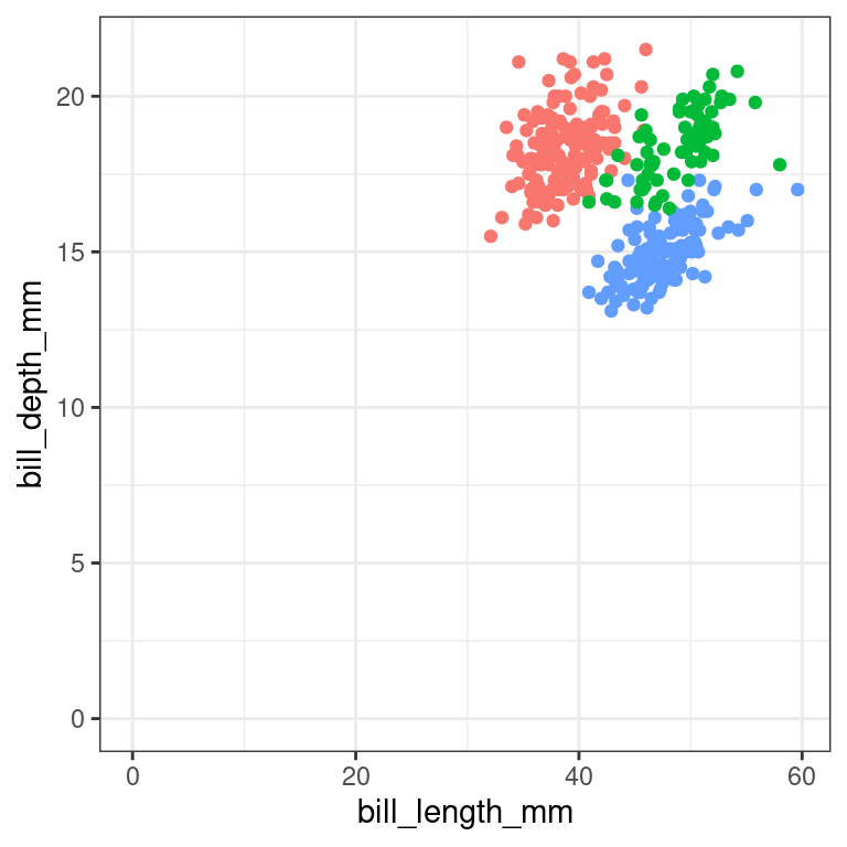
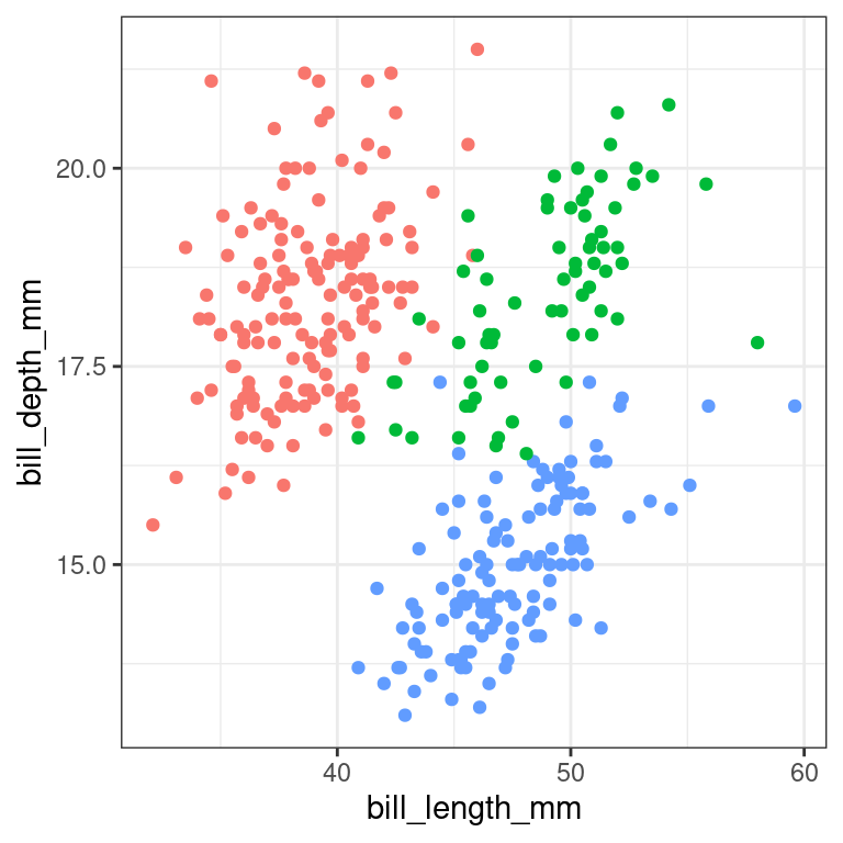
Use the typical range of the data/measurement for context
Some basics
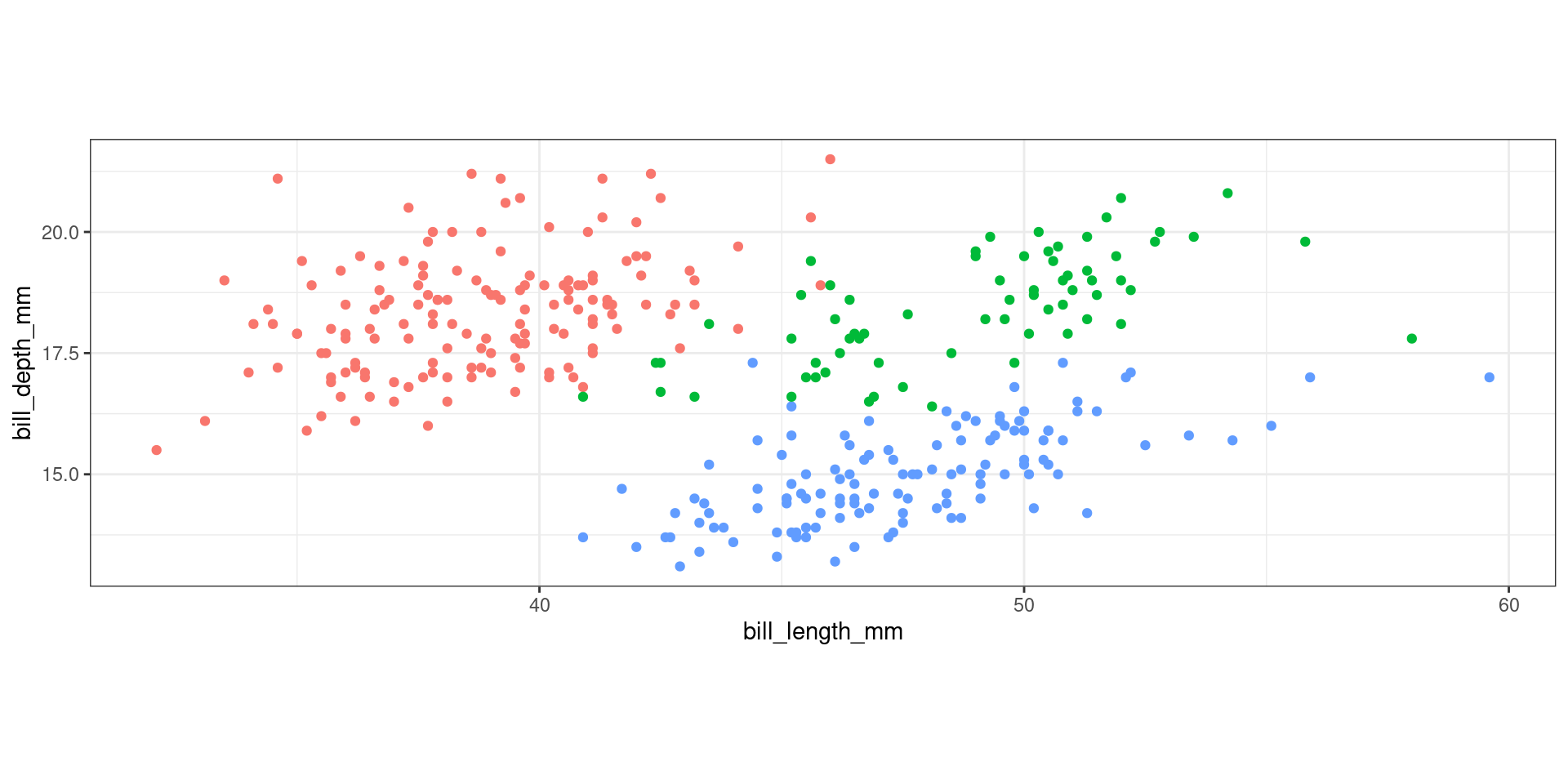
Aspect ratios are important!
Color Choices
Categorical scales: Use no more than 7 categories
Leverage common associations
Transition through a neutral color (white/light yellow)
Vary hue or lightness/saturation, but not both
- Hue:
- Saturation:
- Lightness:
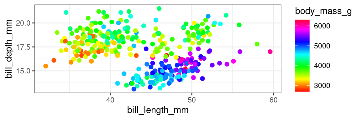
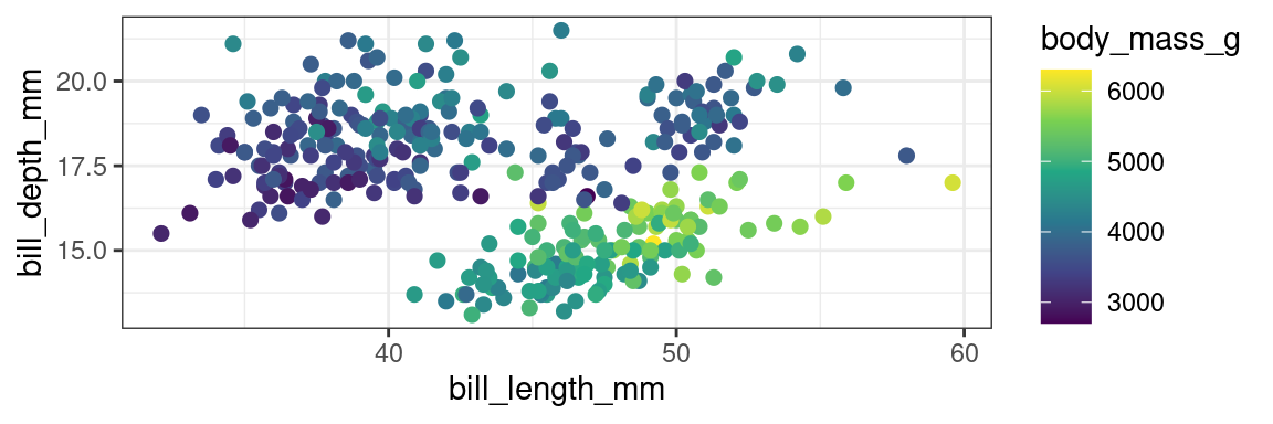
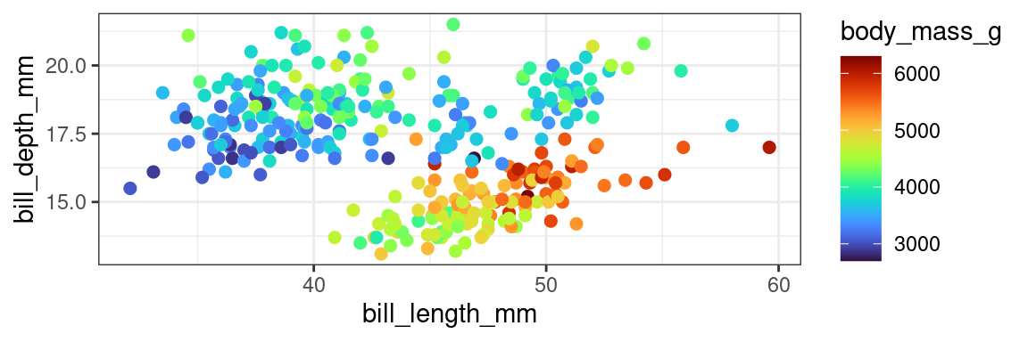
Case Study: Color Schemes
Case Study: Polar Charts
