install.packages("ggplot2")18 Data Visualization Basics
This section is intended as a very light overview of how you might create charts in R and python. Chapter 20 will be much more in depth.
Objectives
- Use ggplot2/seaborn to create a chart
- Begin to identify issues with data formatting that need to be resolved before creating a chart.
18.1 Package Installation
You will need the seaborn (python) and ggplot2 (R) packages for this section.
To install seaborn, pick one of the following methods (you can read more about them and decide which is appropriate for you in Section 10.3.2.1)
pip3 install seaborn matplotlibThis package installation method requires that you have a virtual environment set up (that is, if you are on Windows, don’t try to install packages this way).
reticulate::py_install(c("seaborn", "matplotlib"))In a python chunk (or the python terminal), you can run the following command. This depends on something called “IPython magic” commands, so if it doesn’t work for you, try the System Terminal method instead.
%pip install seaborn matplotlibOnce you have run this command, please comment it out so that you don’t reinstall the same packages every time.
18.2 First Steps
Now that you can read data in to R and python and define new variables, you can create plots! Data visualization is a skill that takes a lifetime to learn, but for now, let’s start out easy: let’s talk about how to make (basic) plots in R (with ggplot2) and in python (with seaborn, which has a similar approach to charts). You can read more about this approach, called the grammar of graphics in Chapter 20.
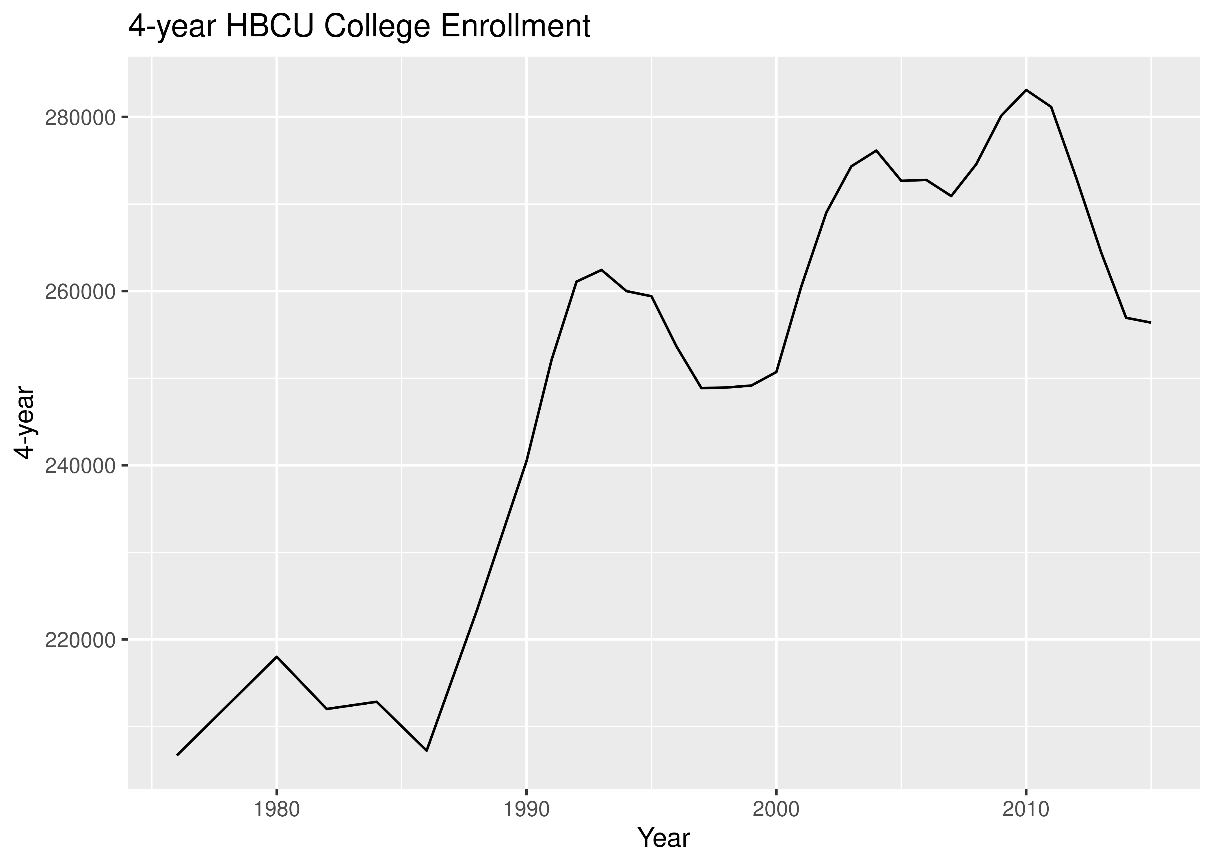
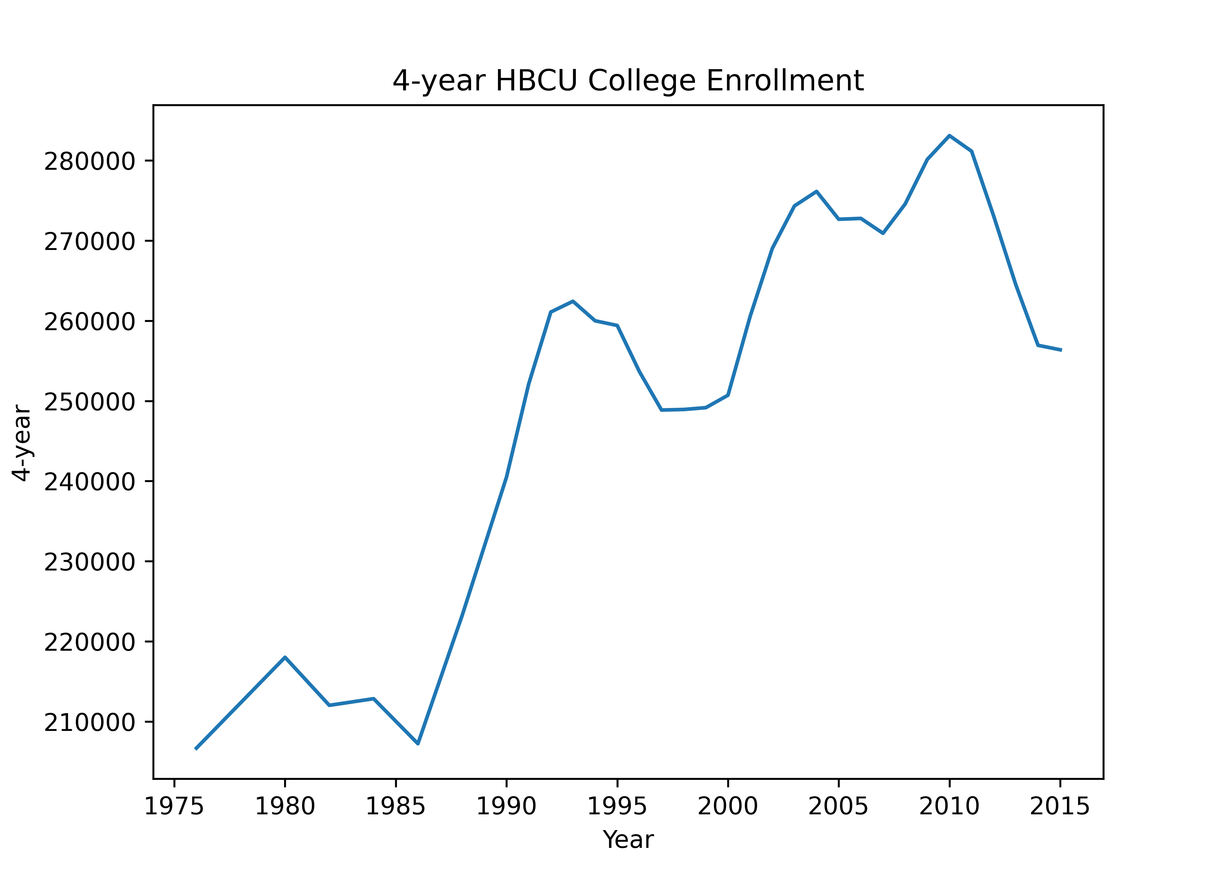
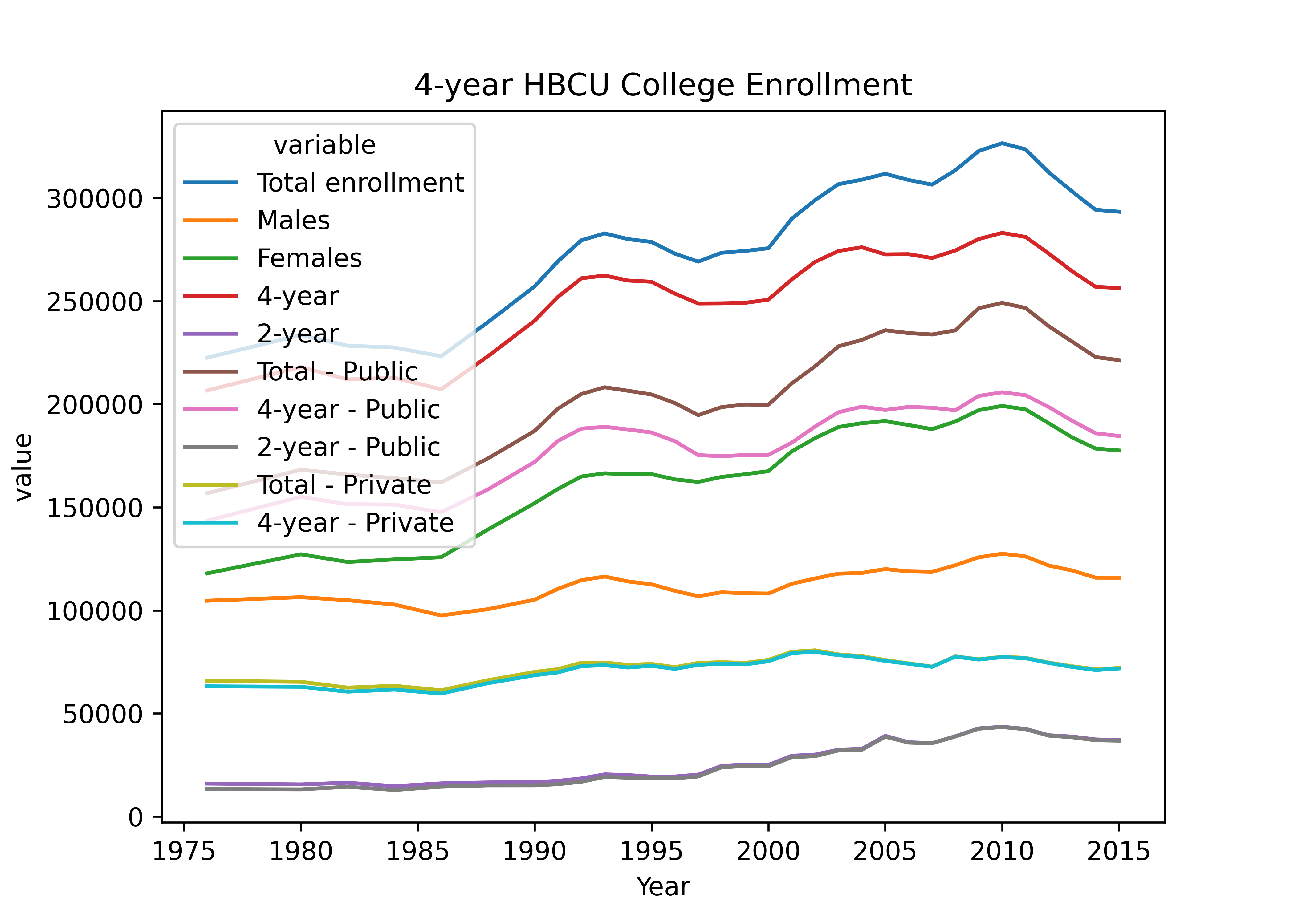
18.2.1 Graphing HBCU Enrollment
Let’s work with Historically Black College and University enrollment.
18.2.1.1 Loading Libraries
import pandas as pd
import seaborn as sns
import matplotlib.pyplot as plt

hbcu_all = pd.read_csv('https://raw.githubusercontent.com/rfordatascience/tidytuesday/master/data/2021/2021-02-02/hbcu_all.csv')
18.2.2 Making a Line Chart
ggplot2 and seaborn work with data frames.
If you pass a data frame in as the data argument, you can refer to columns in that data with “bare” column names (you don’t have to reference the full data object using df$name or df.name; you can instead use name or "name").
18.2.3 Data Formatting
If your data is in the right format, ggplot2 is very easy to use; if your data aren’t formatted neatly, it can be a real pain. If you want to plot multiple lines, you need to either list each variable you want to plot, one by one, or (more likely) you want to get your data into “long form”. We’ll learn more about how to do this type of data transition when we talk about reshaping data.
You don’t need to know exactly how this works, but it is helpful to see the difference in the two datasets:
library(tidyr)
hbcu_long <- pivot_longer(hbcu_all, -Year, names_to = "type", values_to = "value")
hbcu_long = pd.melt(hbcu_all, id_vars = ['Year'], value_vars = hbcu_all.columns[1:11])| Year | Total enrollment | Males | Females | 4-year | 2-year | Total - Public | 4-year - Public | 2-year - Public | Total - Private | 4-year - Private | 2-year - Private |
|---|---|---|---|---|---|---|---|---|---|---|---|
| 1976 | 222613 | 104669 | 117944 | 206676 | 15937 | 156836 | 143528 | 13308 | 65777 | 63148 | 2629 |
| 1980 | 233557 | 106387 | 127170 | 218009 | 15548 | 168217 | 155085 | 13132 | 65340 | 62924 | 2416 |
| 1982 | 228371 | 104897 | 123474 | 212017 | 16354 | 165871 | 151472 | 14399 | 62500 | 60545 | 1955 |
| 1984 | 227519 | 102823 | 124696 | 212844 | 14675 | 164116 | 151289 | 12827 | 63403 | 61555 | 1848 |
| 1986 | 223275 | 97523 | 125752 | 207231 | 16044 | 162048 | 147631 | 14417 | 61227 | 59600 | 1627 |
| 1988 | 239755 | 100561 | 139194 | 223250 | 16505 | 173672 | 158606 | 15066 | 66083 | 64644 | 1439 |
| Year | type | value |
|---|---|---|
| 1976 | Total enrollment | 222613 |
| 1976 | Males | 104669 |
| 1976 | Females | 117944 |
| 1976 | 4-year | 206676 |
| 1976 | 2-year | 15937 |
| 1976 | Total - Public | 156836 |
| 1976 | 4-year - Public | 143528 |
| 1976 | 2-year - Public | 13308 |
| 1976 | Total - Private | 65777 |
| 1976 | 4-year - Private | 63148 |
| 1976 | 2-year - Private | 2629 |
| 1980 | Total enrollment | 233557 |
| 1980 | Males | 106387 |
| 1980 | Females | 127170 |
| 1980 | 4-year | 218009 |
| 1980 | 2-year | 15548 |
| 1980 | Total - Public | 168217 |
| 1980 | 4-year - Public | 155085 |
| 1980 | 2-year - Public | 13132 |
| 1980 | Total - Private | 65340 |
| 1980 | 4-year - Private | 62924 |
| 1980 | 2-year - Private | 2416 |
| 1982 | Total enrollment | 228371 |
| 1982 | Males | 104897 |
| 1982 | Females | 123474 |
| 1982 | 4-year | 212017 |
| 1982 | 2-year | 16354 |
| 1982 | Total - Public | 165871 |
| 1982 | 4-year - Public | 151472 |
| 1982 | 2-year - Public | 14399 |
| 1982 | Total - Private | 62500 |
| 1982 | 4-year - Private | 60545 |
| 1982 | 2-year - Private | 1955 |
| 1984 | Total enrollment | 227519 |
| 1984 | Males | 102823 |
| 1984 | Females | 124696 |
| 1984 | 4-year | 212844 |
| 1984 | 2-year | 14675 |
| 1984 | Total - Public | 164116 |
| 1984 | 4-year - Public | 151289 |
| 1984 | 2-year - Public | 12827 |
| 1984 | Total - Private | 63403 |
| 1984 | 4-year - Private | 61555 |
| 1984 | 2-year - Private | 1848 |
| 1986 | Total enrollment | 223275 |
| 1986 | Males | 97523 |
| 1986 | Females | 125752 |
| 1986 | 4-year | 207231 |
| 1986 | 2-year | 16044 |
| 1986 | Total - Public | 162048 |
| 1986 | 4-year - Public | 147631 |
| 1986 | 2-year - Public | 14417 |
| 1986 | Total - Private | 61227 |
| 1986 | 4-year - Private | 59600 |
In the long form of the data, we have a row for each data point (year x measurement type), not for each year. I’ve shown the same amount of data (6 years, 9 measurements) in this table as in the original data, but this takes up much more vertical space!
18.2.4 Making a (Better) Line Chart
If we had wanted to show all of the available data before, we would have needed to add a separate line for each column, coloring each one manually, and then we would have wanted to create a legend manually (which is a pain). Converting the data to long form means we can use ggplot2/seaborn to do all of this for us with only a single plot statement (geom_line or sns.lineplot). Having the data in the right form to plot is very important if you want to get the plot you’re imagining with relatively little effort.
18.2.5 Highlighting Key Insights
Examining the charts in the previous section, it seems that there are at least three different contrasts which are easily made: 2 year vs. 4 year (vs. Total), Public vs. Private, and Male vs. Female enrollment. The 2 year vs. 4 year vs. Total and Public vs. Private variables seem to be “crossed” - we have values for every combination of these variables. The Male and Female numbers are not broken out further.
When creating charts, it’s useful to think about key comparisons and insights that the user may wish to explore, and then to explicitly highlight those comparisons with separate charts. It’s never enough to just make one chart – any data that is complex enough to plot deserves to be explored from multiple angles.
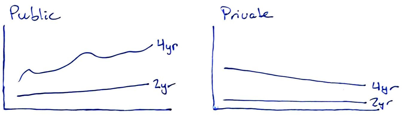
18.2.5.1 Sketching Possible Comparisons
It is helpful to sketch out the data structure and then use that sketch to identify key comparisons. You do not have to know what the data looks like at this stage – it is enough to think through what might be interesting and then to test whether or not the comparison is interesting by generating the chart.
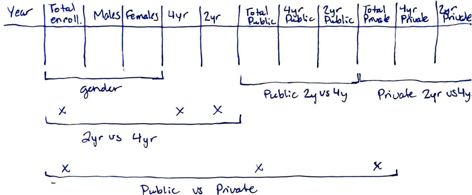
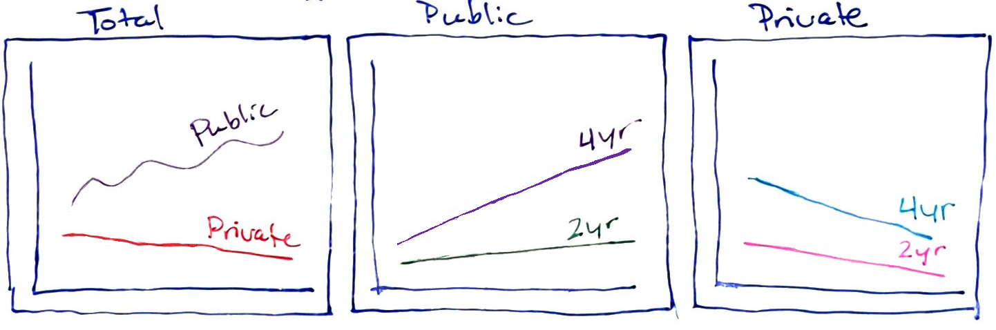 {fig-alt=” There are three subplots shown - Total, Public, and Private. In the Total pane, lines are broken out by public and private, while in the public and private panes they are broken out by 2y vs. 4y.”} ##### Chart 3
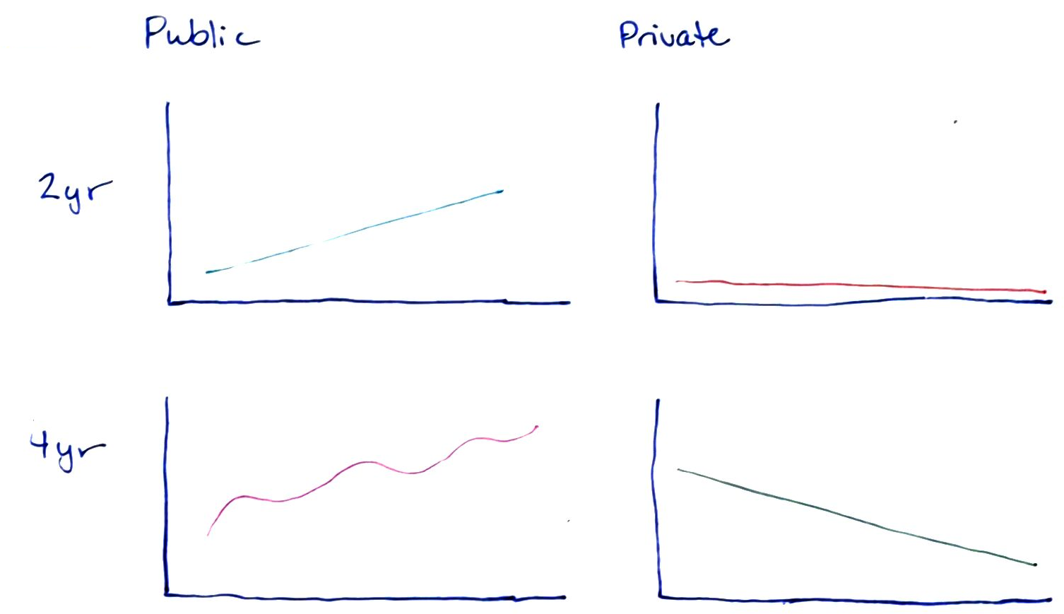 {fig-alt=” There are four subplots shown, arranged in a 2x2 table, with columns Public and Private, and rows 2yr and 4yr. In each cell, there is a subplot with a single line drawn.”}
 {fig-alt=” There are two subplots shown, arranged in a 1x2 table, with columns Public and Private. In each cell there is a chart with two lines: 4yr and 2yr.”}
When considering which version of a chart to generate, it is helpful to think about which comparisons are most natural for each chart. When lines are close together and share the same scale, comparisons are easier to make. So, if the goal is to highlight the difference between 2yr enrollment and 4yr enrollment, then Chart 4 is particularly effective, as those comparisons are easiest to make in that chart. Chapter 20 discusses this in more detail.
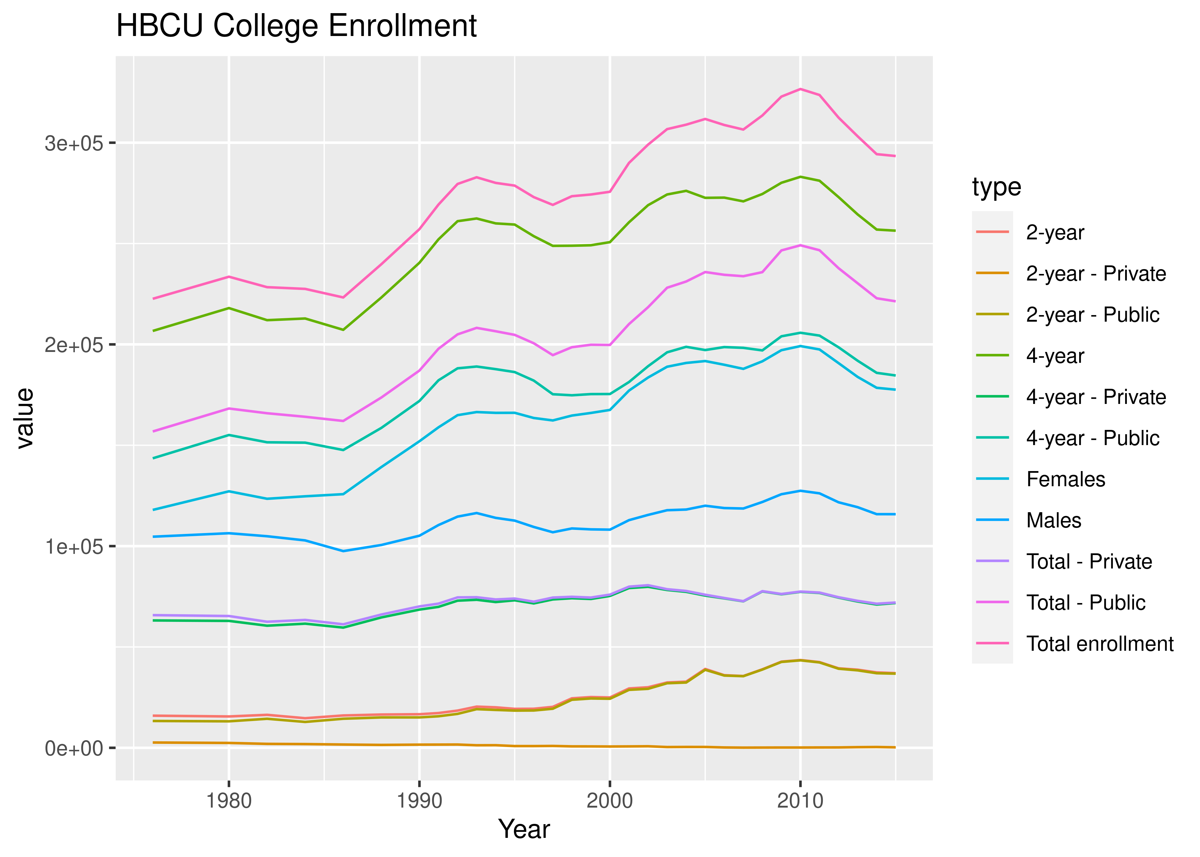
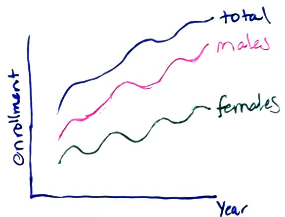
18.2.5.2 HBCU Enrollment by Gender
First, let’s peel off the gender-specific enrollment data. This requires us to find only types “Females” and “Males”, which we can obtain by filtering or subsetting the data.
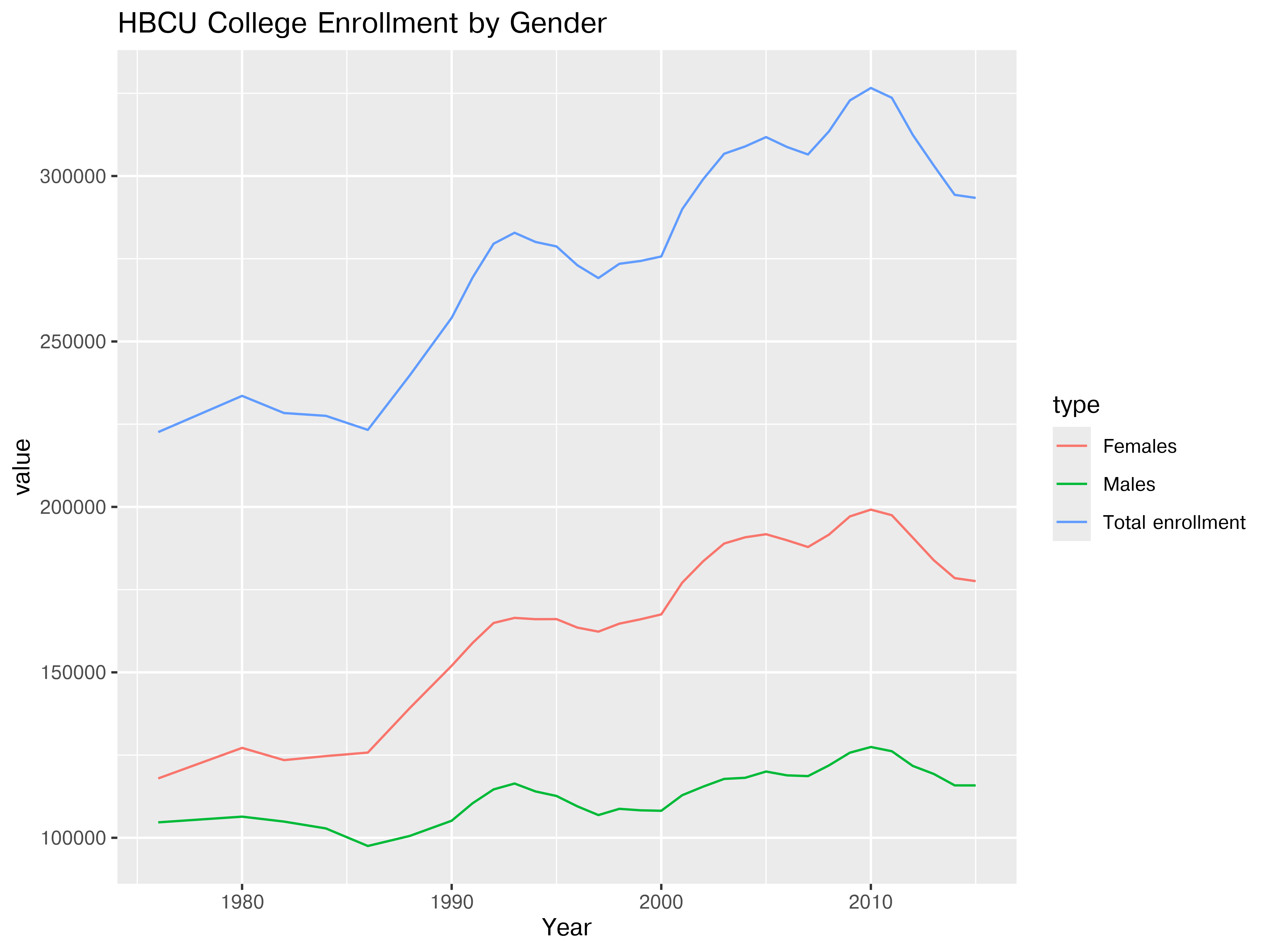
plt.clf() # Clear previous plot
rel_types=["Total enrollment", "Females", "Males"]
hbcu_gender = hbcu_long.query('variable.isin(@rel_types)')
plot = sns.lineplot(hbcu_gender, x = "Year", y = "value", hue = "variable")
plot.set_title("HBCU College Enrollment")
plt.show()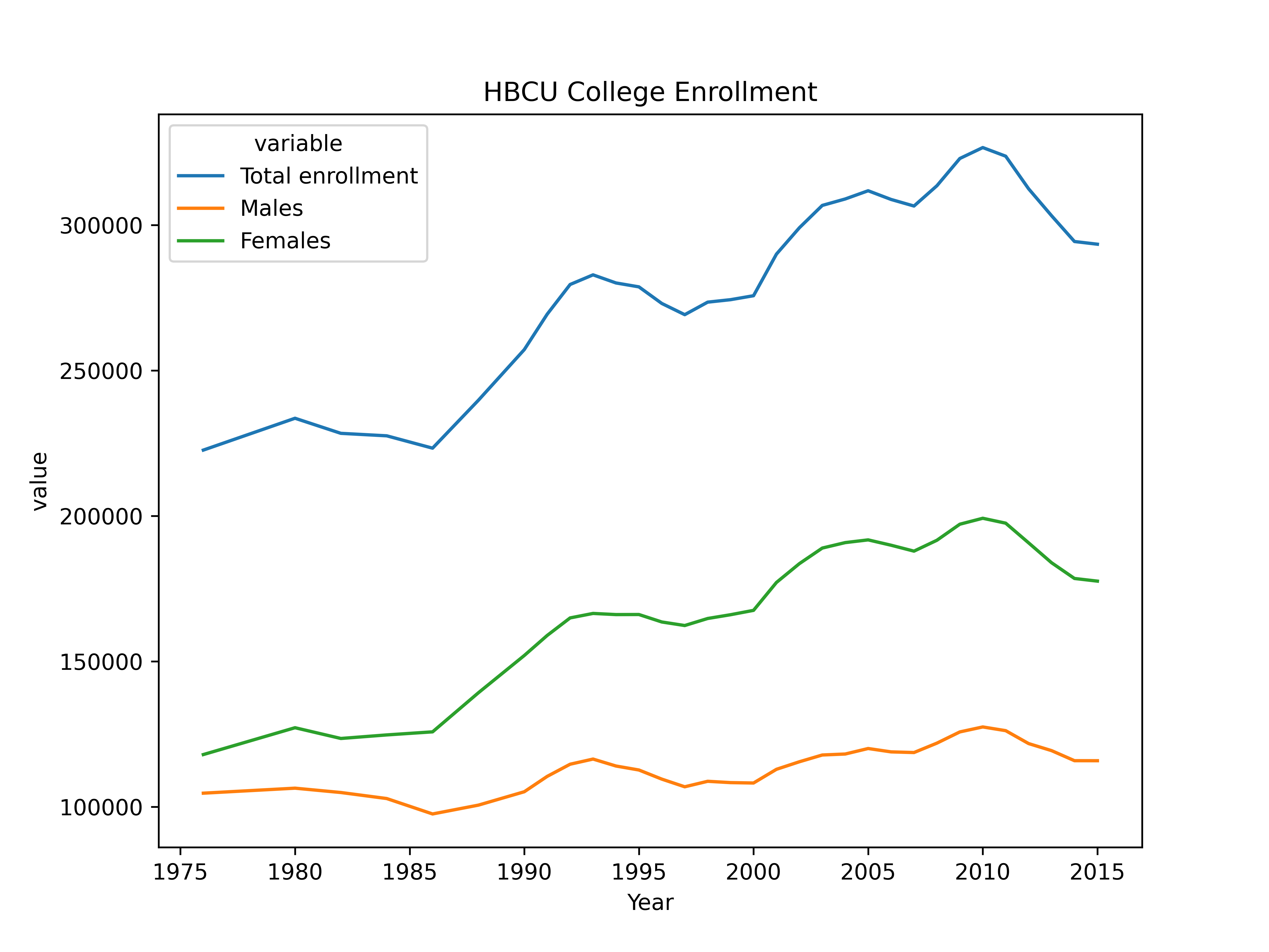
Seeing only the gender related data (with total enrollment as a comparison) helps to highlight that the same temporal trends seem to apply across males and females, though in some cases growth is more shallow in males.
18.2.5.3 Institution Types
It may also be useful to consider the type of institution when we consider enrollment numbers – public or private? 2 year or 4 year? In this case, it may be most useful to aim for creating some “small multiples” – multiple charts that are similarly constructed and placed together systematically.
Demo
hbcu_inst <- hbcu_all |>
  dplyr::select(1:2, 5:12) |>
  dplyr::rename(
    "Total-Total" = "Total enrollment",
    "Total-4year" = "4-year",
    "Total-2year"="2-year",
    "Public-Total" = "Total - Public",
    "Public-4year" = "4-year - Public",
    "Public-2year" = "2-year - Public",
    "Private-Total" = "Total - Private",
    "Private-4year" = "4-year - Private",
    "Private-2year" = "2-year - Private") |>
  tidyr::pivot_longer(2:10, names_to="variable", values_to="enrollment") |>
  tidyr::separate("variable", into = c("Type", "Degree"))

ggplot(hbcu_inst, aes(x = Year, y = enrollment, color = Degree)) + geom_line() +
  ggtitle("HBCU College Enrollment by Institution Type and Degree Length") +
  facet_wrap(~Type)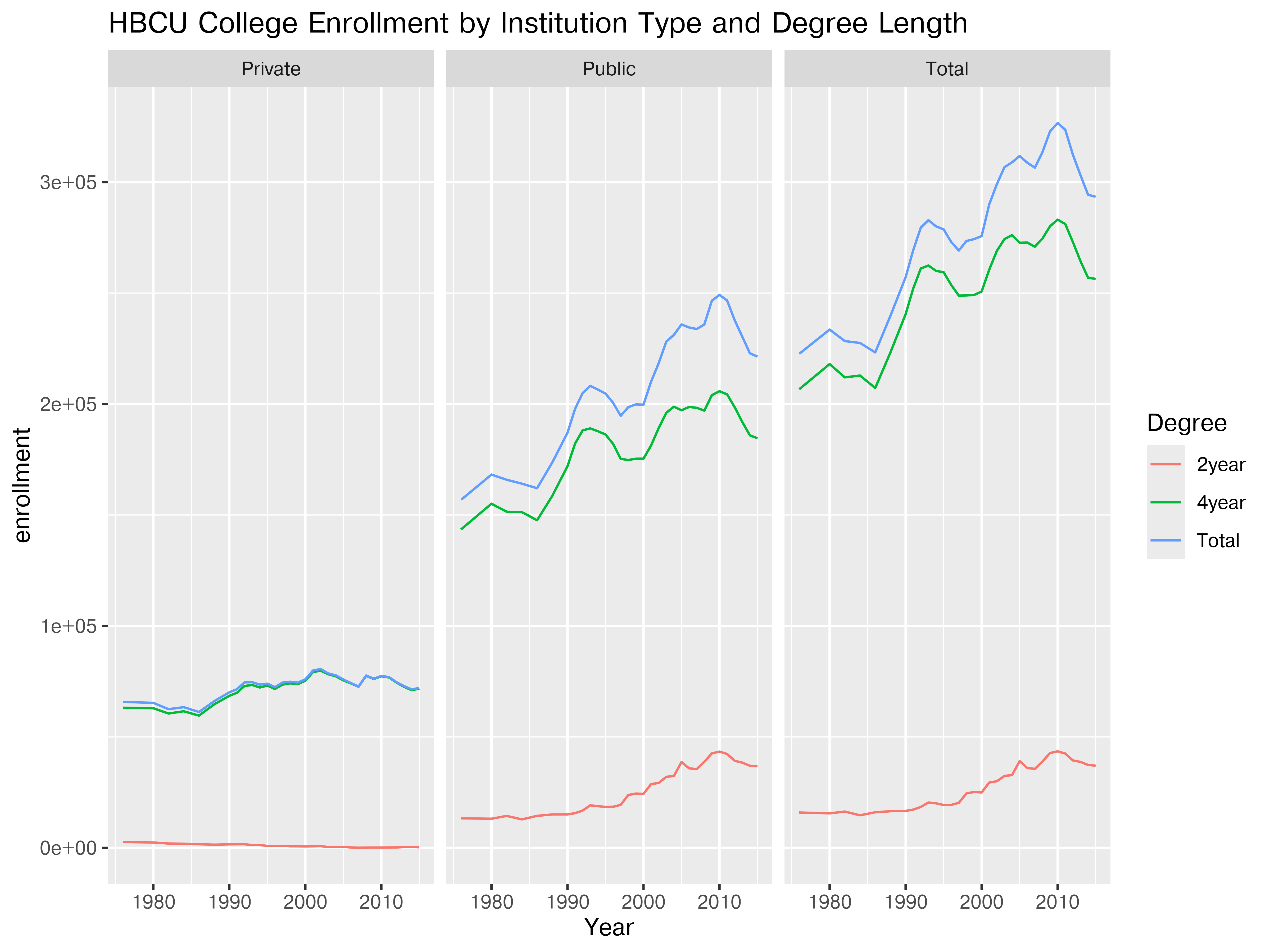
ggplot(hbcu_inst, aes(x = Year, y = enrollment, color = Degree)) + geom_line() +
  ggtitle("HBCU College Enrollment by Institution Type and Degree Length") +
  facet_wrap(~Degree)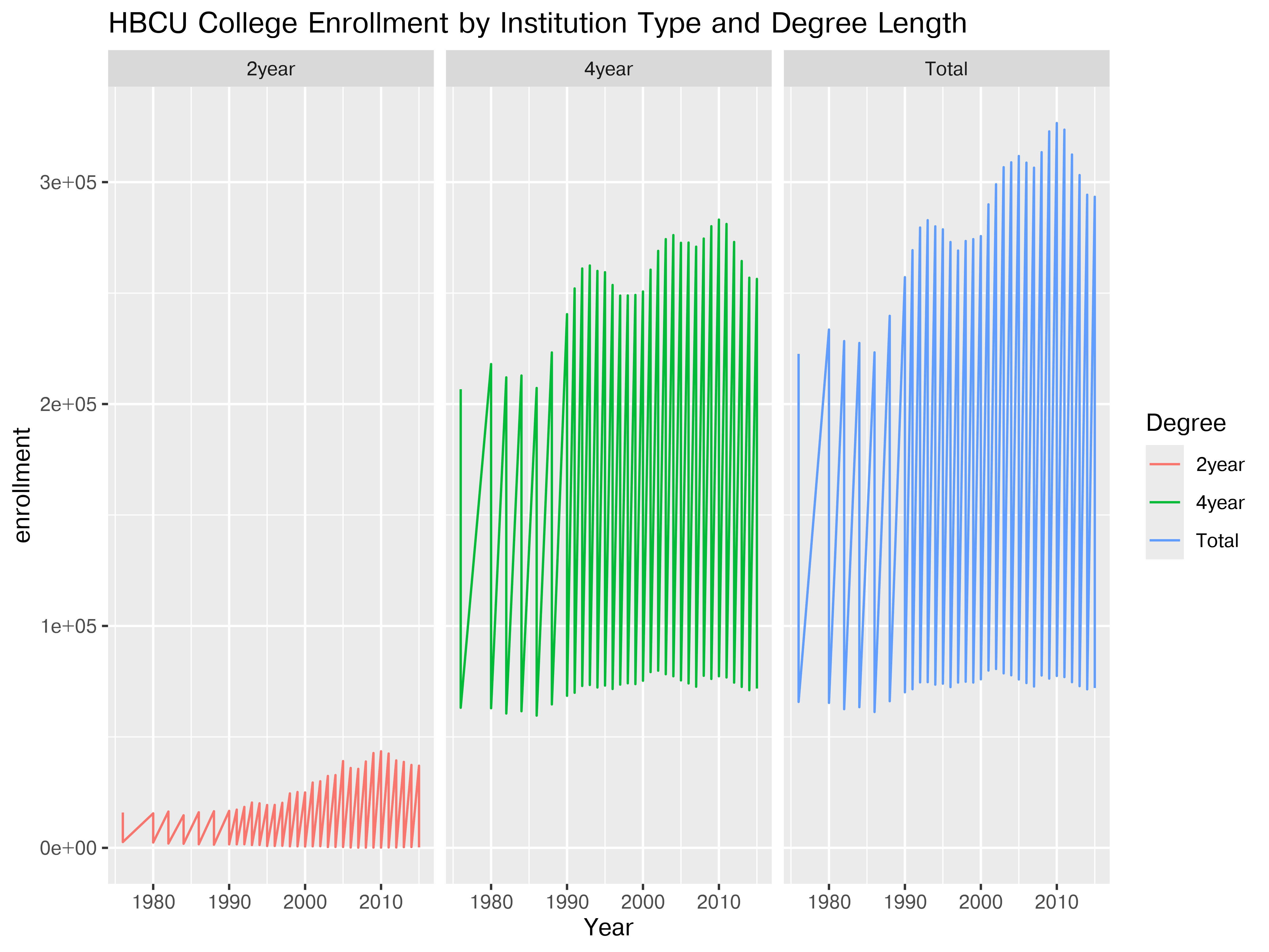
hbcu_inst = hbcu_all.iloc[:,[0,1,4,5,6,7,8,9,10,11]]
hbcu_inst_names=["Year", "Total-Total", "Total-4year", "Total-2year", "Public-Total", "Public-4year", "Public-2year","Private-Total", "Private-4year", "Private-2year"]
hbcu_inst.columns = hbcu_inst_names
hbcu_inst_long = pd.melt(hbcu_inst, id_vars = ['Year'], value_vars = hbcu_inst.columns[1:10])
hbcu_inst_long[['Type','Degree']]=list(hbcu_inst_long["variable"].str.split("-"))

plt.clf() # Clear previous plot
plot = sns.FacetGrid(hbcu_inst_long, col="Type")
plot.map_dataframe(sns.lineplot,x = "Year", y = "value", hue = "Degree")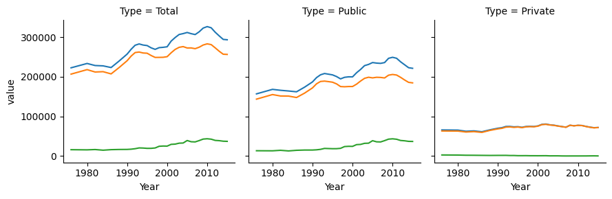
plot.add_legend()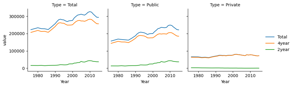
plt.show()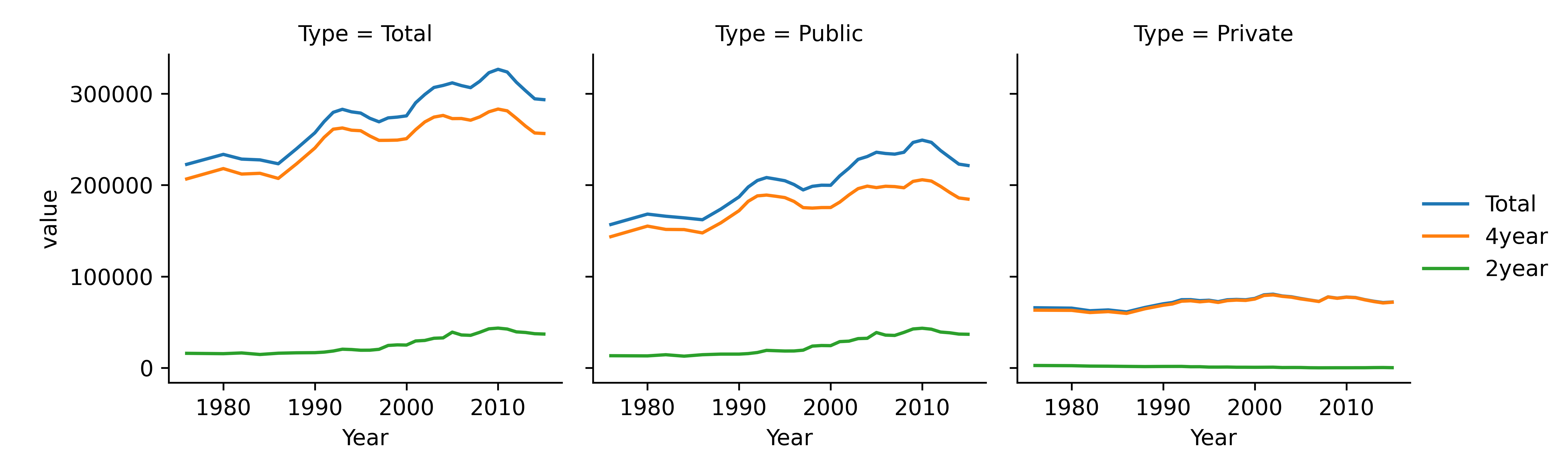
plt.clf() # Clear previous plot
plot = sns.FacetGrid(hbcu_inst_long, col="Degree")
plot.map_dataframe(sns.lineplot,x = "Year", y = "value", hue = "Type")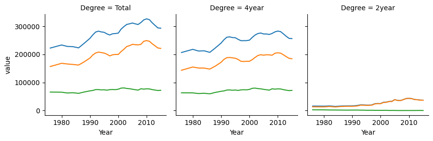
plot.add_legend()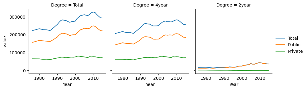
plt.show()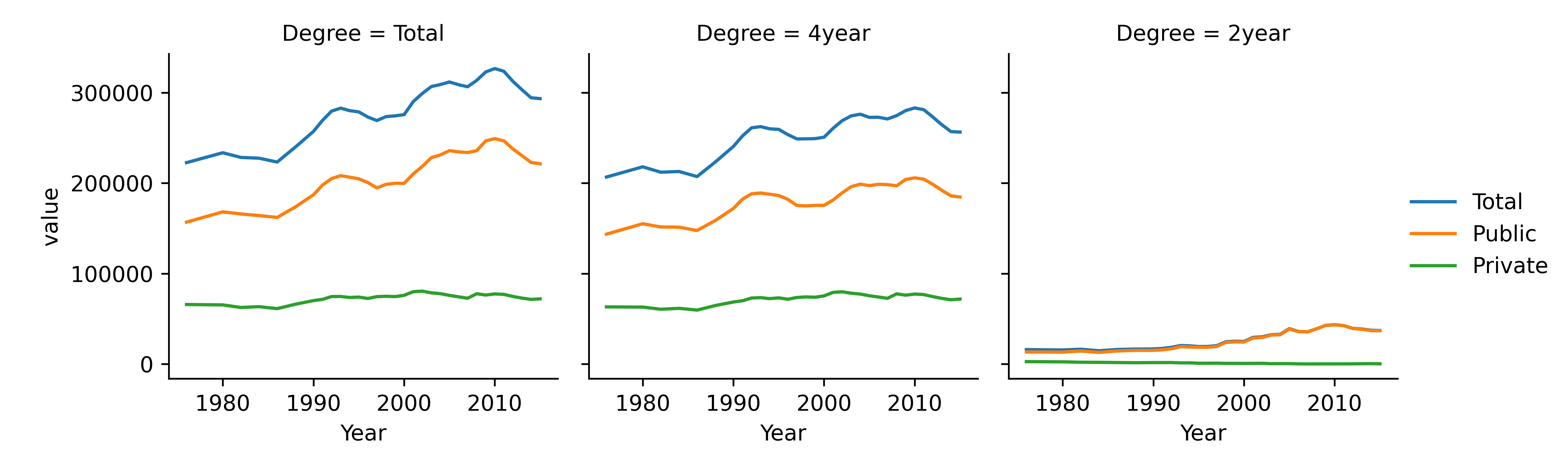

Any of these plots could be customized by e.g. removing Totals (if desired), changing axis parameters so that facets don’t have the same axis values, etc., but this is enough to get the basic idea of how to work with data.
18.2.6 Key Takeaways
From this example of HBCU enrollment, a few things are clear:
- The form of the data is important to be able to plot the data easily
- It can be helpful to break measurements down into disjoint combinations (where the data allows) to create plots that thoughtfully compare variables
- Plotting subsets of variables and rows can help us understand effects in the data better