install.packages("ggplot2")20 A Grammar of Graphics
Objectives
- Describe charts using the grammar of graphics
- Create charts designed to communicate specific aspects of the data
- Create layered graphics that highlight multiple aspects of the data
20.1 Introduction
There are a lot of different types of charts, and equally many ways to categorize and describe the different types of charts. I’m going to be opinionated - while I will provide code for several different plotting programs, this chapter is organized based on the grammar of graphics, and more specifically the implementation in ggplot2, which is one of the more complete and extensible implementations available currently.
Visualization and statistical graphics are also my research area, so I’m more passionate about this material, which means there’s going to be more to read. Sorry about that in advance. I’ll do my best to indicate which content is actually mission-critical and which content you can skip if you’re not that interested.
This is going to be a fairly extensive chapter (in terms of content) because I want you to have a resource to access later, if you need it. That’s why I’m showing you code for many different plotting libraries - I want you to be able to make charts in any program you may need to use for your research.
Guides and Resources
20.1.1 Package Installation
This chapter will cover the following graphics libraries1:
-
ggplot2in R [2] -
seabornin python [3], with some information about its next-generation interface that is much closer to a grammar-of-graphics implementation [4]
To a lesser degree, we will also cover some details of more basic plotting libraries:
To install python graphics packages, pick one of the following methods (you can read more about them and decide which is appropriate for you in Section 10.3.2.1).
pip3 install matplotlib seabornThis package installation method requires that you have a virtual environment set up (that is, if you are on Windows, don’t try to install packages this way).
reticulate::py_install(c("matplotlib", "seaborn"))In a python chunk (or the python terminal), you can run the following command. This depends on something called “IPython magic” commands, so if it doesn’t work for you, try the System Terminal method instead.
%pip install matplotlib seabornOnce you have run this command, please comment it out so that you don’t reinstall the same packages every time.
20.2 Why do we create graphics?
The greatest possibilities of visual display lie in vividness and inescapability of the intended message. A visual display can stop your mental flow in its tracks and make you think. A visual display can force you to notice what you never expected to see. (“Why, that scatter diagram has a hole in the middle!”) – John W. Tukey [7]
Fundamentally, charts are easier to understand than raw data.
When you think about it, data is a pretty artificial thing. We exist in a world of tangible objects, but data are an abstraction - even when the data record information about the tangible world, the measurements are a way of removing the physical and transforming the “real world” into a virtual thing. As a result, it can be hard to wrap our heads around what our data contain. The solution to this is to transform our data back into something that is “tangible” in some way – if not physical and literally touch-able, at least something we can view and “wrap our heads around”.
Thought Experiment
You have a simple data set - 2 variables, about 150 observations. You want to get a sense of how the variables relate to each other. You can do one of the following options:
- Print out the data set
- Create some summary statistics of each variable and perhaps the covariance between the two variables
- Draw a scatter plot of the two variables
Which one would you rather use? Why?
Our brains are very good at processing large amounts of visual information quickly. Evolution is good at optimizing for survival, and it’s important to be able to survey a field and pick out the tiger that might eat you. When we present information visually, in a format that can leverage our visual processing abilities, we offload some of the work of understanding the data to a chart that organizes it for us. You could argue that printing out the data is a visual presentation, but it requires that you read that data in as text, which we’re not nearly as equipped to process quickly (and in parallel).
In addition, it’s a lot easier to talk to non-experts about complicated statistics using visualizations. Moving the discussion from abstract concepts to concrete shapes and lines keeps people who are potentially already math or stat phobic from completely tuning out.
20.3 Thinking Critically About Graphics
When we create graphics, we want to enable people to think about relationships between the variables in our dataset.
For this example, let’s consider the relationship between different physical measurements of penguins. We’ll use the palmerpenguins package in R, which is also available in python.
20.3.1 Load (and examine) the data
## install.packages("palmerpenguins")
library(palmerpenguins)
head(penguins)
## # A tibble: 6 × 8
##   species island    bill_length_mm bill_depth_mm flipper_length_mm body_mass_g
##   <fct>   <fct>              <dbl>         <dbl>             <int>       <int>
## 1 Adelie  Torgersen           39.1          18.7               181        3750
## 2 Adelie  Torgersen           39.5          17.4               186        3800
## 3 Adelie  Torgersen           40.3          18                 195        3250
## 4 Adelie  Torgersen           NA            NA                  NA          NA
## 5 Adelie  Torgersen           36.7          19.3               193        3450
## 6 Adelie  Torgersen           39.3          20.6               190        3650
## # ℹ 2 more variables: sex <fct>, year <int>
In your system console:
pip3 install palmerpenguinsIn Python:
import palmerpenguins
penguins = palmerpenguins.load_penguins()
penguins.head()
##   species     island  bill_length_mm  ...  body_mass_g     sex  year
## 0  Adelie  Torgersen            39.1  ...       3750.0    male  2007
## 1  Adelie  Torgersen            39.5  ...       3800.0  female  2007
## 2  Adelie  Torgersen            40.3  ...       3250.0  female  2007
## 3  Adelie  Torgersen             NaN  ...          NaN     NaN  2007
## 4  Adelie  Torgersen            36.7  ...       3450.0  female  2007
##
## [5 rows x 8 columns]
How do physical measurements (bill width, bill depth, flipper length, and body mass) relate to each other?
20.3.2 Initial plots
library(ggplot2)
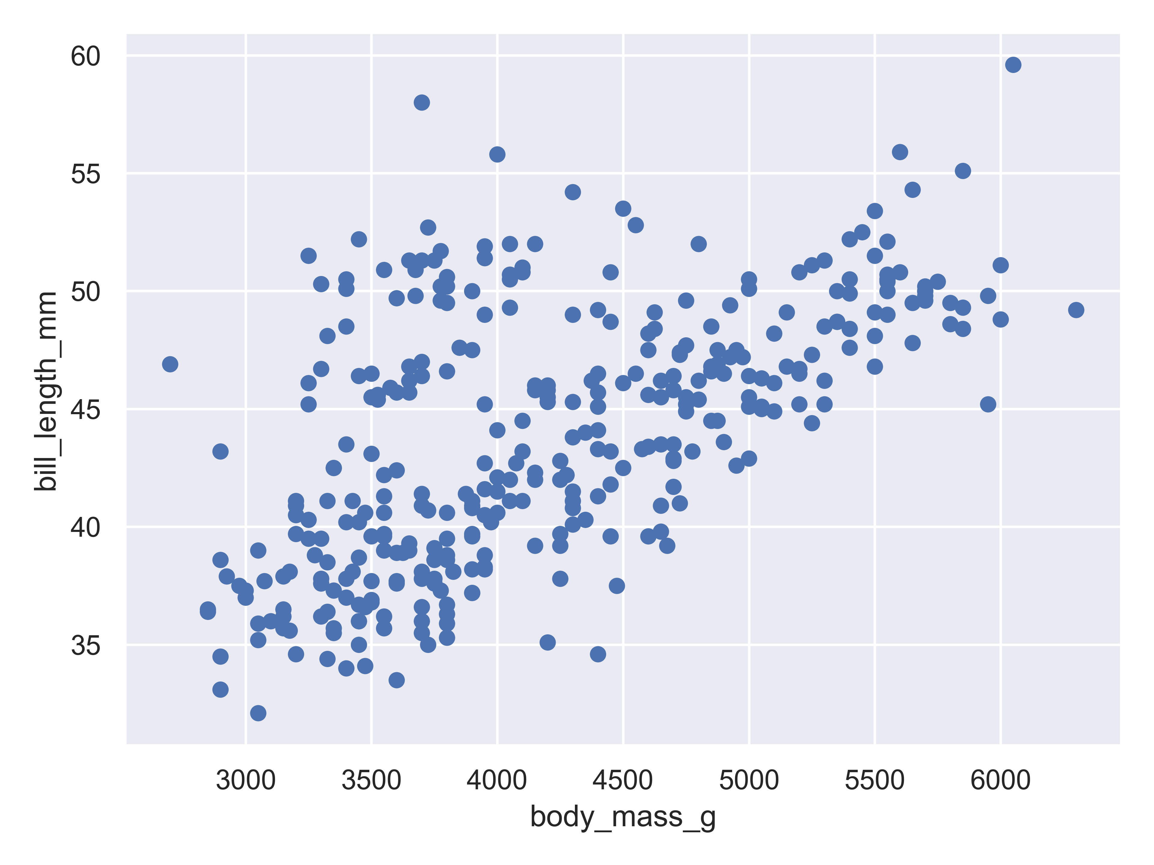
ggplot(data = penguins, aes(x = body_mass_g, y = bill_length_mm)) + geom_point()
Here, we start with a basic plot of bill length (mm) against body mass (g). We can see that there is an overall positive relationship between the two - penguins with higher body mass tend to have longer bills as well. However, it is also clear that there is considerable variation that is not explained by this relationship: there is a group of penguins who seem to have lower body mass and longer bills in the top left quadrant of the plot.
We can extend this process a bit by adding in additional information from the dataset and mapping that information to an additional variable - for instance, we can color the points by the species of penguin.
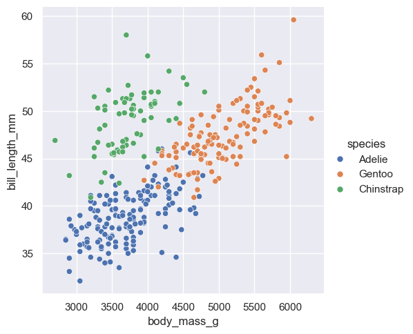
ggplot(data = penguins, aes(x = body_mass_g, y = bill_length_mm, color = species)) + geom_point()
Adding in this additional information allows us to see that chinstrap penguins are the cluster we noticed in the previous plot. Adelie and gentoo penguins have a similar relationship between body mass and bill length, but chinstrap penguins tend to have longer bills and lower body mass.
Each variable in ggplot2 is mapped to a plot feature using the aes() (aesthetic) function. This function automatically constructs a scale that e.g. converts between body mass and the x axis of the plot, which is measured on a (0,1) scale for plotting. Similarly, when we add a categorical variable and color the points of the plot by that variable, the mapping function automatically decides that Adelie penguins will be plotted in red, Chinstrap in green, and Gentoo in blue.
That is, ggplot2 allows the programmer to focus on the relationship between the data and the plot, without having to get into the specifics of how that mapping occurs. This allows the programmer to consider these relationships when constructing the plot, choosing the relationships which are most important for the audience and mapping those variables to important dimensions of the plot, such as the x and y axis.
import seaborn as sns
import matplotlib.pyplot

sns.set_theme() # default theme
sns.relplot(
  data = penguins,
  x = "body_mass_g", y = "bill_length_mm"
)
matplotlib.pyplot.show() # include this line to show the plot in quarto
Here, we start with a basic plot of bill length (mm) against body mass (g). In seaborn, this is called a relational plot - that is, it shows the relationship between the variables on the x and y axis. We can see that there is an overall positive relationship between the two - penguins with higher body mass tend to have longer bills as well. However, it is also clear that there is considerable variation that is not explained by this relationship: there is a group of penguins who seem to have lower body mass and longer bills in the top left quadrant of the plot.
With seaborn, you begin to construct a plot by identifying the type of plot you want - whether it’s a relational plot, like a scatterplot or a lineplot, a distributional plot, like a histogram, density, CDF, or rug plot, or a categorical plot.
We can extend this process a bit by adding in additional information from the dataset and mapping that information to an additional variable - for instance, we can color the points by the species of penguin.
sns.relplot(
  data = penguins,
  x = "body_mass_g", y = "bill_length_mm", hue = "species"
)
matplotlib.pyplot.show() # include this line to show the plot in quarto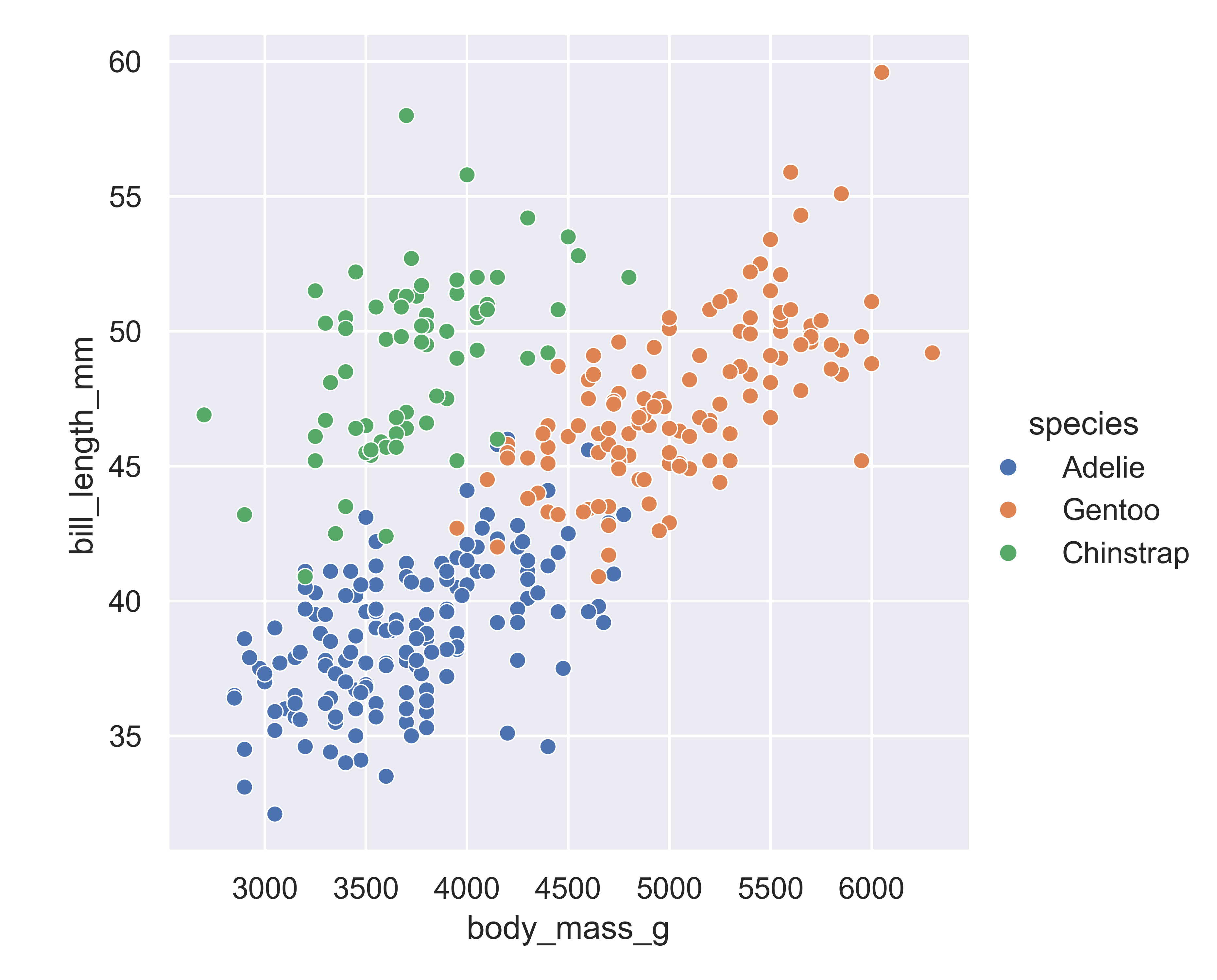
Adding in this additional information allows us to see that chinstrap penguins are the cluster we noticed in the previous plot. Adelie and gentoo penguins have a similar relationship between body mass and bill length, but chinstrap penguins tend to have longer bills and lower body mass.
Each variable in a seaborn relational plot is mapped to a plot feature. This function automatically constructs a scale that e.g. converts between body mass and the x axis of the plot, which is measured on a (0,1) scale for plotting. Similarly, when we add a categorical variable and color the points of the plot by that variable, the mapping function automatically decides that Adelie penguins will be plotted in blue, Chinstrap in green, and Gentoo in red.
As with ggplot2, seaborn allows the programmer to focus on the relationship between the data and the plot, without having to get into the specifics of how that mapping occurs. This allows the programmer to consider these relationships when constructing the plot, choosing the relationships which are most important for the audience and mapping those variables to important dimensions of the plot, such as the x and y axis.
In Version 0.12, Seaborn introduced a new interface, the objects interface, that is much more grammar-of-graphics like than the default Seaborn interface.
import seaborn.objects as so

(
  so.Plot(penguins, x = "body_mass_g", y = "bill_length_mm")
  .add(so.Dot())
  .show()
)
Here, we start with a basic plot of bill length (mm) against body mass (g). We can see that there is an overall positive relationship between the two - penguins with higher body mass tend to have longer bills as well. However, it is also clear that there is considerable variation that is not explained by this relationship: there is a group of penguins who seem to have lower body mass and longer bills in the top left quadrant of the plot.
With seaborn objects interface, you begin to construct a plot by identifying the primary relationship of interest: you define what variables go on each axis (body mass on x, bill length on y) and then create a layer that shows the actual data (so.Dot()).
We can extend this process a bit by adding in additional information from the dataset and mapping that information to an additional variable - for instance, we can color the points by the species of penguin.
(
  so.Plot(penguins, x = "body_mass_g", y = "bill_length_mm", color = "species")
  .add(so.Dot())
  .show()
)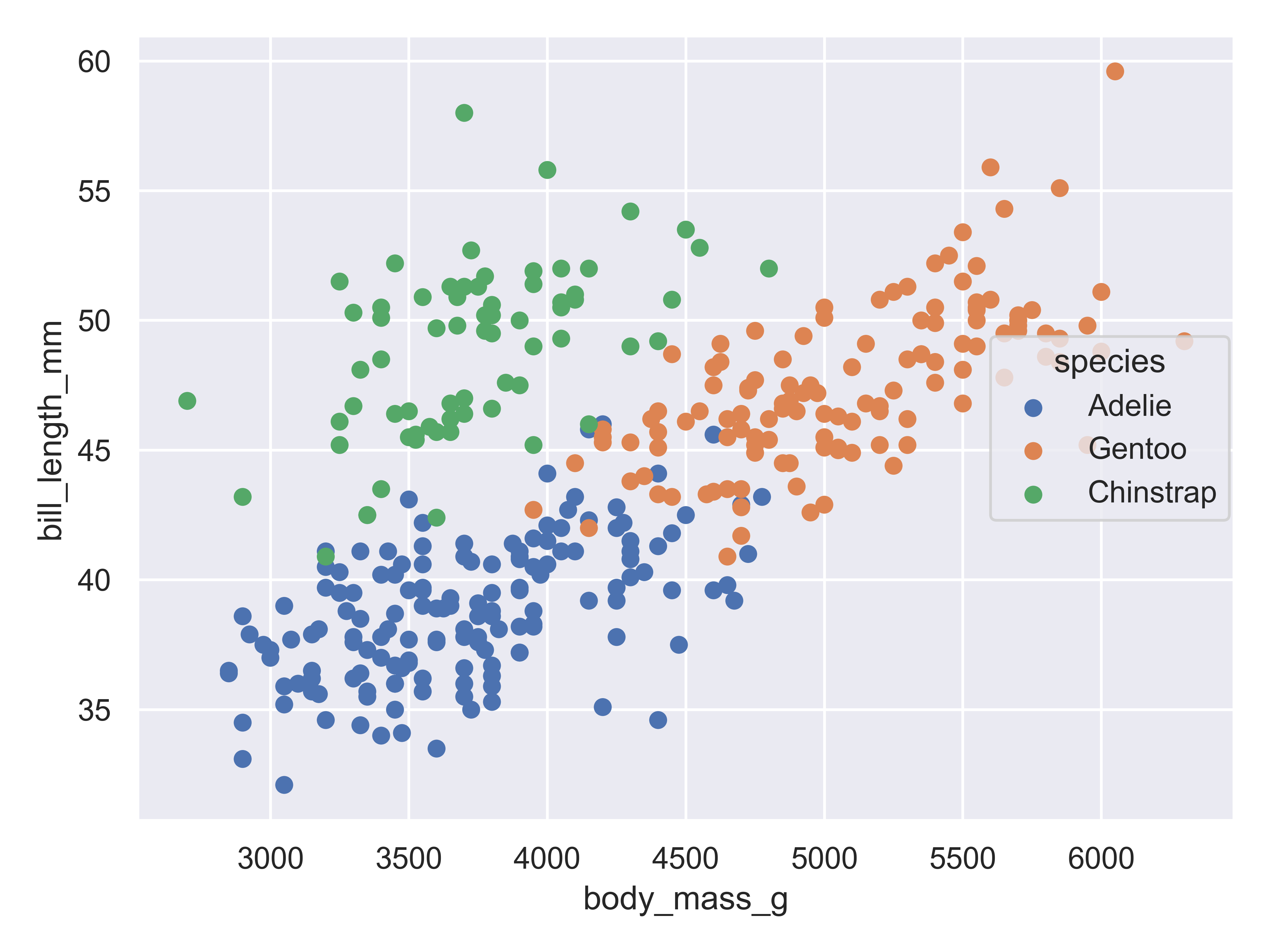
Adding in this additional information allows us to see that chinstrap penguins are the cluster we noticed in the previous plot. Adelie and gentoo penguins have a similar relationship between body mass and bill length, but chinstrap penguins tend to have longer bills and lower body mass.
Each variable in a seaborn objects plot declaration is mapped to a plot feature. Seaborn then automatically constructs a scale that e.g. converts between body mass and the x axis of the plot, which is measured on a (0,1) scale for plotting. Similarly, when we add a categorical variable and color the points of the plot by that variable, the mapping function automatically decides that Adelie penguins will be plotted in blue, Chinstrap in green, and Gentoo in red.
As with ggplot2 and plotnine, seaborn’s objects interface allows the programmer to focus on the relationship between the data and the plot, without having to get into the specifics of how that mapping occurs. This allows the programmer to consider these relationships when constructing the plot, choosing the relationships which are most important for the audience and mapping those variables to important dimensions of the plot, such as the x and y axis.
You may notice that this is much more similar to ggplot2 in syntax than the default Seaborn interface.
plot(penguins$body_mass_g, penguins$bill_length_mm)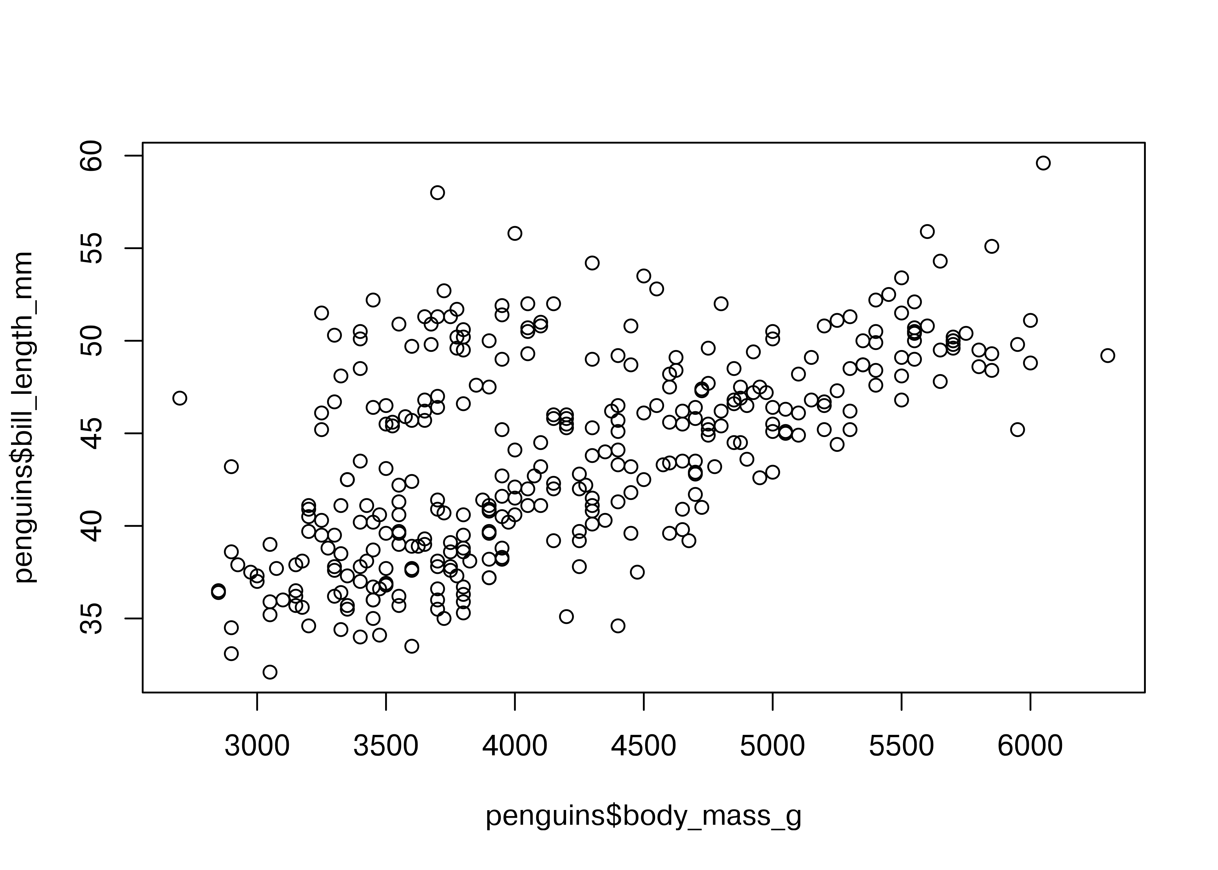
Here, we start with a basic plot of bill length (mm) against body mass (g). We can see that there is an overall positive relationship between the two - penguins with higher body mass tend to have longer bills as well. However, it is also clear that there is considerable variation that is not explained by this relationship: there is a group of penguins who seem to have lower body mass and longer bills in the top left quadrant of the plot.
Notice that in base R, you have to reference each column of the data frame separately, as there is not an included data argument in the plot function.
When we add color to the plot, it gets a little more complicated - to get a legend, we have to know a bit about how base R plots are constructed. When we pass in a factor as a color, R will automatically assign colors to each level of the factor.
plot(penguins$body_mass_g, penguins$bill_length_mm, col = penguins$species)
legend(5500, 40,unique(penguins$species),col=1:3,pch=1)
To create a legend, we need to then identify where the legend should go (x = 5500, y = 40), and then the factor labels (unique(penguins$species)), and then the color levels assigned to those labels (1:3), and finally the point shape (pch = 1).
This manual legend creation process is a bit odd if you start from a grammar-of-graphics approach, but was for a long time the only way to make graphics in essentially any plotting system.
Personally, I still think the base plotting system creates charts that look a bit … ancient …, but there are some people who very much prefer it to ggplot2 [8].
import matplotlib.pyplot as plt

fig, ax = plt.subplots() # Create a new plot

ax.scatter(penguins.body_mass_g, penguins.bill_length_mm)
plt.show()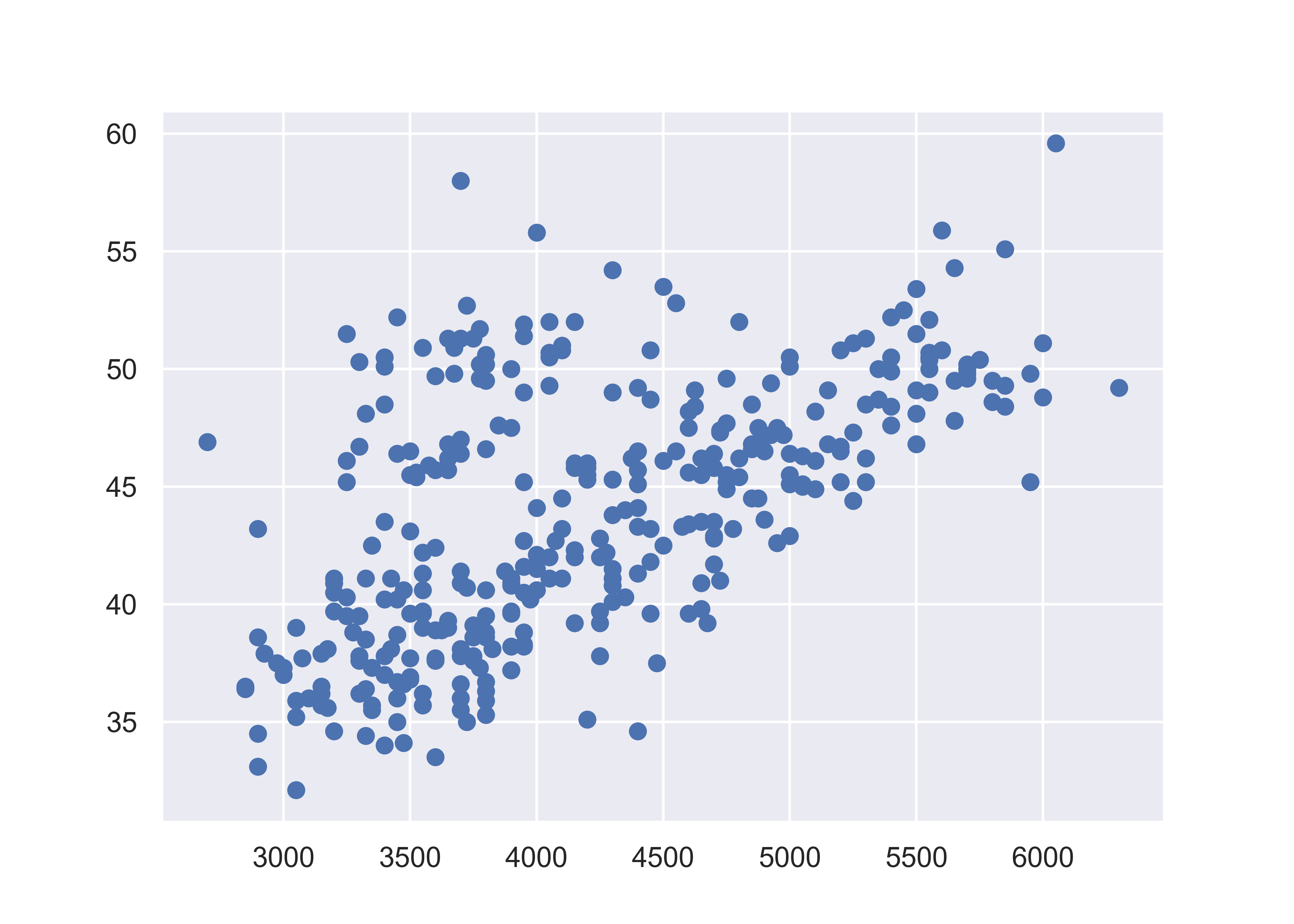
plt.close() # close the figureHere, we start with a basic plot of bill length (mm) against body mass (g). We can see that there is an overall positive relationship between the two - penguins with higher body mass tend to have longer bills as well. However, it is also clear that there is considerable variation that is not explained by this relationship: there is a group of penguins who seem to have lower body mass and longer bills in the top left quadrant of the plot.
When we add color to the plot, it gets a little more complicated. Matplotlib does not automatically assign factors to colors - we have to instead create a dictionary of colors for each factor label, and then use the .map function to apply our dictionary to our factor variable.
To create a legend, we define handles and use the dictionary to create the legend. Then we have to manually position the legend in the lower right of the plot. Note that here, the legend position is defined using bbox_to_anchor in plot coordinates (x = 1, y = 0), and then the orientation of that box is defined using the loc parameter.
from matplotlib.lines import Line2D  # for legend handle
fig, ax = plt.subplots() # Create a new plot

# Define a color mapping
colors = {'Adelie':'tab:blue', 'Gentoo':'tab:orange', 'Chinstrap':'tab:green'}

ax.scatter(x = penguins.body_mass_g, y = penguins.bill_length_mm, c = penguins.species.map(colors))
# add a legend
handles = [Line2D([0], [0], marker='o', color='w', markerfacecolor=v, label=k, markersize=8) for k, v in colors.items()]
ax.legend(title='Species', handles=handles, bbox_to_anchor=(1, 0), loc='lower right')

plt.show()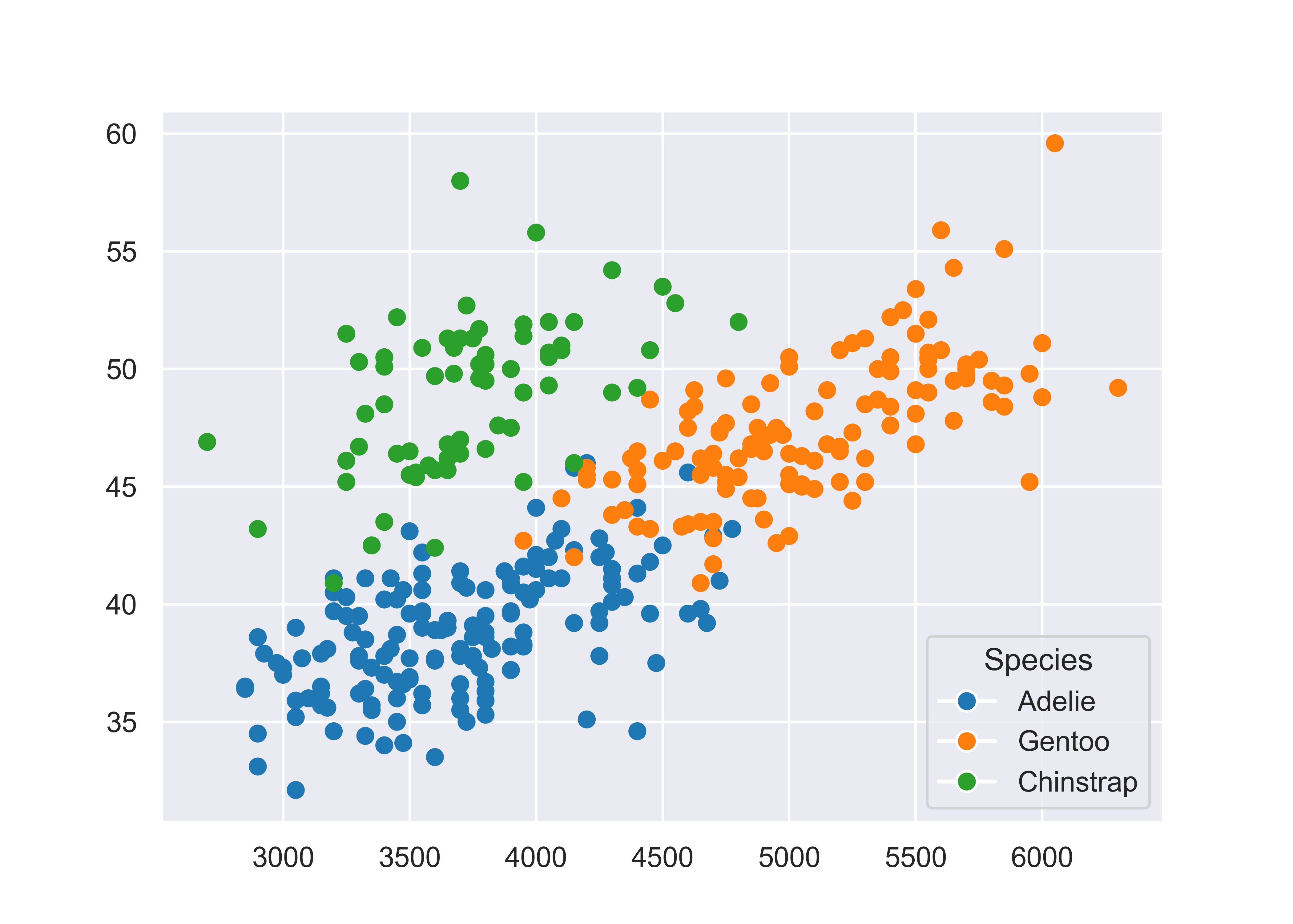
plt.close() # close the figureMatplotlib is prettier than the Base R graphics, but we again have to manually create our legend, which is not ideal. Matplotlib is great for lower-level control over your plot, but that means you have to do a lot of the work manually. Personally, I much prefer to focus my attention on creating the right plot, and let sensible defaults take over whenever possible - this is the idea with both ggplot2 and seaborn objects.
20.3.3 A graphing template
It would be convenient if we could create a template for each of these libraries that would help us create many different types of plots. Unfortunately, that’s going to be a bit difficult, because there are a number of libraries covered here that are not built on the idea of a grammar of graphics - that is, a set of vocabulary that can define a bunch of different types of charts. In this section, I’ll show you basic templates for charts where such templates exist, and otherwise, I will try to give you a set of functions that may get you started.
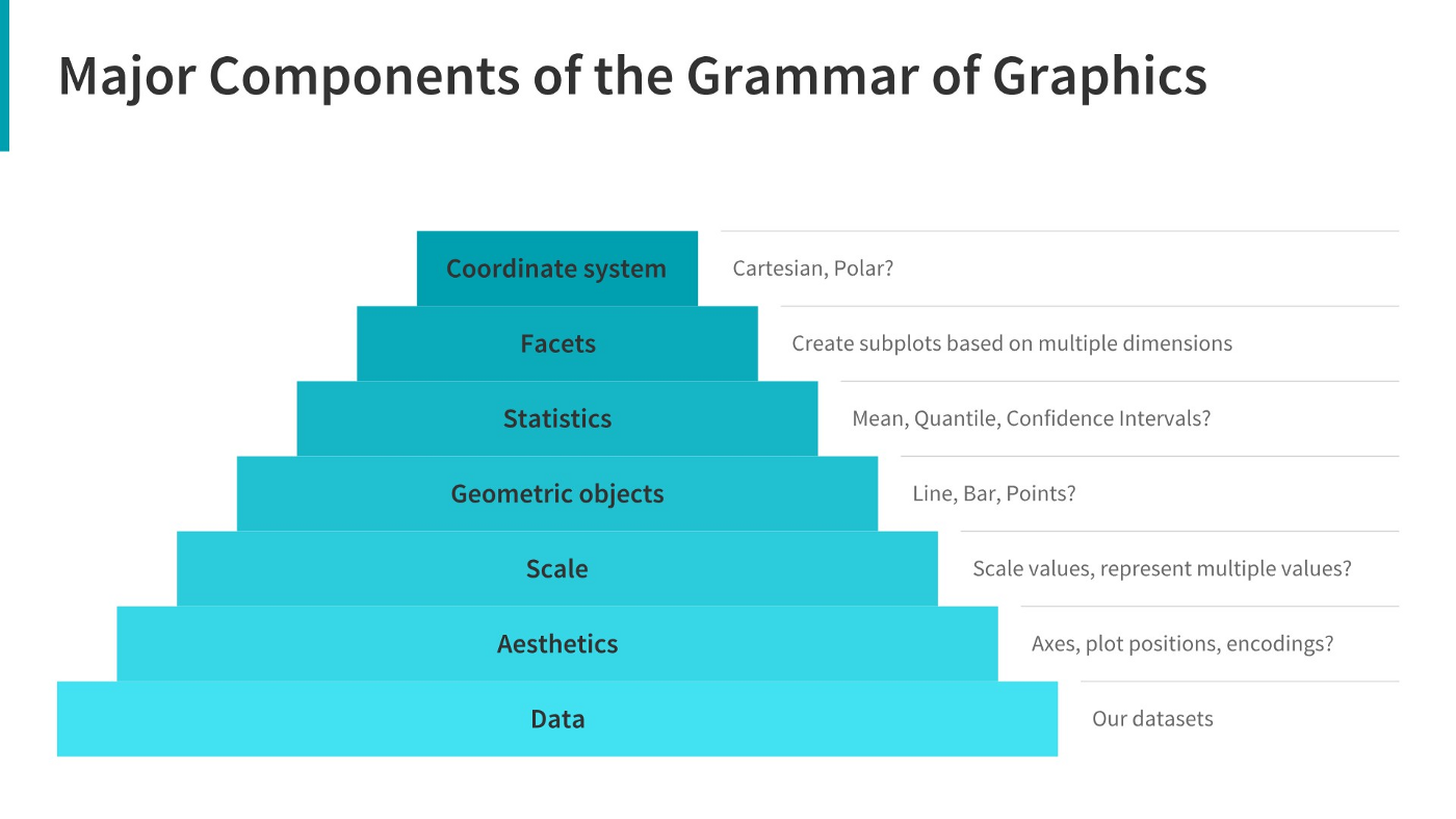
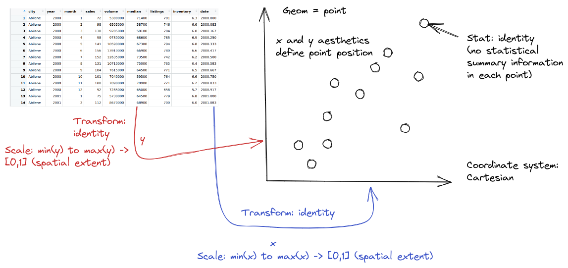
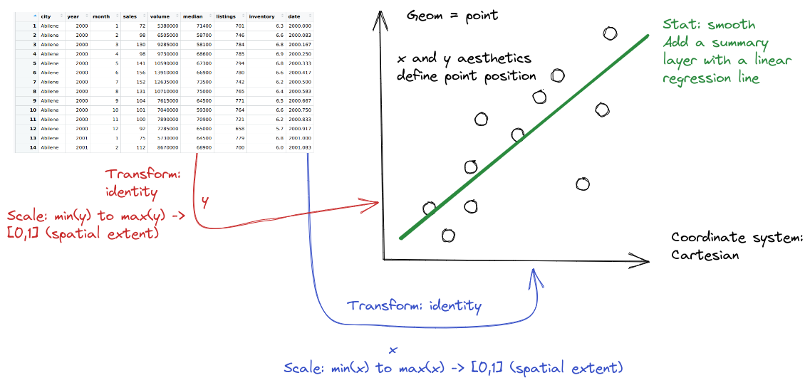
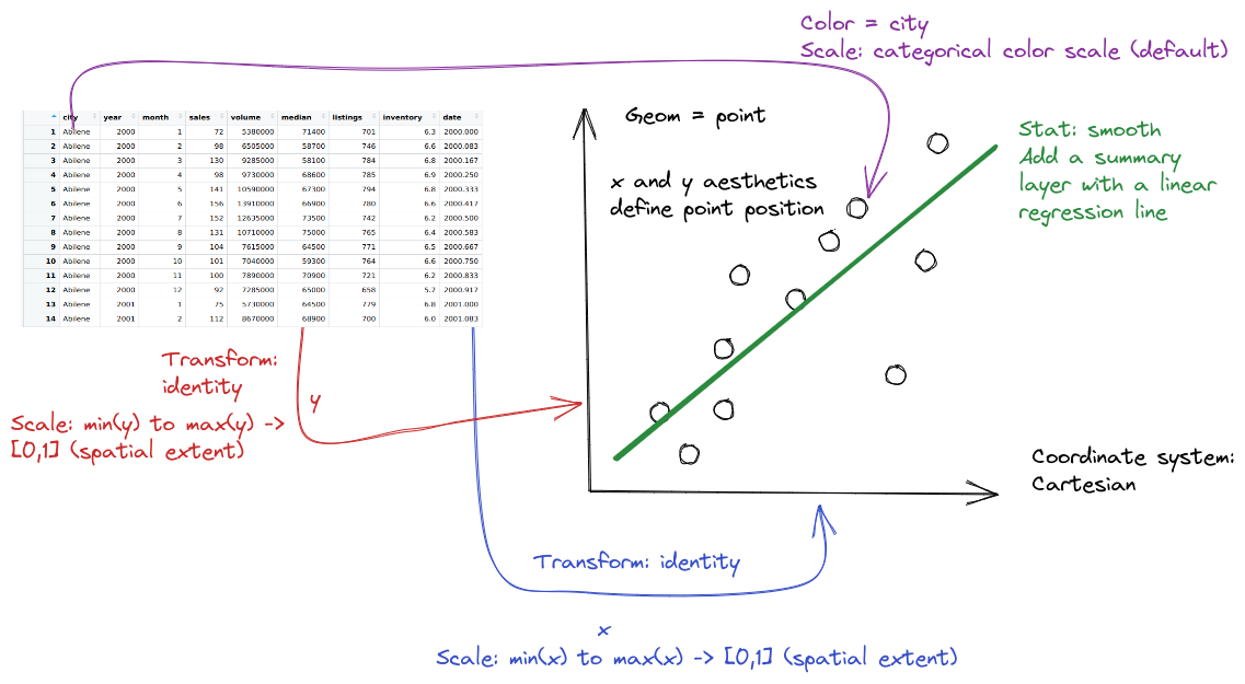
The gg in ggplot2 stands for the grammar of graphics. In ggplot2, we can describe any plot using a template that looks like this:
ggplot(data = <DATA>) +
  <GEOM>(mapping = aes(<MAPPINGS>),
         position = <POSITION>,
         stat = <STAT>) +
  <FACET> +
  <COORD> +
  <THEME>
Geoms are geometric objects, like points (geom_point), lines (geom_line), and rectangles (geom_rect, geom_bar, geom_column). Mappings are relationships between plot characteristics and variables in the dataset - setting x, y, color, fill, size, shape, linetype, and more. Critically, when a visual characteristic, such as color, fill, shape, or size, is a constant, it is set outside of an aes() statement; when it is mapped to a variable, it must be provided inside the aes() statement. Read more about aesthetics
In ggplot2, statistics can be used within geoms to summarize data. Additional modifications of plots in ggplot2 include changing the coordinate system, adjusting positions, and adding subplots using facets.
In seaborn, we can describe plots using three different basic templates:
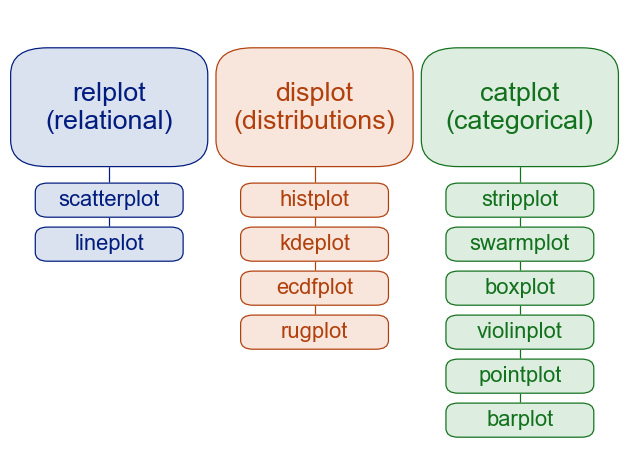
sns.relplot(data = <DATA>, x = <X var>, y = <Y var>,
            kind = <PLOT TYPE>, <ADDITIONAL ARGS>)

sns.displot(data = <DATA>, x = <X var>, y = <Y var, optional>,
            kind = <PLOT TYPE>, <ADDITIONAL ARGS>)

sns.catplot(data = <DATA>, x = <Categorical X var>, y = <Y var>,
            kind = <PLOT TYPE>, <ADDITIONAL ARGS>)

# General version
sns.<PLOTTYPE>(data = <DATA>, <MAPPINGS>,
               kind = <PLOT SUBTYPE>, <ADDITIONAL ARGS>)
Here, the kind argument is somewhat similar to the geom argument in ggplot2, but there are different functions used for different purposes. This seems to be a way to handle statistical transformations without the full grammar-of-graphics implementation of statistics that is found in ggplot2. Read more about statistical relationships, distributions, and categorical data in the seaborn tutorial.
In Version 0.12, Seaborn introduced a new interface, the objects interface, that is much more grammar-of-graphics like than the default Seaborn interface.
We can come up with a generic plot template that looks something like this:
(
  so.Plot(<DATA>, <MAPPINGS>, <GROUPS>)
  .add(so.<GEOM>(<ARGS>), so.<TRANSFORMATION>, so.<POSITION>)
  .show()
)
R’s base graphics library is decidedly non-grammar-of-graphics like. Each plot is defined using plot-specific arguments that are not particularly consistent across different functions.
The following is as close as I can get, but it’s still not accurate for many plots.
<PLOT NAME>(<MAPPINGS>, <ARGS>)
<LEGEND>(<MAPPINGS>, <ARGS>)
Any statistics are either computed as part of the plot function (e.g. hist()) or there are plot methods to accompany the statistic calculation (plot(density(...))). Facets/subplots are sometimes created using par(mfrow=(...)) to define sub-plots, and are sometimes created by the plot command itself, in the case of e.g. passing a numeric matrix to plot(), which creates a scatterplot matrix.
Useful commands: plot() for scatterplots, lines (type = ‘l’), scatterplot matrices, etc. hist() for histograms. plot(density(...)) for density plots. boxplot() for boxplots, barplot() for bar plots, …
I’m not even going to try to create a grammar summary for matplotlib… there just isn’t one. It wasn’t designed with the grammar of graphics in mind, and was built by computer scientists [9], not statisticians. As a result, even retrofitting some sort of “grammar” interpretation doesn’t work so well.
For a primer on matplotlib, I recommend [10], Ch 9.
20.4 Advanced: Charts, Graphics, and the Grammar of Graphics
There are two general approaches to generating statistical graphics computationally:
Manually specify the plot that you want, possibly doing the preprocessing and summarizing before you create the plot.
Base R, matplotlib, SAS graphicsDescribe the relationship between the plot and the data, using sensible defaults that can be customized for common operations.
ggplot2, seaborn (sort of), seaborn objects
There is a difference between low-level plotting libraries (base R, matplotlib) and high-level plotting libraries (ggplot2, seaborn). Grammar of graphics libraries are usually high level, but it is entirely possible to have a high level library that does not follow the grammar of graphics. In general, if you have to manually add a legend, it’s probably a low level library.
In the introduction to the Grammar of Graphics [11], Leland Wilkinson suggests that the first approach is what we would call “charts” - pie charts, line charts, bar charts - objects that are “instances of much more general objects”. His argument is that elegant graphical design means we have to think about an underlying theory of graphics, rather than how to create specific charts. The 2nd approach is called the “grammar of graphics”.
There are other graphics systems (namely, lattice in R, seaborn in Python, and some web-based rendering engines like Observable or d3) that you could explore, but it’s far more important that you know how to functionally create plots in R and/or Python. I don’t recommend you try to become proficient in all of them. Pick one (two at most) and get familiar with those libraries, then google for the rest.
Before we delve into the grammar of graphics, let’s motivate the philosophy using a simple task. Suppose we want to create a pie chart using some data. Pie charts are terrible, and we’ve known it for 100 years [12], so in the interests of showing that we know that pie charts are awful, we’ll also create a stacked bar chart, which is the most commonly promoted alternative to a pie chart. We’ll talk about what makes pie charts terrible in Chapter 21.
Example: Generations of Pokemon
Suppose we want to explore Pokemon. There’s not just the original 150 (gotta catch ’em all!) - now there are over 1000! Let’s start out by looking at the proportion of Pokemon added in each of the 9 generations.
import pandas as pd
poke = pd.read_csv("https://raw.githubusercontent.com/srvanderplas/datasets/main/clean/pokemon_gen_1-9.csv")
poke['generation'] = pd.Categorical(poke.gen)
Once the data is read in, we can start plotting:
In ggplot2, we start by specifying which variables we want to be mapped to which features of the data.
In a pie or stacked bar chart, we don’t care about the x coordinate - the whole chart is centered at (0,0) or is contained in a single “stack”. So it’s easiest to specify our x variable as a constant, ““. We care about the fill of the slices, though - we want each generation to have a different fill color, so we specify generation as our fill variable.
Then, we want to summarize our data by the number of objects in each category - this is basically a stacked bar chart. Any variables specified in the plot statement are used to implicitly calculate the statistical summary we want – that is, to count the rows (so if we had multiple x variables, the summary would be computed for both the x and fill variables). ggplot is smart enough to know that when we use geom_bar, we generally want the y variable to be the count, so we can get away with leaving that part out. We just have to specify that we want the bars to be stacked on top of one another (instead of next to each other, “dodge”).
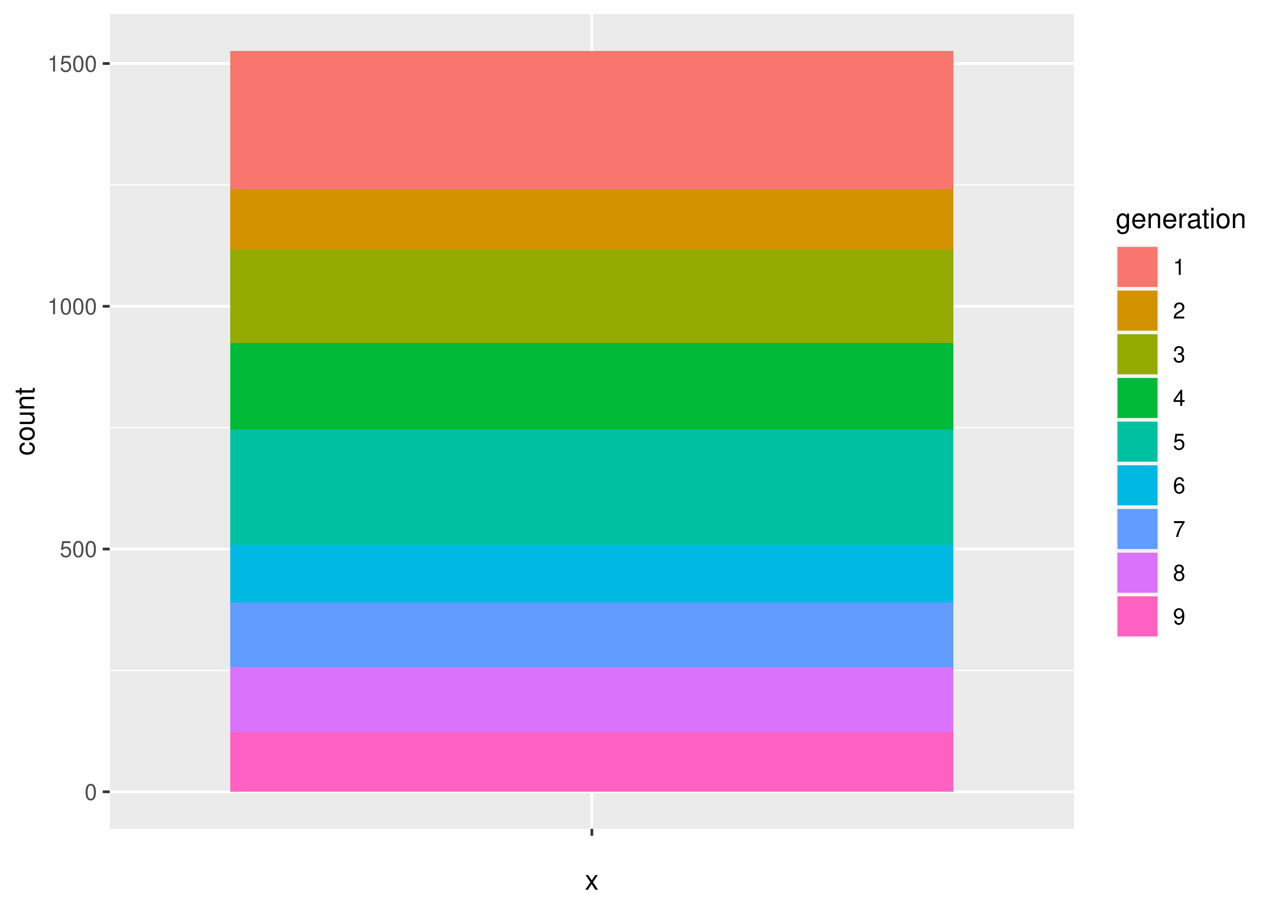
If we want a pie chart, we can get one very easily - we transform the coordinate plane from Cartesian coordinates to polar coordinates. We specify that we want angle to correspond to the “y” coordinate, and that we want to start at \(\theta = 0\).
ggplot(aes(x = "", fill = generation), data = poke) +
  geom_bar(position = "stack") +
  coord_polar("y", start = 0)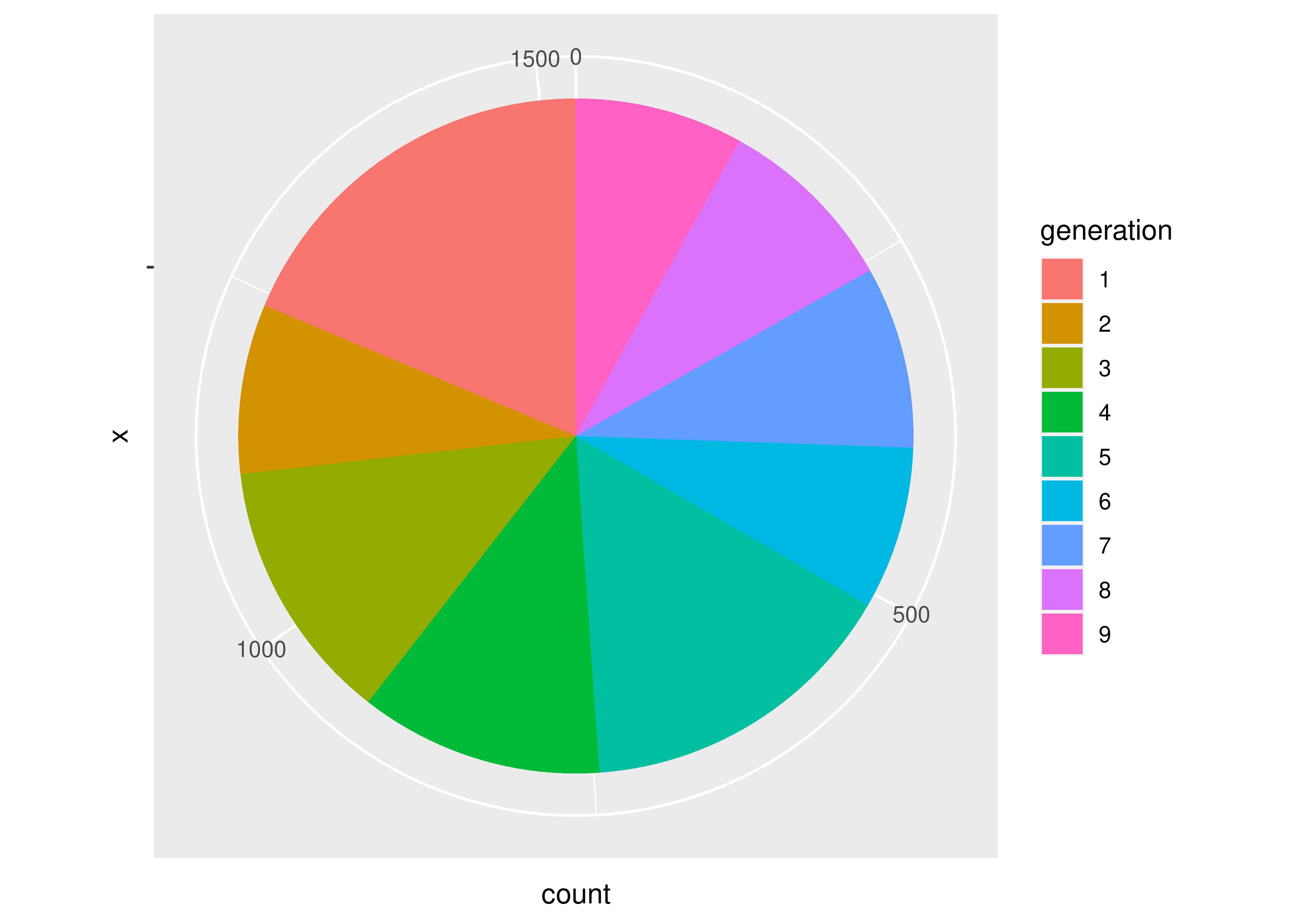
Notice how the syntax and arguments to the functions didn’t change much between the bar chart and the pie chart? That’s because the ggplot package uses what’s called the grammar of graphics, which is a way to describe plots based on the underlying mathematical relationships between data and plotted objects. In base R and in matplotlib in Python, different types of plots will have different syntax, arguments, etc., but in ggplot2, the arguments are consistently named, and for plots which require similar transformations and summary observations, it’s very easy to switch between plot types by changing one word or adding one transformation.
Let’s start with what we want: for each generation, we want the total number of pokemon.
To get a pie chart, we want that information mapped to a circle, with each generation represented by an angle whose size is proportional to the number of pokemon in that generation.
# Create summary of pokemon by type
tmp <- poke %>%
  group_by(generation) %>%
  count()

pie(tmp$n, labels = tmp$generation)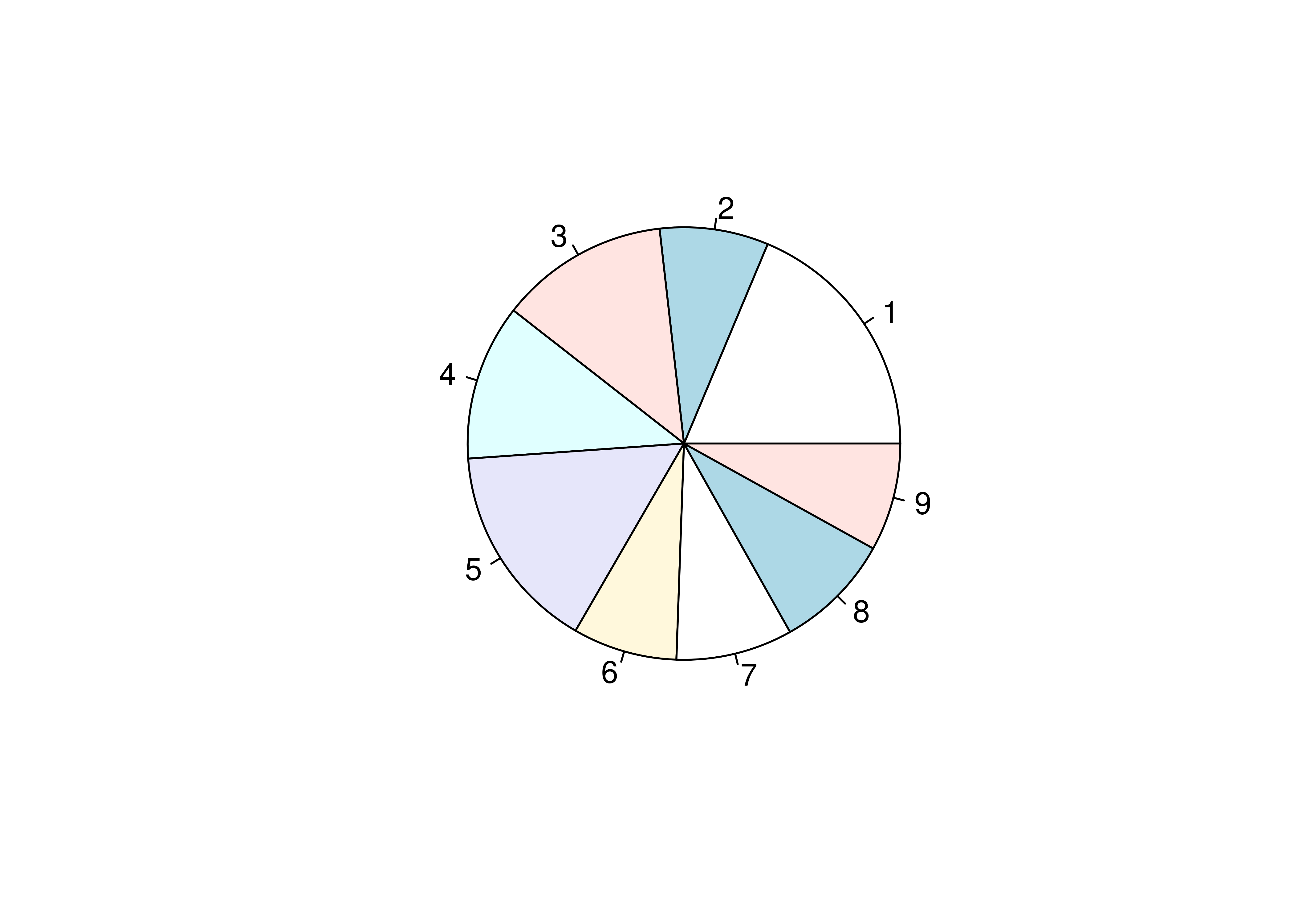
We could alternately make a bar chart and stack the bars on top of each other. This also shows proportion (section vs. total) but does so in a linear fashion.
# Create summary of pokemon by type
tmp <- poke %>%
  group_by(generation) %>%
  count()

# Matrix is necessary for a stacked bar chart
matrix(tmp$n, nrow = 9, ncol = 1, dimnames = list(tmp$generation)) %>%
barplot(beside = F, legend.text = T, main = "Generations of Pokemon")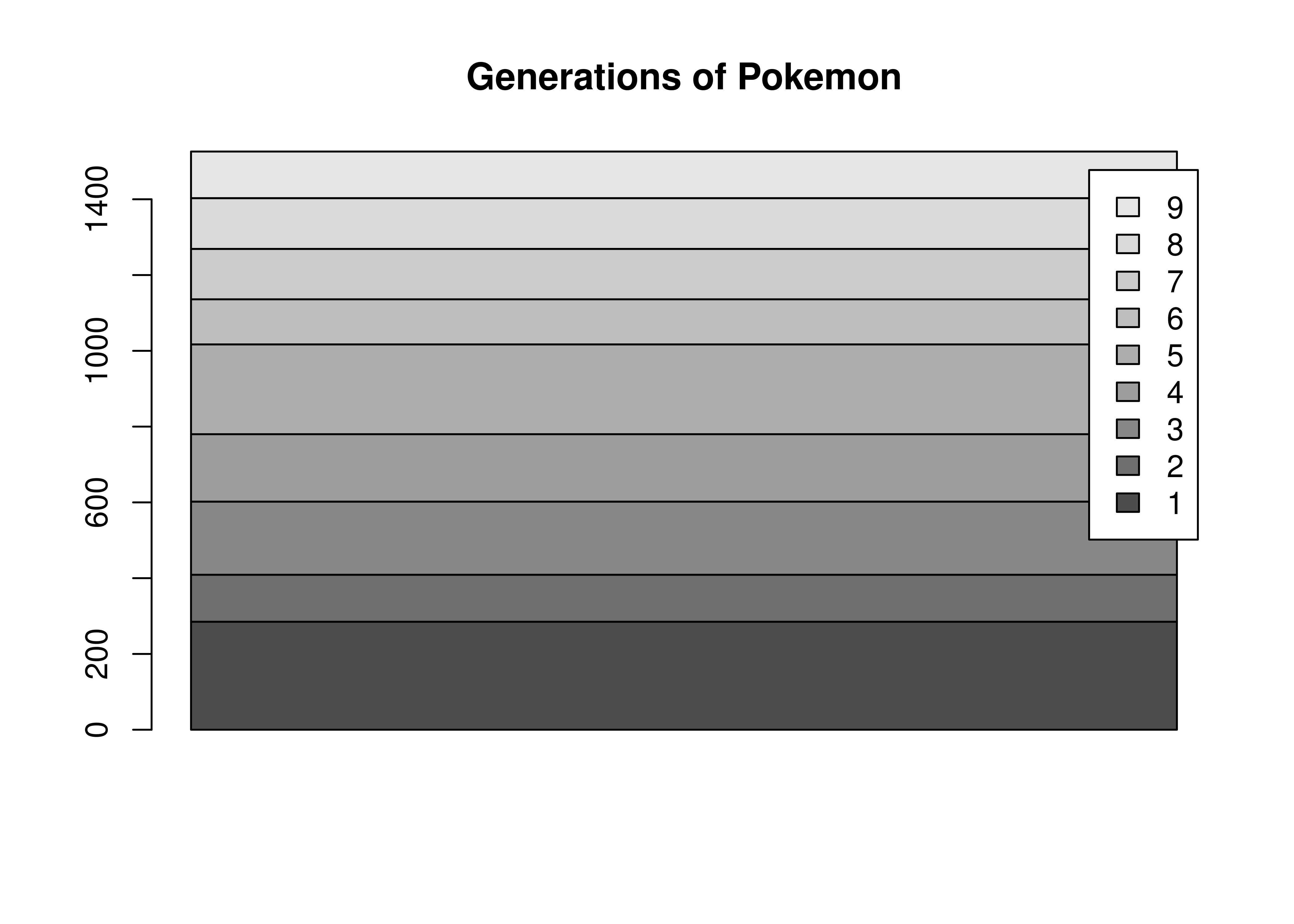
There’s not a huge amount of similarity between the code for a pie chart and a bar plot, even though the underlying statistics required to create the two charts are very similar. The appearance of the two charts is also very different.
Let’s start with what we want: for each generation, we want the total number of pokemon.
To get a pie chart, we want that information mapped to a circle, with each generation represented by an angle whose size is proportional to the number of Pokemon in that generation.
import matplotlib.pyplot as plt
plt.cla() # clear out matplotlib buffer

# Create summary of pokemon by type
labels = list(set(poke.generation)) # create labels by getting unique values
sizes = poke.generation.value_counts(normalize=True)*100

# Draw the plot
fig1, ax1 = plt.subplots()
ax1.pie(sizes, labels = labels, autopct='%1.1f%%', startangle = 90)
## ([<matplotlib.patches.Wedge object at 0x7f11c1f3e050>, <matplotlib.patches.Wedge object at 0x7f11bc097b10>, <matplotlib.patches.Wedge object at 0x7f11bfa15a10>, <matplotlib.patches.Wedge object at 0x7f11bfa15290>, <matplotlib.patches.Wedge object at 0x7f11bfa2ccd0>, <matplotlib.patches.Wedge object at 0x7f11bfa2e850>, <matplotlib.patches.Wedge object at 0x7f11bfa2ffd0>, <matplotlib.patches.Wedge object at 0x7f11bfa398d0>, <matplotlib.patches.Wedge object at 0x7f11bfa3b290>], [Text(-0.6090073012006626, 0.9160295339585321, '1'), Text(-1.0954901637626666, -0.09950528176557247, '2'), Text(-0.6165298897093509, -0.9109834768506923, '3'), Text(0.18481487009430594, -1.0843631604734758, '4'), Text(0.7975739189399522, -0.757545935126555, '5'), Text(1.0758366616678645, -0.2292934308072192, '6'), Text(1.044470095507754, 0.34508291697796867, '7'), Text(0.7443080329240818, 0.8099416967440831, '8'), Text(0.26679773552389424, 1.0671546131275085, '9')], [Text(-0.3321858006549068, 0.4996524730682902, '18.7%'), Text(-0.5975400893250908, -0.05427560823576679, '15.5%'), Text(-0.33628903075055494, -0.49690007828219573, '12.6%'), Text(0.10080811096053051, -0.591470814803714, '11.7%'), Text(0.43504031942179205, -0.4132068737053936, '8.8%'), Text(0.5868199972733805, -0.125069144076665, '8.7%'), Text(0.5697109611860476, 0.18822704562434653, '8.1%'), Text(0.4059861997767718, 0.4417863800422271, '8.1%'), Text(0.14552603755848775, 0.5820843344331864, '7.8%')])
ax1.axis('equal')
## (np.float64(-1.0999996109024037), np.float64(1.0999999852979658), np.float64(-1.0999997040730163), np.float64(1.099999985908239))
plt.show()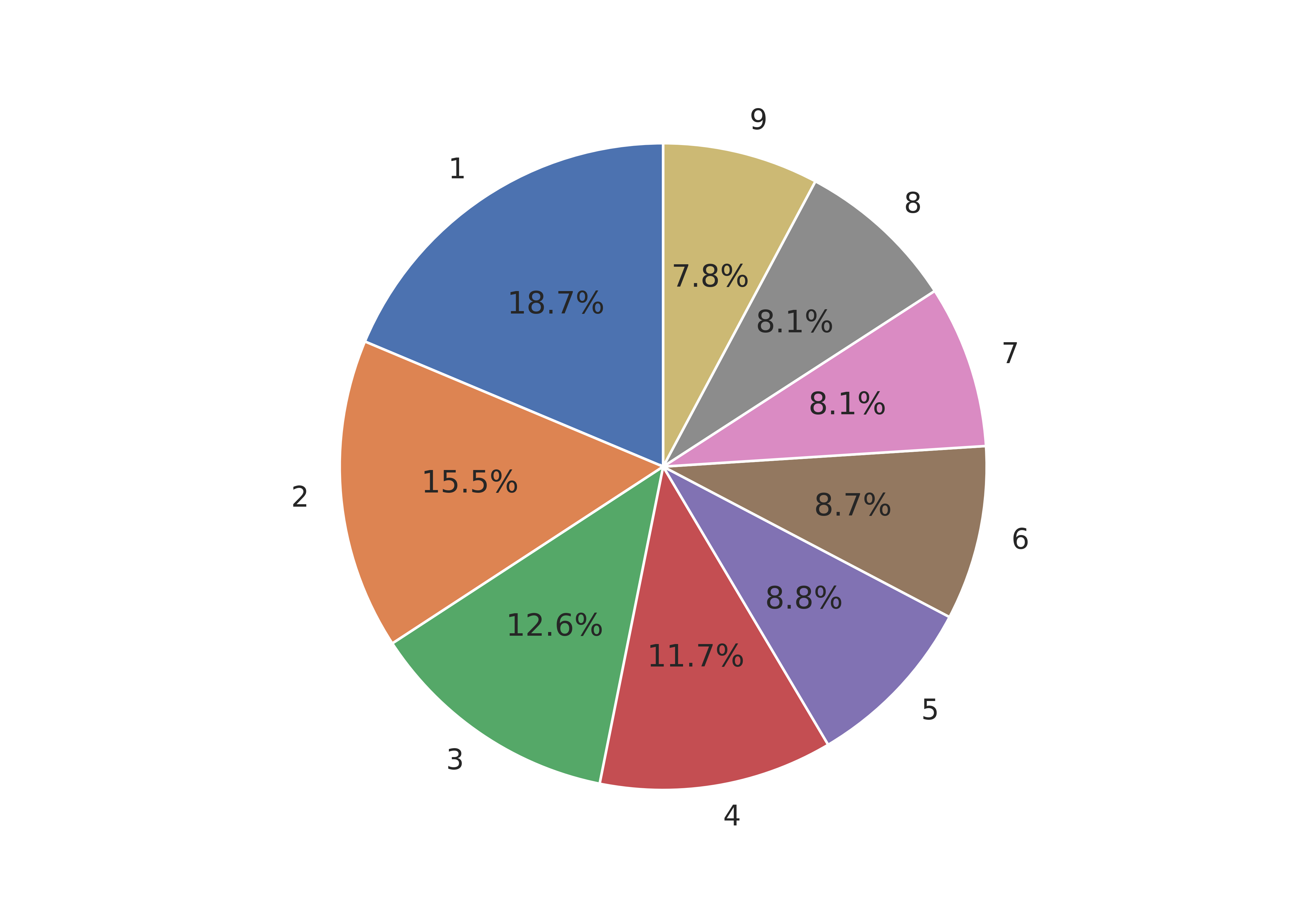

We could alternately make a bar chart and stack the bars on top of each other. This also shows proportion (section vs. total) but does so in a linear fashion.
import matplotlib.pyplot as plt
plt.cla() # clear out matplotlib buffer

# Create summary of pokemon by type
labels = list(set(poke.generation)) # create labels by getting unique values
sizes = poke.generation.value_counts()
sizes = sizes.sort_index()

# Find location of bottom of the bar for each bar
cumulative_sizes = sizes.cumsum() - sizes
width = 1

fig, ax = plt.subplots()

for i in sizes.index:
  ax.bar("Generation", sizes[i-1], width, label=i, bottom = cumulative_sizes[i-1])
## KeyError: 0

ax.set_ylabel('# Pokemon')
ax.set_title('Pokemon Distribution by Generation')
ax.legend()

plt.show()
As with Plotnine, seaborn does not support pie charts due to the same underlying issue. The best option is to create a pie chart in matplotlib and use seaborn colors [13].
# Load the seaborn package
# the alias "sns" stands for Samuel Norman Seaborn
# from "The West Wing" television show
import seaborn as sns
import matplotlib.pyplot as plt

# Initialize seaborn styling; context
sns.set_style('white')
sns.set_context('notebook')

plt.cla() # clear out matplotlib buffer

# Create summary of pokemon by type
labels = list(set(poke.generation)) # create labels by getting unique values
sizes = poke.generation.value_counts(normalize=True)*100

#define Seaborn color palette to use
colors = sns.color_palette()[0:9]

# Draw the plot
fig1, ax1 = plt.subplots()
ax1.pie(sizes, labels = labels, colors = colors, autopct='%1.1f%%', startangle = 90)
## ([<matplotlib.patches.Wedge object at 0x7f11bf80ec50>, <matplotlib.patches.Wedge object at 0x7f11bf846a10>, <matplotlib.patches.Wedge object at 0x7f11bf854850>, <matplotlib.patches.Wedge object at 0x7f11bf847e90>, <matplotlib.patches.Wedge object at 0x7f11bf860450>, <matplotlib.patches.Wedge object at 0x7f11bf8623d0>, <matplotlib.patches.Wedge object at 0x7f11bf86c090>, <matplotlib.patches.Wedge object at 0x7f11bf86e050>, <matplotlib.patches.Wedge object at 0x7f11bf860250>], [Text(-0.6090073012006626, 0.9160295339585321, '1'), Text(-1.0954901637626666, -0.09950528176557247, '2'), Text(-0.6165298897093509, -0.9109834768506923, '3'), Text(0.18481487009430594, -1.0843631604734758, '4'), Text(0.7975739189399522, -0.757545935126555, '5'), Text(1.0758366616678645, -0.2292934308072192, '6'), Text(1.044470095507754, 0.34508291697796867, '7'), Text(0.7443080329240818, 0.8099416967440831, '8'), Text(0.26679773552389424, 1.0671546131275085, '9')], [Text(-0.3321858006549068, 0.4996524730682902, '18.7%'), Text(-0.5975400893250908, -0.05427560823576679, '15.5%'), Text(-0.33628903075055494, -0.49690007828219573, '12.6%'), Text(0.10080811096053051, -0.591470814803714, '11.7%'), Text(0.43504031942179205, -0.4132068737053936, '8.8%'), Text(0.5868199972733805, -0.125069144076665, '8.7%'), Text(0.5697109611860476, 0.18822704562434653, '8.1%'), Text(0.4059861997767718, 0.4417863800422271, '8.1%'), Text(0.14552603755848775, 0.5820843344331864, '7.8%')])
ax1.axis('equal')
## (np.float64(-1.0999996109024037), np.float64(1.0999999852979658), np.float64(-1.0999997040730163), np.float64(1.099999985908239))
plt.show()
Seaborn doesn’t have the autopct option that matplotlib uses, so we have to aggregate the data ourselves before creating a barchart.
poke['generation'] = pd.Categorical(poke['generation'])

plt.cla() # clear out matplotlib buffer
sns.catplot(data = poke, x = 'generation', kind = "count")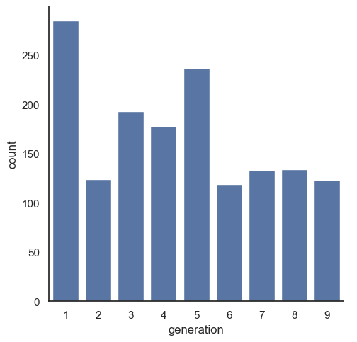
plt.show()

![]()
The grammar of graphics is an approach first introduced in Leland Wilkinson’s book [11]. Unlike other graphics classification schemes, the grammar of graphics makes an attempt to describe how the dataset itself relates to the components of the chart.
This has a few advantages:
- It’s relatively easy to represent the same dataset with different types of plots (and to find their strengths and weaknesses)
- Grammar leads to a concise description of the plot and its contents
- We can add layers to modify the graphics, each with their own basic grammar (just like we combine sentences and clauses to build a rich, descriptive paragraph)
Note
I have turned off warnings for all of the code chunks in this chapter. When you run the code you may get warnings about e.g. missing points - this is normal, I just didn’t want to have to see them over and over again - I want you to focus on the changes in the code.
When creating a grammar of graphics chart, we start with the data (this is consistent with the data-first tidyverse philosophy).
Identify the dimensions of your dataset you want to visualize.
-
Decide what aesthetics you want to map to different variables. For instance, it may be natural to put time on the \(x\) axis, or the experimental response variable on the \(y\) axis. You may want to think about other aesthetics, such as color, size, shape, etc. at this step as well.
- It may be that your preferred representation requires some summary statistics in order to work. At this stage, you would want to determine what variables you feed in to those statistics, and then how the statistics relate to the geoms that you’re envisioning. You may want to think in terms of layers - showing the raw data AND a summary geom.
In most cases,
ggplotwill determine the scale for you, but sometimes you want finer control over the scale - for instance, there may be specific, meaningful bounds for a variable that you want to directly set.Coordinate system: Are you going to use a polar coordinate system? (Please say no, for reasons we’ll get into later!)
Facets: Do you want to show subplots based on specific categorical variable values?
(this list modified from [14]).
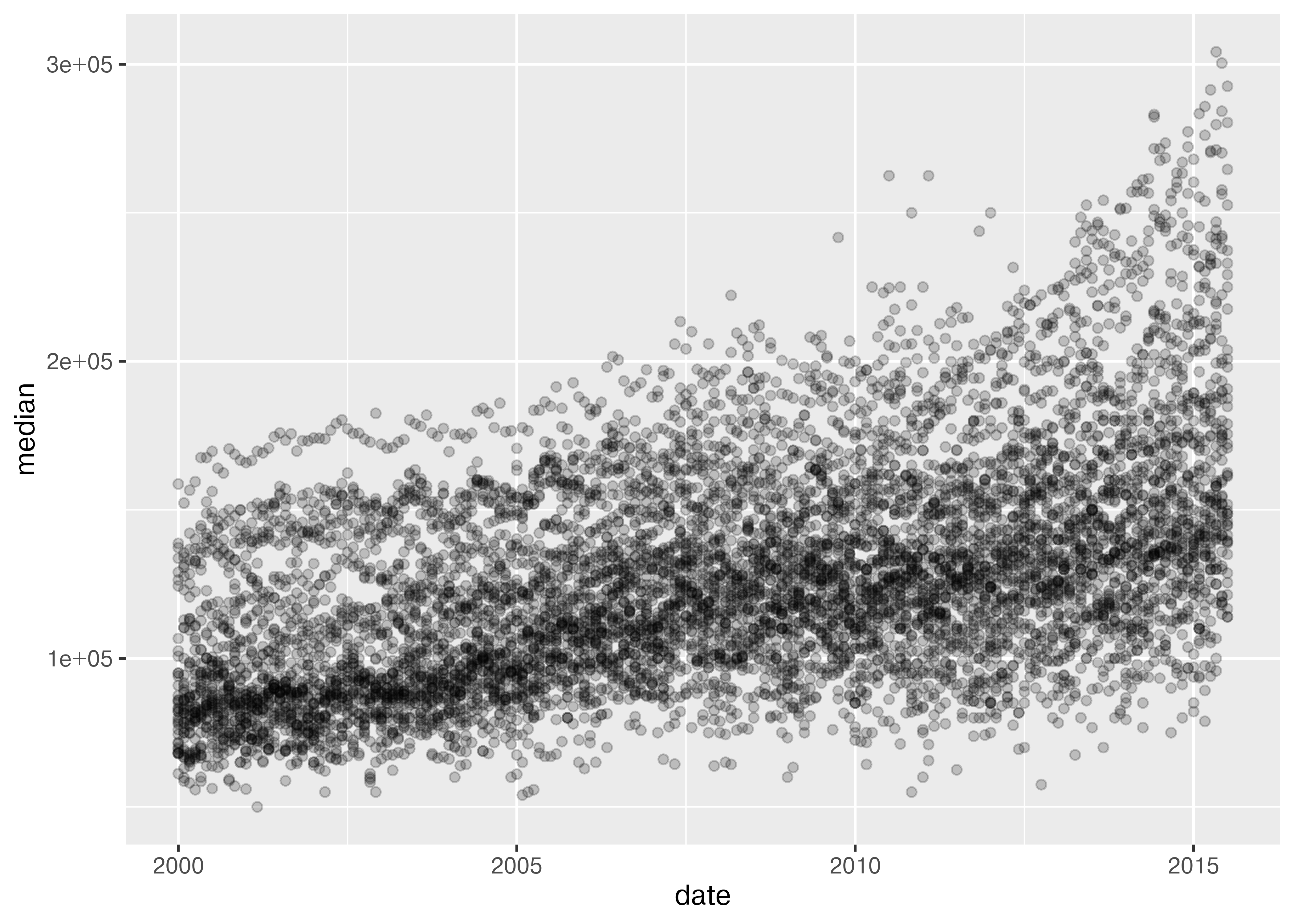
from plotnine.data import txhousing
import seaborn.objects as so

(
  so.Plot(txhousing, x = "date", y = "median")
  .add(so.Dot(alpha = 0.1))
  .show()
)
20.5 Exploratory Data Analysis and Plot Customization
When you first get a new dataset, it is critical that you, as the analyst, get a feel for the data. John Tukey, in his book [15], likens exploratory data analysis to detective work, and says that in both cases the analyst needs two things: tools, and understanding. Tools, like fingerprint powder or types of charts, are essential to collect evidence; understanding helps the analyst to know where to apply the tools and what to look out for.
Tukey claims that while tools are constantly evolving, and there may not be one set of “best” tools, understanding is a bit different. There are situational elements – you might need different base knowledge to solve a crime in a small village in the UK than you need to solve a crime in New York City or Buenos Aires. However, the broad strokes of what questions are asked during an investigation will be similar across different locations and types of crimes.
The same thing is true in exploratory data analysis - while it is helpful to have a basic understanding of the dataset, and being intimately familiar with the type of data and data collection processes can give the analyst an advantage, the same basic detective skills will be useful across a wide variety of data sets.
There is one other aspect of the analogy between EDA and detective work that is useful: the detective gathers evidence, but does not try the case or make decisions about what should happen to the accused. Similarly, the individual conducting an exploratory data analysis should not move too quickly to hypothesis testing and other confirmatory data analysis techniques. In exploratory data analysis, the goal is to lay the foundation, assess the evidence (data) for interesting clues, and to try to understand the whole story. Only once this process is complete should we move to any sort of confirmatory analysis.
In this section, we’ll primarily use charts as a tool for exploratory data analysis. Pay close attention not only to the tools, but to the process of inquiry.
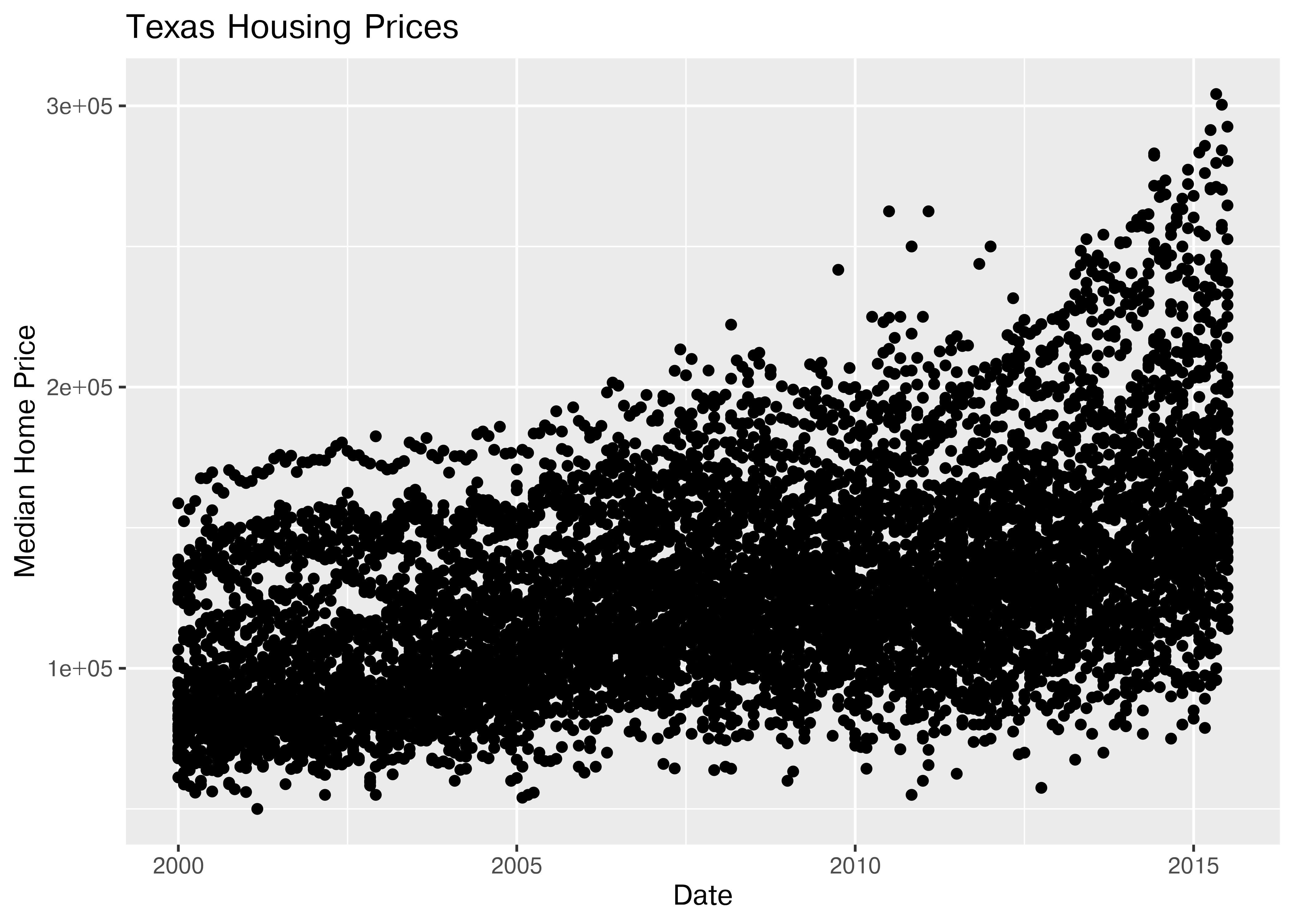
20.5.1 Texas Housing Data
Let’s explore the txhousing data a bit more thoroughly by adding some complexity to our chart. This example will give me an opportunity to show you how an exploratory data analysis might work in practice, while also demonstrating some of the features of each plotting library.
20.5.2 Starting Chart
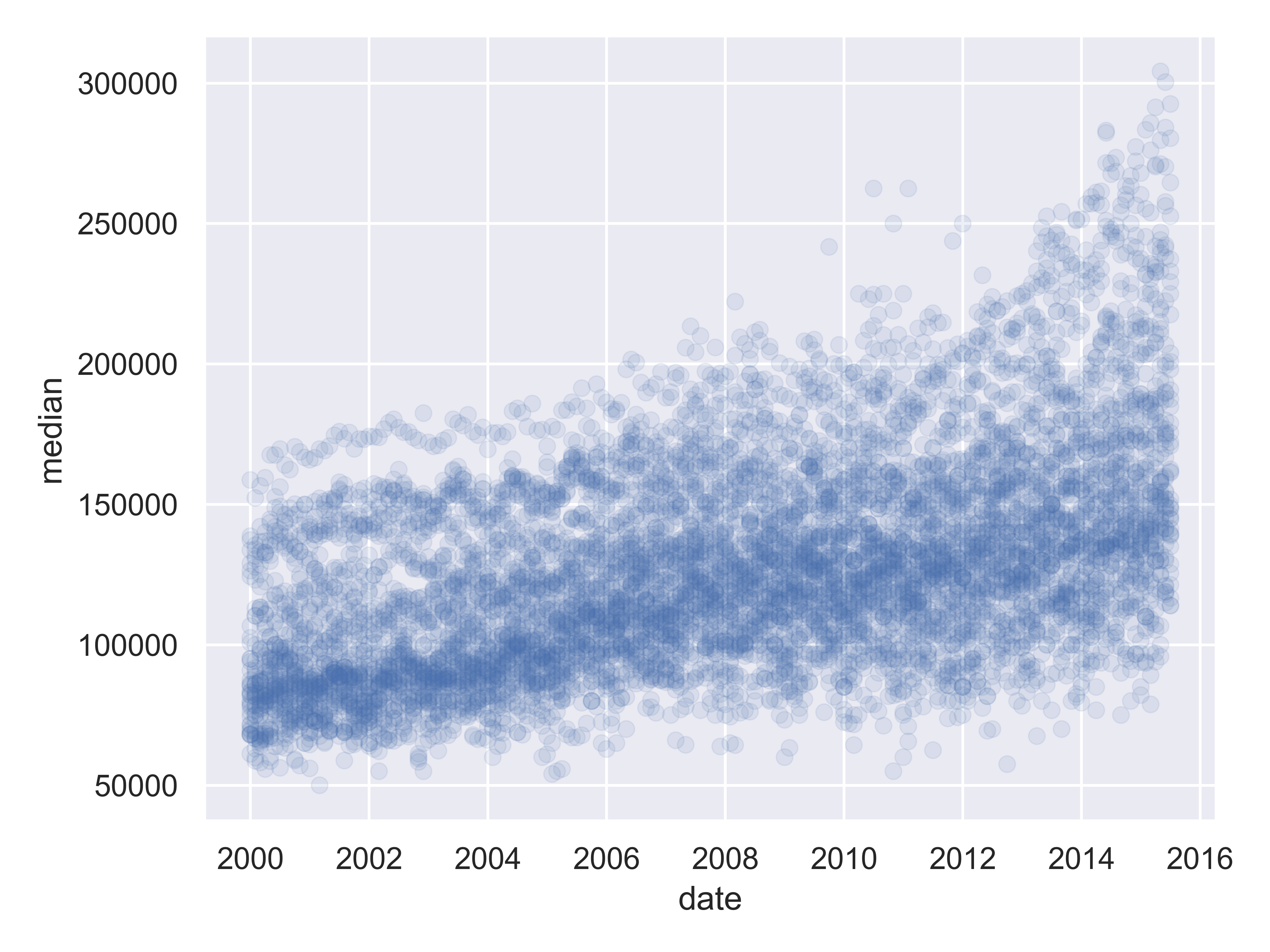
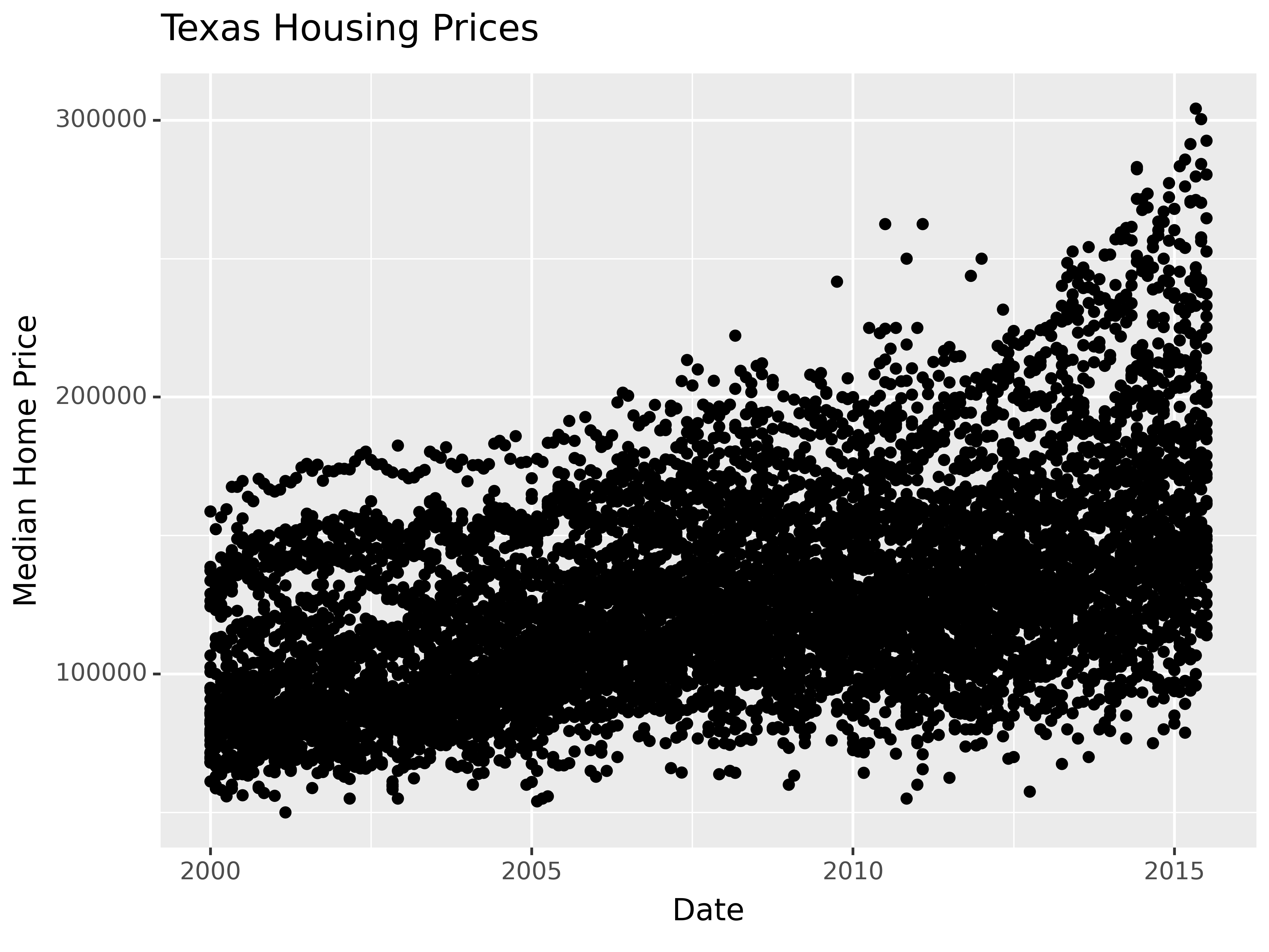
Before we start exploring, let’s start with a basic scatterplot, and add a title and label our axes, so that we’re creating good, informative charts.
(
  so.Plot(txhousing, x = "date", y = "median")
  .add(so.Dot(alpha = 0.1))
  .label(x = "Date", y = "Median Home Price", title = "Texas Housing Prices")
  .show()
)
20.5.3 Exploring Trends
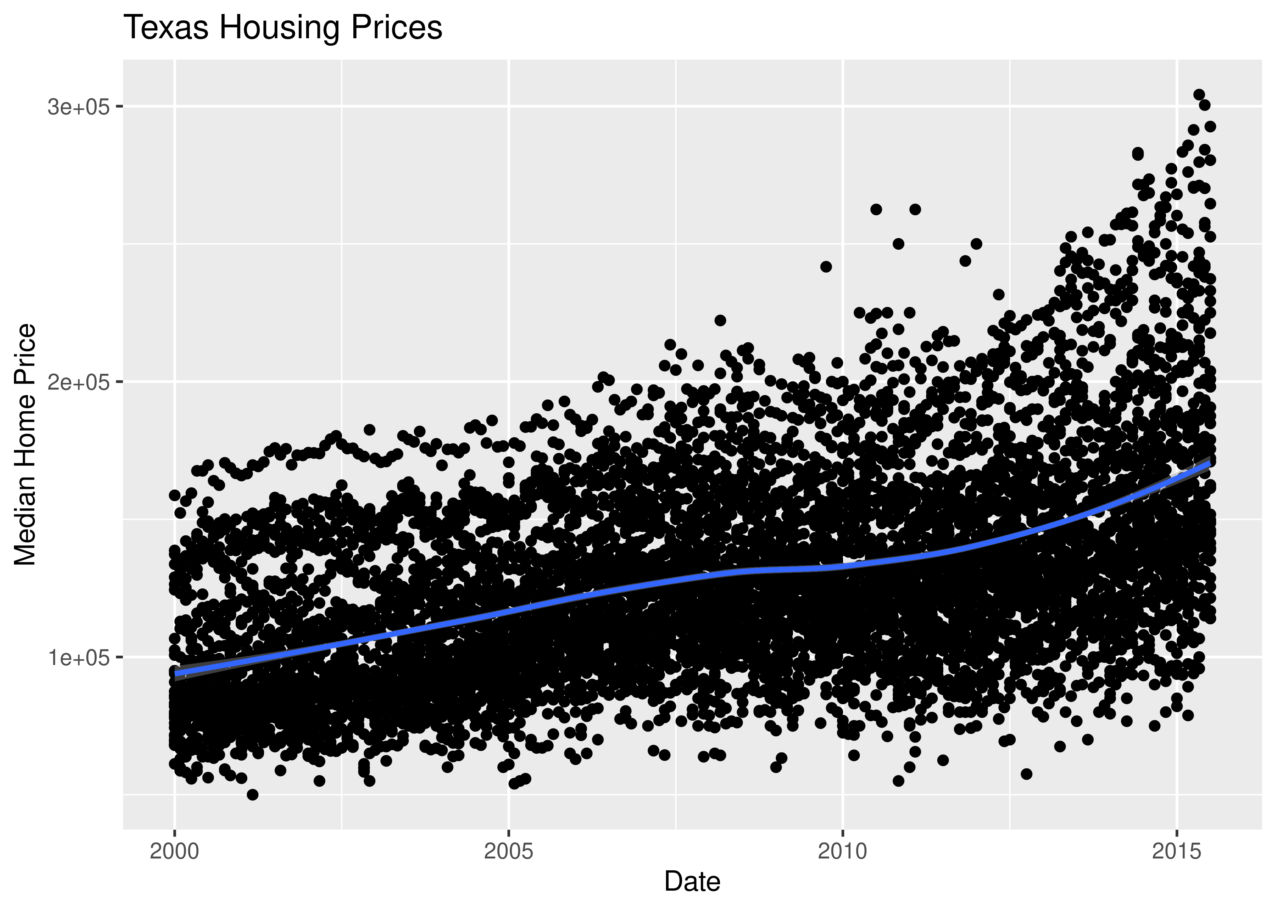
First, we may want to show some sort of overall trend line. We can start with a linear regression, but it may be better to use a loess smooth (loess regression is a fancy weighted average and can create curves without too much additional effort on your part).
ggplot(data = txhousing, aes(x = date, y = median)) +
  geom_point() +
  geom_smooth(method = "lm") +
  xlab("Date") + ylab("Median Home Price") +
  ggtitle("Texas Housing Prices")
We can also use a loess (locally weighted) smooth:
ggplot(data = txhousing, aes(x = date, y = median)) +
  geom_point() +
  geom_smooth(method = "loess") +
  xlab("Date") + ylab("Median Home Price") +
  ggtitle("Texas Housing Prices")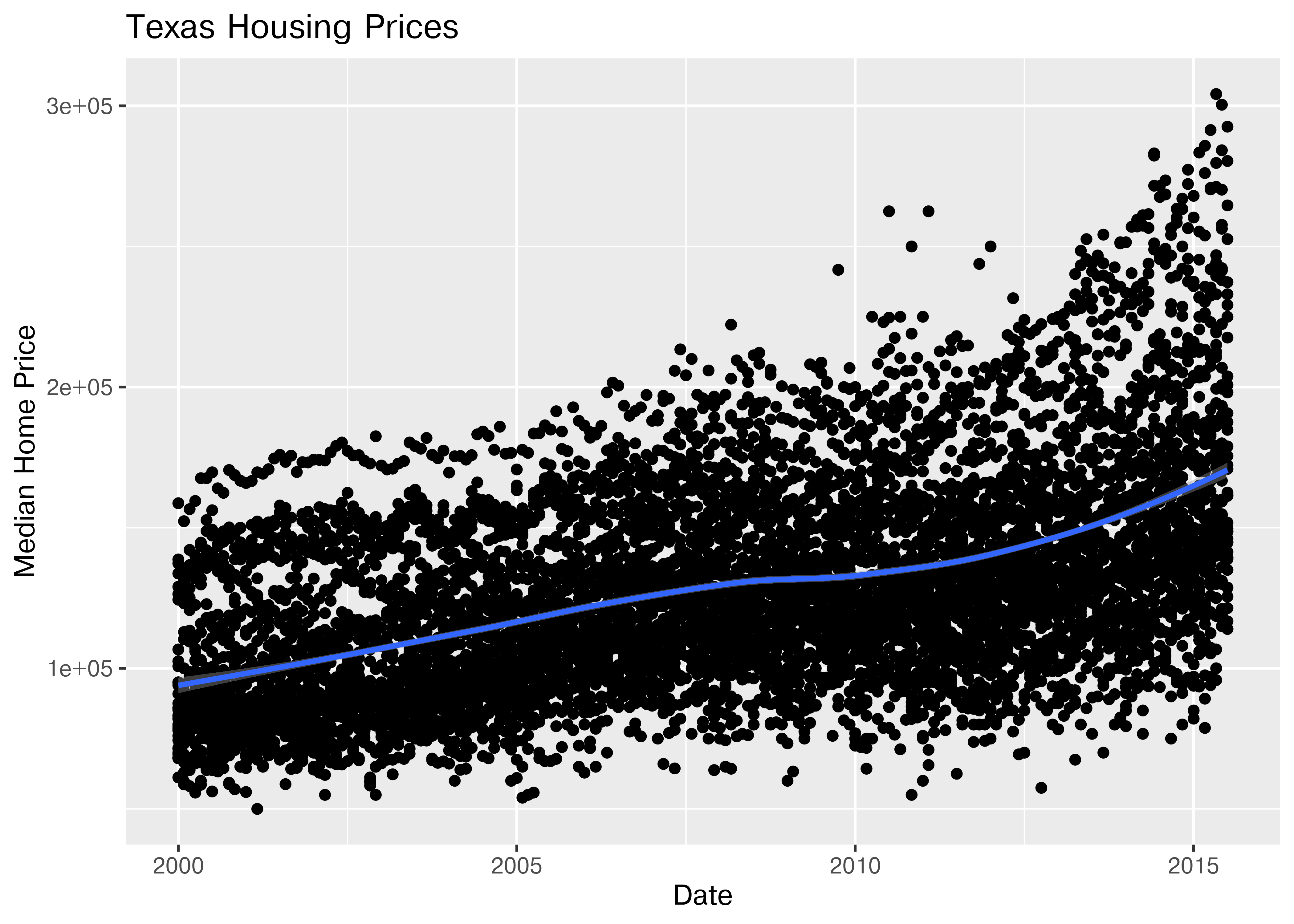
(
  so.Plot(txhousing, x = "date", y = "median")
  .add(so.Dot(alpha = 0.1))
  .add(so.Line(color = "black"), so.PolyFit(order = 2))
  .label(x = "Date", y = "Median Home Price", title = "Texas Housing Prices")
  .show()
)
I haven’t yet figured out a way to do locally weighted regression in Seaborn using the objects interface, but I’m sure that will come as the interface develops.
20.5.4 Adding Complexity with Moderating Variables
Looking at the plots here, it’s clear that there are small sub-groupings (see, for instance, the almost continuous line of points at the very top of the group between 2000 and 2005). Let’s see if we can figure out what those additional variables are…
As it happens, the best viable option is City.
ggplot(data = txhousing, aes(x = date, y = median, color = city)) +
  geom_point() +
  geom_smooth(method = "loess") +
  xlab("Date") + ylab("Median Home Price") +
  ggtitle("Texas Housing Prices")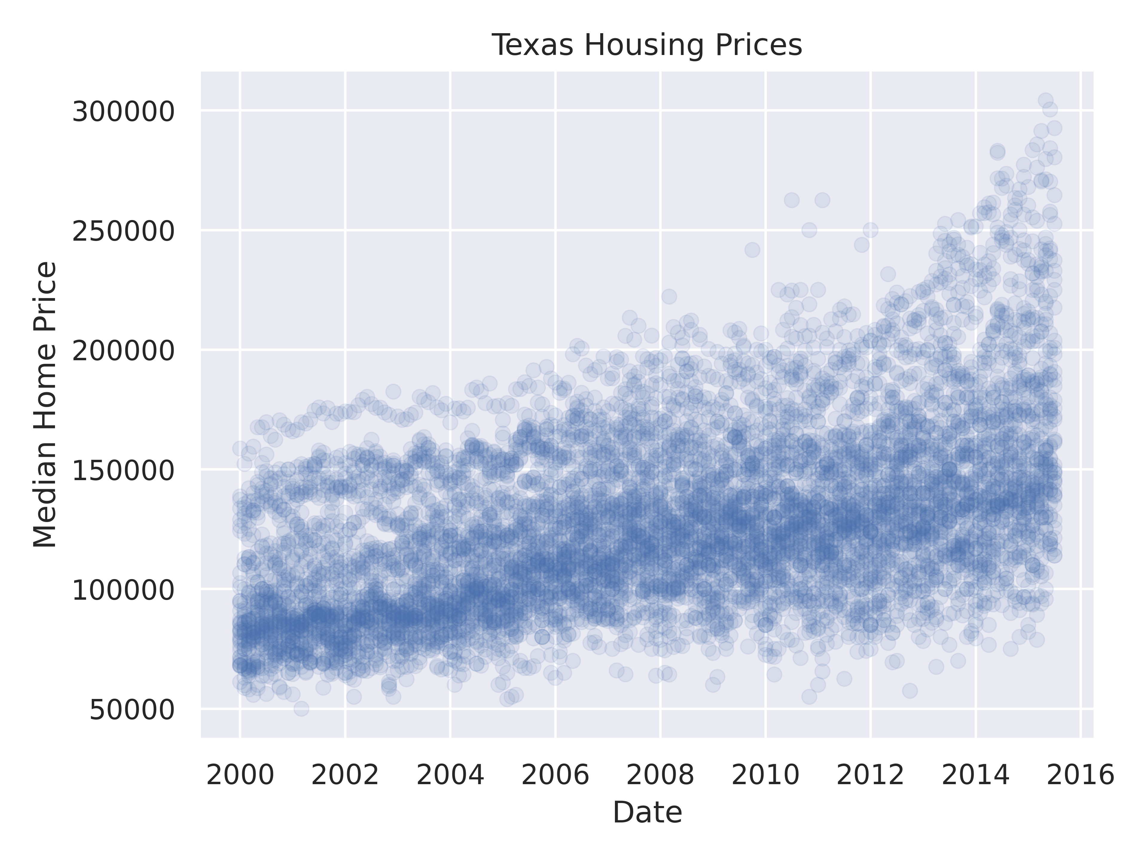
That’s a really crowded graph! It’s slightly easier if we just take the points away and only show the statistics, but there are still way too many cities to be able to tell what shade matches which city.
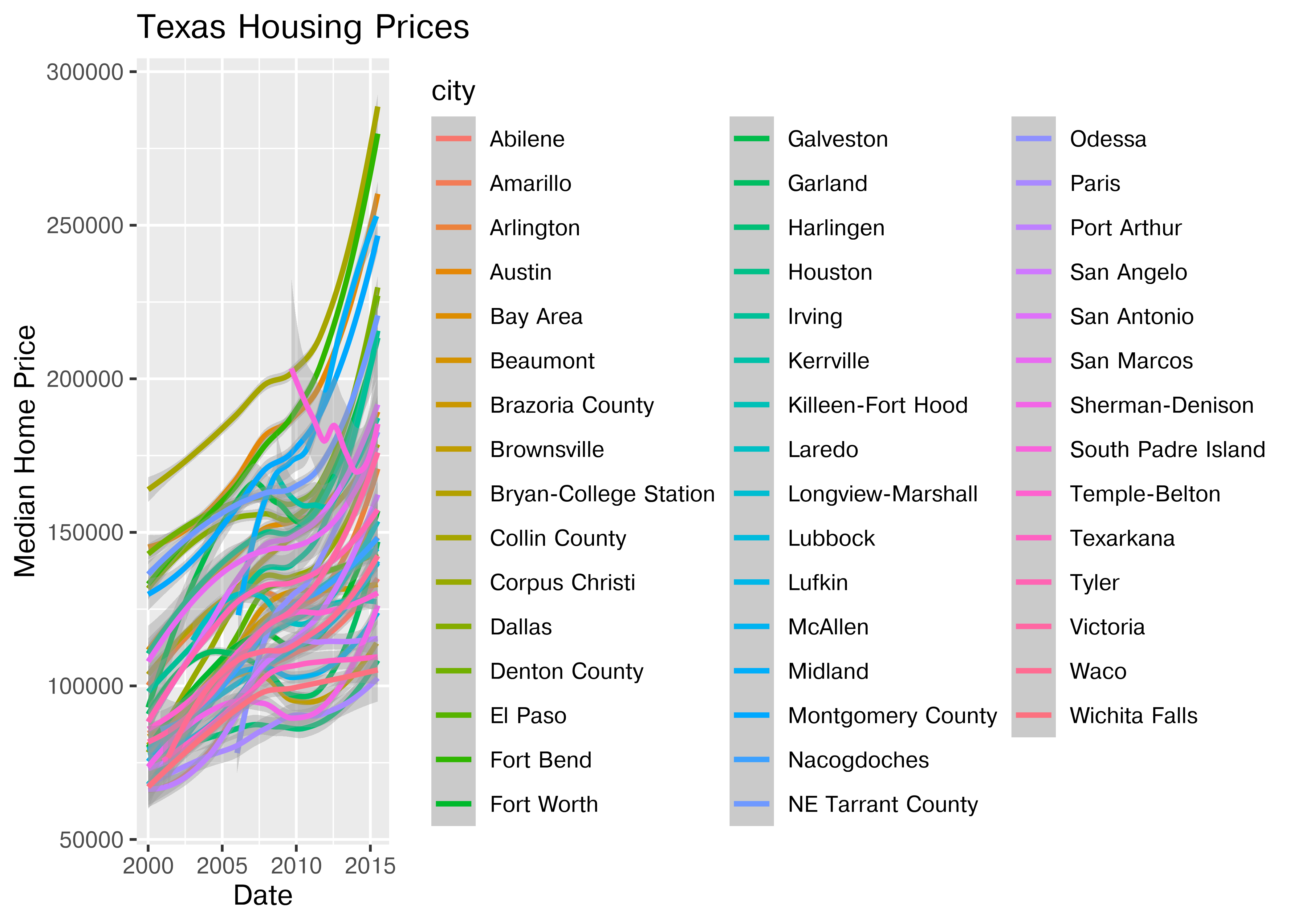
(
  so.Plot(txhousing, x = "date", y = "median", color = "city")
  .add(so.Line())
  .label(x = "Date", y = "Median Home Price", title = "Texas Housing Prices")
  .show()
)
This is one of the first places we see differences in Python and R’s graphs - python doesn’t allocate sufficient space for the legend by default. In Python, you have to manually adjust the theme to show the legend (or plot the legend separately).
20.5.5 Data Reduction Strategies
In reality, though, you should not ever map color to something with more than about 7 categories if your goal is to allow people to trace the category back to the label. It just doesn’t work well perceptually.
So let’s work with a smaller set of data: Houston, Dallas, Fort worth, Austin, and San Antonio (the major cities).
Another way to show this data is to plot each city as its own subplot. In ggplot2 lingo, these subplots are called “facets”. In visualization terms, we call this type of plot “small multiples” - we have many small charts, each showing the trend for a subset of the data.
citylist <- c("Houston", "Austin", "Dallas", "Fort Worth", "San Antonio")
housingsub <- dplyr::filter(txhousing, city %in% citylist)

ggplot(data = housingsub, aes(x = date, y = median, color = city)) +
  geom_point() +
  geom_smooth(method = "loess") +
  xlab("Date") + ylab("Median Home Price") +
  ggtitle("Texas Housing Prices")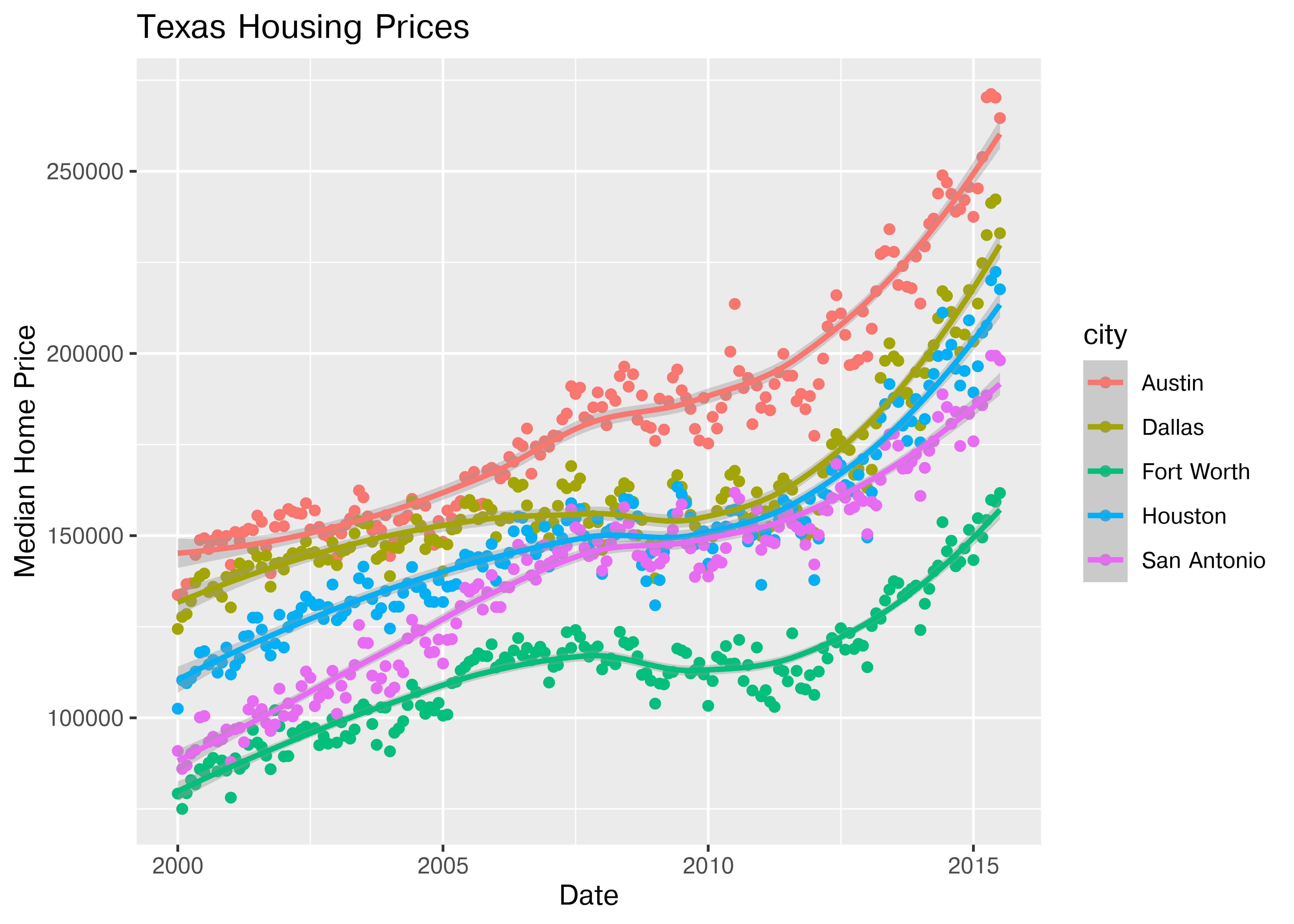
Here’s the facetted version of the chart:
ggplot(data = housingsub, aes(x = date, y = median)) +
  geom_point() +
  geom_smooth(method = "loess") +
  facet_wrap(~city) +
  xlab("Date") + ylab("Median Home Price") +
  ggtitle("Texas Housing Prices")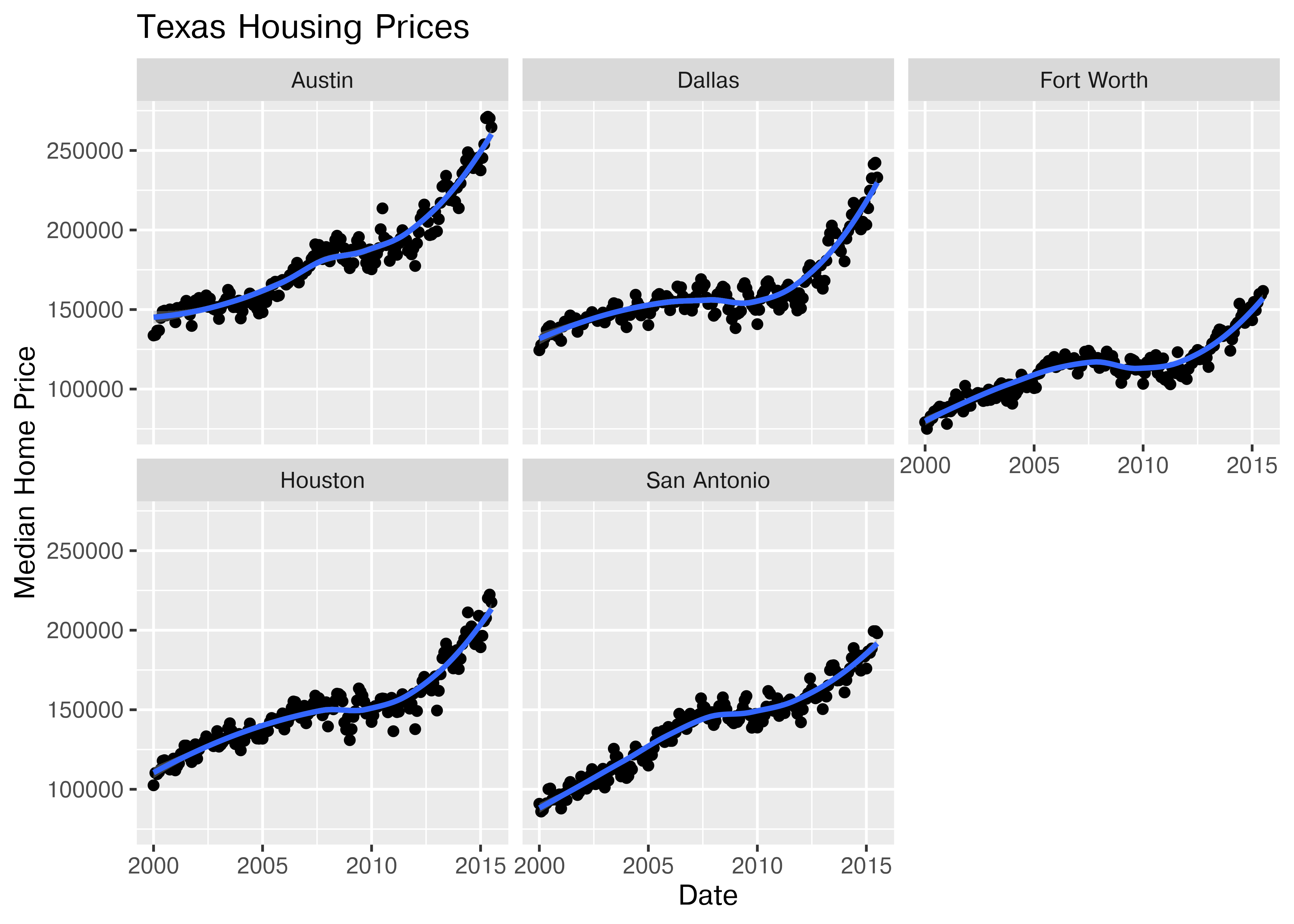
Notice I’ve removed the aesthetic mapping to color as it’s redundant now that each city is split out in its own plot.
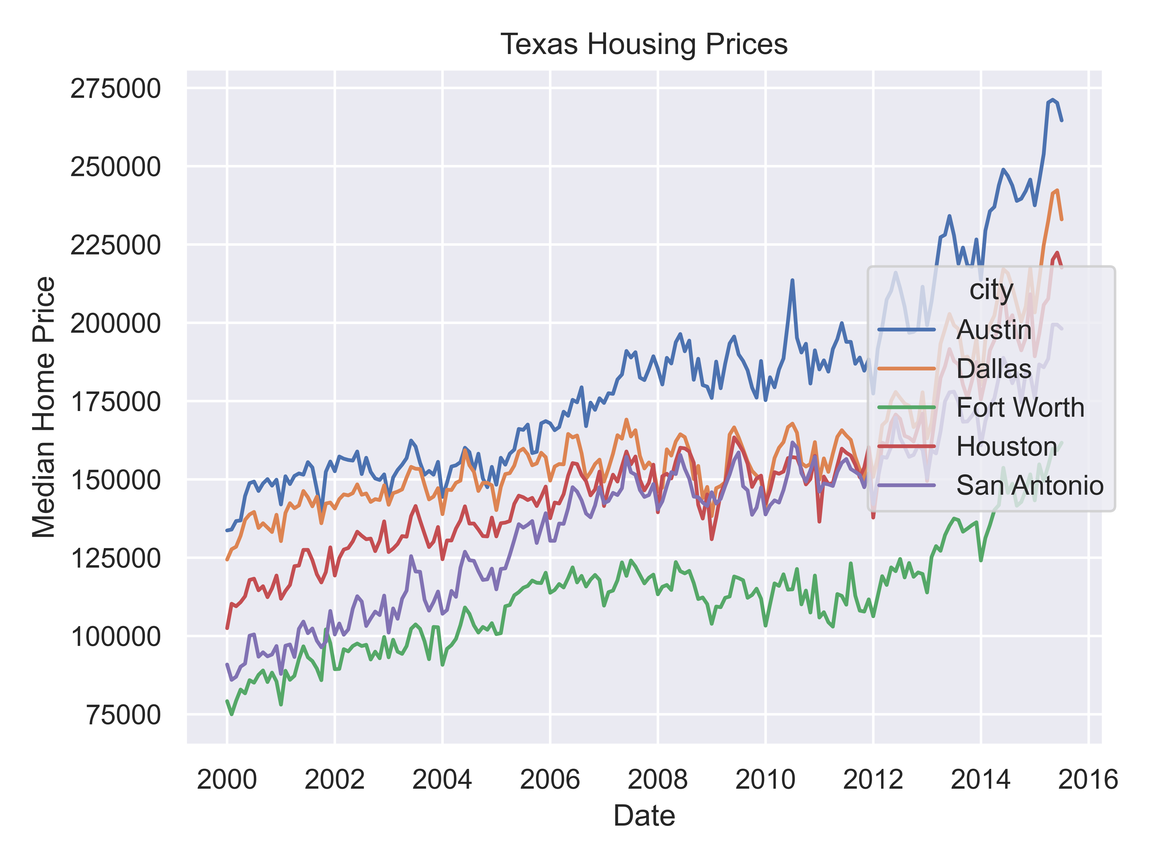
citylist = ["Houston", "Austin", "Dallas", "Fort Worth", "San Antonio"]
housingsub = txhousing[txhousing['city'].isin(citylist)]

(
  so.Plot(housingsub, x = "date", y = "median", color = "city")
  .add(so.Line())
  .label(x = "Date", y = "Median Home Price", title = "Texas Housing Prices")
  .show()
)
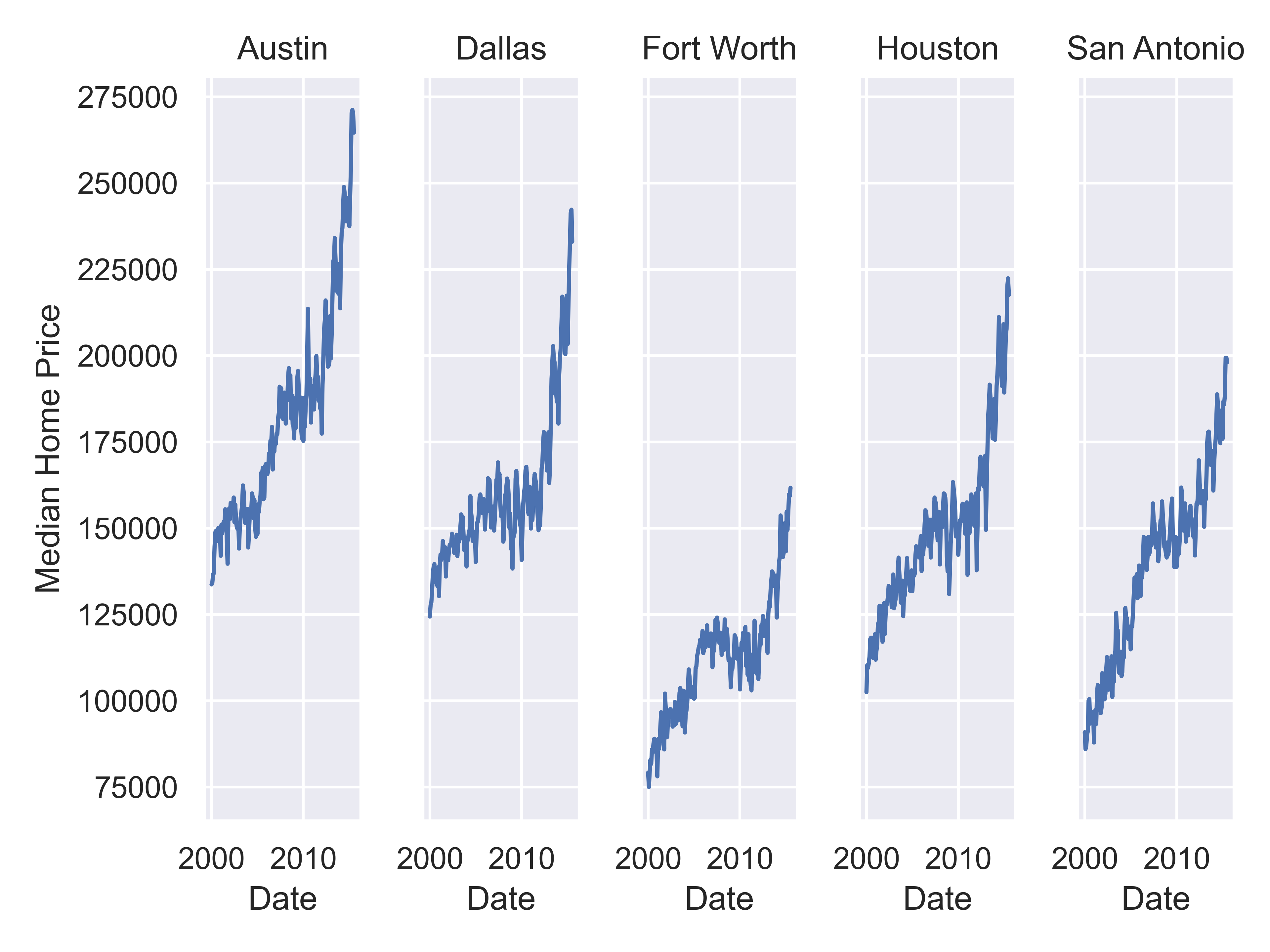
citylist = ["Houston", "Austin", "Dallas", "Fort Worth", "San Antonio"]
housingsub = txhousing[txhousing['city'].isin(citylist)]

(
  so.Plot(housingsub, x = "date", y = "median")
  .add(so.Line())
  .label(x = "Date", y = "Median Home Price")
  .facet(col = "city")
  .show()
)
20.5.6 Adding Additional Complexity
Now that we’ve simplified our charts a bit, we can explore a couple of the other quantitative variables by mapping them to additional aesthetics:
ggplot(data = housingsub, aes(x = date, y = median, size = sales)) +
  geom_point(alpha = .15) + # Make points transparent
  geom_smooth(method = "loess") +
  facet_wrap(~city) +
  # Remove extra information from the legend -
  # line and error bands aren't what we want to show
  # Also add a title
  guides(size = guide_legend(title = 'Number of Sales',
                             override.aes = list(linetype = NA,
                                                 fill = 'transparent'))) +
  # Move legend to bottom right of plot
  theme(legend.position = c(1, 0), legend.justification = c(1, 0)) +
  xlab("Date") + ylab("Median Home Price") +
  ggtitle("Texas Housing Prices")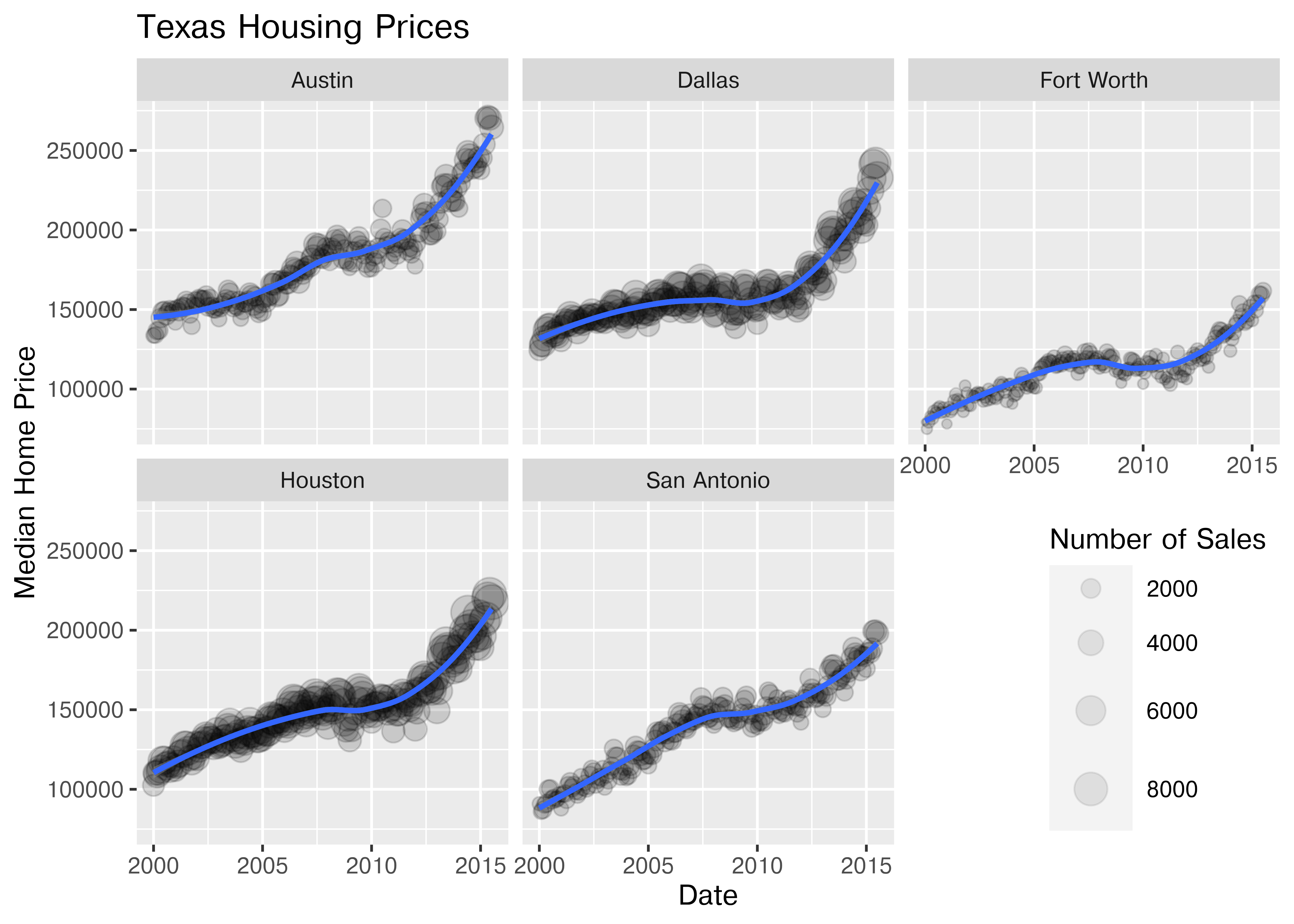
Notice I’ve removed the aesthetic mapping to color as it’s redundant now that each city is split out in its own plot.
Coming soon!
20.5.7 Exploring Other Variables and Relationships
Up to this point, we’ve used the same position information - date for the y axis, median sale price for the y axis. Let’s switch that up a bit so that we can play with some transformations on the x and y axis and add variable mappings to a continuous variable.
ggplot(data = housingsub, aes(x = listings, y = sales, color = city)) +
  geom_point(alpha = .15) + # Make points transparent
  geom_smooth(method = "loess") +
  xlab("Number of Listings") + ylab("Number of Sales") +
  ggtitle("Texas Housing Prices")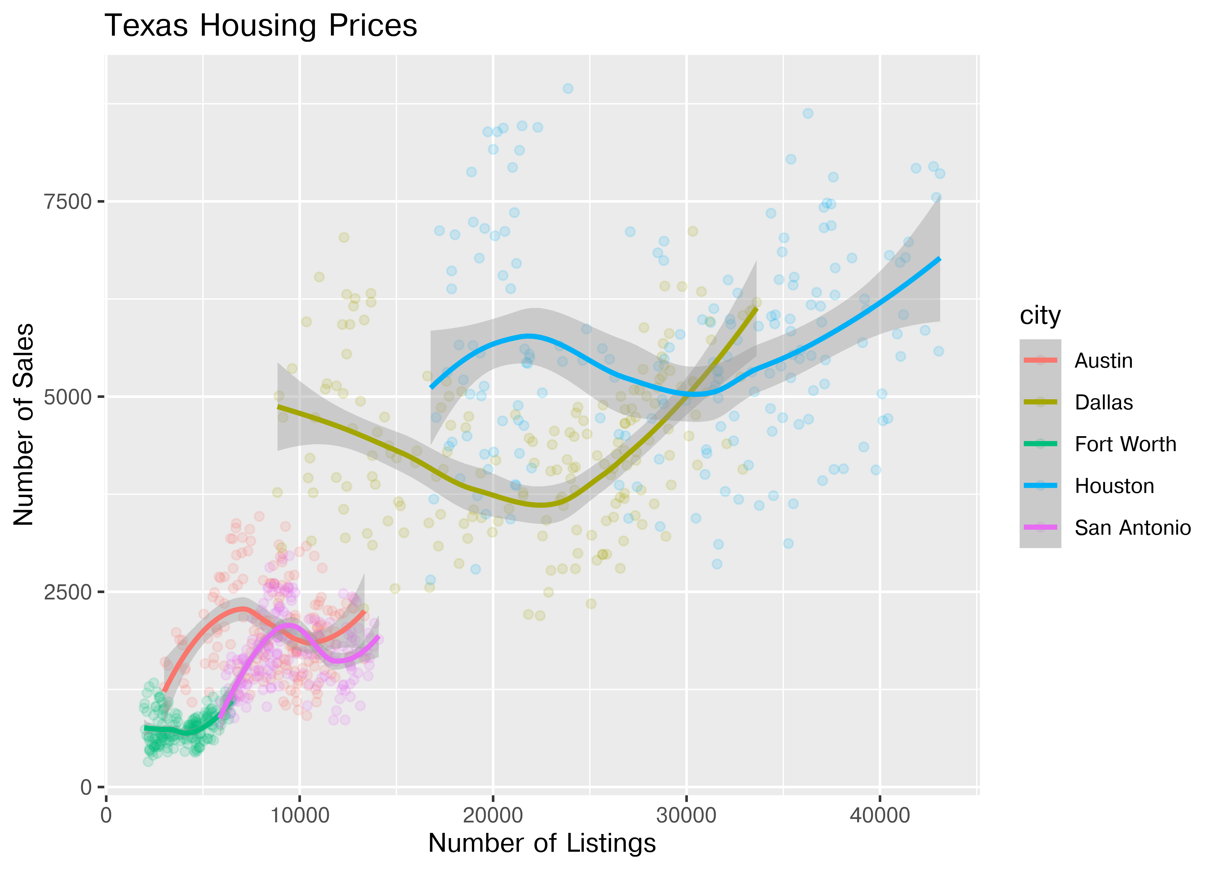
The points for Fort Worth are compressed pretty tightly relative to the points for Houston and Dallas. When we get this type of difference, it is sometimes common to use a log transformation2. Here, I have transformed both the x and y axis, since the number of sales seems to be proportional to the number of listings.
ggplot(data = housingsub, aes(x = listings, y = sales, color = city)) +
  geom_point(alpha = .15) + # Make points transparent
  geom_smooth(method = "loess") +
  scale_x_log10() +
  scale_y_log10() +
  xlab("Number of Listings") + ylab("Number of Sales") +
  ggtitle("Texas Housing Prices")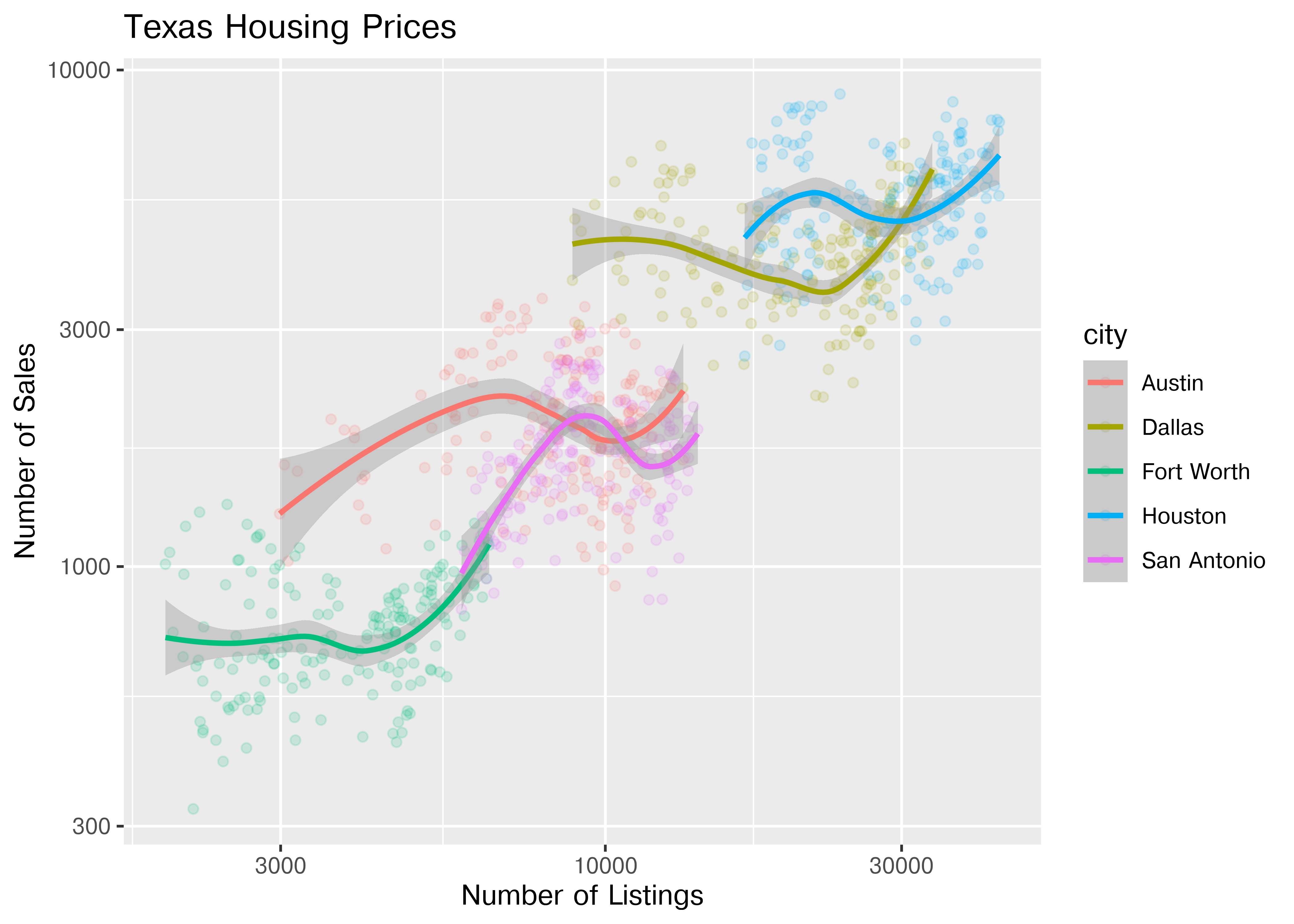
( # This is used to group lines together in python
ggplot(housingsub, aes(x = "listings", y = "sales", color = "city"))
+ geom_point(alpha = .15) # Make points transparent
+ geom_smooth(method = "loess")
+ scale_x_log10()
+ scale_y_log10()
+ xlab("Date") + ylab("Median Home Price")
+ ggtitle("Texas Housing Prices")
)
## NameError: name 'ggplot' is not defined
Notice that the gridlines included in python by default are different than those in ggplot2 by default (personally, I vastly prefer the python version - it makes it obvious that we’re using a log scale).
20.5.8 Adding Additional Moderating Variables
For the next demonstration, let’s look at just Houston’s data. We can examine the inventory’s relationship to the number of sales by looking at the inventory-date relationship in x and y, and mapping the size or color of the point to number of sales.
houston <- dplyr::filter(txhousing, city == "Houston")

ggplot(data = houston, aes(x = date, y = inventory, size = sales)) +
  geom_point(shape = 1) +
  xlab("Date") + ylab("Months of Inventory") +
  guides(size = guide_legend(title = "Number of Sales")) +
  ggtitle("Houston Housing Data")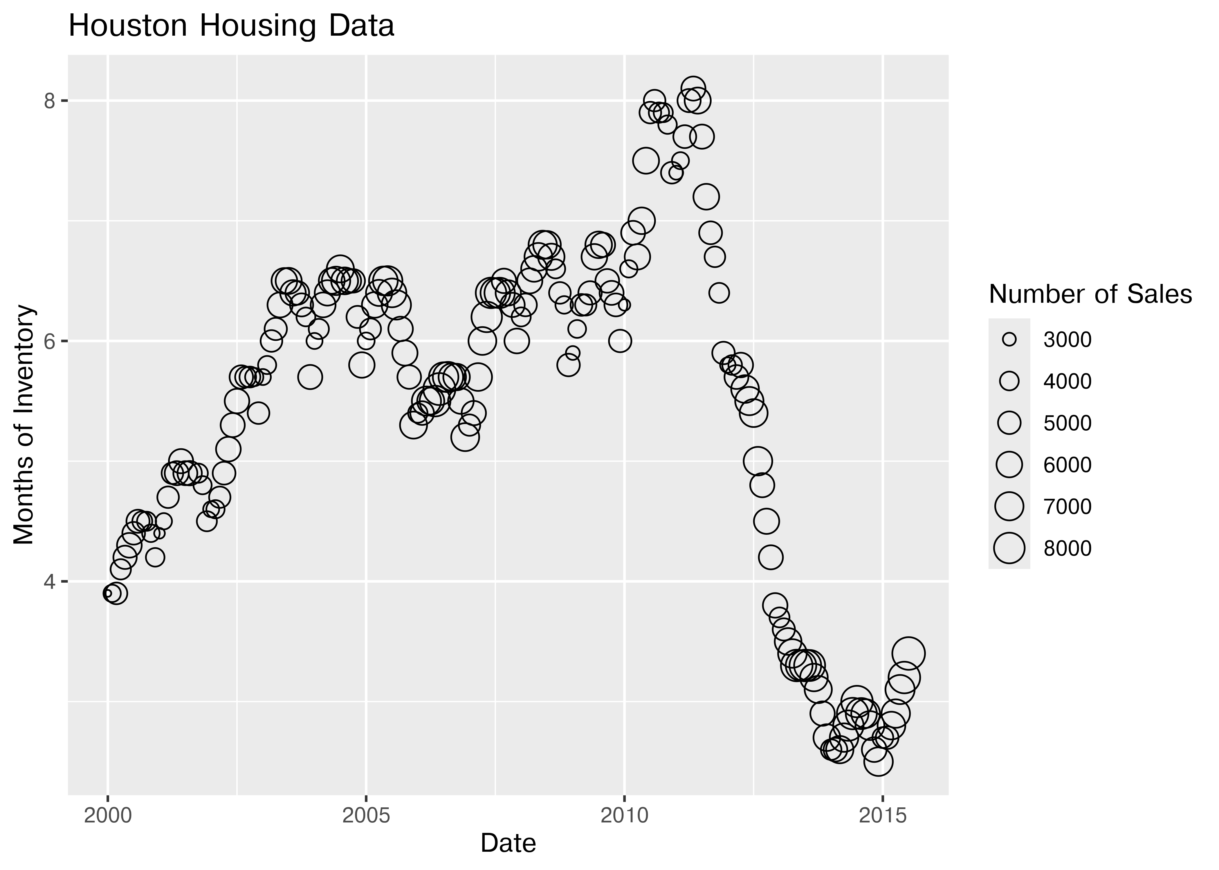
ggplot(data = houston, aes(x = date, y = inventory, color = sales)) +
  geom_point() +
  xlab("Date") + ylab("Months of Inventory") +
  guides(size = guide_colorbar(title = "Number of Sales")) +
  ggtitle("Houston Housing Data")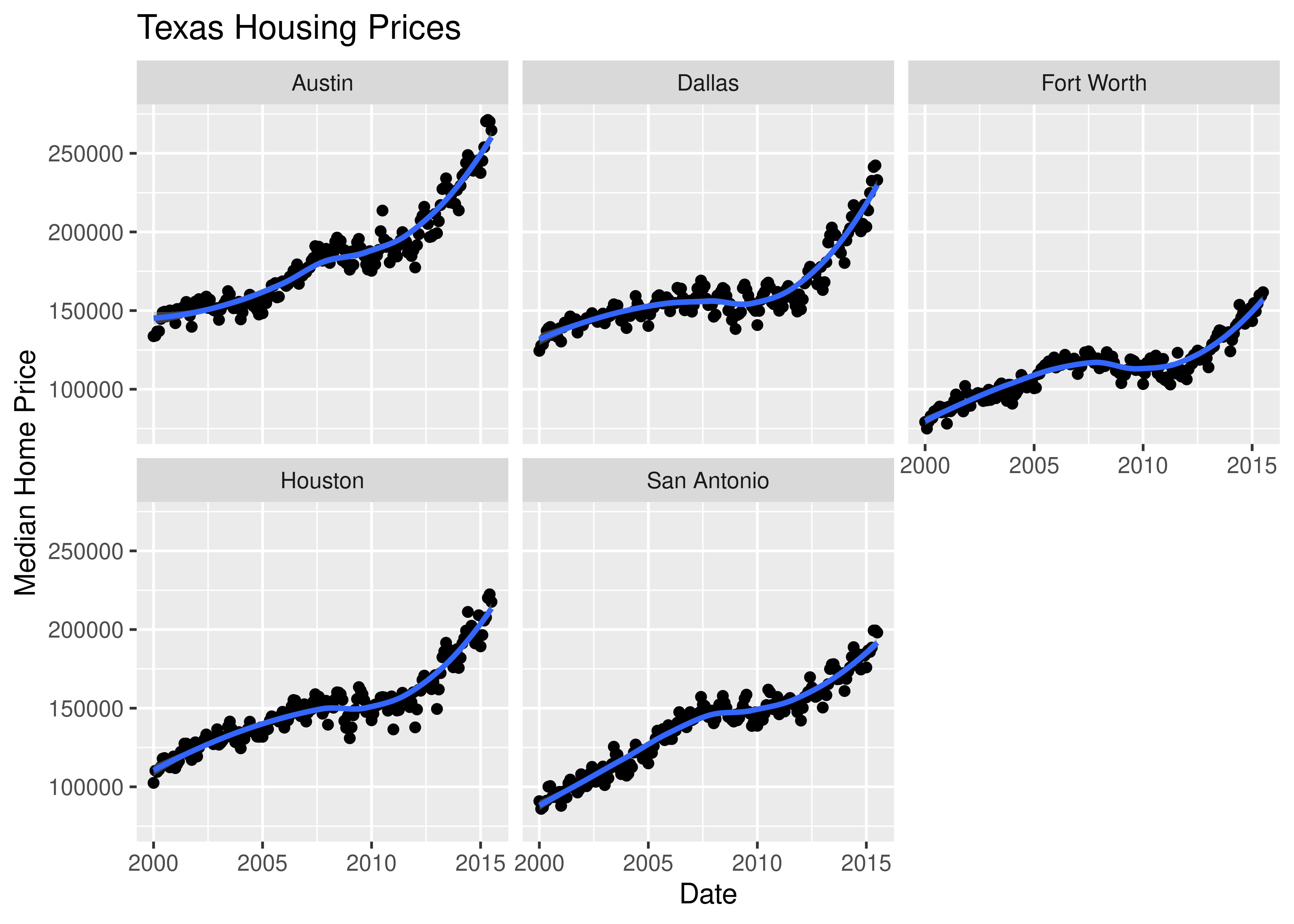
Which is easier to read?
What happens if we move the variables around and map date to the point color?
ggplot(data = houston, aes(x = sales, y = inventory, color = date)) +
  geom_point() +
  xlab("Number of Sales") + ylab("Months of Inventory") +
  guides(size = guide_colorbar(title = "Date")) +
  ggtitle("Houston Housing Data")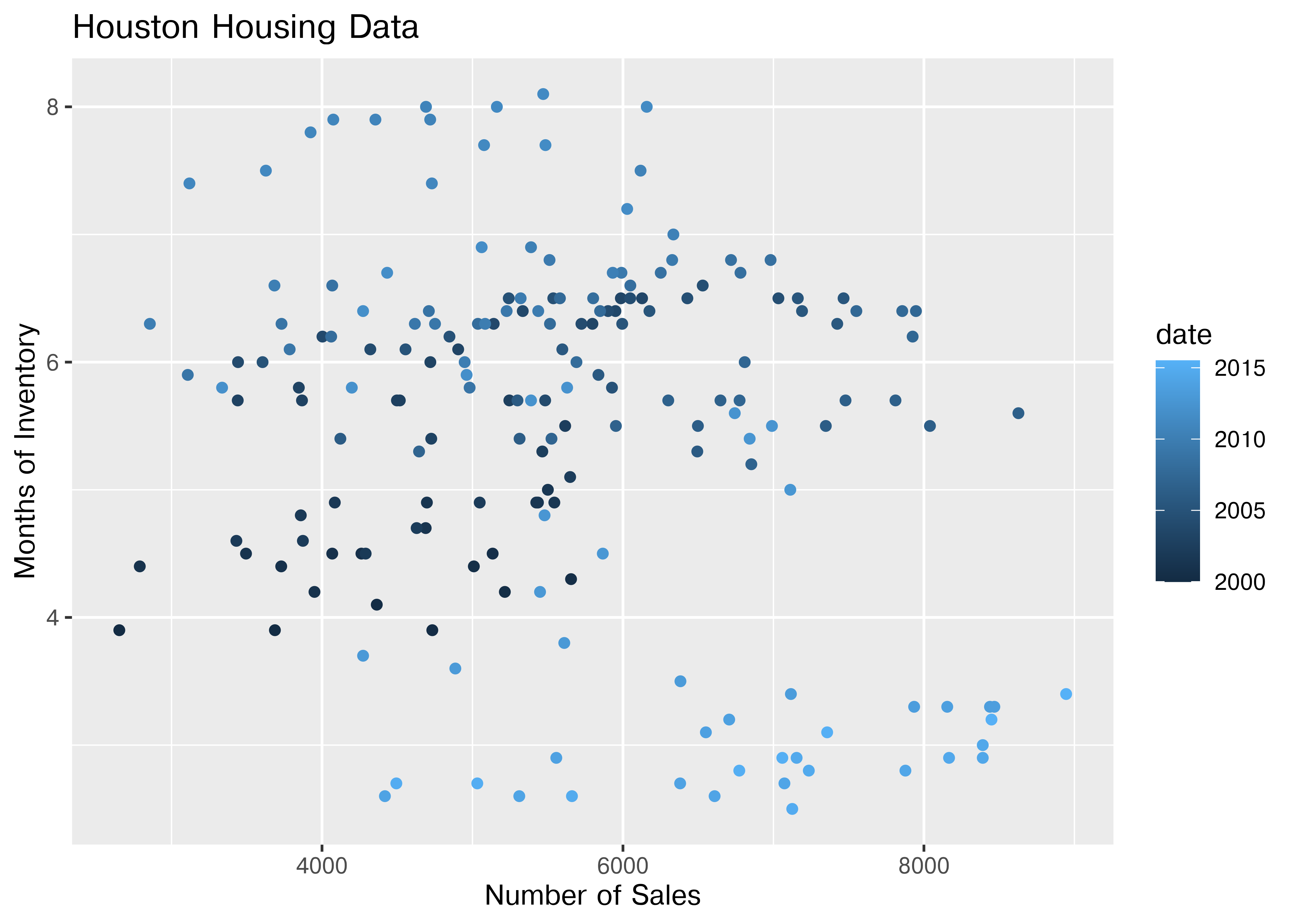
Is that easier or harder to read?
20.6 What type of chart to use?
It can be hard to know what type of chart to use for a particular type of data. I recommend figuring out what you want to show first, and then thinking about how to show that data with an appropriate plot type.
Consider the following factors:
What type of variable is x? Categorical? Continuous? Discrete?
What type of variable is y?
How many observations do I have for each x/y variable?
Are there any important moderating variables?
Do I have data that might be best shown in small multiples? E.g. a categorical moderating variable and a lot of data, where the categorical variable might be important for showing different features of the data?
Once you’ve thought through this, take a look through catalogs like the R Graph Gallery or the Python Graph Gallery to see what visualizations match your data and use-case.
Chapter 21 talks in more depth about considerations for creating good charts; these considerations may also inform your decisions.
20.7 Additional Reading
R graphics
- ggplot2 cheat sheet
- ggplot2 aesthetics cheat sheet - aesthetic mapping one page cheatsheet
- ggplot2 reference guide
- R graph cookbook
- Data Visualization in R (@ramnathv)
Python graphics
-
Matplotlib documentation - Matplotlib is the base that plotnine uses to replicate ggplot2 functionality
- Visualization with Matplotlib chapter of Python Data Science
- Scientific Visualization with Python
20.8 References
[1]
H. Kibirige, “A grammar of graphics for python. Plotnine 0.10.1 documentation,” 2022. [Online]. Available: https://plotnine.readthedocs.io/en/stable/. [Accessed: Feb. 06, 2023]
[2]
H. Wickham, ggplot2: Elegant graphics for data analysis. Springer-Verlag New York, 2016 [Online]. Available: https://ggplot2.tidyverse.org
[3]
M. Waskom, “An introduction to seaborn. Seaborn 0.12.2 documentation,” 2022. [Online]. Available: https://seaborn.pydata.org/tutorial/introduction.html. [Accessed: Feb. 06, 2023]
[4]
M. Waskom, “Next-generation seaborn interface. Seaborn nextgen documentation,” 2022. [Online]. Available: https://seaborn.pydata.org/nextgen/. [Accessed: Aug. 29, 2022]
[5]
The matplotlib development team, “Matplotlib — visualization with python. Matplotlib,” 2023. [Online]. Available: https://matplotlib.org/. [Accessed: Feb. 06, 2023]
[6]
R. D. Peng, “The base plotting system,” in Exploratory data analysis with r, 1st ed., leanpub, 2020 [Online]. Available: https://bookdown.org/rdpeng/exdata/. [Accessed: Feb. 06, 2023]
[7]
J. W. Tukey, “Data-Based Graphics: Visual Display in the Decades to Come,” Statistical Science, vol. 5, no. 3, pp. 327–339, Aug. 1990, doi: 10.1214/ss/1177012101. [Online]. Available: https://projecteuclid.org/journals/statistical-science/volume-5/issue-3/Data-Based-Graphics--Visual-Display-in-the-Decades-to/10.1214/ss/1177012101.full. [Accessed: Aug. 22, 2022]
[8]
N. Yau, “Comparing ggplot2 and r base graphics. FlowingData,” Mar. 22, 2016. [Online]. Available: https://flowingdata.com/2016/03/22/comparing-ggplot2-and-r-base-graphics/. [Accessed: Feb. 06, 2023]
[9]
W. Koehrsen, “The next level of data visualization in python. Medium,” Jan. 24, 2019. [Online]. Available: https://towardsdatascience.com/the-next-level-of-data-visualization-in-python-dd6e99039d5e. [Accessed: Feb. 06, 2023]
[10]
W. McKinney, Python for data analysis, 3rd ed. O’Reilly, 2022 [Online]. Available: https://wesmckinney.com/book/. [Accessed: Feb. 06, 2023]
[11]
L. Wilkinson, The grammar of graphics. New York: Springer, 1999.
[12]
F. E. Croxton and R. E. Stryker, “Bar Charts Versus Circle Diagrams,” Journal of the American Statistical Association, vol. 22, no. 160, pp. 473–482, 1927, doi: 10.2307/2276829.
[13]
Zach, “How to Create a Pie Chart in Seaborn,” Statology. Jul. 2021 [Online]. Available: https://www.statology.org/seaborn-pie-chart/. [Accessed: Sep. 19, 2022]
[14]
D. (DJ). Sarkar, “A Comprehensive Guide to the Grammar of Graphics for Effective Visualization of Multi-dimensional…,” Medium. Sep. 2018 [Online]. Available: https://towardsdatascience.com/a-comprehensive-guide-to-the-grammar-of-graphics-for-effective-visualization-of-multi-dimensional-1f92b4ed4149. [Accessed: Apr. 11, 2022]
[15]
J. Tukey, Exploratory data analysis. Addison-Wesley Publishing Company, 1977.
This chapter used to contain examples of plotnine [1], which is a python ggplot2 clone, but it has not been updated in a while, so it has been removed to ensure compatibility with up-to-date python packages.↩︎
This isn’t necessarily a good thing, but you should know how to do it. The jury is still very much out on whether log transformations make data easier to read and understand↩︎