install.packages("ggplot2")19 Exploratory Data Analysis
Objectives
- Understand the main goals of exploratory data analysis
- Generate and answer questions about a new dataset using charts, tables, and numerical summaries
19.1 Package Installation
You will need the seaborn and matplotlib (python) and ggplot2 (R) packages for this section.
To install python graphing libraries, pick one of the following methods (you can read more about them and decide which is appropriate for you in Section 10.3.2.1)
pip3 install matplotlib seabornThis package installation method requires that you have a virtual environment set up (that is, if you are on Windows, don’t try to install packages this way).
reticulate::py_install(c("matplotlib", "seaborn"))In a python chunk (or the python terminal), you can run the following command. This depends on something called “IPython magic” commands, so if it doesn’t work for you, try the System Terminal method instead.
%pip install matplotlib seabornOnce you have run this command, please comment it out so that you don’t reinstall the same packages every time.
Extra Reading
The EDA chapter in R for Data Science [1] is very good at explaining what the goals of EDA are, and what types of questions you will typically need to answer in EDA. Much of the material in this chapter is based at least in part on the R4DS chapter.
Major components of Exploratory Data Analysis (EDA):
- generating questions about your data
- look for answers to the questions (visualization, transformation, modeling)
- use answers to refine the questions and generate new questions
EDA is an iterative process. It is like brainstorming - you start with an idea or question you might have about the data, investigate, and then generate new ideas. EDA is useful even when you are relatively familiar with the type of data you’re working with: in any dataset, it is good to make sure that you know the quality of the data as well as the relationships between the variables in the dataset.
EDA is important because it helps us to know what challenges a particular data set might bring, what we might do with it. Real data is often messy, with large amounts of cleaning that must be done before statistical analysis can commence.
While in many classes you’ll be given mostly clean data, you do need to know how to clean your own data up so that you can use more interesting data sets for projects (and for fun!). EDA is an important component to learning how to work with messy data.
In this section, I will mostly be using the plot commands that come with base R/python and require no extra packages. The R for Data Science book [1] shows plot commands which use the ggplot2 library. I’ll show you some plots from ggplot here as well, but you don’t have to understand how to generate them yet. We will learn more about ggplot2 later, though if you want to start using it now, you may.
19.2 A Note on Language Philosophies
It is usually relatively easy to get summary statistics from a dataset, but the “flow” of EDA is somewhat different depending on the language patterns.
You must realize that R is written by experts in statistics and statistical computing who, despite popular opinion, do not believe that everything in SAS and SPSS is worth copying. Some things done in such packages, which trace their roots back to the days of punched cards and magnetic tape when fitting a single linear model may take several days because your first 5 attempts failed due to syntax errors in the JCL or the SAS code, still reflect the approach of “give me every possible statistic that could be calculated from this model, whether or not it makes sense”. The approach taken in R is different. The underlying assumption is that the useR is thinking about the analysis while doing it. – Douglas Bates
I provide this as a historical artifact, but it does explain the difference between the approach to EDA and model output in R and Python, and the approach in SAS, which you may see in your other statistics classes. This is not (at least, in my opinion) a criticism – the SAS philosophy dates back to the mainframe and punch card days, and the syntax and output still bear evidence of that – but it is worth noting.
In R and in Python, you will have to specify each piece of output you want, but in SAS you will get more than you ever wanted with a single command. Neither approach is wrong, but sometimes one is preferable over the other for a given problem.
19.3 Generating EDA Questions
I very much like the two quotes in the [1] section on EDA Questions:
There are no routine statistical questions, only questionable statistical routines. — Sir David Cox
Far better an approximate answer to the right question, which is often vague, than an exact answer to the wrong question, which can always be made precise. — John Tukey
As statisticians, we are concerned with variability by default. This is also true during EDA: we are interested in variability (or sometimes, lack thereof) in the variables in our dataset, including the co-variability between multiple variables.
We may assess variability using pictures or numerical summaries:
- histograms or density plots (continuous variables)
- column plots (categorical variables)
- boxplots
- 5 number summaries (min, 25%, mean, 75%, max)
- tabular data summaries (for categorical variables)
In many cases, this gives us a picture of both variability and the “typical” value of our variable.
Sometimes we may also be interested in identifying unusual values: outliers, data entry errors, and other points which don’t conform to our expectations. These unusual values may show up when we generate pictures and the axis limits are much larger than expected.
We also are usually concerned with missing values - in many cases, not all observations are complete, and this missingness can interfere with statistical analyses. It can be helpful to keep track of how much missingness there is in any particular variable and any patterns of missingness that would impact the eventual data analysis1.
If you are having trouble getting started on EDA, [3] provides a nice checklist to get you thinking:
- What question(s) are you trying to solve (or prove wrong)?
- What kind of data do you have and how do you treat different types?
- What’s missing from the data and how do you deal with it?
- Where are the outliers and why should you care about them?
- How can you add, change or remove features to get more out of your data?
19.4 Useful EDA Techniques
![]()
Example: Generations of Pokemon
Suppose we want to explore Pokemon. There’s not just the original 150 (gotta catch ’em all!) - now there are over 1000! Let’s start out by looking at the proportion of Pokemon added in each of the 9 generations.
import pandas as pd
poke = pd.read_csv("https://raw.githubusercontent.com/srvanderplas/datasets/main/clean/pokemon_gen_1-9.csv")
poke['generation'] = pd.Categorical(poke.gen)
This data has several categorical and continuous variables that should allow for a reasonable demonstration of a number of techniques for exploring data.
19.4.1 Numerical Summary Statistics
The first, and most basic EDA command in R is summary().
For numeric variables, summary provides 5-number summaries plus the mean. For categorical variables, summary provides the length of the variable and the Class and Mode. For factors, summary provides a table of the most common values, as well as a catch-all “other” category.
# Make types into factors to demonstrate the difference
poke <- tidyr::separate(poke, type, into = c("type_1", "type_2"), sep = ",")
poke$type_1 <- factor(poke$type_1)
poke$type_2 <- factor(poke$type_2)

summary(poke)
##       gen          pokedex_no       img_link             name
##  Min.   :1.000   Min.   :   1.0   Length:1526        Length:1526
##  1st Qu.:2.000   1st Qu.: 226.2   Class :character   Class :character
##  Median :4.000   Median : 484.0   Mode  :character   Mode  :character
##  Mean   :4.478   Mean   : 487.9
##  3rd Qu.:7.000   3rd Qu.: 726.8
##  Max.   :9.000   Max.   :1008.0
##
##    variant               type_1        type_2        total
##  Length:1526        Water   :179   Flying :157   Min.   : 175.0
##  Class :character   Normal  :156   Psychic: 61   1st Qu.: 345.8
##  Mode  :character   Psychic :123   Ghost  : 57   Median : 475.0
##                     Electric:119   Ground : 57   Mean   : 450.3
##                     Grass   :113   Steel  : 55   3rd Qu.: 525.0
##                     Bug     :107   (Other):466   Max.   :1125.0
##                     (Other) :729   NA's   :673
##        hp             attack          defense         sp_attack
##  Min.   :  1.00   Min.   :  5.00   Min.   :  5.00   Min.   : 10.00
##  1st Qu.: 50.25   1st Qu.: 60.00   1st Qu.: 55.00   1st Qu.: 50.00
##  Median : 70.00   Median : 80.00   Median : 70.00   Median : 70.00
##  Mean   : 71.18   Mean   : 82.05   Mean   : 75.66   Mean   : 75.05
##  3rd Qu.: 85.00   3rd Qu.:100.00   3rd Qu.: 95.00   3rd Qu.: 98.00
##  Max.   :255.00   Max.   :190.00   Max.   :250.00   Max.   :194.00
##
##    sp_defense         speed         species             height_m
##  Min.   : 20.00   Min.   :  5.0   Length:1526        Min.   : 0.100
##  1st Qu.: 55.00   1st Qu.: 50.0   Class :character   1st Qu.: 0.500
##  Median : 70.00   Median : 70.0   Mode  :character   Median : 1.000
##  Mean   : 73.84   Mean   : 72.5                      Mean   : 1.233
##  3rd Qu.: 90.00   3rd Qu.: 95.0                      3rd Qu.: 1.500
##  Max.   :250.00   Max.   :200.0                      Max.   :20.000
##
##    weight_kg        generation
##  Min.   :  0.10   1      :285
##  1st Qu.:  8.00   5      :237
##  Median : 29.25   3      :193
##  Mean   : 68.25   4      :178
##  3rd Qu.: 78.50   8      :134
##  Max.   :999.90   7      :133
##                   (Other):366
One common question in EDA is whether there are missing values or other inconsistencies that need to be handled. summary() provides you with the NA count for each variable, making it easy to identify what variables are likely to cause problems in an analysis. We can see in this summary that 673 pokemon don’t have a second type.
We also look for extreme values. There is at least one pokemon who appears to have a weight of 999.90 kg. Let’s investigate further:
poke[poke$weight_kg > 999,]
## # A tibble: 2 × 18
##     gen pokedex_no img_link       name  variant type_1 type_2 total    hp attack
##   <dbl>      <dbl> <chr>          <chr> <chr>   <fct>  <fct>  <dbl> <dbl>  <dbl>
## 1     7        790 https://img.p… Cosm… NA      Psych… <NA>     400    43     29
## 2     7        797 https://img.p… Cele… NA      Steel  Flying   570    97    101
## # ℹ 8 more variables: defense <dbl>, sp_attack <dbl>, sp_defense <dbl>,
## #   speed <dbl>, species <chr>, height_m <dbl>, weight_kg <dbl>,
## #   generation <fct>
# Show any rows where weight_kg is extreme
This is the last row of our data frame, and this pokemon appears to have many missing values.
The most basic EDA command in pandas is df.describe() (which operates on a DataFrame named df). Like summary() in R, describe() provides a 5-number summary for numeric variables. For categorical variables, describe() provides the number of unique values, the most common value, and the frequency of that common value.
# Split types into two columns
poke[['type_1', 'type_2']] = poke.type.str.split(",", expand = True)
# Make each one categorical
poke['type_1'] = pd.Categorical(poke.type_1)
poke['type_2'] = pd.Categorical(poke.type_2)

poke.iloc[:,:].describe() # describe only shows numeric variables by default
##                gen   pokedex_no  ...     height_m    weight_kg
## count  1526.000000  1526.000000  ...  1526.000000  1526.000000
## mean      4.477720   487.863041  ...     1.232962    68.249607
## std       2.565182   290.328644  ...     1.289446   121.828015
## min       1.000000     1.000000  ...     0.100000     0.100000
## 25%       2.000000   226.250000  ...     0.500000     8.000000
## 50%       4.000000   484.000000  ...     1.000000    29.250000
## 75%       7.000000   726.750000  ...     1.500000    78.500000
## max       9.000000  1008.000000  ...    20.000000   999.900000
##
## [8 rows x 11 columns]

# You can get categorical variables too if that's all you give it to show
poke['type_1'].describe()
## count      1526
## unique       18
## top       Water
## freq        179
## Name: type_1, dtype: object
poke['type_2'].describe()
## count        853
## unique        18
## top       Flying
## freq         157
## Name: type_2, dtype: object
An R package that is incredibly useful for this type of dataset exploration is skimr.
| Name | poke |
| Number of rows | 1526 |
| Number of columns | 18 |
| _______________________ | |
| Column type frequency: | |
| character | 4 |
| factor | 3 |
| numeric | 11 |
| ________________________ | |
| Group variables | None |
Variable type: character
| skim_variable | n_missing | complete_rate | min | max | empty | n_unique | whitespace |
|---|---|---|---|---|---|---|---|
| img_link | 0 | 1 | 59 | 84 | 0 | 1192 | 0 |
| name | 0 | 1 | 3 | 12 | 0 | 1008 | 0 |
| variant | 0 | 1 | 2 | 22 | 0 | 105 | 0 |
| species | 0 | 1 | 11 | 21 | 0 | 708 | 0 |
Variable type: factor
| skim_variable | n_missing | complete_rate | ordered | n_unique | top_counts |
|---|---|---|---|---|---|
| type_1 | 0 | 1.00 | FALSE | 18 | Wat: 179, Nor: 156, Psy: 123, Ele: 119 |
| type_2 | 673 | 0.56 | FALSE | 18 | Fly: 157, Psy: 61, Gho: 57, Gro: 57 |
| generation | 0 | 1.00 | FALSE | 9 | 1: 285, 5: 237, 3: 193, 4: 178 |
Variable type: numeric
| skim_variable | n_missing | complete_rate | mean | sd | p0 | p25 | p50 | p75 | p100 | hist |
|---|---|---|---|---|---|---|---|---|---|---|
| gen | 0 | 1 | 4.48 | 2.57 | 1.0 | 2.00 | 4.00 | 7.00 | 9.0 | ▇▇▅▅▅ |
| pokedex_no | 0 | 1 | 487.86 | 290.33 | 1.0 | 226.25 | 484.00 | 726.75 | 1008.0 | ▇▆▇▇▆ |
| total | 0 | 1 | 450.29 | 120.59 | 175.0 | 345.75 | 475.00 | 525.00 | 1125.0 | ▅▇▂▁▁ |
| hp | 0 | 1 | 71.18 | 26.53 | 1.0 | 50.25 | 70.00 | 85.00 | 255.0 | ▃▇▁▁▁ |
| attack | 0 | 1 | 82.05 | 32.41 | 5.0 | 60.00 | 80.00 | 100.00 | 190.0 | ▂▇▇▂▁ |
| defense | 0 | 1 | 75.66 | 30.21 | 5.0 | 55.00 | 70.00 | 95.00 | 250.0 | ▃▇▂▁▁ |
| sp_attack | 0 | 1 | 75.05 | 33.88 | 10.0 | 50.00 | 70.00 | 98.00 | 194.0 | ▅▇▅▂▁ |
| sp_defense | 0 | 1 | 73.84 | 27.72 | 20.0 | 55.00 | 70.00 | 90.00 | 250.0 | ▇▇▁▁▁ |
| speed | 0 | 1 | 72.50 | 30.74 | 5.0 | 50.00 | 70.00 | 95.00 | 200.0 | ▃▇▆▁▁ |
| height_m | 0 | 1 | 1.23 | 1.29 | 0.1 | 0.50 | 1.00 | 1.50 | 20.0 | ▇▁▁▁▁ |
| weight_kg | 0 | 1 | 68.25 | 121.83 | 0.1 | 8.00 | 29.25 | 78.50 | 999.9 | ▇▁▁▁▁ |
skim provides a beautiful table of summary statistics along with a sparklines-style histogram of values, giving you a sneak peek at the distribution.
There is a similar package to skimr in R called skimpy in Python.
from skimpy import skim
skim(poke)
## ╭─────────────────────────────── skimpy summary ───────────────────────────────╮
## │          Data Summary                Data Types                              │
## │ ┏━━━━━━━━━━━━━━━━━━━┳━━━━━━━━┓ ┏━━━━━━━━━━━━━┳━━━━━━━┓                       │
## │ ┃ Dataframe         ┃ Values ┃ ┃ Column Type ┃ Count ┃                       │
## │ ┡━━━━━━━━━━━━━━━━━━━╇━━━━━━━━┩ ┡━━━━━━━━━━━━━╇━━━━━━━┩                       │
## │ │ Number of rows    │ 1526   │ │ int64       │ 9     │                       │
## │ │ Number of columns │ 19     │ │ string      │ 5     │                       │
## │ └───────────────────┴────────┘ │ category    │ 3     │                       │
## │                                │ float64     │ 2     │                       │
## │                                └─────────────┴───────┘                       │
## │        Categories                                                            │
## │ ┏━━━━━━━━━━━━━━━━━━━━━━━┓                                                    │
## │ ┃ Categorical Variables ┃                                                    │
## │ ┡━━━━━━━━━━━━━━━━━━━━━━━┩                                                    │
## │ │ generation            │                                                    │
## │ │ type_1                │                                                    │
## │ │ type_2                │                                                    │
## │ └───────────────────────┘                                                    │
## │                                   number                                     │
## │ ┏━━━━━━┳━━━━┳━━━━━━┳━━━━━━┳━━━━━━┳━━━━━┳━━━━━━┳━━━━━━┳━━━━━━┳━━━━━━┳━━━━━━┓  │
## │ ┃ colu ┃    ┃      ┃      ┃      ┃     ┃      ┃      ┃      ┃      ┃      ┃  │
## │ ┃ mn   ┃ NA ┃ NA % ┃ mean ┃ sd   ┃ p0  ┃ p25  ┃ p50  ┃ p75  ┃ p100 ┃ hist ┃  │
## │ ┡━━━━━━╇━━━━╇━━━━━━╇━━━━━━╇━━━━━━╇━━━━━╇━━━━━━╇━━━━━━╇━━━━━━╇━━━━━━╇━━━━━━┩  │
## │ │ gen  │  0 │    0 │ 4.47 │ 2.56 │   1 │    2 │    4 │    7 │    9 │ █▄▃▇ │  │
## │ │      │    │      │    8 │    5 │     │      │      │      │      │  ▃▅  │  │
## │ │ poke │  0 │    0 │ 487. │ 290. │   1 │ 226. │  484 │ 726. │ 1008 │ █▅▇▇ │  │
## │ │ dex_ │    │      │    9 │    3 │     │    2 │      │    8 │      │  ▆▆  │  │
## │ │ no   │    │      │      │      │     │      │      │      │      │      │  │
## │ │ tota │  0 │    0 │ 450. │ 120. │ 175 │ 345. │  475 │  525 │ 1125 │ ▅█▇▁ │  │
## │ │ l    │    │      │    3 │    6 │     │    8 │      │      │      │      │  │
## │ │ hp   │  0 │    0 │ 71.1 │ 26.5 │   1 │ 50.2 │   70 │   85 │  255 │ ▁█▃  │  │
## │ │      │    │      │    8 │    3 │     │    5 │      │      │      │      │  │
## │ │ atta │  0 │    0 │ 82.0 │ 32.4 │   5 │   60 │   80 │  100 │  190 │ ▂▇█▆ │  │
## │ │ ck   │    │      │    5 │    1 │     │      │      │      │      │  ▂▁  │  │
## │ │ defe │  0 │    0 │ 75.6 │ 30.2 │   5 │   55 │   70 │   95 │  250 │ ▂█▄▁ │  │
## │ │ nse  │    │      │    6 │    1 │     │      │      │      │      │      │  │
## │ │ sp_a │  0 │    0 │ 75.0 │ 33.8 │  10 │   50 │   70 │   98 │  194 │ ▄█▆▃ │  │
## │ │ ttac │    │      │    5 │    8 │     │      │      │      │      │  ▁   │  │
## │ │ k    │    │      │      │      │     │      │      │      │      │      │  │
## │ │ sp_d │  0 │    0 │ 73.8 │ 27.7 │  20 │   55 │   70 │   90 │  250 │ ▅█▃  │  │
## │ │ efen │    │      │    4 │    2 │     │      │      │      │      │      │  │
## │ │ se   │    │      │      │      │     │      │      │      │      │      │  │
## │ │ spee │  0 │    0 │ 72.5 │ 30.7 │   5 │   50 │   70 │   95 │  200 │ ▃▆█▂ │  │
## │ │ d    │    │      │      │    4 │     │      │      │      │      │  ▁   │  │
## │ │ heig │  0 │    0 │ 1.23 │ 1.28 │ 0.1 │  0.5 │    1 │  1.5 │   20 │  █   │  │
## │ │ ht_m │    │      │    3 │    9 │     │      │      │      │      │      │  │
## │ │ weig │  0 │    0 │ 68.2 │ 121. │ 0.1 │    8 │ 29.2 │ 78.5 │ 999. │  █▁  │  │
## │ │ ht_k │    │      │    5 │    8 │     │      │    5 │      │    9 │      │  │
## │ │ g    │    │      │      │      │     │      │      │      │      │      │  │
## │ └──────┴────┴──────┴──────┴──────┴─────┴──────┴──────┴──────┴──────┴──────┘  │
## │                                  category                                    │
## │ ┏━━━━━━━━━━━━━━━━┳━━━━━━━┳━━━━━━━━━━━━━━━━━━━━━━━━━┳━━━━━━━━━━━━┳━━━━━━━━━┓  │
## │ ┃ column         ┃ NA    ┃ NA %                    ┃ ordered    ┃ unique  ┃  │
## │ ┡━━━━━━━━━━━━━━━━╇━━━━━━━╇━━━━━━━━━━━━━━━━━━━━━━━━━╇━━━━━━━━━━━━╇━━━━━━━━━┩  │
## │ │ generation     │     0 │                       0 │ False      │       9 │  │
## │ │ type_1         │     0 │                       0 │ False      │      18 │  │
## │ │ type_2         │   673 │       44.10222804718217 │ False      │      19 │  │
## │ └────────────────┴───────┴─────────────────────────┴────────────┴─────────┘  │
## │                                   string                                     │
## │ ┏━━━━━━┳━━━━━━┳━━━━━━┳━━━━━━━┳━━━━━━┳━━━━━━━┳━━━━━━┳━━━━━━━┳━━━━━━┳━━━━━━━┓  │
## │ ┃      ┃      ┃      ┃       ┃      ┃       ┃      ┃       ┃ word ┃       ┃  │
## │ ┃      ┃      ┃      ┃       ┃      ┃       ┃      ┃ chars ┃ s    ┃       ┃  │
## │ ┃ colu ┃      ┃      ┃ short ┃ long ┃       ┃      ┃ per   ┃ per  ┃ total ┃  │
## │ ┃ mn   ┃ NA   ┃ NA % ┃ est   ┃ est  ┃ min   ┃ max  ┃ row   ┃ row  ┃ words ┃  │
## │ ┡━━━━━━╇━━━━━━╇━━━━━━╇━━━━━━━╇━━━━━━╇━━━━━━━╇━━━━━━╇━━━━━━━╇━━━━━━╇━━━━━━━┩  │
## │ │ img_ │    0 │    0 │ https │ http │ https │ http │  65.9 │    1 │  1526 │  │
## │ │ link │      │      │ ://im │ s:// │ ://im │ s:// │       │      │       │  │
## │ │      │      │      │ g.pok │ img. │ g.pok │ img. │       │      │       │  │
## │ │      │      │      │ emond │ poke │ emond │ poke │       │      │       │  │
## │ │      │      │      │ b.net │ mond │ b.net │ mond │       │      │       │  │
## │ │      │      │      │ /spri │ b.ne │ /spri │ b.ne │       │      │       │  │
## │ │      │      │      │ tes/s │ t/sp │ tes/s │ t/sp │       │      │       │  │
## │ │      │      │      │ word- │ rite │ carle │ rite │       │      │       │  │
## │ │      │      │      │ shiel │ s/sw │ t-vio │ s/sw │       │      │       │  │
## │ │      │      │      │ d/ico │ ord- │ let/i │ ord- │       │      │       │  │
## │ │      │      │      │ n/muk │ shie │ con/a │ shie │       │      │       │  │
## │ │      │      │      │ .png  │ ld/i │ nnihi │ ld/i │       │      │       │  │
## │ │      │      │      │       │ con/ │ lape. │ con/ │       │      │       │  │
## │ │      │      │      │       │ darm │ png   │ zyga │       │      │       │  │
## │ │      │      │      │       │ anit │       │ rde- │       │      │       │  │
## │ │      │      │      │       │ an-g │       │ comp │       │      │       │  │
## │ │      │      │      │       │ alar │       │ lete │       │      │       │  │
## │ │      │      │      │       │ ian- │       │ .png │       │      │       │  │
## │ │      │      │      │       │ stan │       │      │       │      │       │  │
## │ │      │      │      │       │ dard │       │      │       │      │       │  │
## │ │      │      │      │       │ .png │       │      │       │      │       │  │
## │ │ name │    0 │    0 │ Muk   │ Crab │ Aboma │ Zyga │  7.55 │    1 │  1551 │  │
## │ │      │      │      │       │ omin │ snow  │ rde  │       │      │       │  │
## │ │      │      │      │       │ able │       │      │       │      │       │  │
## │ │ vari │ 1071 │ 70.1 │ Fan   │ Gala │ 10%   │ Zero │  7.51 │ 0.39 │   598 │  │
## │ │ ant  │      │ 8348 │       │ rian │       │      │       │      │       │  │
## │ │      │      │ 6238 │       │      │       │      │       │      │       │  │
## │ │      │      │ 5321 │       │ Stan │       │      │       │      │       │  │
## │ │      │      │    1 │       │ dard │       │      │       │      │       │  │
## │ │      │      │      │       │      │       │      │       │      │       │  │
## │ │      │      │      │       │ Mode │       │      │       │      │       │  │
## │ │ type │    0 │    0 │ Bug   │ Elec │ Bug   │ Wate │  9.03 │    1 │  1526 │  │
## │ │      │      │      │       │ tric │       │ r,St │       │      │       │  │
## │ │      │      │      │       │ ,Fig │       │ eel  │       │      │       │  │
## │ │      │      │      │       │ htin │       │      │       │      │       │  │
## │ │      │      │      │       │ g    │       │      │       │      │       │  │
## │ │ spec │    0 │    0 │ Fox   │ Mega │ Abund │ Zen  │  15.4 │  2.3 │  3469 │  │
## │ │ ies  │      │      │ Pokém │ Fire │ ance  │ Char │       │      │       │  │
## │ │      │      │      │ on    │ Pig  │ Pokém │ m    │       │      │       │  │
## │ │      │      │      │       │ Poké │ on    │ Poké │       │      │       │  │
## │ │      │      │      │       │ mon  │       │ mon  │       │      │       │  │
## │ └──────┴──────┴──────┴───────┴──────┴───────┴──────┴───────┴──────┴───────┘  │
## ╰──────────────────────────────────── End ─────────────────────────────────────╯
19.4.2 Assessing Distributions
We are often also interested in the distribution of values.
19.4.2.1 Categorical Variables
One useful way to assess the distribution of values is to generate a cross-tabular view of the data. This is mostly important for variables with a relatively low number of categories - otherwise, it is usually easier to use a graphical summary method.
Tabular Summaries
We can generate cross-tabs for variables that we know are discrete (such as generation, which will always be a whole number). We can even generate cross-tabular views for a combination of two variables (or theoretically more, but this gets hard to read and track).
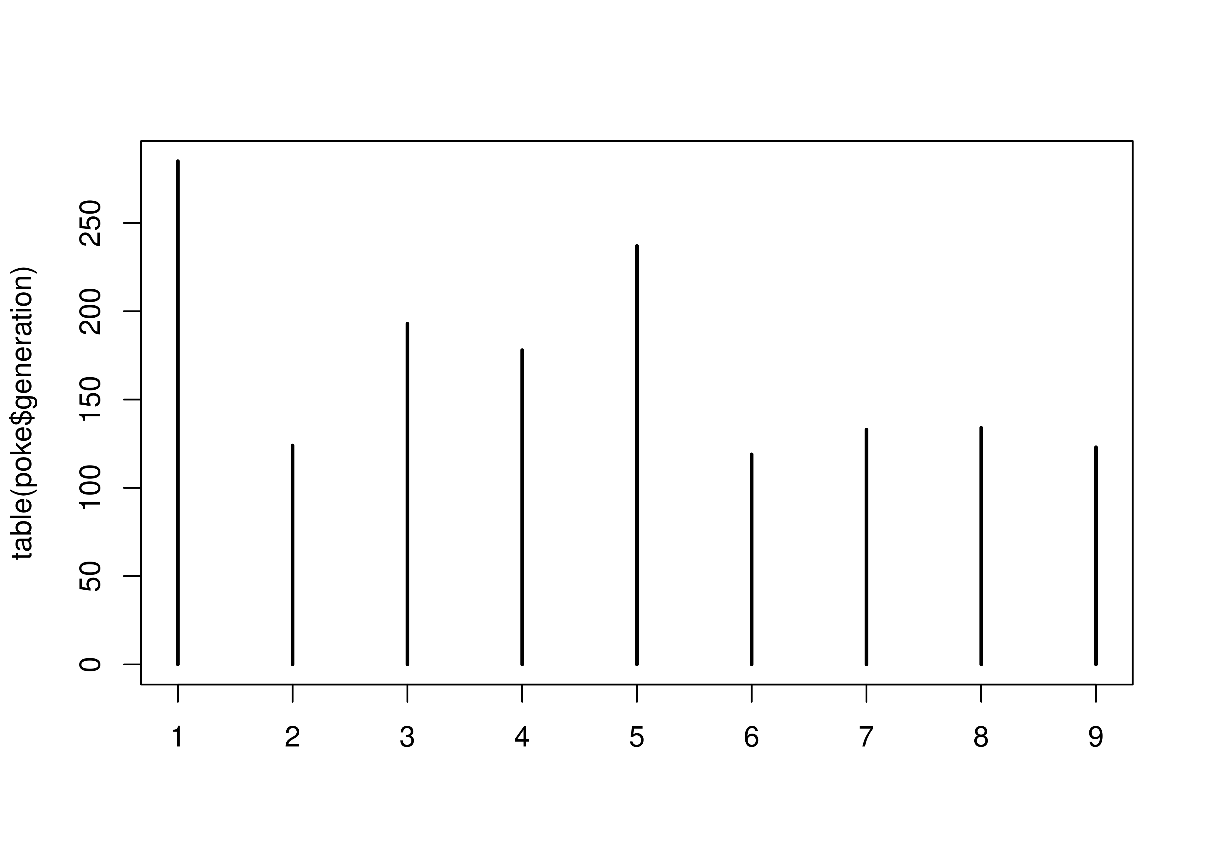
table(poke$generation)
##
##   1   2   3   4   5   6   7   8   9
## 285 124 193 178 237 119 133 134 123

table(poke$type_1, poke$type_2)
##
##            Bug Dark Dragon Electric Fairy Fighting Fire Flying Ghost Grass
##   Bug        0    1      0        4     2        5    2     14     1     8
##   Dark       0    0      4        0     3        2    4      8     2     2
##   Dragon     0    1      0        1     1        2    1      6     3     0
##   Electric   0    4      3        0     2        2    6     19     6    10
##   Fairy      0    0      0        0     0        1    0      6     0     0
##   Fighting   0    3      1        1     0        0    4      3     2     0
##   Fire       2    1      2        0     0        7    0     11     7     0
##   Flying     0    1      2        0     0        1    0      0     0     0
##   Ghost      0    1      4        0     3        0    3      6     0    11
##   Grass      0    5      6        0     5        7    1      8     4     0
##   Ground     0    3      2        2     0        1    1      6     5     2
##   Ice        2    0      0        0     2        0    4      3     1     0
##   Normal     0    0      1        0     5        5    0     33     4     8
##   Poison     1    7      4        0     2        3    2      3     0     0
##   Psychic    0    2      3        0    11        3    1     14     9     4
##   Rock       2    2      2        7     3        1    2      8     0     2
##   Steel      0    0      9        0     4        1    0      2     7     0
##   Water      2    9      6        2     4        6    0      7     6     3
##
##            Ground Ice Normal Poison Psychic Rock Steel Water
##   Bug           4   0      0     12       3    4    13     3
##   Dark          1   4      9      3       2    0     3     0
##   Dragon       13  12      1      0       4    0     0     9
##   Electric      1   7      2      5       2    0     4     6
##   Fairy         0   0      0      0       1    0     5     0
##   Fighting      0   1      0      2       3    0     4     6
##   Fire          3   0      2      1       6    5     1     1
##   Flying        0   0      0      0       0    0     1     3
##   Ghost         2   0      0      4       0    0     0     0
##   Grass         1   3      3     15       3    0     3     0
##   Ground        0   0      1      0       2    3     8     0
##   Ice           3   0      0      0       5    2     4     4
##   Normal        1   0      0      0       6    0     0     1
##   Poison        5   0      2      0       4    0     0     3
##   Psychic       0   3      4      0       0    0     4     0
##   Rock          9   2      0      3       2    0     4     6
##   Steel         2   0      0      2       7    3     0     0
##   Water        12   4      0      4      11    6     1     0
import numpy as np
# For only one factor, use .groupby('colname')['colname'].count()
poke.groupby(['generation'])['generation'].count()
## generation
## 1 285
## 2 124
## 3 193
## 4 178
## 5 237
## 6 119
## 7 133
## 8 134
## 9 123
## Name: generation, dtype: int64
# for two or more factors, use pd.crosstab
pd.crosstab(index = poke['type_1'], columns = poke['type_2'])
## type_2 Bug Dark Dragon Electric ... Psychic Rock Steel Water
## type_1 ...
## Bug 0 1 0 4 ... 3 4 13 3
## Dark 0 0 4 0 ... 2 0 3 0
## Dragon 0 1 0 1 ... 4 0 0 9
## Electric 0 4 3 0 ... 2 0 4 6
## Fairy 0 0 0 0 ... 1 0 5 0
## Fighting 0 3 1 1 ... 3 0 4 6
## Fire 2 1 2 0 ... 6 5 1 1
## Flying 0 1 2 0 ... 0 0 1 3
## Ghost 0 1 4 0 ... 0 0 0 0
## Grass 0 5 6 0 ... 3 0 3 0
## Ground 0 3 2 2 ... 2 3 8 0
## Ice 2 0 0 0 ... 5 2 4 4
## Normal 0 0 1 0 ... 6 0 0 1
## Poison 1 7 4 0 ... 4 0 0 3
## Psychic 0 2 3 0 ... 0 0 4 0
## Rock 2 2 2 7 ... 2 0 4 6
## Steel 0 0 9 0 ... 7 3 0 0
## Water 2 9 6 2 ... 11 6 1 0
##
## [18 rows x 18 columns]Frequency Plots
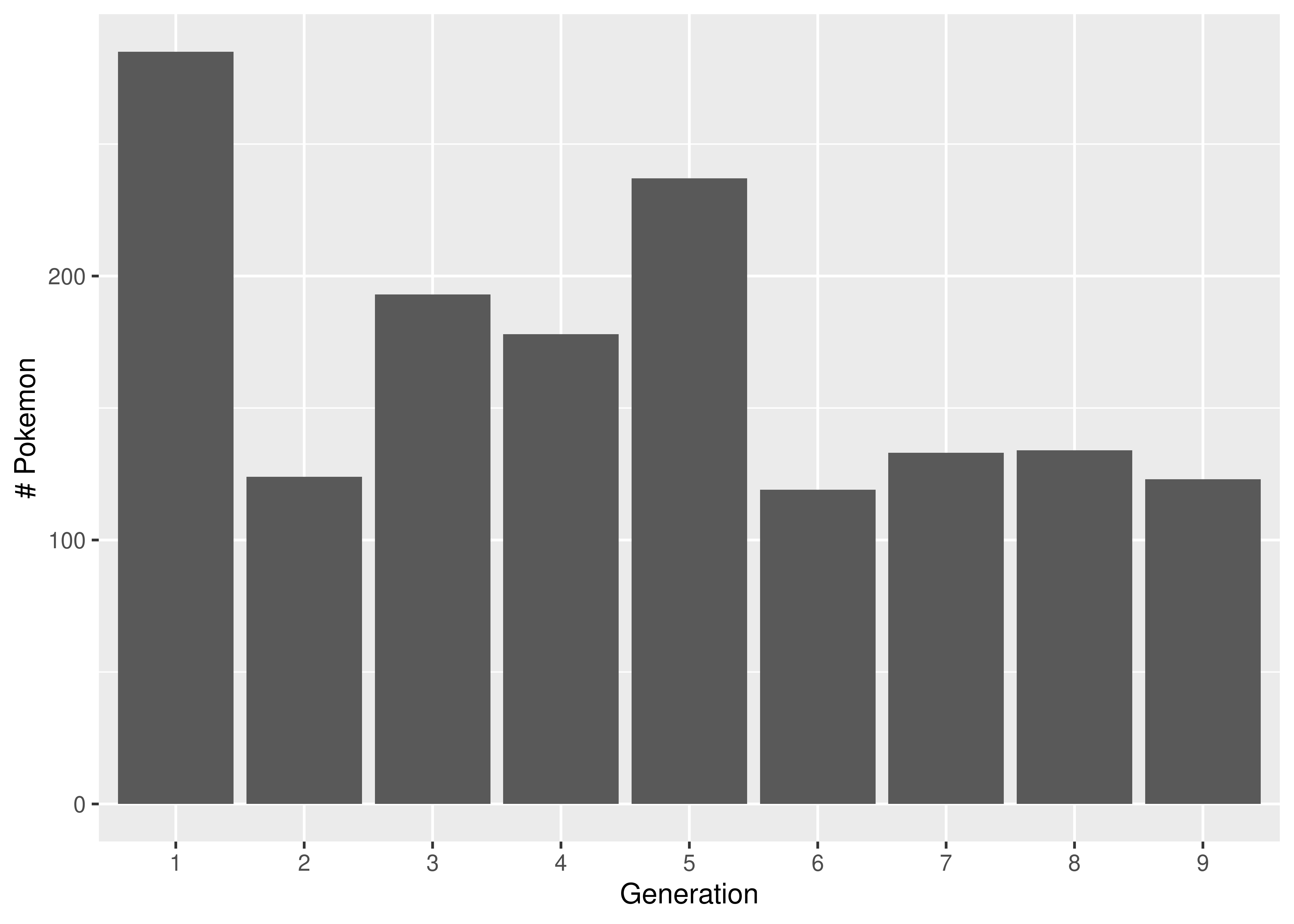
We generate a bar chart using geom_bar. It helps to tell R that generation (despite appearances) is categorical by declaring it a factor variable. This ensures that we get a break on the x-axis at each generation.
We generate a bar chart using the contingency table we generated earlier combined with matplotlib’s plt.bar().
import matplotlib.pyplot as plt

tab = poke.groupby(['generation'])['generation'].count()

plt.bar(tab.keys(), tab.values, color = 'grey')
plt.xlabel("Generation")
plt.ylabel("# Pokemon")
plt.show()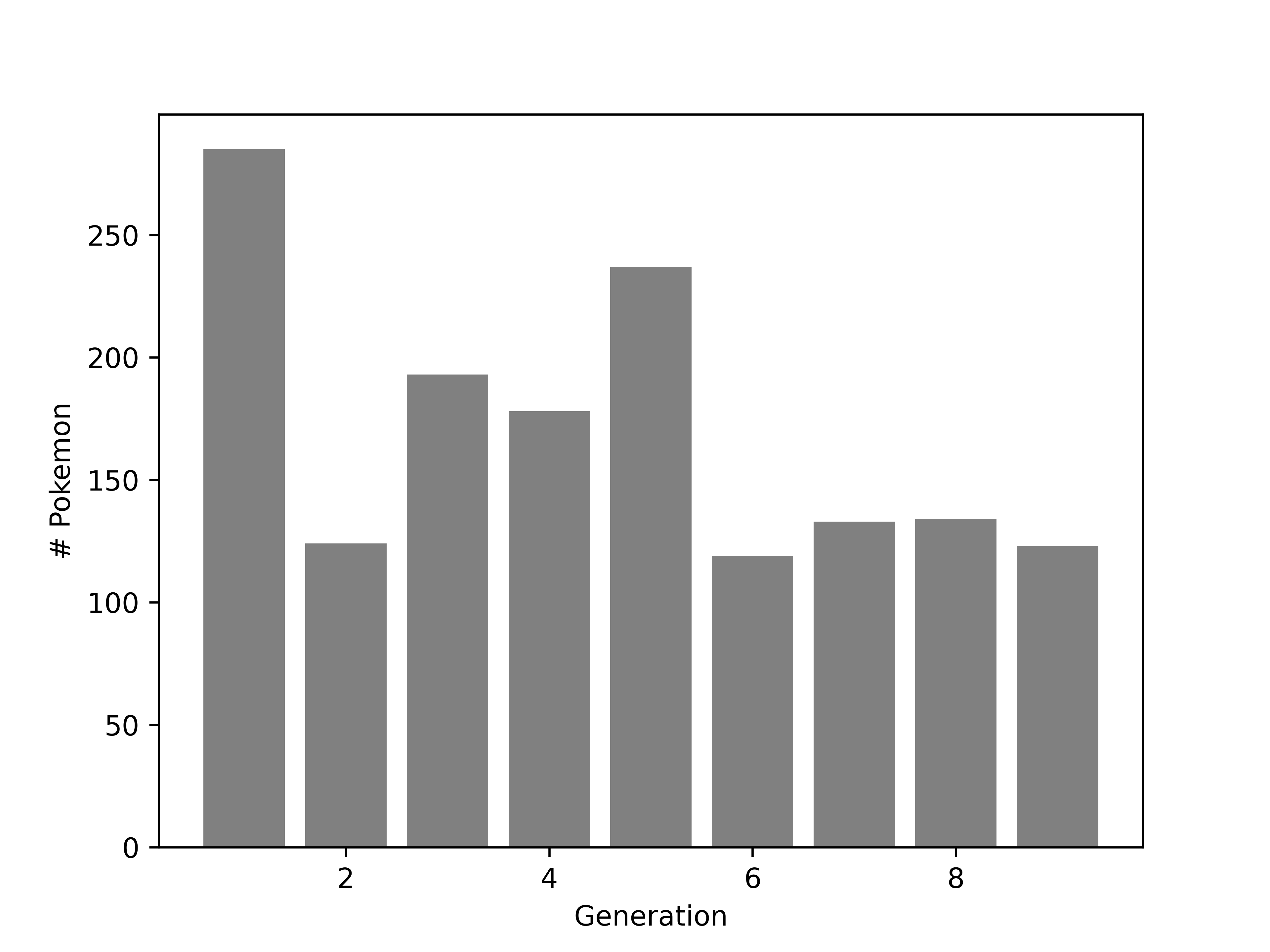
19.4.2.2 Quantitative Variables
We covered some numerical summary statistics in the numerical summary statistic section above. In this section, we will primarily focus on visualization methods for assessing the distribution of quantitative variables.
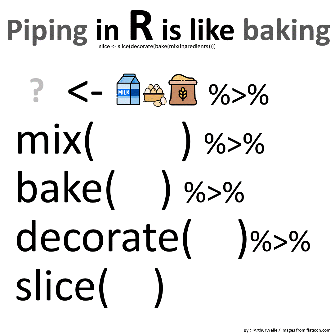
Note: R pipe
The code in this section uses the R pipe, %>%. The left side of the pipe is passed as an argument to the right side. This makes code easier to read because it becomes a step-wise “recipe” instead of a nested mess of functions and parentheses.
We can generate histograms2 or kernel density plots (a continuous version of the histogram) to show us the distribution of a continuous variable.
By default, R uses ranges of \((a, b]\) in histograms, so we specify which breaks will give us a desirable result. If we do not specify breaks, R will pick them for us.
hist(poke$hp)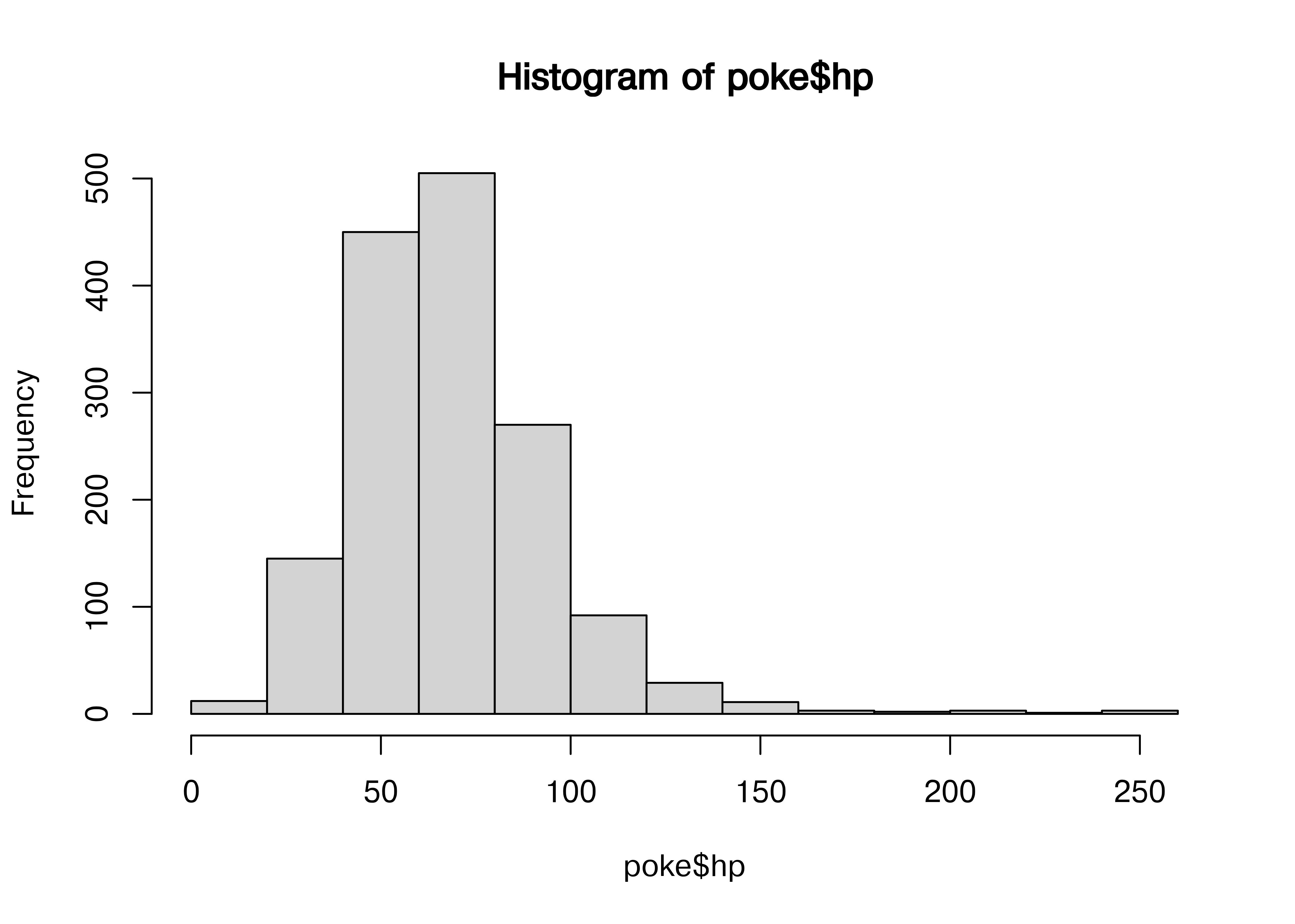
For continuous variables, we can use histograms, or we can examine kernel density plots.
library(magrittr) # This provides the pipe command, %>%

hist(poke$weight_kg)

poke$weight_kg %>%
  log10() %>% # Take the log - will transformation be useful w/ modeling?
  hist(main = "Histogram of Log10 Weight (Kg)") # create a histogram

poke$weight_kg %>%
  density(na.rm = T) %>% # First, we compute the kernel density
  # (na.rm = T says to ignore NA values)
  plot(main = "Density of Weight (Kg)") # Then, we plot the result


poke$weight_kg %>%
  log10() %>% # Transform the variable
  density(na.rm = T) %>% # Compute the density ignoring missing values
  plot(main = "Density of Log10 pokemon weight in Kg") # Plot the result,
    # changing the title of the plot to a meaningful value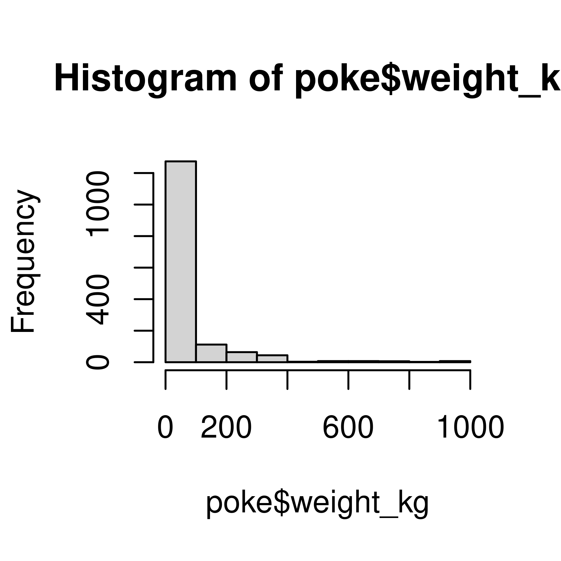
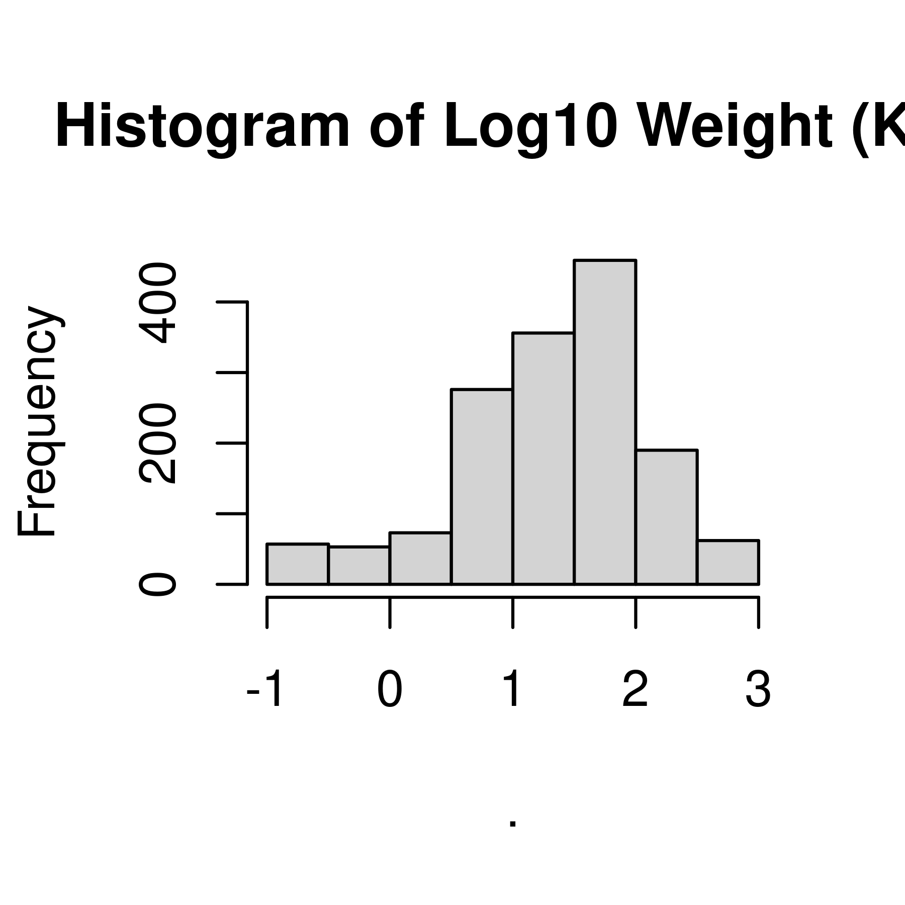
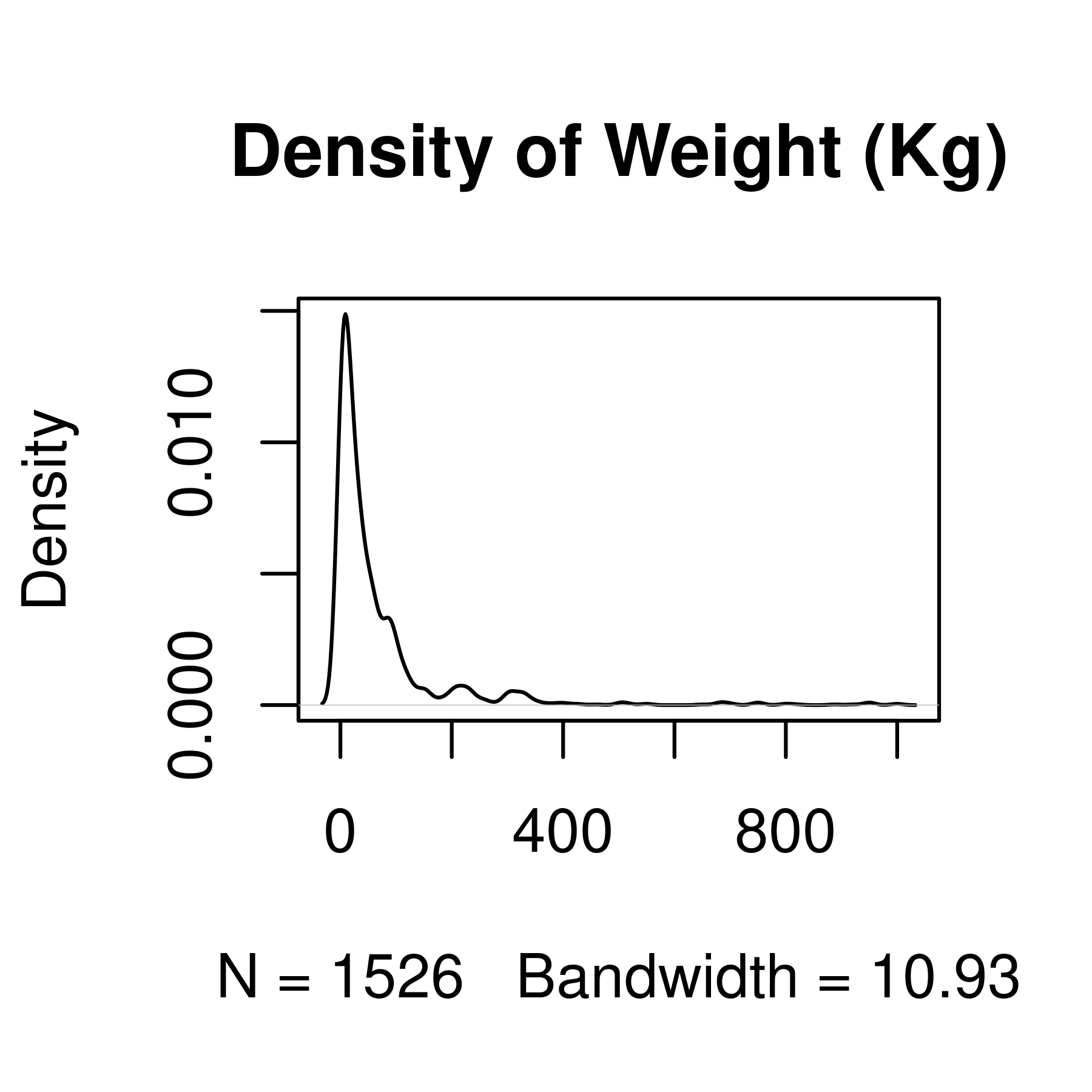
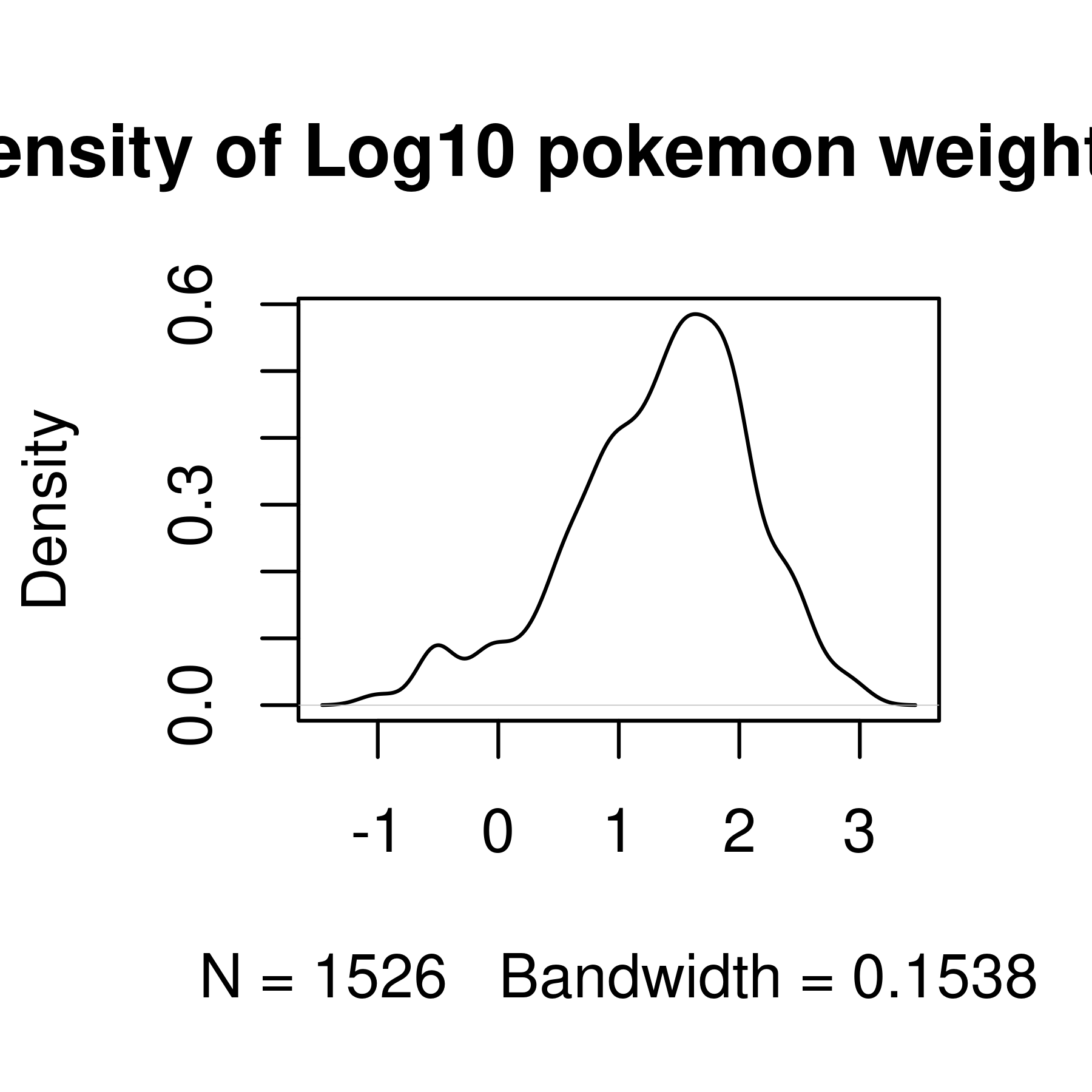
Histogram and density plots of weight and log10 weight of different pokemon. The untransformed data are highly skewed, the transformed data are significantly less skewed.
import matplotlib.pyplot as plt

# Create a 2x2 grid of plots with separate axes
# This uses python multi-assignment to assign figures, axes
# variables all in one go
fig, ((ax1, ax2), (ax3, ax4)) = plt.subplots(2, 2)

poke.weight_kg.plot.hist(ax = ax1) # first plot
ax1.set_title("Histogram of Weight (kg)")


np.log10(poke.weight_kg).plot.hist(ax = ax2)
ax2.set_title("Histogram of Log10 Weight (kg)")

poke.weight_kg.plot.density(ax = ax3)
ax3.set_title("Density of Weight (kg)")

np.log10(poke.weight_kg).plot.density(ax = ax4)
ax4.set_title("Density of Log10 Weight (kg)")

plt.tight_layout()
plt.show()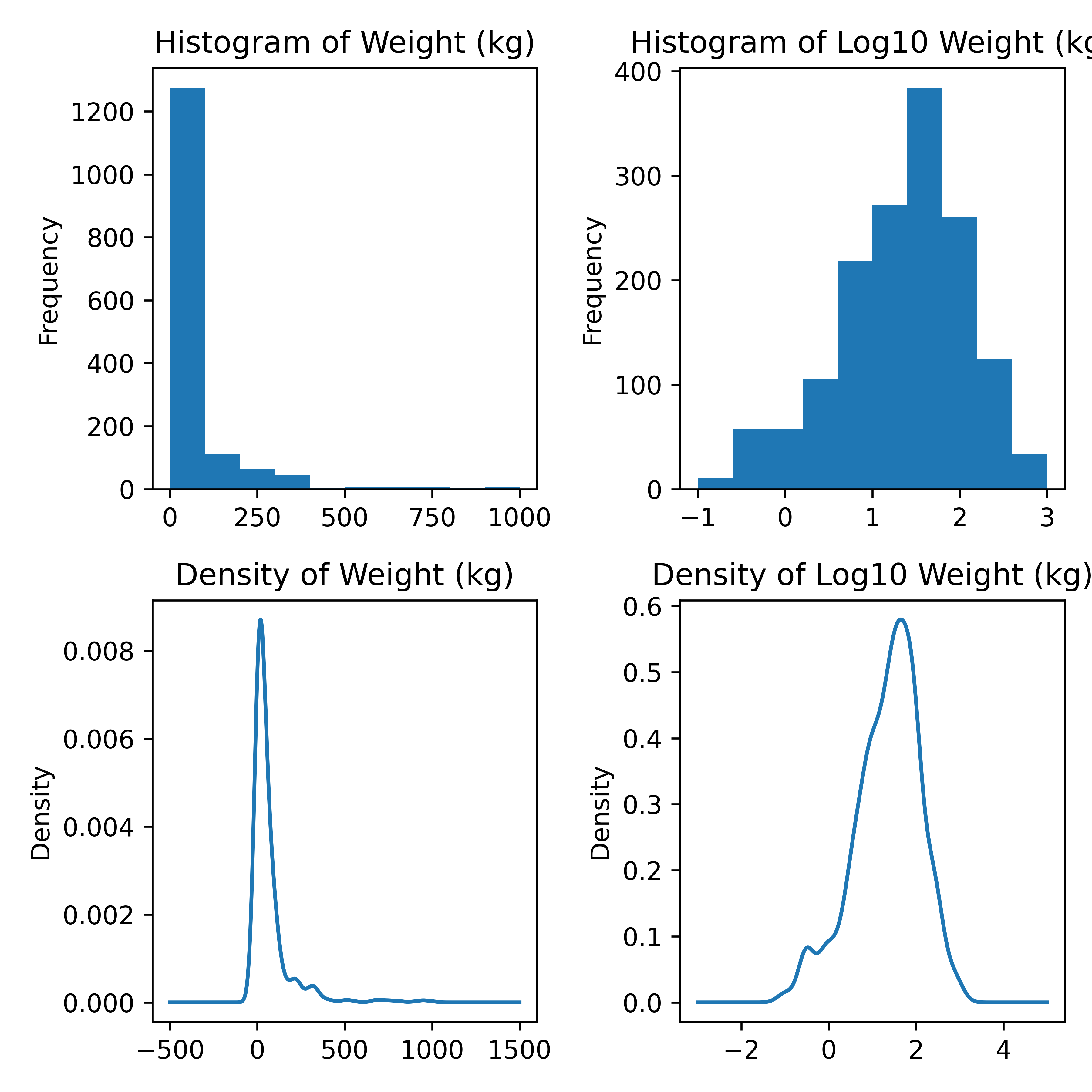
library(ggplot2)
ggplot(poke, aes(x = height_m)) +
  geom_histogram(bins = 30)
ggplot(poke, aes(x = height_m)) +
  geom_histogram(bins = 30) +
  scale_x_log10()
ggplot(poke, aes(x = height_m)) +
  geom_density()
ggplot(poke, aes(x = height_m)) +
  geom_density() +
  scale_x_log10()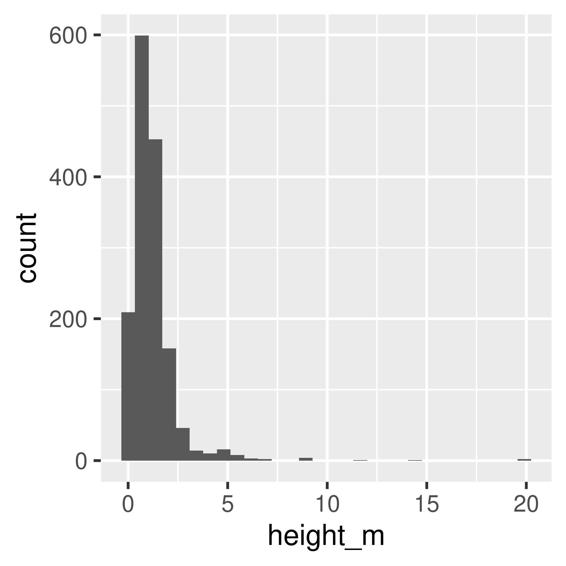
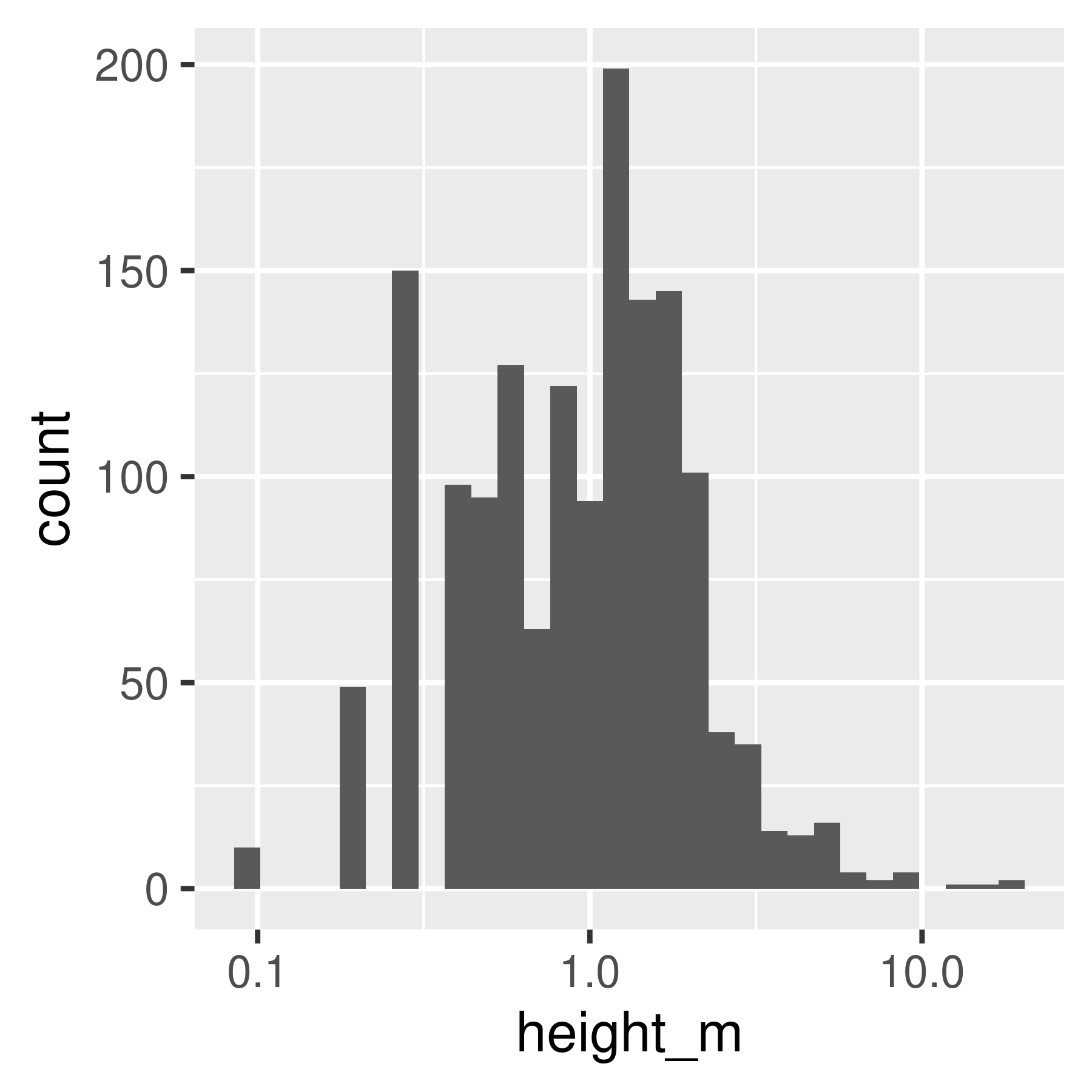
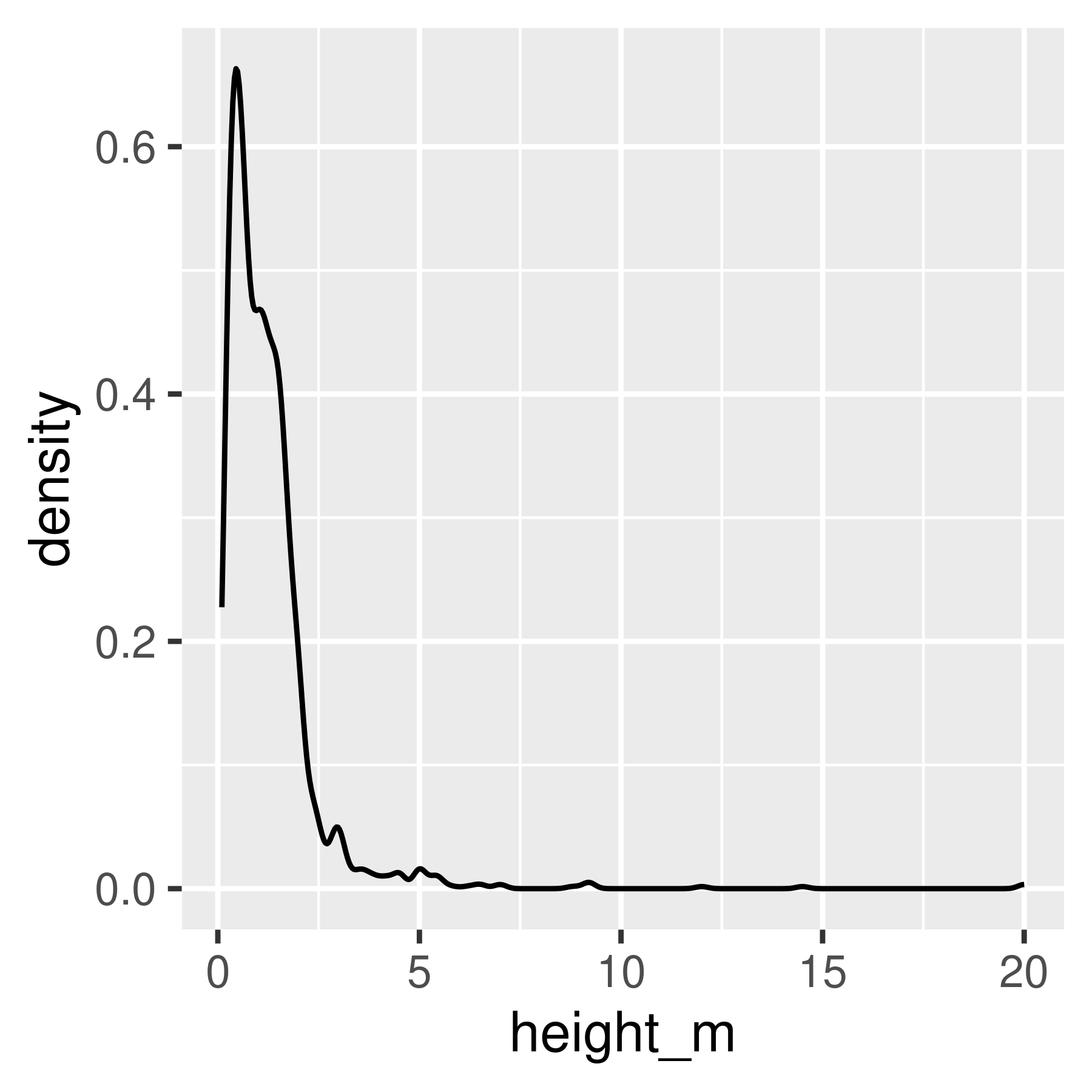
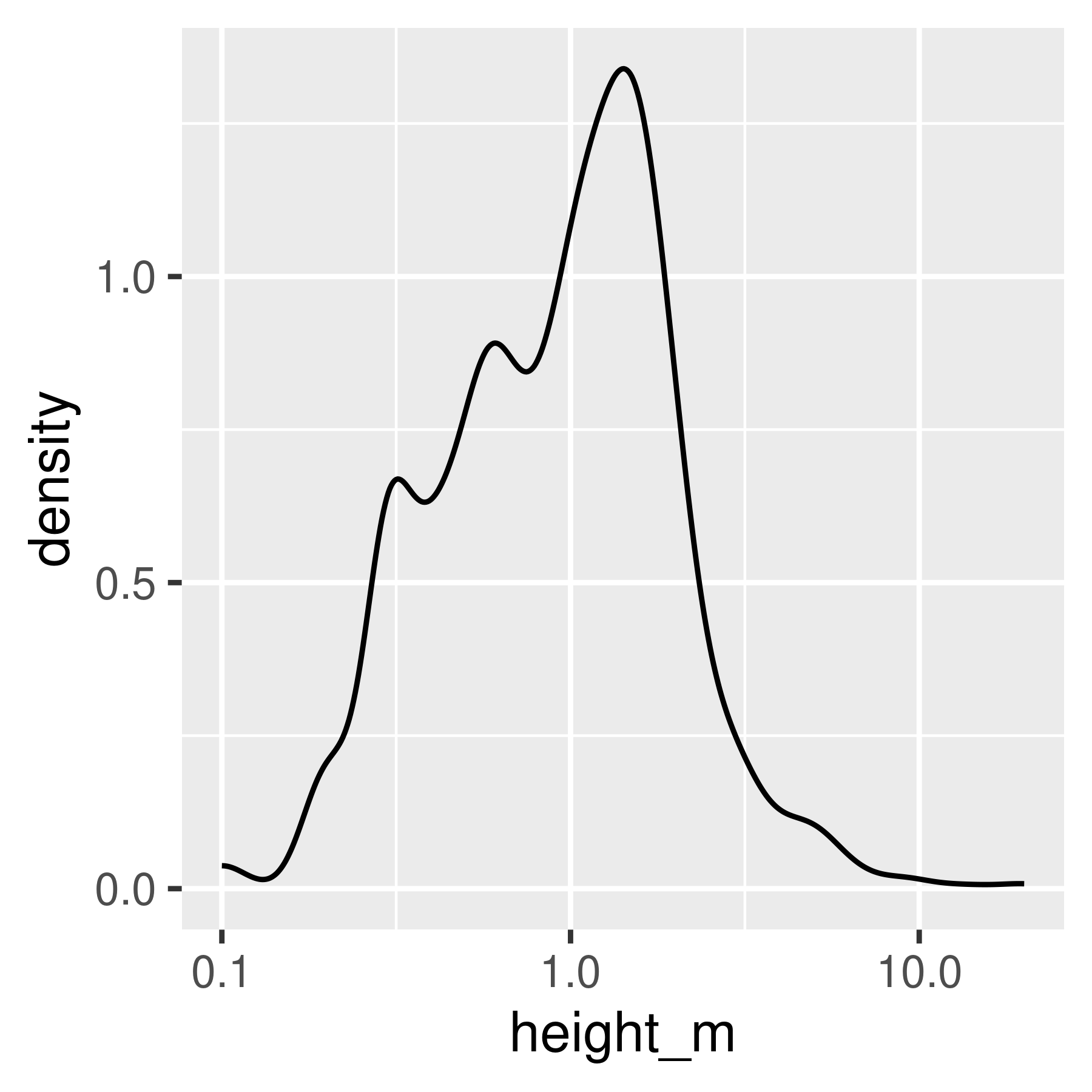
Histogram and density plots of height and log10 height of different pokemon. The untransformed data are highly skewed, the transformed data are significantly less skewed.
Notice that in ggplot2, we transform the axes instead of the data. This means that the units on the axis are true to the original, unlike in base R and matplotlib.
import seaborn as sns
import matplotlib.pyplot as plt

# Create a 2x2 grid of plots with separate axes
# This uses python multi-assignment to assign figures, axes
# variables all in one go
fig, ((ax1, ax2), (ax3, ax4)) = plt.subplots(2, 2)

sns.histplot(poke, x = "height_m", bins = 30, ax = ax1)
sns.histplot(poke, x = "height_m", bins = 30, log_scale = True, ax = ax2)
sns.kdeplot(poke, x = "height_m", bw_adjust = 1, ax = ax3)
sns.kdeplot(poke, x = "height_m", bw_adjust = 1, log_scale = True, ax = ax4)

plt.show()
19.4.3 Relationships Between Variables
19.4.3.1 Categorical - Categorical Relationships
We can generate a (simple) mosaic plot (the equivalent of a 2-dimensional cross-tabular view) using geom_bar with position = 'fill', which scales each bar so that it ends at 1. I’ve flipped the axes using coord_flip so that you can read the labels more easily.
library(ggplot2)

ggplot(poke, aes(x = factor(type_1), fill = factor(type_2))) +
  geom_bar(color = "black", position = "fill") +
  xlab("Type 1") + ylab("Proportion of Pokemon w/ Type 2") +
  coord_flip()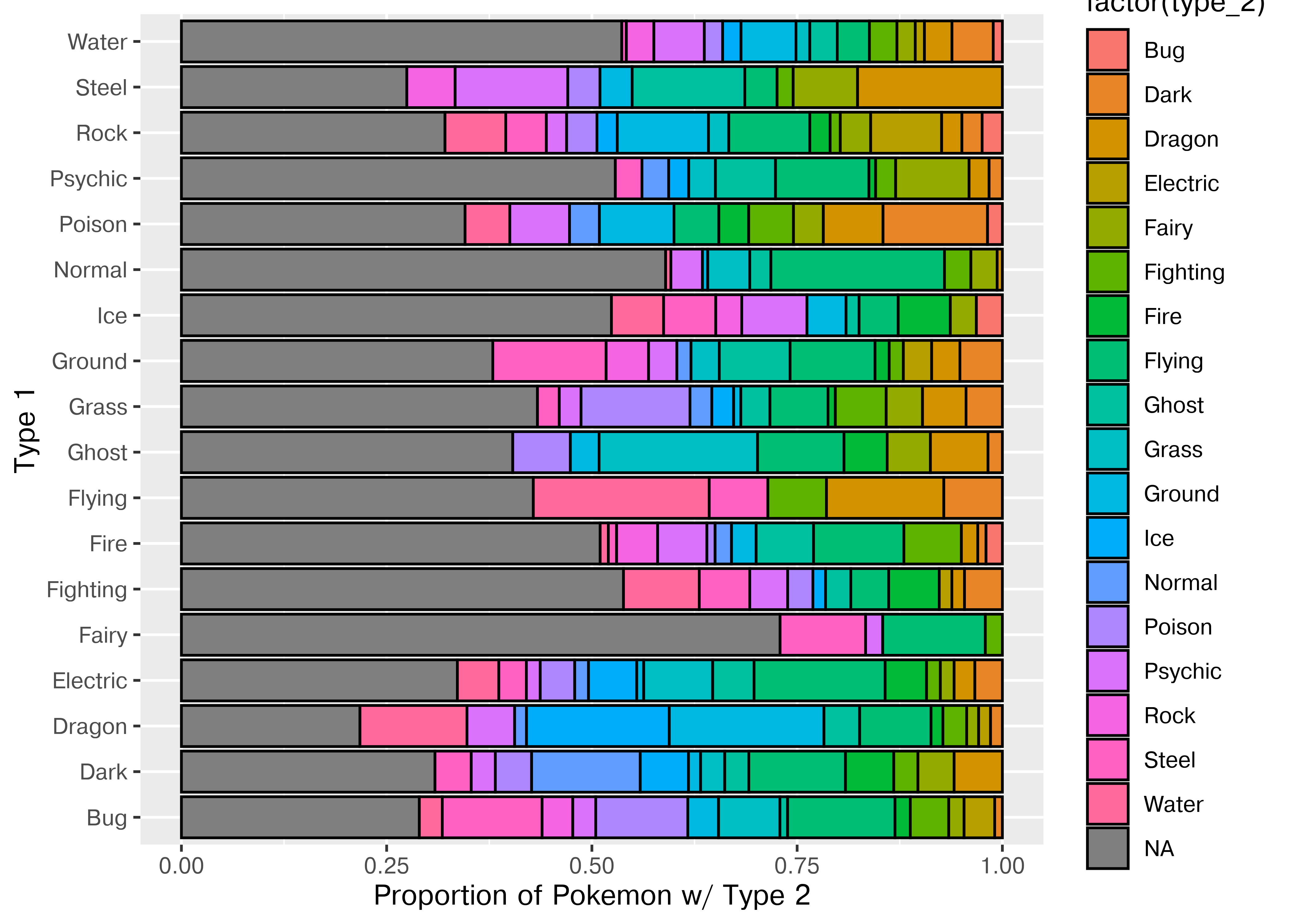
Another way to look at this data is to bin it in x and y and shade the resulting bins by the number of data points in each bin. We can even add in labels so that this is at least as clear as the tabular view!
ggplot(poke, aes(x = factor(type_1), y = factor(type_2))) +
  # Shade tiles according to the number of things in the bin
  geom_tile(aes(fill = after_stat(count)), stat = "bin2d") +
  # Add the number of things in the bin to the top of the tile as text
  geom_text(aes(label = after_stat(count)), stat = 'bin2d') +
  # Scale the tile fill
  scale_fill_gradient2(limits = c(0, 100), low = "white", high = "blue", na.value = "white") +
  theme(axis.text.x = element_text(angle = 90, hjust = 1, vjust = 0.5))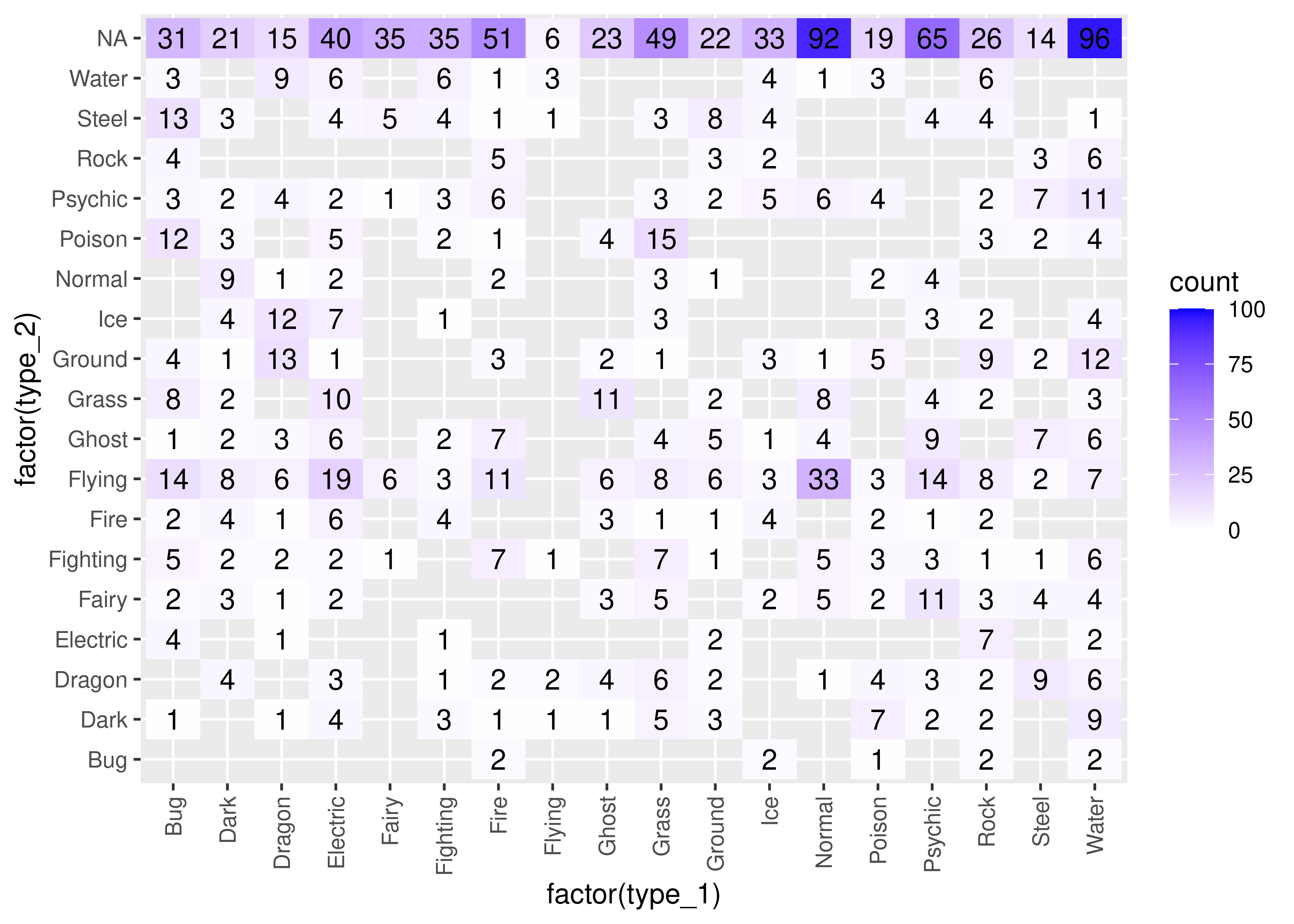
Base R mosaic plots aren’t nearly as pretty as the ggplot version, but I will at least show you how to create them.
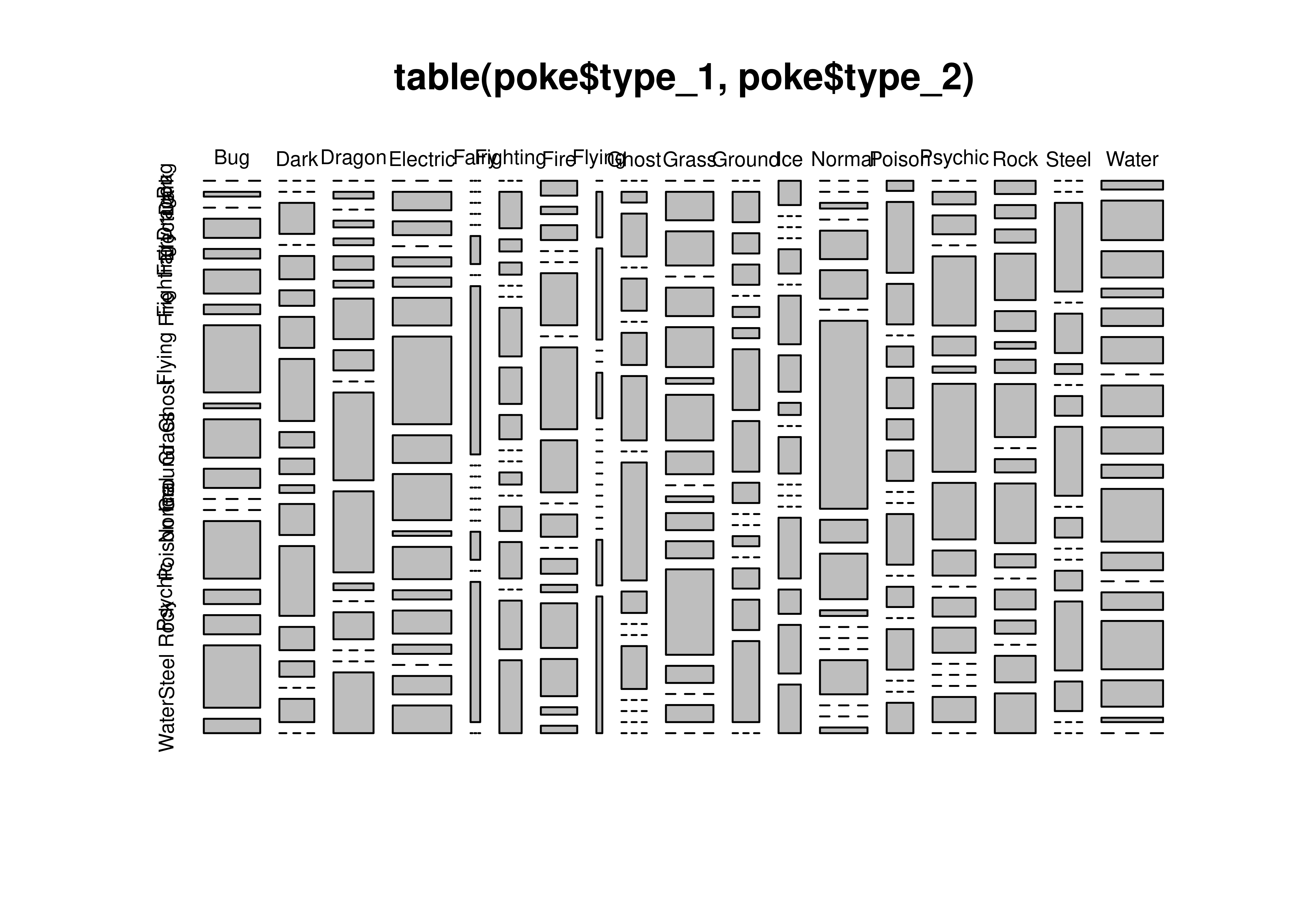
To get a mosaicplot, we need an additional library, called statsmodels, which we install with pip install statsmodels in the terminal.
import matplotlib.pyplot as plt
from statsmodels.graphics.mosaicplot import mosaic

mosaic(poke, ['type_1', 'type_2'], title = "Pokemon Types")
plt.show()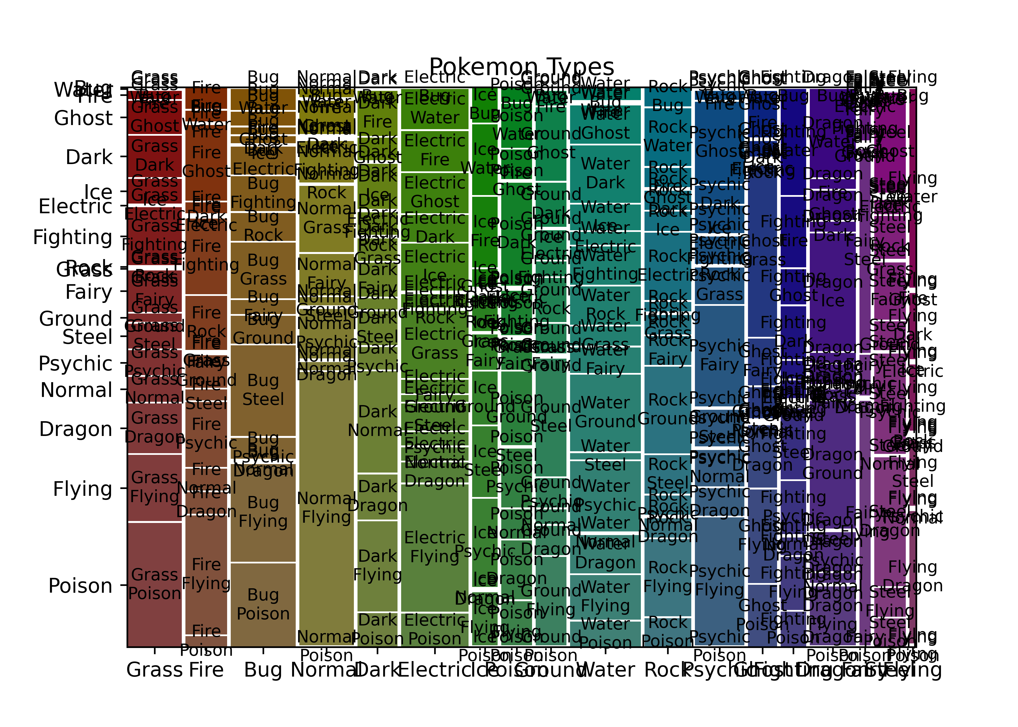
This obviously needs a bit of cleaning up to remove extra labels, but it’s easy to get to and relatively functional. Notice that it does not, by default, show NA values.
Seaborn doesn’t appear to have built-in mosaic plots; the example I found used the statsmodels function shown in the maptlotlib example and used seaborn to create facets. As the point here isn’t to display facets, borrowing the code from that example doesn’t add any value here.
19.4.3.2 Categorical - Continuous Relationships
In R, most models are specified as y ~ x1 + x2 + x3, where the information on the left side of the tilde is the dependent variable, and the information on the right side are any explanatory variables. Interactions are specified using x1*x2 to get all combinations of x1 and x2 (x1, x2, x1*x2); single interaction terms are specified as e.g. x1:x2 and do not include any component terms.
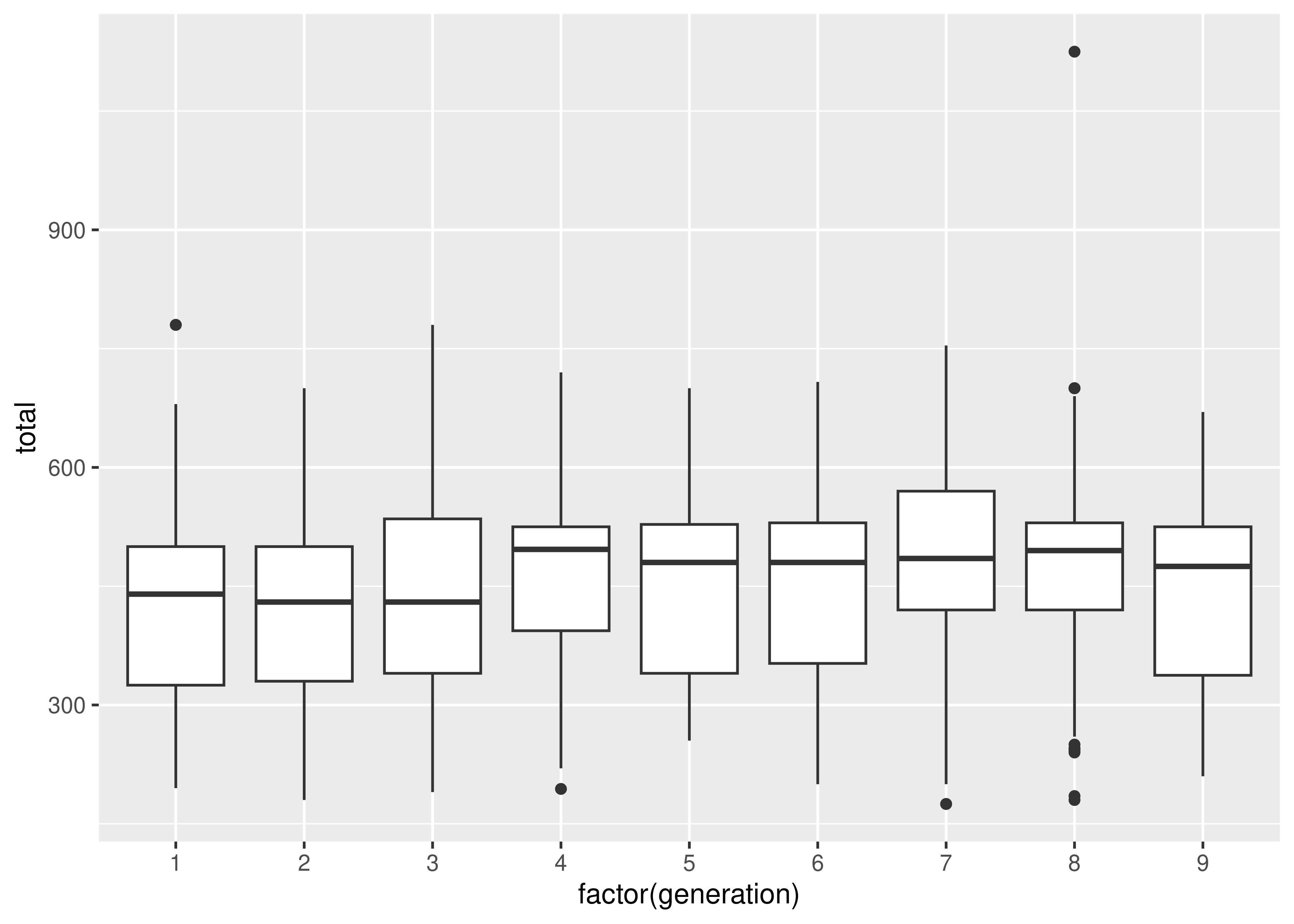
To examine the relationship between a categorical variable and a continuous variable, we might look at box plots:
par(mfrow = c(1, 2)) # put figures in same row
boxplot(log10(height_m) ~ type_1, data = poke)
boxplot(total ~ generation, data = poke)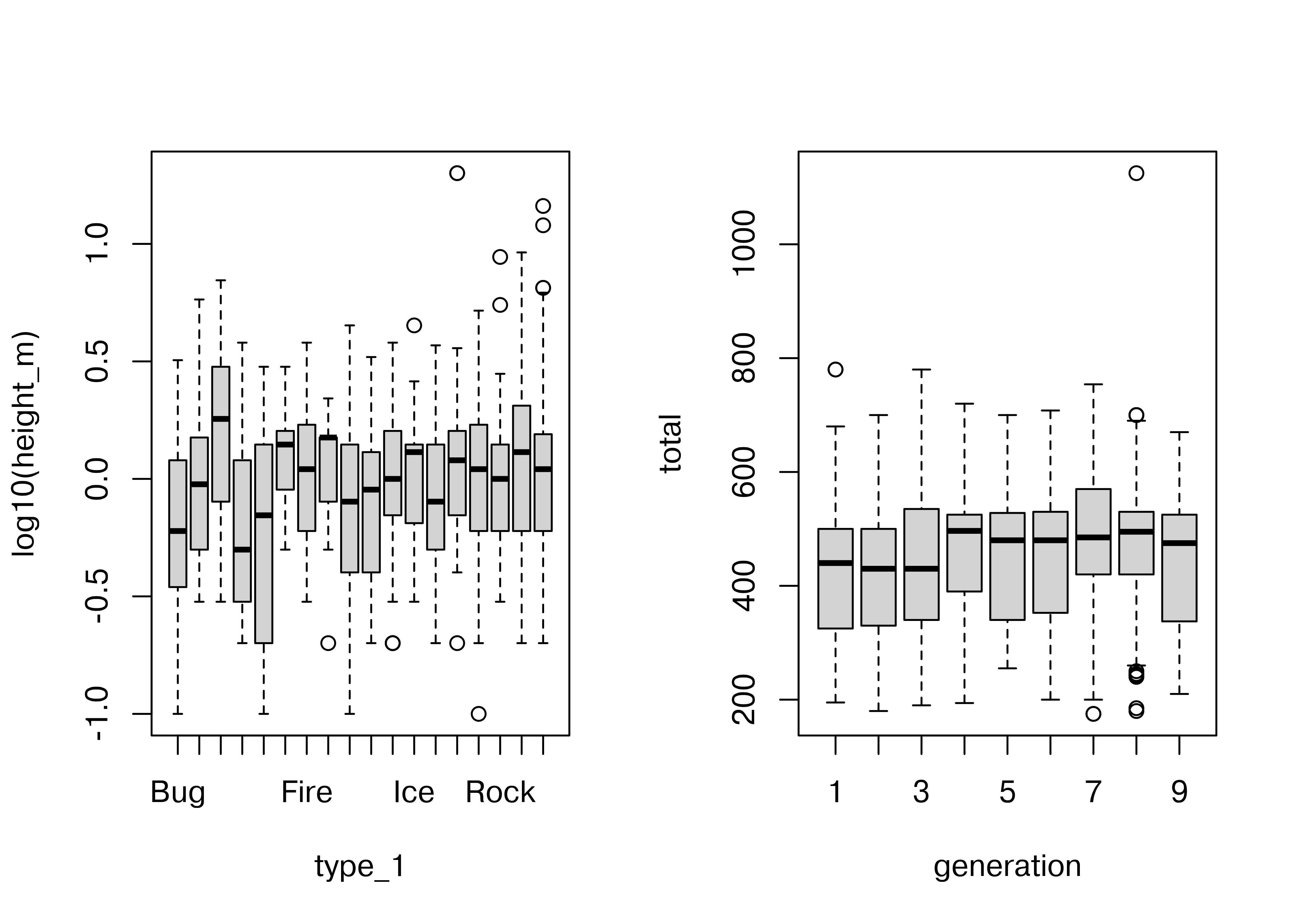
In the second box plot, there are far too many categories to be able to resolve the relationship clearly, but the plot is still effective in that we can identify that there are one or two species which have a much higher point range than other species. EDA isn’t usually about creating pretty plots (or we’d be using ggplot right now) but rather about identifying things which may come up in the analysis later.
ggplot(data = poke, aes(x = type_1, y = height_m)) +
  geom_boxplot() +
  scale_y_log10()

ggplot(data = poke, aes(x = factor(generation), y = total)) +
  geom_boxplot()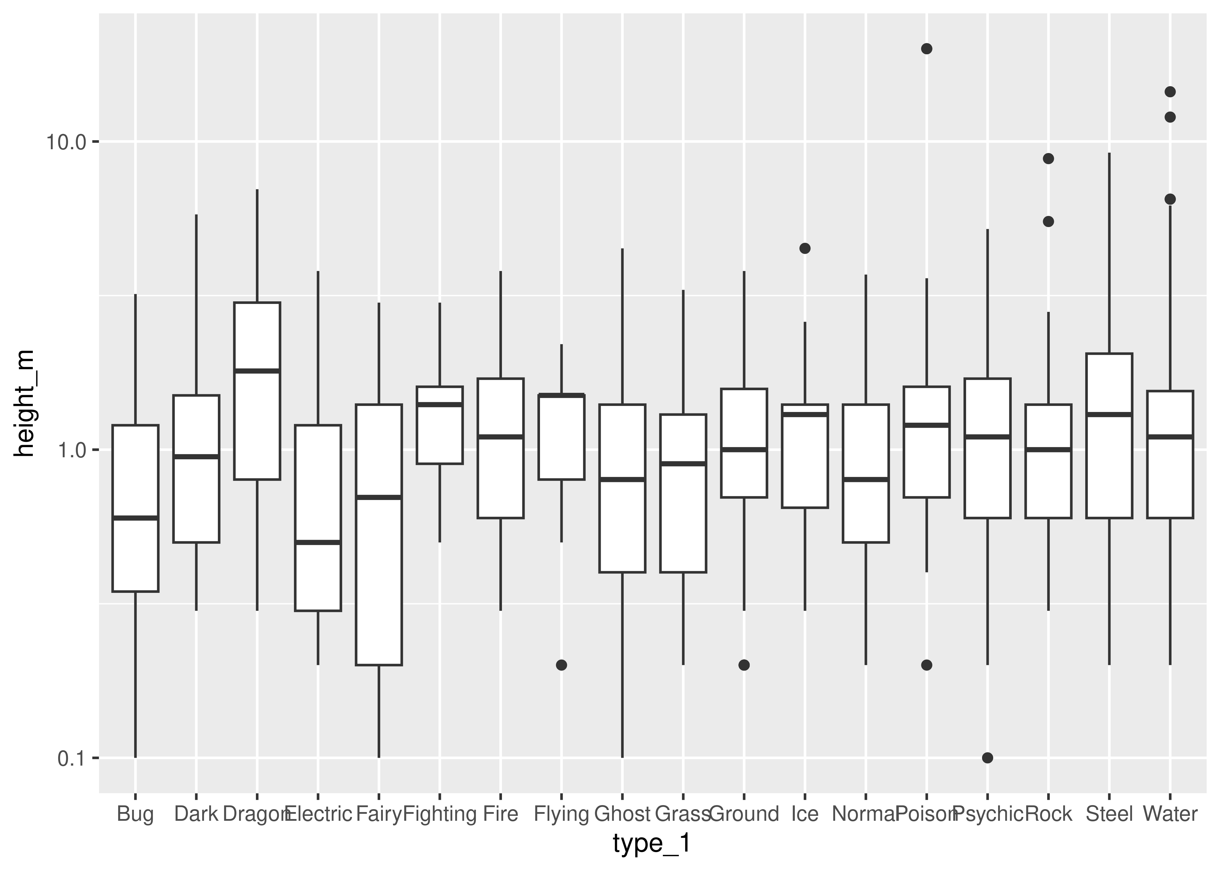
import matplotlib.pyplot as plt
import numpy as np

plt.figure()

# Create a list of vectors of height_m by type_1
poke['height_m_log'] = np.log(poke.height_m)
height_by_type = poke.groupby('type_1', group_keys = True).height_m_log.apply(list)

# Plot each object in the list
plt.boxplot(height_by_type, labels = height_by_type.index)
## {'whiskers': [<matplotlib.lines.Line2D object at 0x7f94f260b890>, <matplotlib.lines.Line2D object at 0x7f94f23c4050>, <matplotlib.lines.Line2D object at 0x7f94f23c7610>, <matplotlib.lines.Line2D object at 0x7f94f23c7e10>, <matplotlib.lines.Line2D object at 0x7f94f23d3350>, <matplotlib.lines.Line2D object at 0x7f94f23d3c50>, <matplotlib.lines.Line2D object at 0x7f94f23df010>, <matplotlib.lines.Line2D object at 0x7f94f23df890>, <matplotlib.lines.Line2D object at 0x7f94f23eed50>, <matplotlib.lines.Line2D object at 0x7f94f23ef550>, <matplotlib.lines.Line2D object at 0x7f94f23feb50>, <matplotlib.lines.Line2D object at 0x7f94f23ff450>, <matplotlib.lines.Line2D object at 0x7f94f240e9d0>, <matplotlib.lines.Line2D object at 0x7f94f240f2d0>, <matplotlib.lines.Line2D object at 0x7f94f241a990>, <matplotlib.lines.Line2D object at 0x7f94f241b1d0>, <matplotlib.lines.Line2D object at 0x7f94f2426690>, <matplotlib.lines.Line2D object at 0x7f94f2426f90>, <matplotlib.lines.Line2D object at 0x7f94f2435950>, <matplotlib.lines.Line2D object at 0x7f94f2391690>, <matplotlib.lines.Line2D object at 0x7f94f2445c50>, <matplotlib.lines.Line2D object at 0x7f94f24464d0>, <matplotlib.lines.Line2D object at 0x7f94f23b3bd0>, <matplotlib.lines.Line2D object at 0x7f94f3bcefd0>, <matplotlib.lines.Line2D object at 0x7f94f39a2310>, <matplotlib.lines.Line2D object at 0x7f94f39a09d0>, <matplotlib.lines.Line2D object at 0x7f94f288c850>, <matplotlib.lines.Line2D object at 0x7f94f288eb90>, <matplotlib.lines.Line2D object at 0x7f94f2813790>, <matplotlib.lines.Line2D object at 0x7f94f3a50d90>, <matplotlib.lines.Line2D object at 0x7f94f28d2490>, <matplotlib.lines.Line2D object at 0x7f94f28d1c10>, <matplotlib.lines.Line2D object at 0x7f94f2788e10>, <matplotlib.lines.Line2D object at 0x7f94f2788c90>, <matplotlib.lines.Line2D object at 0x7f94f27f8f50>, <matplotlib.lines.Line2D object at 0x7f94f27fa690>], 'caps': [<matplotlib.lines.Line2D object at 0x7f94f23c49d0>, <matplotlib.lines.Line2D object at 0x7f94f23c5350>, <matplotlib.lines.Line2D object at 0x7f94f23d0710>, <matplotlib.lines.Line2D object at 0x7f94f23d0fd0>, <matplotlib.lines.Line2D object at 0x7f94f23dc450>, <matplotlib.lines.Line2D object at 0x7f94f23dcd50>, <matplotlib.lines.Line2D object at 0x7f94f23ec150>, <matplotlib.lines.Line2D object at 0x7f94f23ec950>, <matplotlib.lines.Line2D object at 0x7f94f23efe50>, <matplotlib.lines.Line2D object at 0x7f94f23fc750>, <matplotlib.lines.Line2D object at 0x7f94f23ffcd0>, <matplotlib.lines.Line2D object at 0x7f94f240c650>, <matplotlib.lines.Line2D object at 0x7f94f240fbd0>, <matplotlib.lines.Line2D object at 0x7f94f24184d0>, <matplotlib.lines.Line2D object at 0x7f94f241b9d0>, <matplotlib.lines.Line2D object at 0x7f94f2424310>, <matplotlib.lines.Line2D object at 0x7f94f2427850>, <matplotlib.lines.Line2D object at 0x7f94f2434090>, <matplotlib.lines.Line2D object at 0x7f94f24371d0>, <matplotlib.lines.Line2D object at 0x7f94f2437a90>, <matplotlib.lines.Line2D object at 0x7f94f2446d90>, <matplotlib.lines.Line2D object at 0x7f94f2447590>, <matplotlib.lines.Line2D object at 0x7f94f27df5d0>, <matplotlib.lines.Line2D object at 0x7f94f27dc0d0>, <matplotlib.lines.Line2D object at 0x7f94f39a18d0>, <matplotlib.lines.Line2D object at 0x7f94f39a2e10>, <matplotlib.lines.Line2D object at 0x7f94f288fc10>, <matplotlib.lines.Line2D object at 0x7f94f2813d50>, <matplotlib.lines.Line2D object at 0x7f94f3a52cd0>, <matplotlib.lines.Line2D object at 0x7f94f3a51150>, <matplotlib.lines.Line2D object at 0x7f94f28d0750>, <matplotlib.lines.Line2D object at 0x7f94f28d1e90>, <matplotlib.lines.Line2D object at 0x7f94f278a490>, <matplotlib.lines.Line2D object at 0x7f94f278b210>, <matplotlib.lines.Line2D object at 0x7f94f27fb6d0>, <matplotlib.lines.Line2D object at 0x7f94f28a8c10>], 'boxes': [<matplotlib.lines.Line2D object at 0x7f94f3eecfd0>, <matplotlib.lines.Line2D object at 0x7f94f23c6dd0>, <matplotlib.lines.Line2D object at 0x7f94f23d2a50>, <matplotlib.lines.Line2D object at 0x7f94f23de750>, <matplotlib.lines.Line2D object at 0x7f94f23ee4d0>, <matplotlib.lines.Line2D object at 0x7f94f23fe2d0>, <matplotlib.lines.Line2D object at 0x7f94f240e150>, <matplotlib.lines.Line2D object at 0x7f94f241a090>, <matplotlib.lines.Line2D object at 0x7f94f2425dd0>, <matplotlib.lines.Line2D object at 0x7f94f2435ad0>, <matplotlib.lines.Line2D object at 0x7f94f24453d0>, <matplotlib.lines.Line2D object at 0x7f94f2458f10>, <matplotlib.lines.Line2D object at 0x7f94f27dfe90>, <matplotlib.lines.Line2D object at 0x7f94f288c950>, <matplotlib.lines.Line2D object at 0x7f94f2812050>, <matplotlib.lines.Line2D object at 0x7f94f3a53bd0>, <matplotlib.lines.Line2D object at 0x7f94f27884d0>, <matplotlib.lines.Line2D object at 0x7f94f27f8e50>], 'medians': [<matplotlib.lines.Line2D object at 0x7f94f23c5d50>, <matplotlib.lines.Line2D object at 0x7f94f23d18d0>, <matplotlib.lines.Line2D object at 0x7f94f23dd590>, <matplotlib.lines.Line2D object at 0x7f94f23ed250>, <matplotlib.lines.Line2D object at 0x7f94f23fcfd0>, <matplotlib.lines.Line2D object at 0x7f94f240cf90>, <matplotlib.lines.Line2D object at 0x7f94f2418d50>, <matplotlib.lines.Line2D object at 0x7f94f2424b50>, <matplotlib.lines.Line2D object at 0x7f94f24347d0>, <matplotlib.lines.Line2D object at 0x7f94f2444310>, <matplotlib.lines.Line2D object at 0x7f94f2447d90>, <matplotlib.lines.Line2D object at 0x7f94f27dc910>, <matplotlib.lines.Line2D object at 0x7f94f39a3f50>, <matplotlib.lines.Line2D object at 0x7f94f2812a10>, <matplotlib.lines.Line2D object at 0x7f94f3a51f10>, <matplotlib.lines.Line2D object at 0x7f94f28d3190>, <matplotlib.lines.Line2D object at 0x7f94f27f9bd0>, <matplotlib.lines.Line2D object at 0x7f94f28a8290>], 'fliers': [<matplotlib.lines.Line2D object at 0x7f94f23c6650>, <matplotlib.lines.Line2D object at 0x7f94f23d2150>, <matplotlib.lines.Line2D object at 0x7f94f23dde50>, <matplotlib.lines.Line2D object at 0x7f94f23edb50>, <matplotlib.lines.Line2D object at 0x7f94f23fd950>, <matplotlib.lines.Line2D object at 0x7f94f240d850>, <matplotlib.lines.Line2D object at 0x7f94f2419710>, <matplotlib.lines.Line2D object at 0x7f94f2425450>, <matplotlib.lines.Line2D object at 0x7f94f2435250>, <matplotlib.lines.Line2D object at 0x7f94f2444ad0>, <matplotlib.lines.Line2D object at 0x7f94f2458690>, <matplotlib.lines.Line2D object at 0x7f94f27dce50>, <matplotlib.lines.Line2D object at 0x7f94f288e690>, <matplotlib.lines.Line2D object at 0x7f94f2810150>, <matplotlib.lines.Line2D object at 0x7f94f3a52f10>, <matplotlib.lines.Line2D object at 0x7f94f28d0290>, <matplotlib.lines.Line2D object at 0x7f94f27f9510>, <matplotlib.lines.Line2D object at 0x7f94f28a9410>], 'means': []}

plt.show()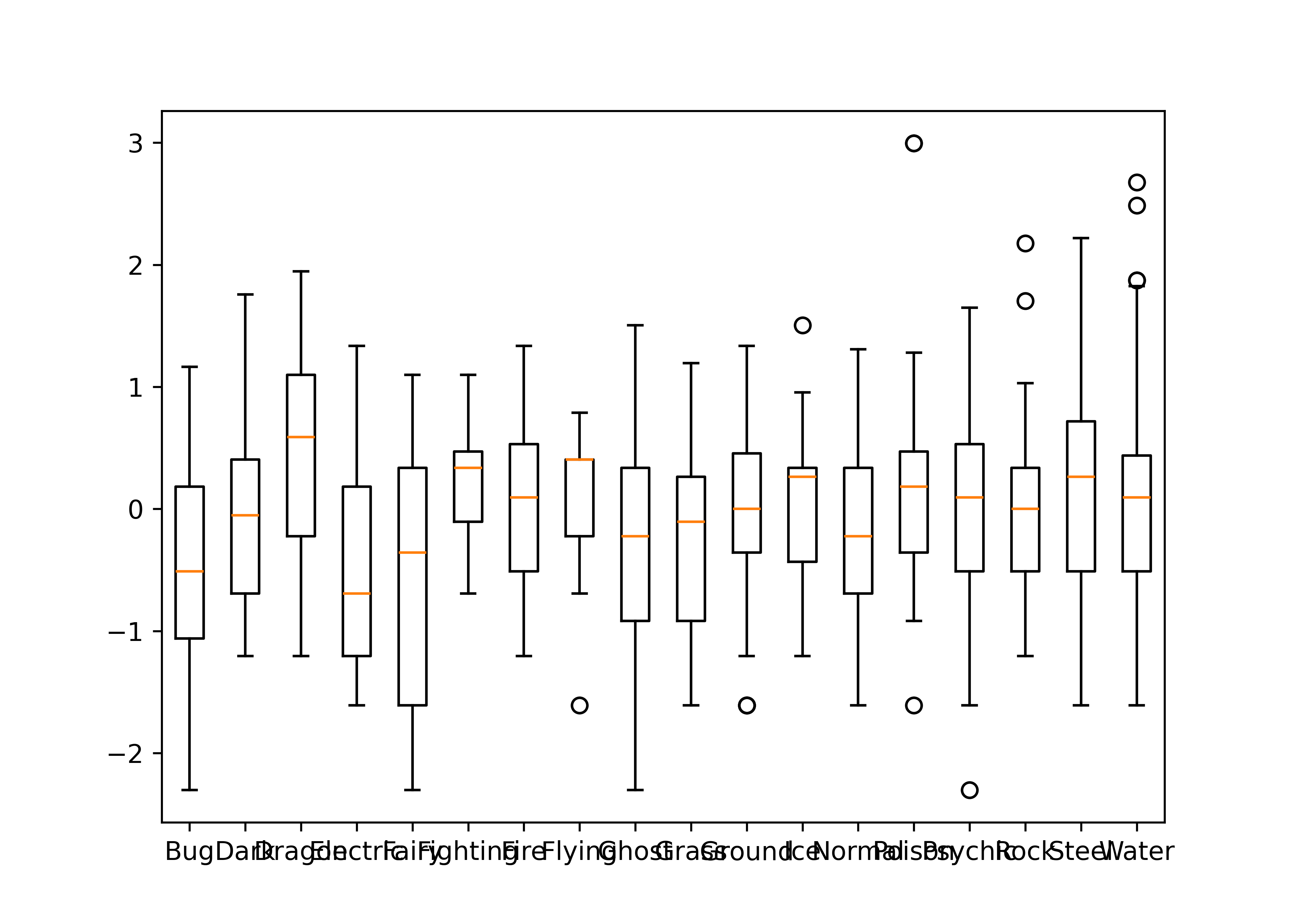
plt.figure()

# Create a list of vectors of total by generation
total_by_gen = poke.groupby('generation', group_keys = True).total.apply(list)

# Plot each object in the list
plt.boxplot(total_by_gen, labels = total_by_gen.index)
## {'whiskers': [<matplotlib.lines.Line2D object at 0x7f94f27336d0>, <matplotlib.lines.Line2D object at 0x7f94f2968890>, <matplotlib.lines.Line2D object at 0x7f94f296b450>, <matplotlib.lines.Line2D object at 0x7f94f28ba050>, <matplotlib.lines.Line2D object at 0x7f94f28bba10>, <matplotlib.lines.Line2D object at 0x7f94f28bb550>, <matplotlib.lines.Line2D object at 0x7f94f27afe50>, <matplotlib.lines.Line2D object at 0x7f94f282a7d0>, <matplotlib.lines.Line2D object at 0x7f94f2682490>, <matplotlib.lines.Line2D object at 0x7f94f26812d0>, <matplotlib.lines.Line2D object at 0x7f94f26dc510>, <matplotlib.lines.Line2D object at 0x7f94f26ddf90>, <matplotlib.lines.Line2D object at 0x7f94f27e8d50>, <matplotlib.lines.Line2D object at 0x7f94f27eb350>, <matplotlib.lines.Line2D object at 0x7f94f3a47c90>, <matplotlib.lines.Line2D object at 0x7f94f26a6610>, <matplotlib.lines.Line2D object at 0x7f94f2970510>, <matplotlib.lines.Line2D object at 0x7f94f2973110>], 'caps': [<matplotlib.lines.Line2D object at 0x7f94f296b0d0>, <matplotlib.lines.Line2D object at 0x7f94f296a790>, <matplotlib.lines.Line2D object at 0x7f94f28b9210>, <matplotlib.lines.Line2D object at 0x7f94f28b8090>, <matplotlib.lines.Line2D object at 0x7f94f27ac150>, <matplotlib.lines.Line2D object at 0x7f94f27ac0d0>, <matplotlib.lines.Line2D object at 0x7f94f2829310>, <matplotlib.lines.Line2D object at 0x7f94f2829110>, <matplotlib.lines.Line2D object at 0x7f94f2680c10>, <matplotlib.lines.Line2D object at 0x7f94f2682750>, <matplotlib.lines.Line2D object at 0x7f94f26df290>, <matplotlib.lines.Line2D object at 0x7f94f26dc310>, <matplotlib.lines.Line2D object at 0x7f94f3a44e90>, <matplotlib.lines.Line2D object at 0x7f94f3a45650>, <matplotlib.lines.Line2D object at 0x7f94f26a5d50>, <matplotlib.lines.Line2D object at 0x7f94f26a4050>, <matplotlib.lines.Line2D object at 0x7f94f29704d0>, <matplotlib.lines.Line2D object at 0x7f94f2971b10>], 'boxes': [<matplotlib.lines.Line2D object at 0x7f94f2732e10>, <matplotlib.lines.Line2D object at 0x7f94f296aa10>, <matplotlib.lines.Line2D object at 0x7f94f28ba4d0>, <matplotlib.lines.Line2D object at 0x7f94f27af050>, <matplotlib.lines.Line2D object at 0x7f94f2683110>, <matplotlib.lines.Line2D object at 0x7f94f26de3d0>, <matplotlib.lines.Line2D object at 0x7f94f27e8f90>, <matplotlib.lines.Line2D object at 0x7f94f3a46c50>, <matplotlib.lines.Line2D object at 0x7f94f26a7c10>], 'medians': [<matplotlib.lines.Line2D object at 0x7f94f2968c50>, <matplotlib.lines.Line2D object at 0x7f94f28b8fd0>, <matplotlib.lines.Line2D object at 0x7f94f27ac910>, <matplotlib.lines.Line2D object at 0x7f94f282a4d0>, <matplotlib.lines.Line2D object at 0x7f94f2683310>, <matplotlib.lines.Line2D object at 0x7f94f27e89d0>, <matplotlib.lines.Line2D object at 0x7f94f3a44b10>, <matplotlib.lines.Line2D object at 0x7f94f26a54d0>, <matplotlib.lines.Line2D object at 0x7f94f2973450>], 'fliers': [<matplotlib.lines.Line2D object at 0x7f94f2969a90>, <matplotlib.lines.Line2D object at 0x7f94f28b9fd0>, <matplotlib.lines.Line2D object at 0x7f94f27ac250>, <matplotlib.lines.Line2D object at 0x7f94f282b790>, <matplotlib.lines.Line2D object at 0x7f94f26dda50>, <matplotlib.lines.Line2D object at 0x7f94f27eae90>, <matplotlib.lines.Line2D object at 0x7f94f3a45e50>, <matplotlib.lines.Line2D object at 0x7f94f26a6f10>, <matplotlib.lines.Line2D object at 0x7f94f2973810>], 'means': []}

plt.show()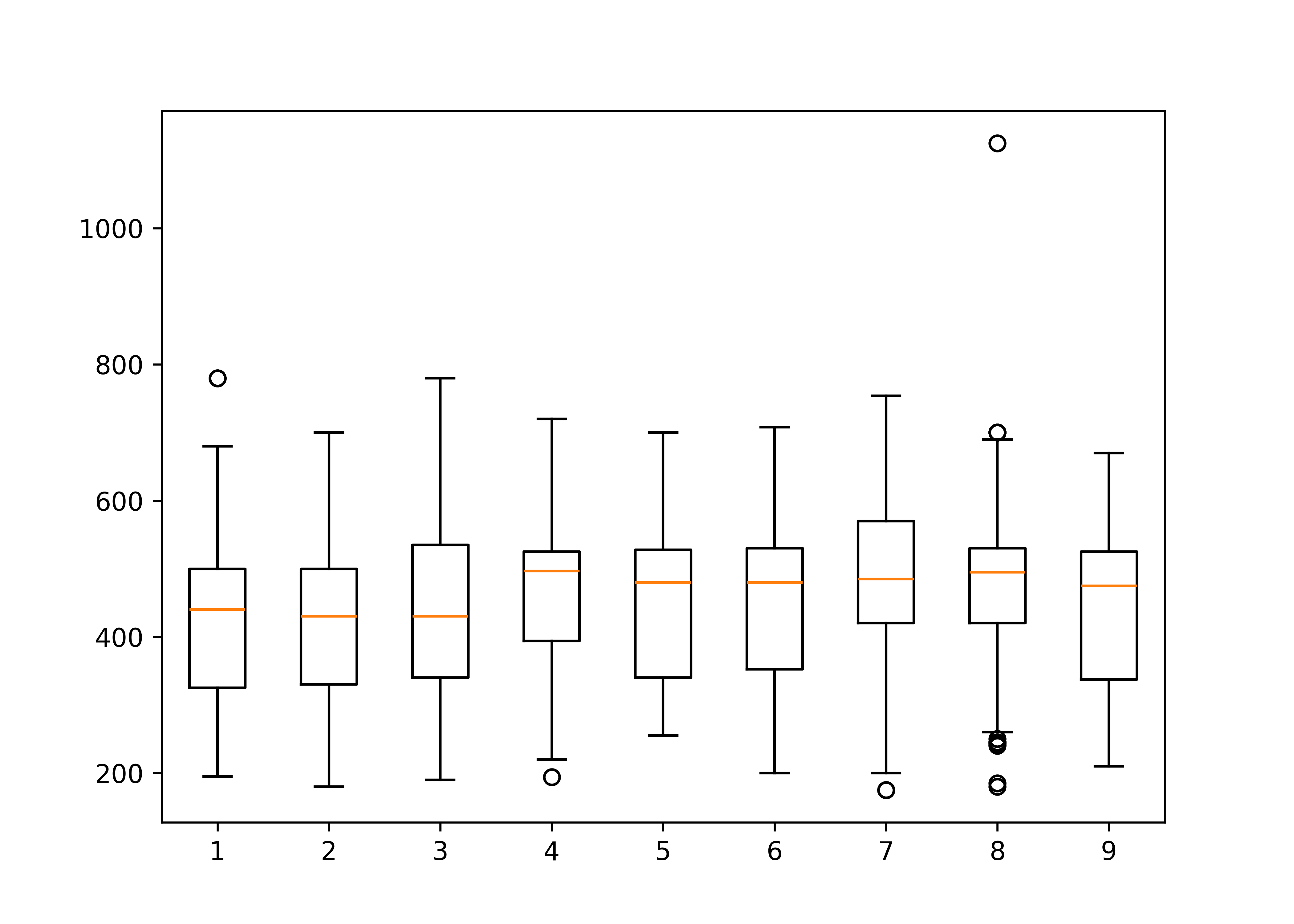
import seaborn as sns
plt.figure()
sns.boxplot(poke, x = "generation", y = "height_m", log_scale = True)
plt.show()
As a higher-level graphics library, seaborn allows you to transform the scale shown on the axes instead of having to manually transform the data. This is a more natural presentation, as the values on the scale are (at least in theory) a bit easier to read. In practice, I’d still probably customize the labels on the y-axis if I were hoping to use this for publication.
import seaborn as sns
plt.figure()
sns.boxplot(poke, x = "generation", y = "total")
plt.show()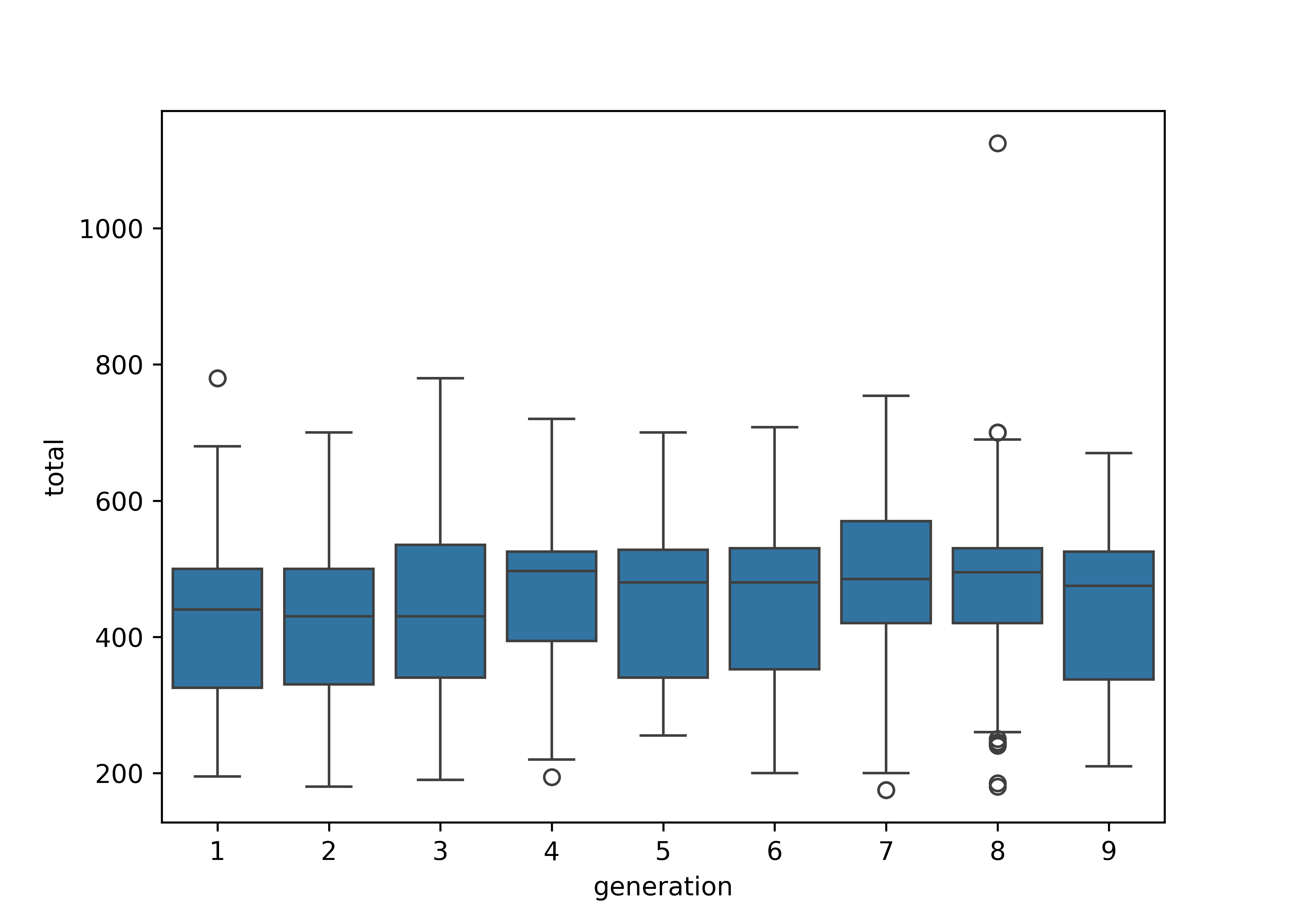
You can find more on boxplots and ways to customize boxplots in the Graphics chapter.
19.4.3.3 Continuous - Continuous Relationships
To look at the relationship between numeric variables, we could compute a numeric correlation, but a plot may be more useful, because it allows us to see outliers as well.
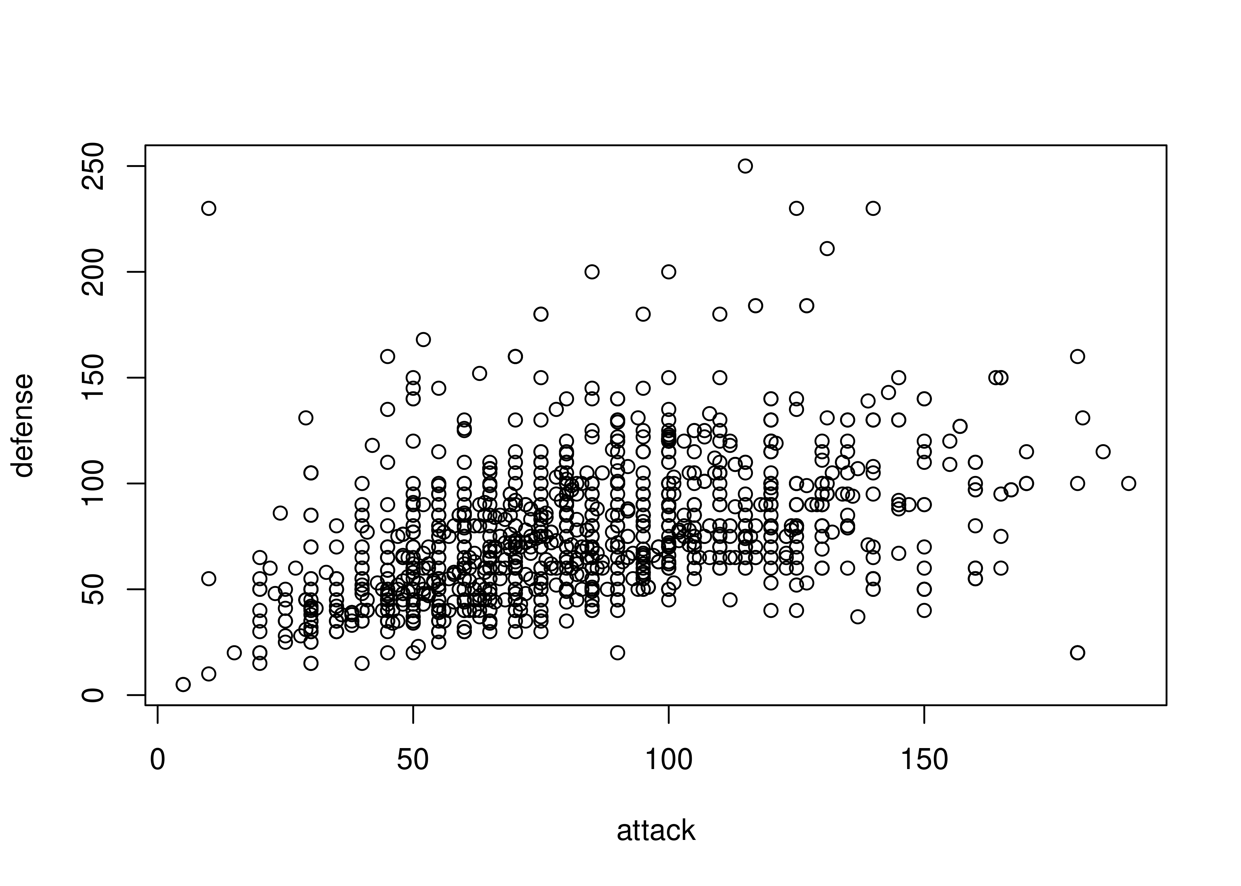
Sometimes, we discover that a numeric variable which may seem to be continuous is actually relatively quantized. In other cases, like in the plot below, we may discover an interesting correlation that sticks out - the identity line \(y=x\) seems to stand out from the cloud here.
plot(x = poke$sp_attack, y = poke$attack, type = "p")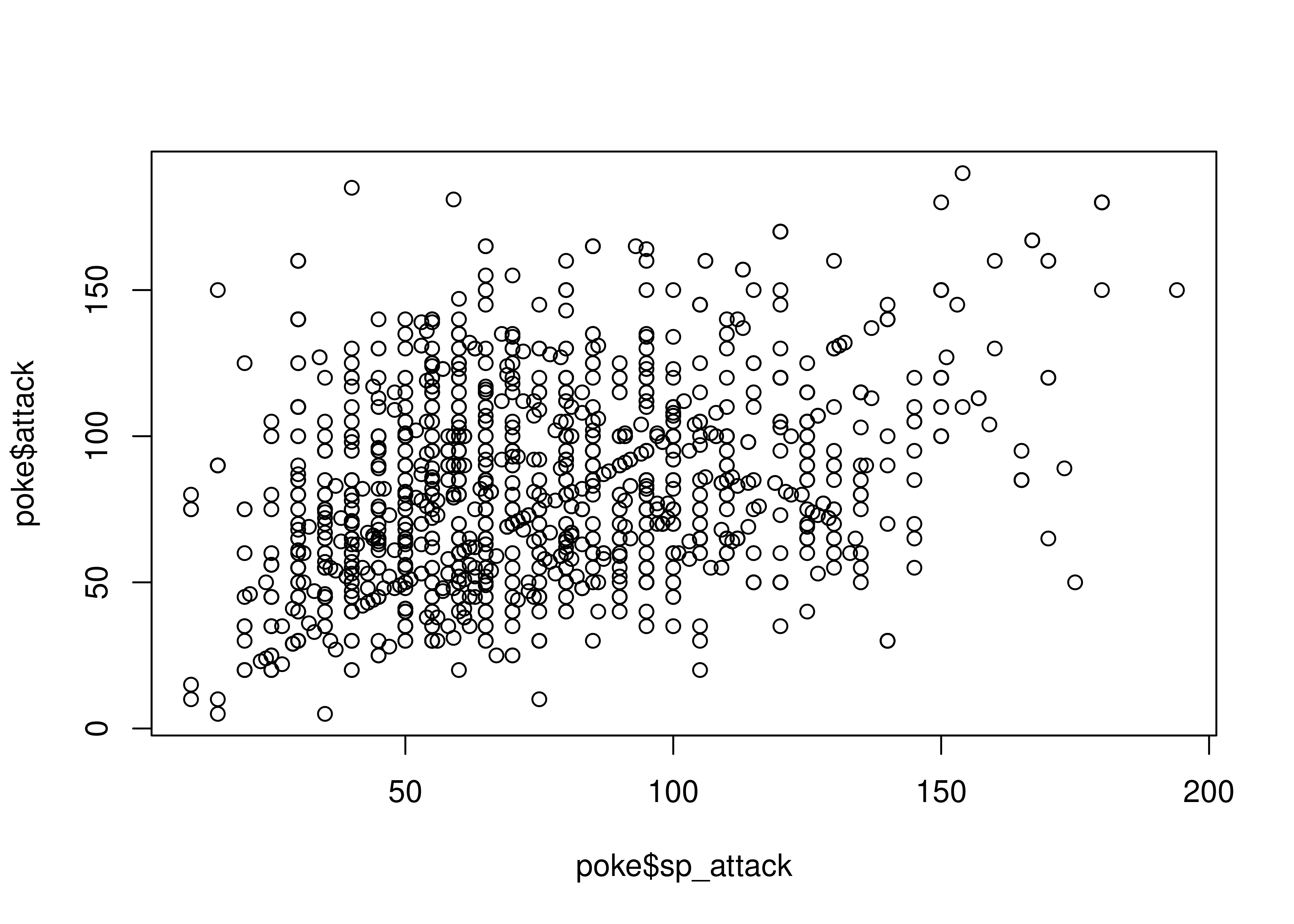
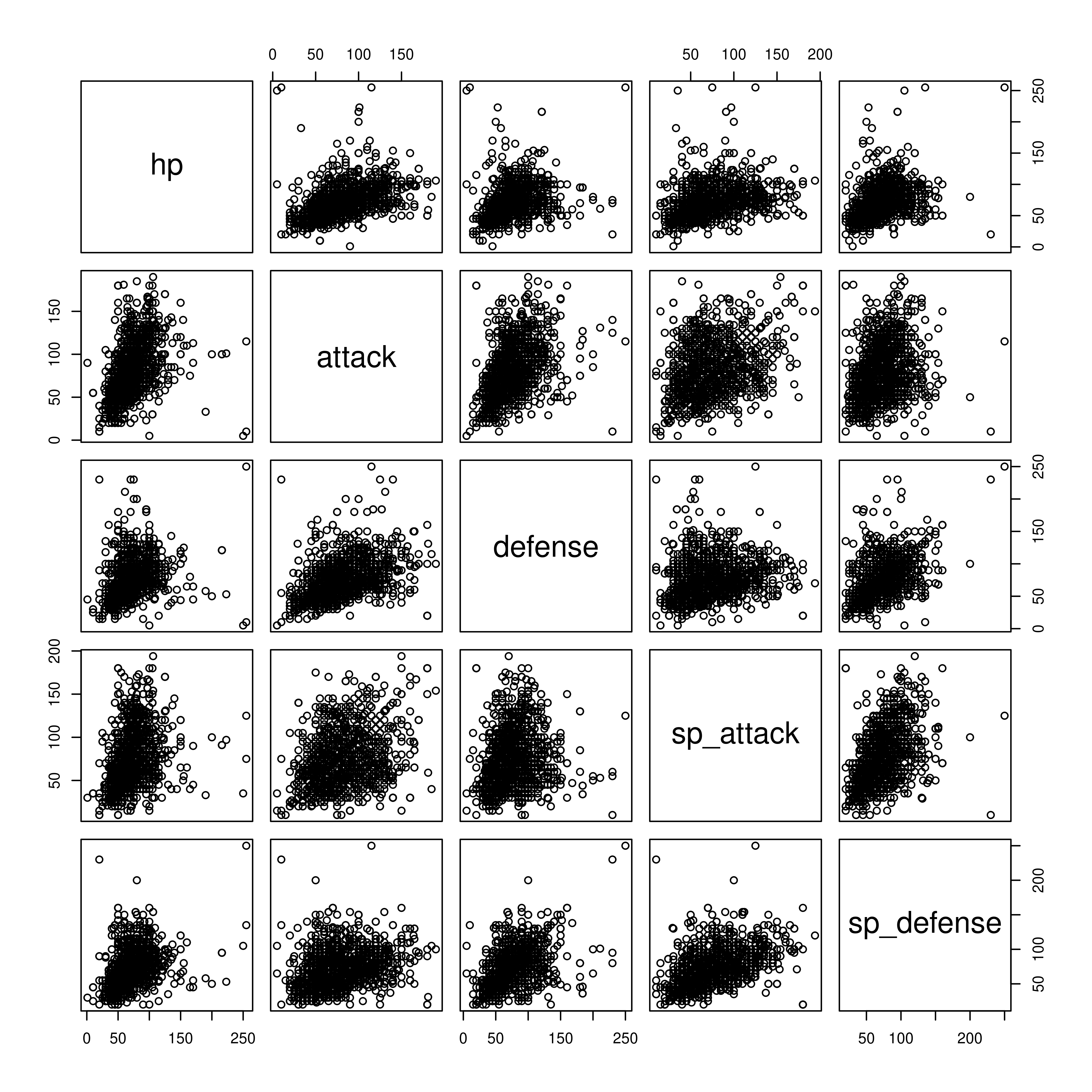
A scatterplot matrix can also be a useful way to visualize relationships between several variables.
To look at the relationship between numeric variables, we could compute a numeric correlation, but a plot may be more useful, because it allows us to see outliers as well.
library(ggplot2)
ggplot(poke, aes(x = attack, y = defense)) + geom_point()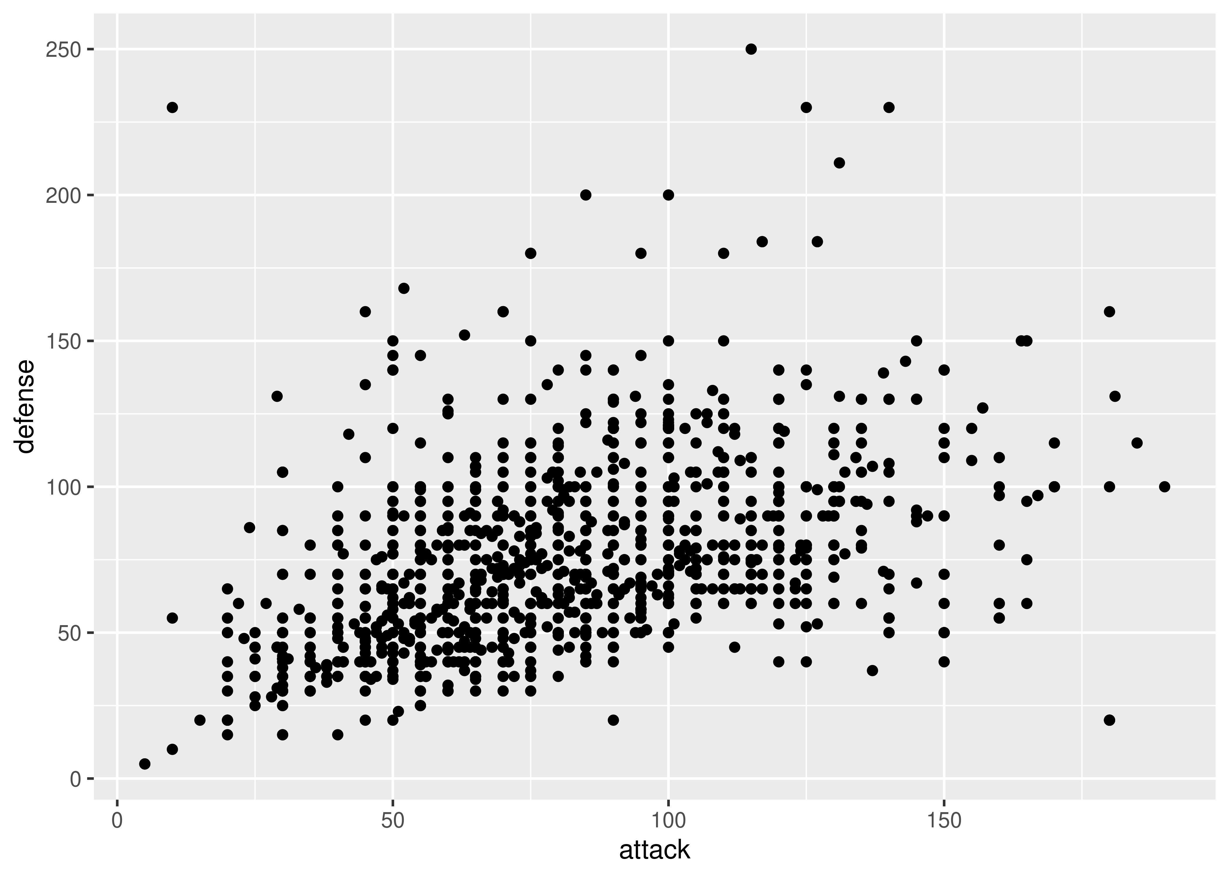
Sometimes, we discover that a numeric variable which may seem to be continuous is actually relatively quantized. When this happens, it can be a good idea to use geom_jitter to provide some “wiggle” in the data so that you can still see the point density. Changing the point transparency (alpha = .5) can also help with overplotting.
In other cases, we might find that there is a prominent feature of a scatterplot (in this case, the line \(y=x\) seems to stand out a bit from the overall point cloud). We can highlight this feature by adding a line at \(y=x\) in red behind the points.
ggplot(poke, aes(x = attack, y = sp_attack)) + geom_point()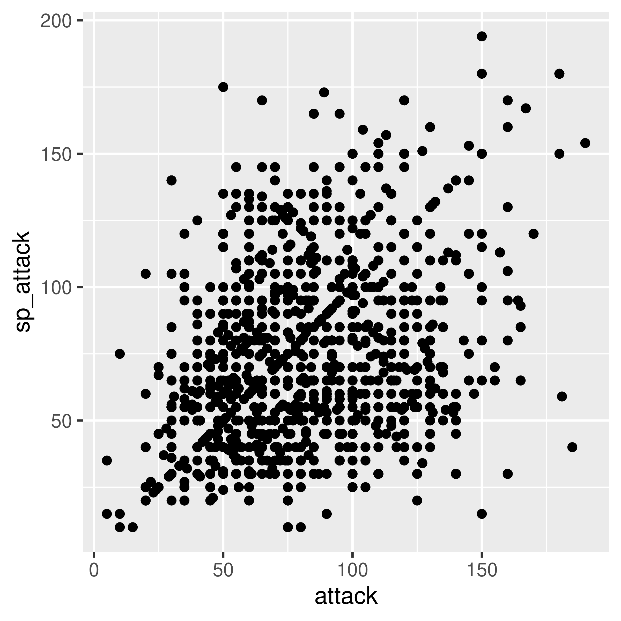
ggplot(poke, aes(x = attack, y = sp_attack)) +
  geom_abline(slope = 1, color = "red") +
  geom_jitter(alpha = 0.5)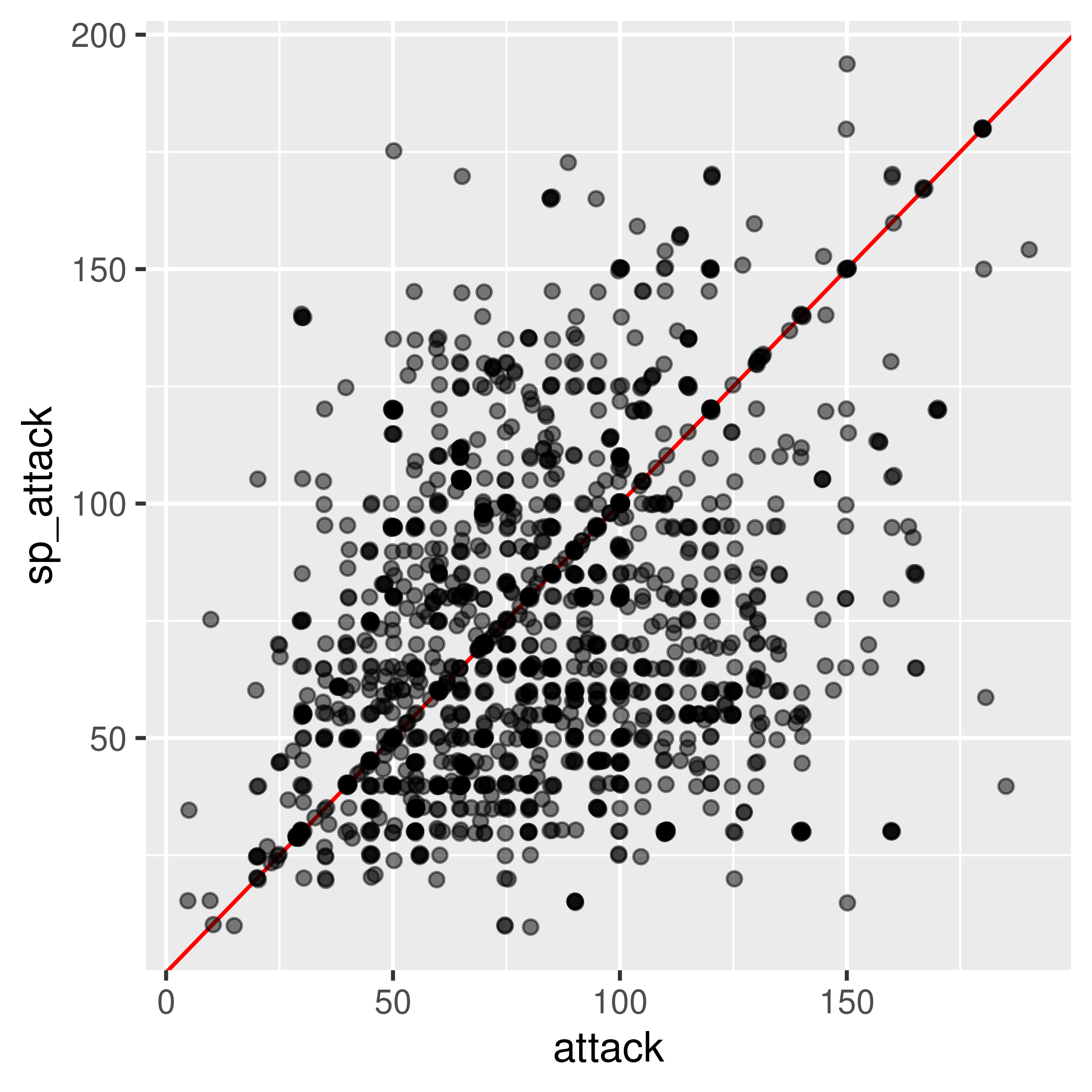
library(GGally) # an extension to ggplot2
ggpairs(poke[,c("hp", "attack", "defense", "sp_attack", "sp_defense")],
        # hp - sp_defense columns
        lower = list(continuous = wrap("points", alpha = .15)),
progress = F) 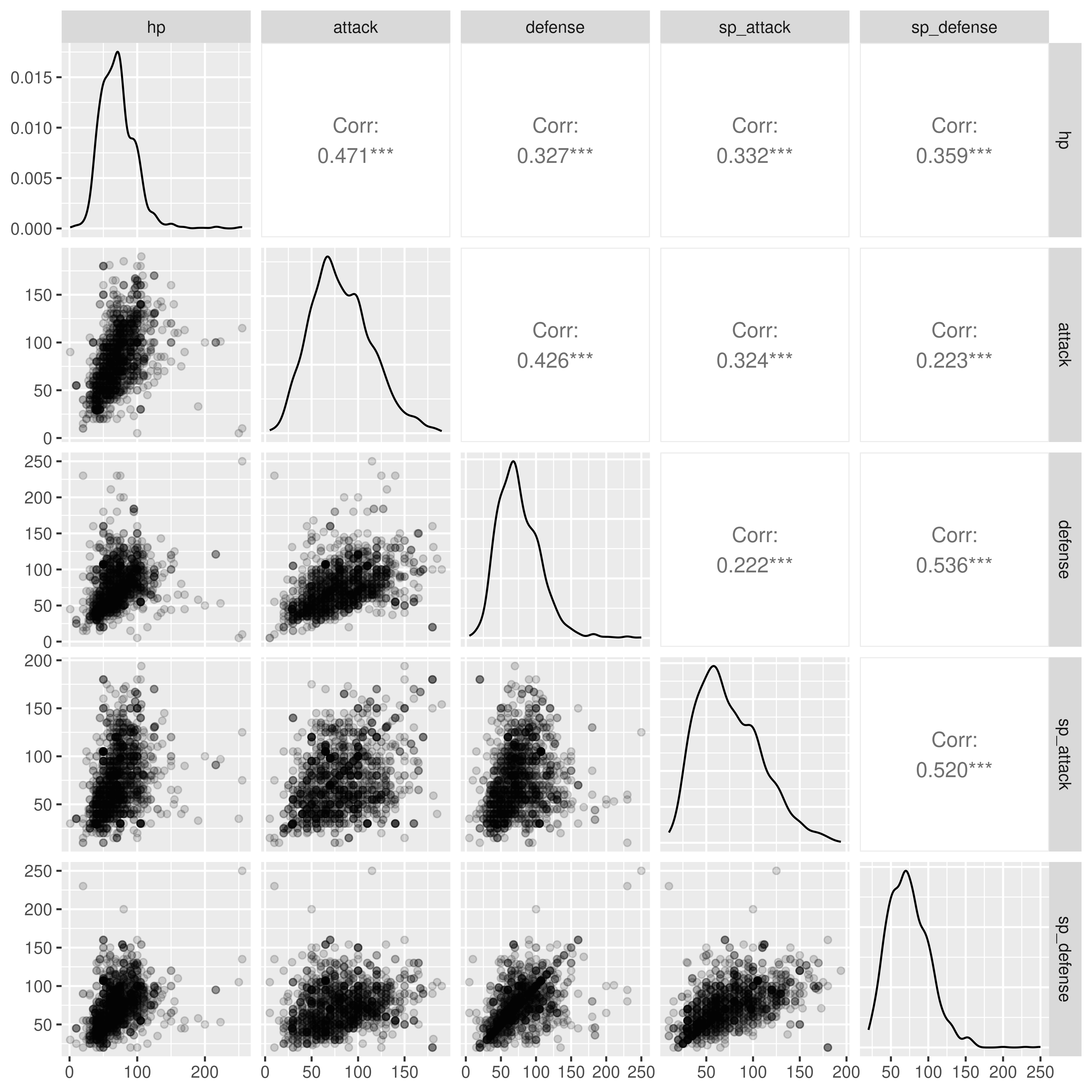
ggpairs can also handle continuous variables, if you want to explore the options available.
Believe it or not, you don’t have to go to matplotlib to get plots in python - you can get some plots from pandas directly, even if you are still using matplotlib under the hood (this is why you have to run plt.show() to get the plot to appear if you’re working in markdown).
import matplotlib.pyplot as plt

poke.plot.scatter(x = 'attack', y = 'defense')
plt.show()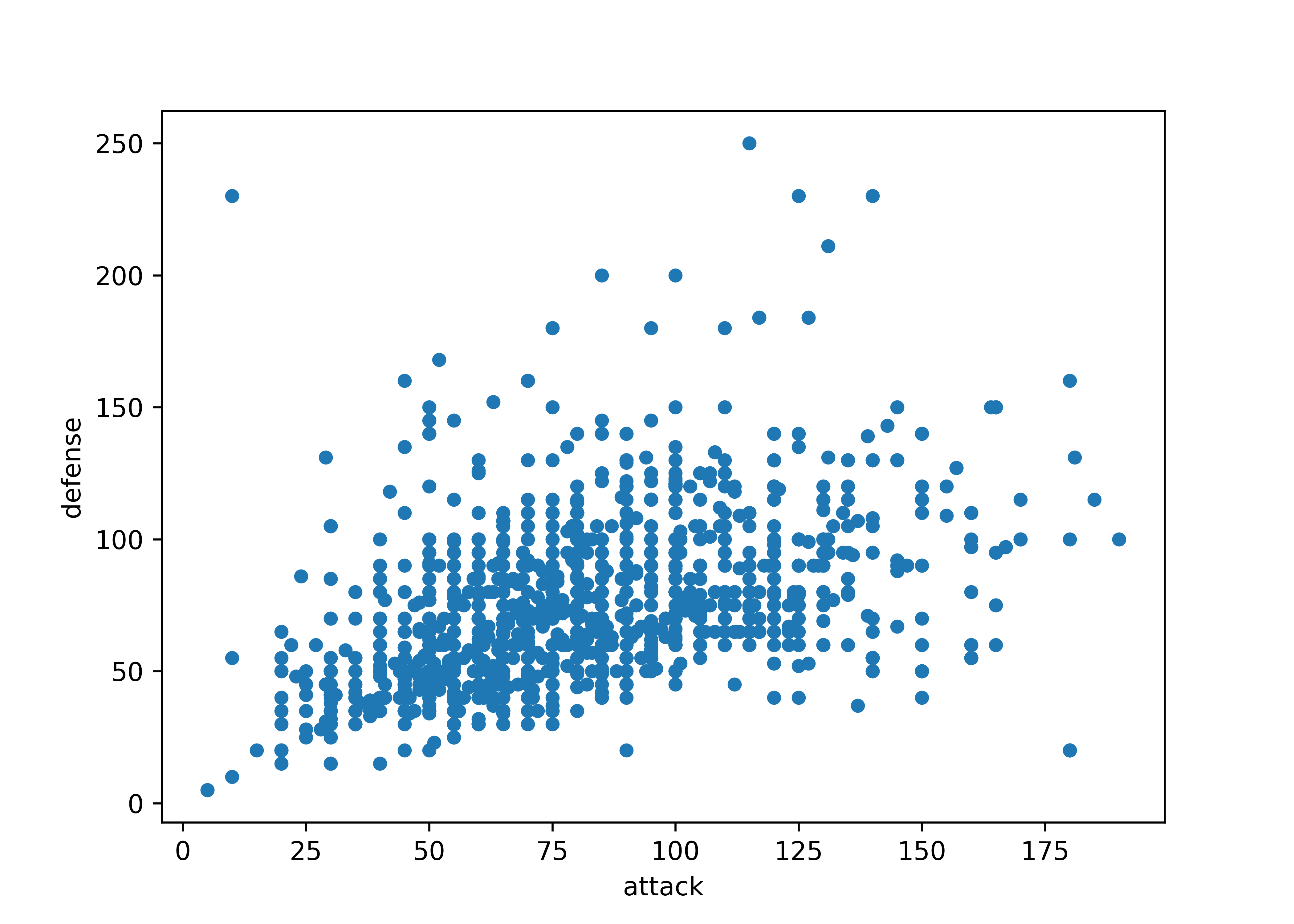
Pandas also includes a nice scatterplot matrix method.
from pandas.plotting import scatter_matrix
import matplotlib.pyplot as plt

vars = [6, 7,14,15]
scatter_matrix(poke.iloc[:,vars], alpha = 0.2, figsize = (6, 6), diagonal = 'kde')
## array([[<Axes: xlabel='total', ylabel='total'>,
##         <Axes: xlabel='hp', ylabel='total'>,
##         <Axes: xlabel='height_m', ylabel='total'>,
##         <Axes: xlabel='weight_kg', ylabel='total'>],
##        [<Axes: xlabel='total', ylabel='hp'>,
##         <Axes: xlabel='hp', ylabel='hp'>,
##         <Axes: xlabel='height_m', ylabel='hp'>,
##         <Axes: xlabel='weight_kg', ylabel='hp'>],
##        [<Axes: xlabel='total', ylabel='height_m'>,
##         <Axes: xlabel='hp', ylabel='height_m'>,
##         <Axes: xlabel='height_m', ylabel='height_m'>,
##         <Axes: xlabel='weight_kg', ylabel='height_m'>],
##        [<Axes: xlabel='total', ylabel='weight_kg'>,
##         <Axes: xlabel='hp', ylabel='weight_kg'>,
##         <Axes: xlabel='height_m', ylabel='weight_kg'>,
##         <Axes: xlabel='weight_kg', ylabel='weight_kg'>]], dtype=object)
plt.show()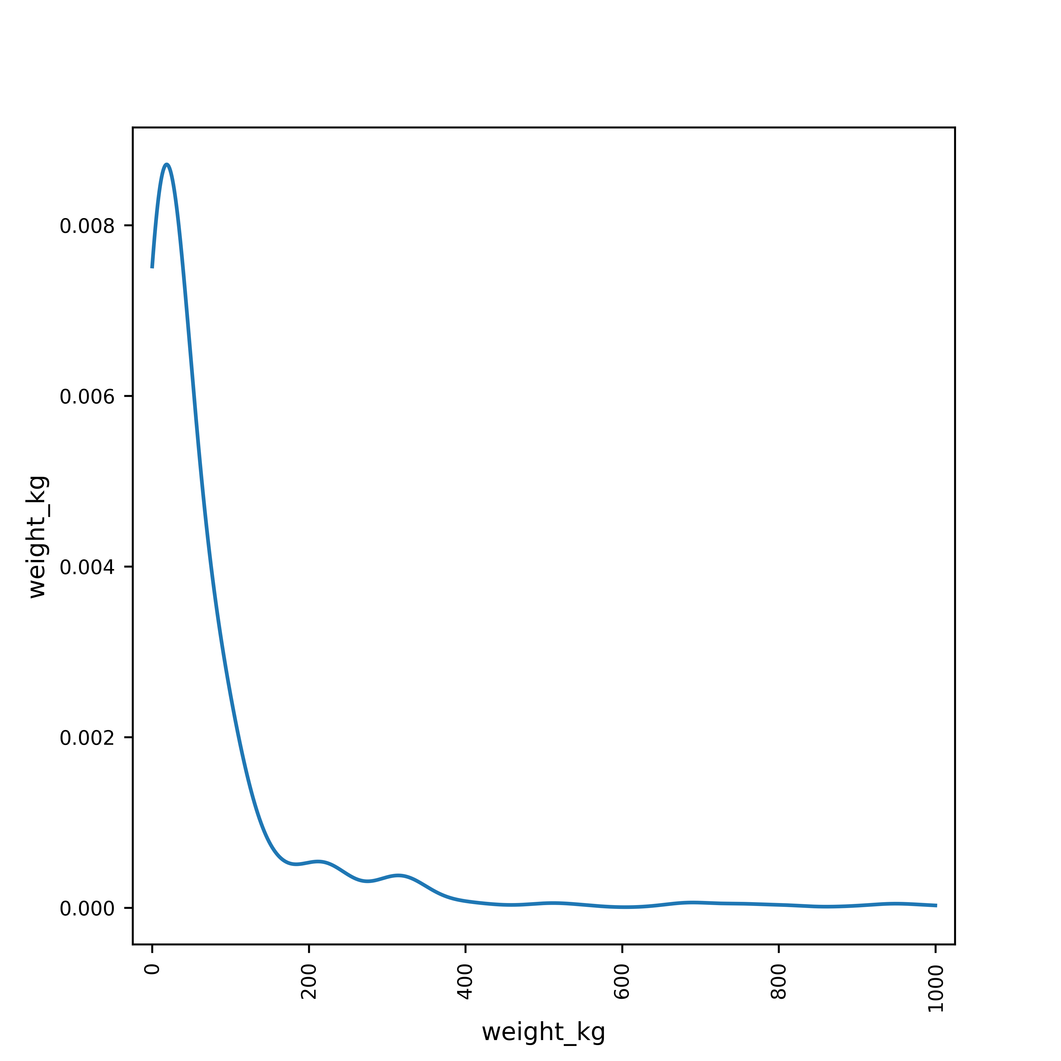
vars = [6, 7,14,15]

plt.figure()
sns.set_theme(style="ticks")
sns.pairplot(data = poke.iloc[:,vars])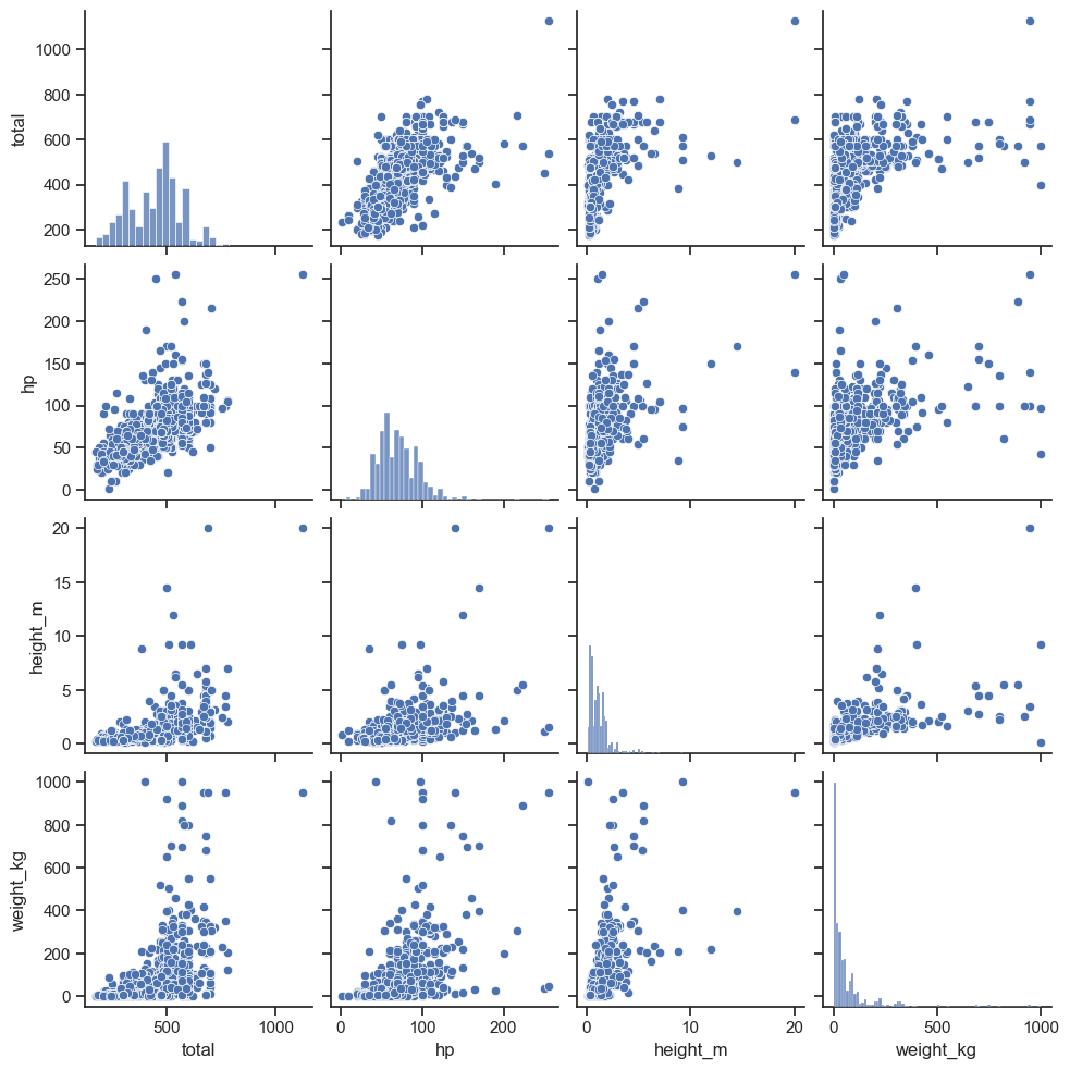
plt.show()

If you want summary statistics by group, you can get that using the dplyr package functions select and group_by, which we will learn more about in the next section. (I’m cheating a bit by mentioning it now, but it’s just so useful!)
Try it out: EDA
Explore the variables present in the Lancaster County Assessor Housing Sales Data Documentation.
Note that some variables may be too messy to handle with the things that you have seen thus far - that is ok. As you find irregularities, document them - these are things you may need to clean up in the dataset before you conduct a formal analysis.
if (!"readxl" %in% installed.packages()) install.packages("readxl")
library(readxl)
download.file("https://github.com/srvanderplas/datasets/blob/main/raw/Lancaster%20County,%20NE%20-%20Assessor.xlsx?raw=true", destfile = "../data/lancaster-housing.xlsx")
housing_lincoln <- read_xlsx("../data/lancaster-housing.xlsx", sheet = 1, guess_max = 7000)
import pandas as pd
housing_lincoln = pd.read_excel("../data/lancaster-housing.xlsx")housing_lincoln$TLA <- readr::parse_number(housing_lincoln$`TLA (Sqft)`)
housing_lincoln$Assd_Value <- readr::parse_number(housing_lincoln$Assd_Value)
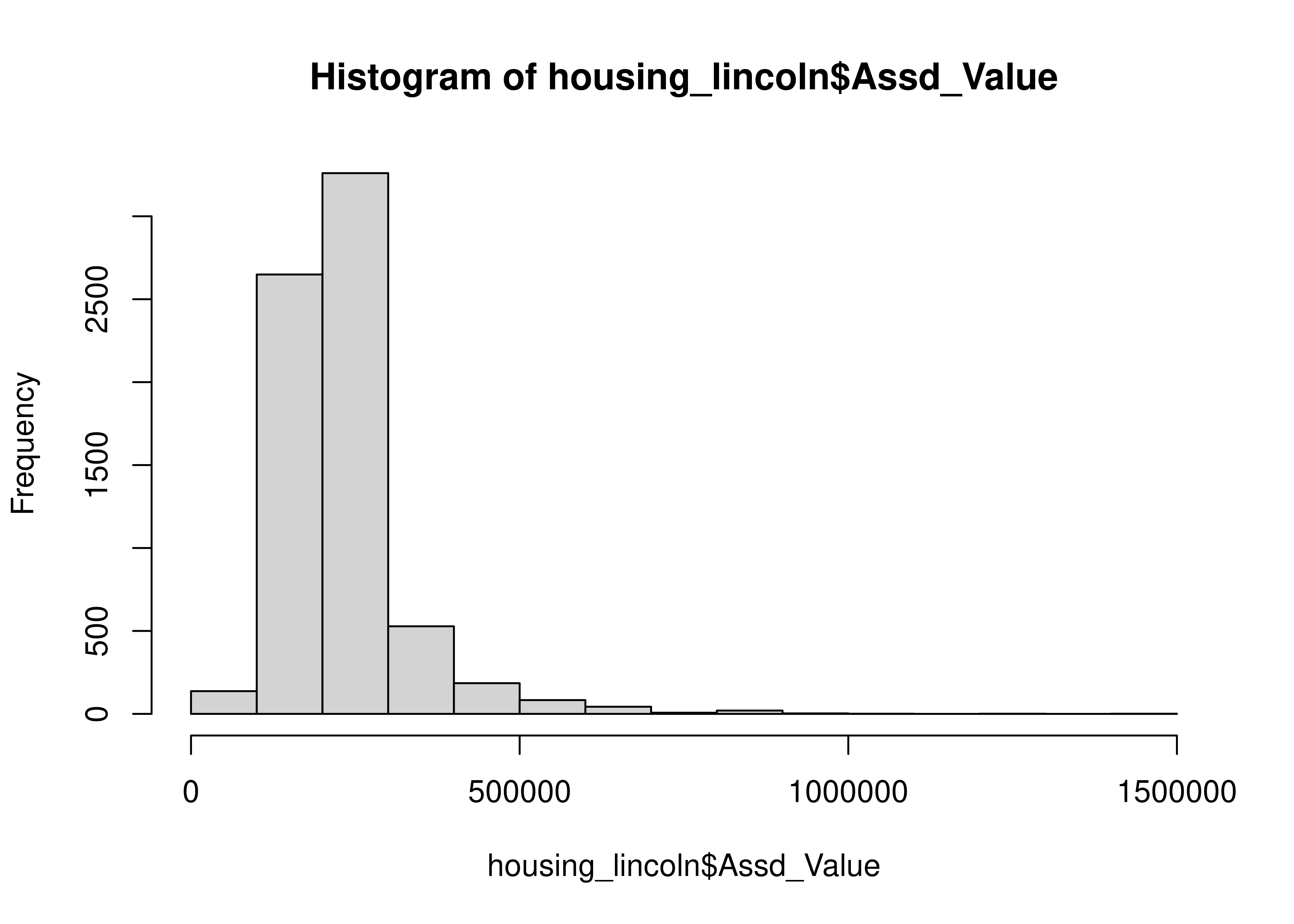
skim(housing_lincoln)| Name | housing_lincoln |
| Number of rows | 6918 |
| Number of columns | 9 |
| _______________________ | |
| Column type frequency: | |
| character | 6 |
| numeric | 3 |
| ________________________ | |
| Group variables | None |
Variable type: character
| skim_variable | n_missing | complete_rate | min | max | empty | n_unique | whitespace |
|---|---|---|---|---|---|---|---|
| Parcel_ID | 0 | 1 | 17 | 17 | 0 | 6740 | 0 |
| Address | 0 | 1 | 29 | 50 | 0 | 6740 | 0 |
| Owner | 0 | 1 | 6 | 67 | 0 | 6435 | 0 |
| Owner Address | 0 | 1 | 25 | 93 | 0 | 6184 | 0 |
| Imp_Type | 0 | 1 | 2 | 3 | 0 | 39 | 0 |
| TLA (Sqft) | 0 | 1 | 3 | 5 | 0 | 1767 | 0 |
Variable type: numeric
| skim_variable | n_missing | complete_rate | mean | sd | p0 | p25 | p50 | p75 | p100 | hist |
|---|---|---|---|---|---|---|---|---|---|---|
| Yr_Blt | 0 | 1 | 1950.85 | 22.55 | 1900 | 1933 | 1954.0 | 1963 | 2023 | ▂▃▇▂▁ |
| Assd_Value | 0 | 1 | 229956.23 | 96272.53 | 36500 | 174925 | 214500.0 | 259175 | 1404800 | ▇▁▁▁▁ |
| TLA | 0 | 1 | 1379.08 | 599.09 | 400 | 966 | 1235.5 | 1612 | 6819 | ▇▂▁▁▁ |
Let’s examine the numeric variables first:
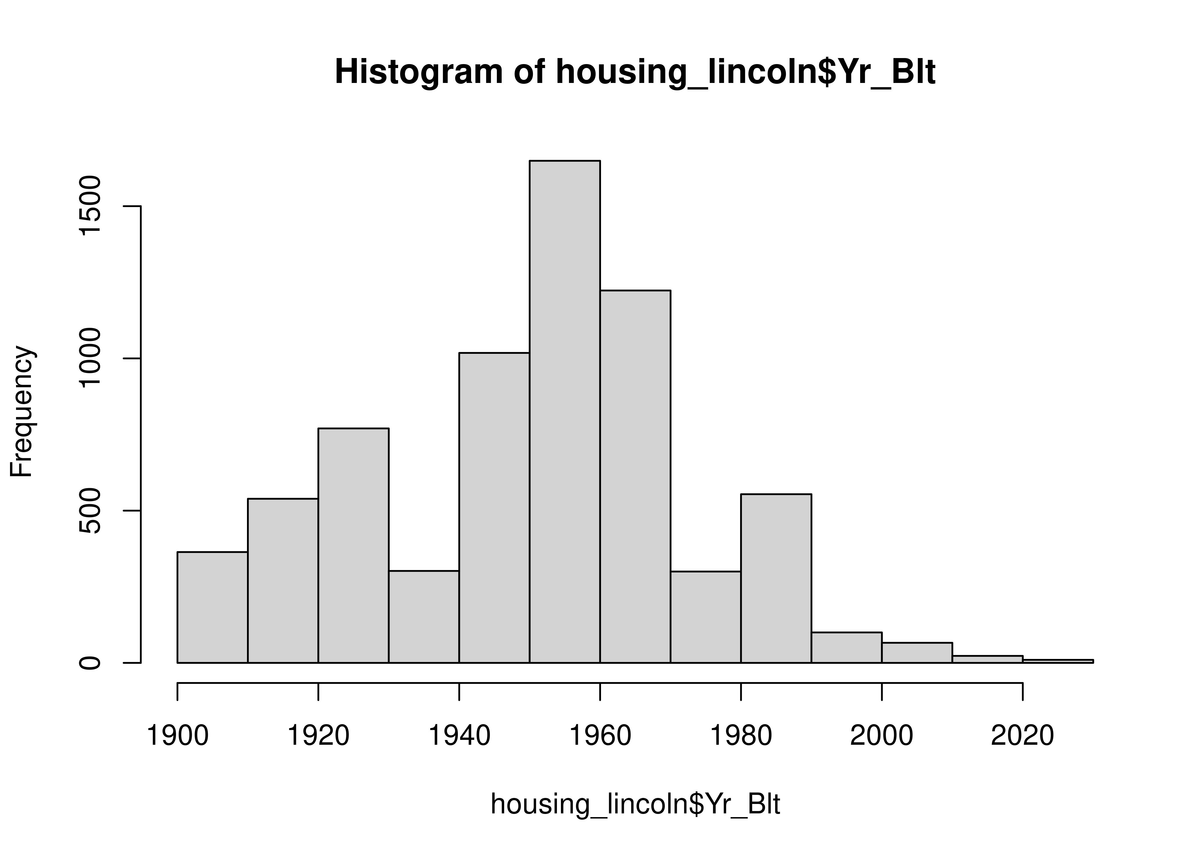
Let’s look at the years the houses were built and the Imp_Types. We can find more data on what the Improvement Types mean here, where the various abbreviations are defined.
housing_lincoln$decade <- 10*floor(housing_lincoln$Yr_Blt/10)

table(housing_lincoln$decade, useNA = 'ifany')
##
## 1900 1910 1920 1930 1940 1950 1960 1970 1980 1990 2000 2010 2020
##  245  295  885  414  647 1949 1429  282  550  116   72   24   10
table(housing_lincoln$Imp_Type)
##
##   BL   BN   C1   C2   CA   CB  CXF  CXU  CYF  CYU   D1   D2   D3   D4   D5   D6
##  163  764   11   39   48   17    4    3    7   25    2   40    9  232   45   10
##   DA   HC   M1   R1   R2   RA   RB   RR   RS  RXF  RXU  RYF  RYU   T1   T2   T3
##    2  132    1 3165  492  628   23   15  218  257   79   31   73  160    9   14
##   T4   T5   T6   T7   TA   TS  TYF
##   17   37    5   21  110    9    1
table(housing_lincoln$Imp_Type, housing_lincoln$decade)
##
##       1900 1910 1920 1930 1940 1950 1960 1970 1980 1990 2000 2010 2020
##   BL     0    0    0    0    0    0  119   42    0    1    1    0    0
##   BN    77   84  413  176   14    0    0    0    0    0    0    0    0
##   C1     1    0    8    0    1    0    0    0    1    0    0    0    0
##   C2    14    9   12    1    1    2    0    0    0    0    0    0    0
##   CA     7   14   17    5    4    1    0    0    0    0    0    0    0
##   CB     5   11    0    0    0    1    0    0    0    0    0    0    0
##   CXF    0    1    2    0    1    0    0    0    0    0    0    0    0
##   CXU    0    0    1    2    0    0    0    0    0    0    0    0    0
##   CYF    0    5    2    0    0    0    0    0    0    0    0    0    0
##   CYU    7    9    7    2    0    0    0    0    0    0    0    0    0
##   D1     0    0    0    0    0    0    1    1    0    0    0    0    0
##   D2     0    0    0    0    0    5   26    8    1    0    0    0    0
##   D3     0    0    0    0    0    0    1    1    2    3    2    0    0
##   D4     0    0    1    3   29   91   87    8    5    5    1    2    0
##   D5     0    2    1   10    9   12    0    5    1    2    3    0    0
##   D6     0    0    0    0    0    2    0    2    0    6    0    0    0
##   DA     0    0    1    0    0    1    0    0    0    0    0    0    0
##   HC     0    0    0    0    0    0   83    8   41    0    0    0    0
##   M1     0    0    0    1    0    0    0    0    0    0    0    0    0
##   R1     3    1   10    8  382 1641  902  133   52   10    3   10   10
##   R2    33   46   76   42   19   11   48   25  163   27    0    2    0
##   RA    47   51  165   87  115  104   13    7   26    6    4    3    0
##   RB     4    5    8    5    1    0    0    0    0    0    0    0    0
##   RR     0    0    0    0    1    9    3    0    0    1    1    0    0
##   RS     0    0    2    0    4   33  145   26    8    0    0    0    0
##   RXF   16   13  101   53   45   28    1    0    0    0    0    0    0
##   RXU    3    8   31   12   18    7    0    0    0    0    0    0    0
##   RYF   12   11    6    0    1    1    0    0    0    0    0    0    0
##   RYU   16   25   21    7    2    0    0    0    2    0    0    0    0
##   T1     0    0    0    0    0    0    0    6  124    8   22    0    0
##   T2     0    0    0    0    0    0    0    0    3    0    0    6    0
##   T3     0    0    0    0    0    0    0    4   10    0    0    0    0
##   T4     0    0    0    0    0    0    0    0   16    0    0    1    0
##   T5     0    0    0    0    0    0    0    0    8   29    0    0    0
##   T6     0    0    0    0    0    0    0    0    4    1    0    0    0
##   T7     0    0    0    0    0    0    0    0    5   13    3    0    0
##   TA     0    0    0    0    0    0    0    0   74    4   32    0    0
##   TS     0    0    0    0    0    0    0    6    3    0    0    0    0
##   TYF    0    0    0    0    0    0    0    0    1    0    0    0    0

plot(table(housing_lincoln$decade, housing_lincoln$Imp_Type),
     main = "Year Built and Improvement Type")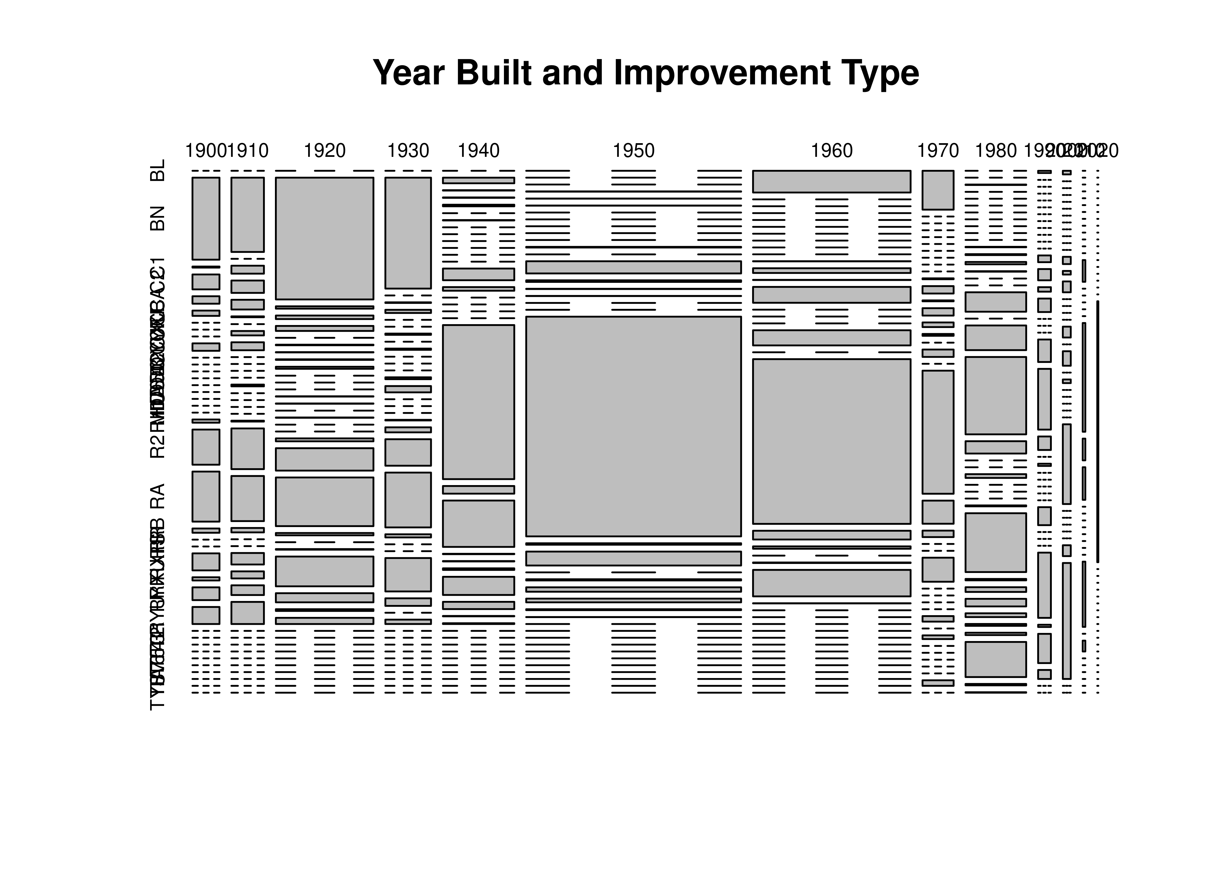
We can also look at the square footage for each improvement type:
housing_lincoln %>%
  subset(Imp_Type %in% c("BN", "R1", "R2", "RA")) %>%
  boxplot(TLA ~ Imp_Type, data = .)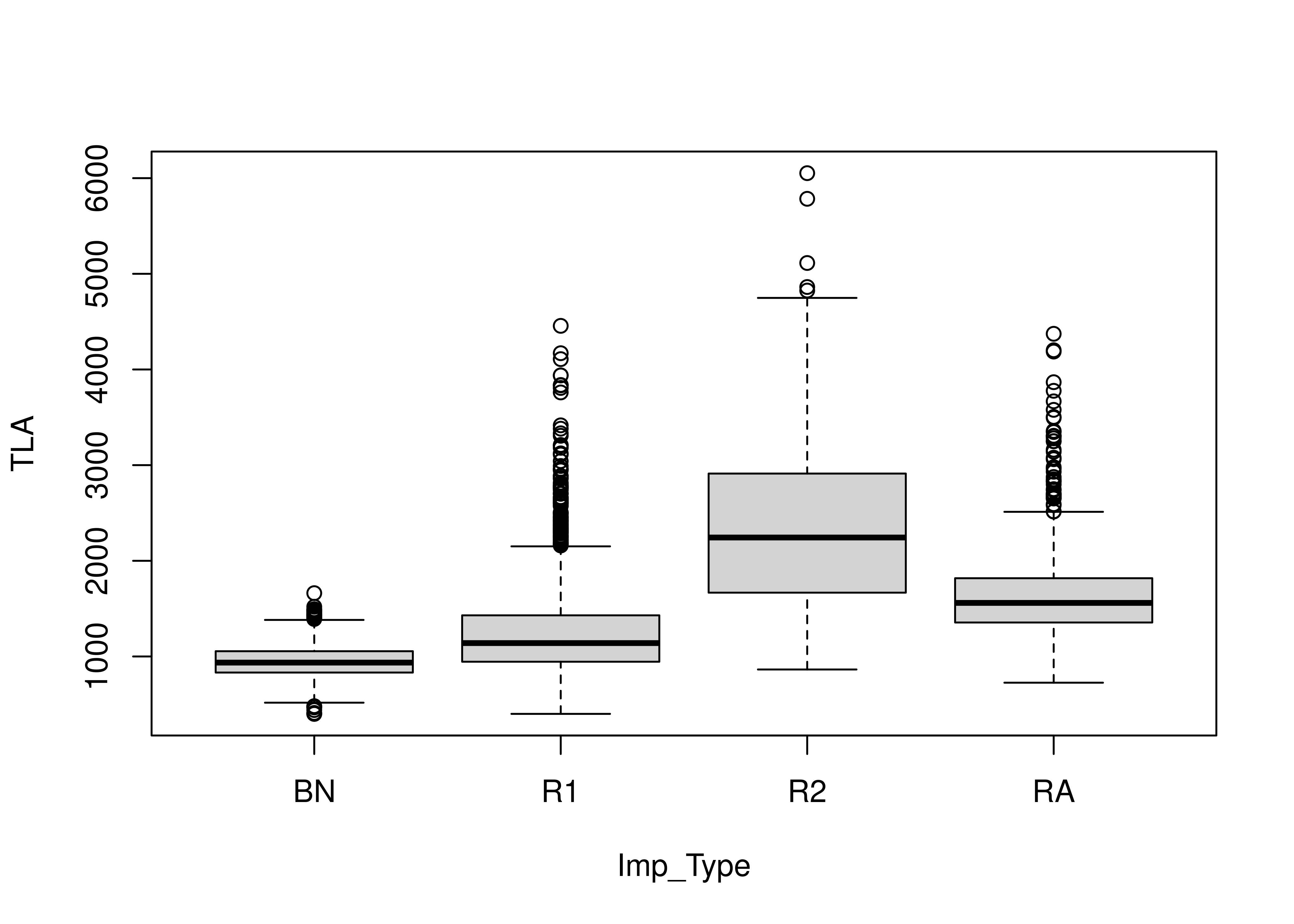
This makes sense - there are relatively few bungalows (BN), but R1 means 1 story house, R2 means 2 story house, and RA is a so-called 1.5 story house.
housing_lincoln["TLA"] = housing_lincoln["TLA (Sqft)"].str.replace("[,\$]", "", regex = True)
# For some reason, things without a comma just get NaN'd, so fix that
housing_lincoln.loc[housing_lincoln["TLA"].isna(), "TLA"] = housing_lincoln.loc[housing_lincoln["TLA"].isna(), "TLA (Sqft)"]
housing_lincoln["TLA"] = pd.to_numeric(housing_lincoln["TLA"], errors = 'coerce')

housing_lincoln["Assessed"] = housing_lincoln["Assd_Value"].str.replace("[,\$]", "", regex = True)
# For some reason, things without a comma just get NaN'd, so fix that
housing_lincoln.loc[housing_lincoln["Assessed"].isna(), "Assessed"] = housing_lincoln.loc[housing_lincoln["Assessed"].isna(), "Assd_Value"]
housing_lincoln["Assessed"] = pd.to_numeric(housing_lincoln["Assessed"], errors = 'coerce')

housing_lincoln = housing_lincoln.drop(["TLA (Sqft)", "Assd_Value"], axis = 1)

# housing_lincoln.describe()
skim(housing_lincoln)
## ╭─────────────────────────────── skimpy summary ───────────────────────────────╮
## │          Data Summary                Data Types                              │
## │ ┏━━━━━━━━━━━━━━━━━━━┳━━━━━━━━┓ ┏━━━━━━━━━━━━━┳━━━━━━━┓                       │
## │ ┃ Dataframe         ┃ Values ┃ ┃ Column Type ┃ Count ┃                       │
## │ ┡━━━━━━━━━━━━━━━━━━━╇━━━━━━━━┩ ┡━━━━━━━━━━━━━╇━━━━━━━┩                       │
## │ │ Number of rows    │ 6918   │ │ string      │ 5     │                       │
## │ │ Number of columns │ 8      │ │ int64       │ 3     │                       │
## │ └───────────────────┴────────┘ └─────────────┴───────┘                       │
## │                                   number                                     │
## │ ┏━━━━━━┳━━━━┳━━━━━━┳━━━━━━┳━━━━━━┳━━━━━━┳━━━━━━┳━━━━━━┳━━━━━━┳━━━━━━┳━━━━━┓  │
## │ ┃ colu ┃    ┃      ┃      ┃      ┃      ┃      ┃      ┃      ┃      ┃ his ┃  │
## │ ┃ mn   ┃ NA ┃ NA % ┃ mean ┃ sd   ┃ p0   ┃ p25  ┃ p50  ┃ p75  ┃ p100 ┃ t   ┃  │
## │ ┡━━━━━━╇━━━━╇━━━━━━╇━━━━━━╇━━━━━━╇━━━━━━╇━━━━━━╇━━━━━━╇━━━━━━╇━━━━━━╇━━━━━┩  │
## │ │ Yr_B │  0 │    0 │ 1951 │ 22.5 │ 1900 │ 1933 │ 1954 │ 1963 │ 2023 │ ▃▃█ │  │
## │ │ lt   │    │      │      │    5 │      │      │      │      │      │ ▄▂  │  │
## │ │ TLA  │  0 │    0 │ 1379 │ 599. │  400 │  966 │ 1236 │ 1612 │ 6819 │ █▃▁ │  │
## │ │      │    │      │      │    1 │      │      │      │      │      │     │  │
## │ │ Asse │  0 │    0 │ 2300 │ 9627 │ 3650 │ 1749 │ 2145 │ 2592 │ 1405 │ █▂  │  │
## │ │ ssed │    │      │   00 │    0 │    0 │   00 │   00 │   00 │  000 │     │  │
## │ └──────┴────┴──────┴──────┴──────┴──────┴──────┴──────┴──────┴──────┴─────┘  │
## │                                   string                                     │
## │ ┏━━━━━━━┳━━━━┳━━━━━━┳━━━━━━━┳━━━━━━━┳━━━━━━━┳━━━━━━━┳━━━━━━┳━━━━━━━┳━━━━━━┓  │
## │ ┃       ┃    ┃      ┃       ┃       ┃       ┃       ┃ char ┃       ┃ tota ┃  │
## │ ┃       ┃    ┃      ┃       ┃       ┃       ┃       ┃ s    ┃ words ┃ l    ┃  │
## │ ┃ colum ┃    ┃      ┃ short ┃ longe ┃       ┃       ┃ per  ┃ per   ┃ word ┃  │
## │ ┃ n     ┃ NA ┃ NA % ┃ est   ┃ st    ┃ min   ┃ max   ┃ row  ┃ row   ┃ s    ┃  │
## │ ┡━━━━━━━╇━━━━╇━━━━━━╇━━━━━━━╇━━━━━━━╇━━━━━━━╇━━━━━━━╇━━━━━━╇━━━━━━━╇━━━━━━┩  │
## │ │ Parce │  0 │    0 │ 10-25 │ 10-25 │ 10-25 │ 17-34 │   17 │     1 │ 6918 │  │
## │ │ l_ID  │    │      │ -125- │ -125- │ -125- │ -241- │      │       │      │  │
## │ │       │    │      │ 007-0 │ 007-0 │ 007-0 │ 001-0 │      │       │      │  │
## │ │       │    │      │ 00    │ 00    │ 00    │ 00    │      │       │      │  │
## │ │ Addre │  0 │    0 │ 2011  │ 1100  │ 100   │ 964 S │ 33.8 │   7.4 │ 5141 │  │
## │ │ ss    │    │      │ L ST, │ SILVE │ SYCAM │ 49TH  │      │       │    0 │  │
## │ │       │    │      │ LINCO │ R     │ ORE   │ ST,   │      │       │      │  │
## │ │       │    │      │ LN,   │ RIDGE │ DR,   │ LINCO │      │       │      │  │
## │ │       │    │      │ NE    │ RD,   │ LINCO │ LN,   │      │       │      │  │
## │ │       │    │      │ 68510 │ UNIT  │ LN,   │ NE    │      │       │      │  │
## │ │       │    │      │       │ #13,  │ NE    │ 68510 │      │       │      │  │
## │ │       │    │      │       │ LINCO │ 68510 │       │      │       │      │  │
## │ │       │    │      │       │ LN,   │       │       │      │       │      │  │
## │ │       │    │      │       │ NE    │       │       │      │       │      │  │
## │ │       │    │      │       │ 68510 │       │       │      │       │      │  │
## │ │ Owner │  0 │    0 │ NBK   │ GOVAE │ 1     │ ZWIEB │   23 │   4.2 │ 2929 │  │
## │ │       │    │      │ PC    │ RTS,  │ CHRON │ EL,   │      │       │    4 │  │
## │ │       │    │      │       │ KENNE │ 29:11 │ THOMA │      │       │      │  │
## │ │       │    │      │       │ TH    │ LLC   │ S E   │      │       │      │  │
## │ │       │    │      │       │ CHARL │       │       │      │       │      │  │
## │ │       │    │      │       │ ES &  │       │       │      │       │      │  │
## │ │       │    │      │       │ KATHR │       │       │      │       │      │  │
## │ │       │    │      │       │ YN    │       │       │      │       │      │  │
## │ │       │    │      │       │ ANN   │       │       │      │       │      │  │
## │ │       │    │      │       │ REVOC │       │       │      │       │      │  │
## │ │       │    │      │       │ ABLE  │       │       │      │       │      │  │
## │ │       │    │      │       │ LIVIN │       │       │      │       │      │  │
## │ │       │    │      │       │ G     │       │       │      │       │      │  │
## │ │       │    │      │       │ TRUST │       │       │      │       │      │  │
## │ │       │    │      │       │ , THE │       │       │      │       │      │  │
## │ │ Owner │  0 │    0 │ 3419  │ Attn: │ 100 N │ UNION │ 33.8 │   7.6 │ 5229 │  │
## │ │ Addre │    │      │ J     │ US    │ 12 ST │ BANK- │      │       │    2 │  │
## │ │ ss    │    │      │ LINCO │ BANK  │ #UNIT │ ANDRE │      │       │      │  │
## │ │       │    │      │ LN,   │ NATIO │ 1005  │ W     │      │       │      │  │
## │ │       │    │      │ NE    │ NAL   │ LINCO │ KAFKA │      │       │      │  │
## │ │       │    │      │ 68510 │ ASSOC │ LN,   │ PO    │      │       │      │  │
## │ │       │    │      │       │ IATIO │ NE    │ BOX   │      │       │      │  │
## │ │       │    │      │       │ N C/O │ 68508 │ 82535 │      │       │      │  │
## │ │       │    │      │       │ YVONN │       │ LINCO │      │       │      │  │
## │ │       │    │      │       │ E     │       │ LN,   │      │       │      │  │
## │ │       │    │      │       │ LUNNE │       │ NE    │      │       │      │  │
## │ │       │    │      │       │ Y 233 │       │ 68501 │      │       │      │  │
## │ │       │    │      │       │ S 13  │       │       │      │       │      │  │
## │ │       │    │      │       │ ST    │       │       │      │       │      │  │
## │ │       │    │      │       │ #STE  │       │       │      │       │      │  │
## │ │       │    │      │       │ 1011  │       │       │      │       │      │  │
## │ │       │    │      │       │ LINCO │       │       │      │       │      │  │
## │ │       │    │      │       │ LN,   │       │       │      │       │      │  │
## │ │       │    │      │       │ NE    │       │       │      │       │      │  │
## │ │       │    │      │       │ 68508 │       │       │      │       │      │  │
## │ │ Imp_T │  0 │    0 │ BN    │ RXU   │ BL    │ TYF   │ 2.07 │     1 │ 6918 │  │
## │ │ ype   │    │      │       │       │       │       │      │       │      │  │
## │ └───────┴────┴──────┴───────┴───────┴───────┴───────┴──────┴───────┴──────┘  │
## ╰──────────────────────────────────── End ─────────────────────────────────────╯
Let’s examine the numeric and date variables first:
housing_lincoln["TLA"].plot.hist()
plt.show()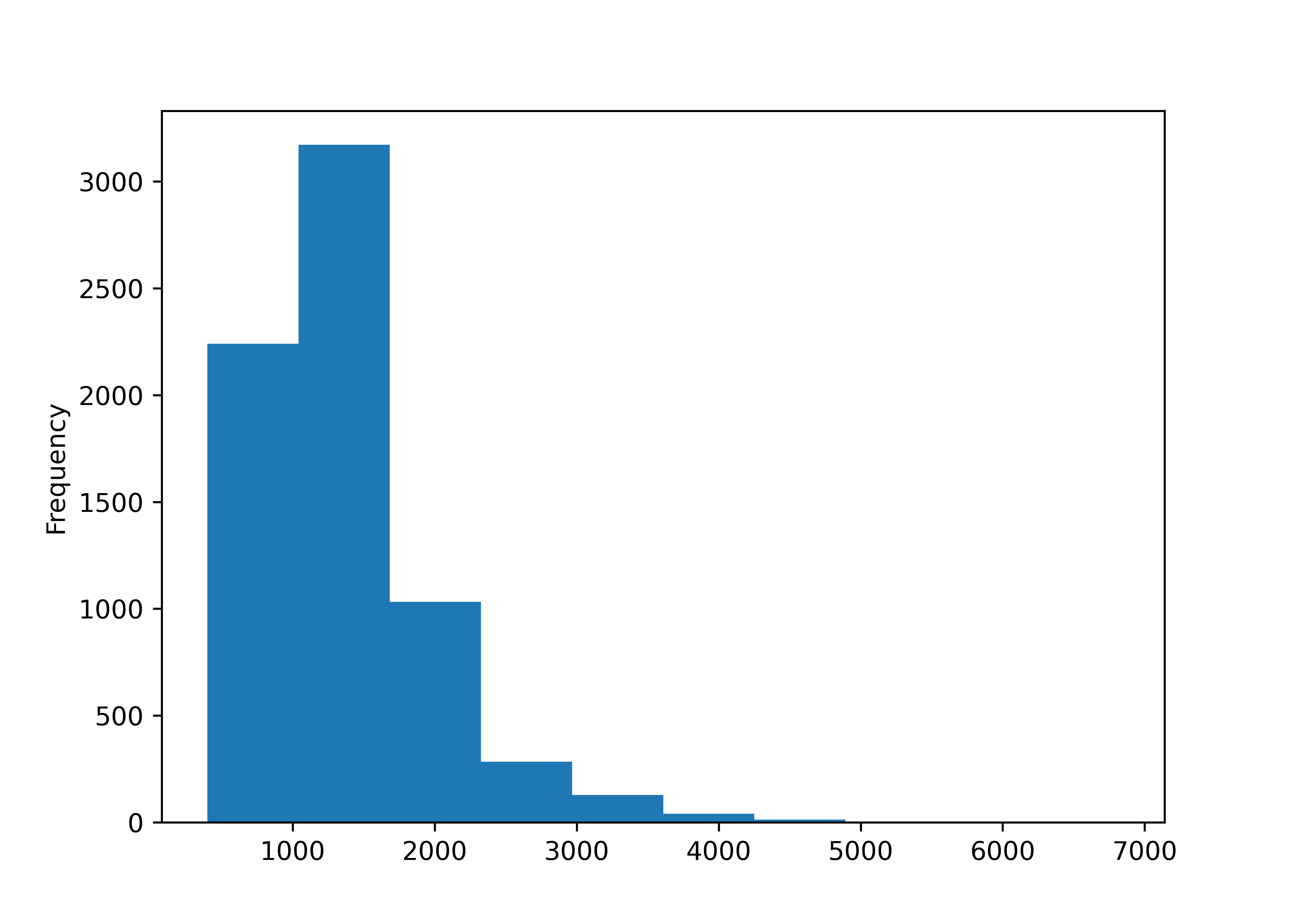
housing_lincoln["Yr_Blt"].plot.hist()
plt.show()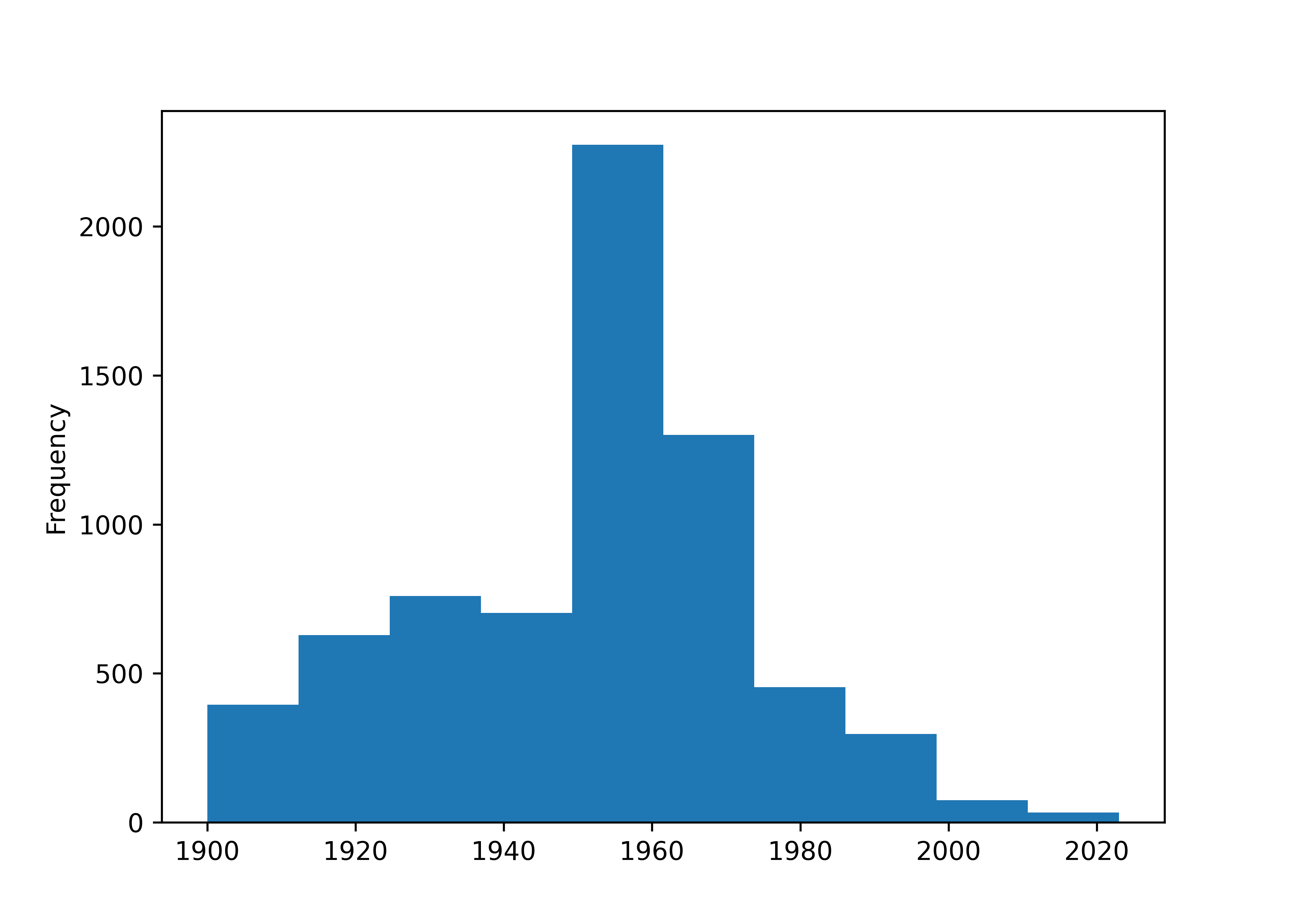
Let’s look at the years the houses were built and the Imp_Types. We can find more data on what the Improvement Types mean here, where the various abbreviations are defined.
import numpy as np
housing_lincoln['decade'] = 10*np.floor(housing_lincoln.Yr_Blt/10)

housing_lincoln["decade"].groupby(housing_lincoln["decade"]).count()
## decade
## 1900.0     245
## 1910.0     295
## 1920.0     885
## 1930.0     414
## 1940.0     647
## 1950.0    1949
## 1960.0    1429
## 1970.0     282
## 1980.0     550
## 1990.0     116
## 2000.0      72
## 2010.0      24
## 2020.0      10
## Name: decade, dtype: int64
housing_lincoln["Imp_Type"].groupby(housing_lincoln["Imp_Type"]).count()
## Imp_Type
## BL      163
## BN      764
## C1       11
## C2       39
## CA       48
## CB       17
## CXF       4
## CXU       3
## CYF       7
## CYU      25
## D1        2
## D2       40
## D3        9
## D4      232
## D5       45
## D6       10
## DA        2
## HC      132
## M1        1
## R1     3165
## R2      492
## RA      628
## RB       23
## RR       15
## RS      218
## RXF     257
## RXU      79
## RYF      31
## RYU      73
## T1      160
## T2        9
## T3       14
## T4       17
## T5       37
## T6        5
## T7       21
## TA      110
## TS        9
## TYF       1
## Name: Imp_Type, dtype: int64

pd.crosstab(index = housing_lincoln["decade"], columns = housing_lincoln["Imp_Type"])
## Imp_Type   BL   BN  C1  C2  CA  CB  CXF  CXU  ...  T3  T4  T5  T6  T7  TA  TS  TYF
## decade                                        ...
## 1900.0      0   77   1  14   7   5    0    0  ...   0   0   0   0   0   0   0    0
## 1910.0      0   84   0   9  14  11    1    0  ...   0   0   0   0   0   0   0    0
## 1920.0      0  413   8  12  17   0    2    1  ...   0   0   0   0   0   0   0    0
## 1930.0      0  176   0   1   5   0    0    2  ...   0   0   0   0   0   0   0    0
## 1940.0      0   14   1   1   4   0    1    0  ...   0   0   0   0   0   0   0    0
## 1950.0      0    0   0   2   1   1    0    0  ...   0   0   0   0   0   0   0    0
## 1960.0    119    0   0   0   0   0    0    0  ...   0   0   0   0   0   0   0    0
## 1970.0     42    0   0   0   0   0    0    0  ...   4   0   0   0   0   0   6    0
## 1980.0      0    0   1   0   0   0    0    0  ...  10  16   8   4   5  74   3    1
## 1990.0      1    0   0   0   0   0    0    0  ...   0   0  29   1  13   4   0    0
## 2000.0      1    0   0   0   0   0    0    0  ...   0   0   0   0   3  32   0    0
## 2010.0      0    0   0   0   0   0    0    0  ...   0   1   0   0   0   0   0    0
## 2020.0      0    0   0   0   0   0    0    0  ...   0   0   0   0   0   0   0    0
##
## [13 rows x 39 columns]

import matplotlib.pyplot as plt
from statsmodels.graphics.mosaicplot import mosaic

mosaic(housing_lincoln, ["decade", "Imp_Type"], title = "Housing Built by Type, Decade")
plt.show()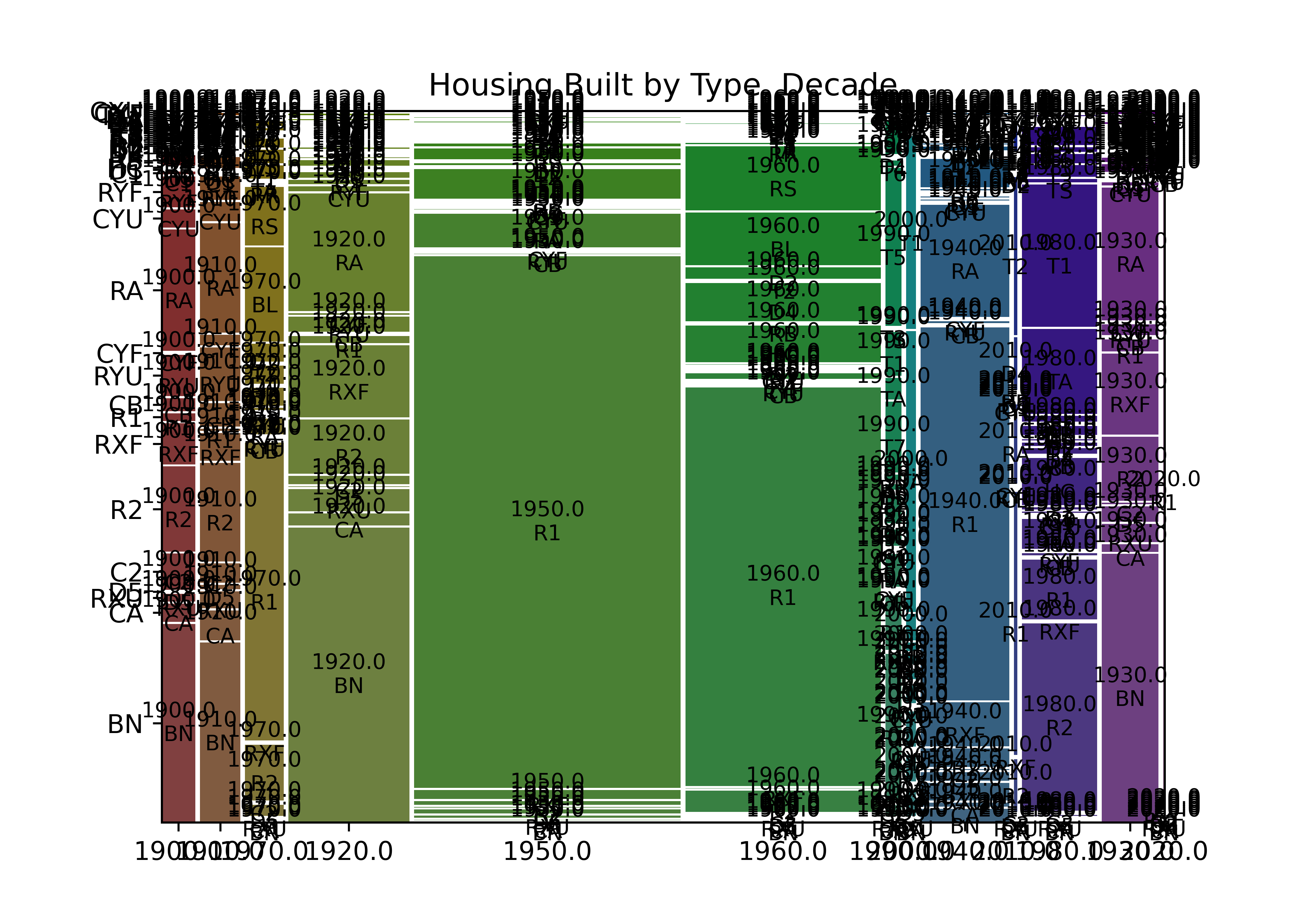
We can also look at the square footage for each improvement type:
housing_subcat = ["BN", "R1", "RA", "R2"]

housing_sub = housing_lincoln.loc[housing_lincoln["Imp_Type"].isin(housing_subcat)]
housing_sub = housing_sub.assign(Imp_cat = pd.Categorical(housing_sub["Imp_Type"], categories = housing_subcat))

housing_sub.boxplot("TLA", by = "Imp_cat")
plt.show()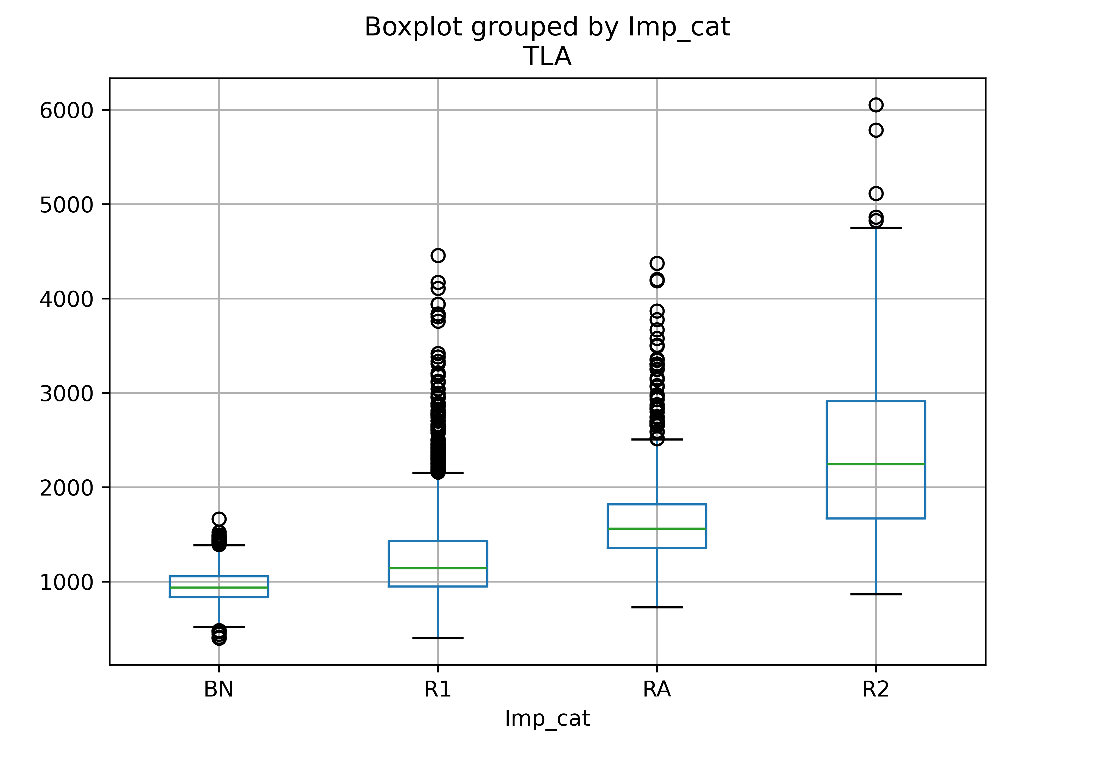
This makes sense - there are relatively few bungalows (BN), but R1 means 1 story house, R2 means 2 story house, and RA is a so-called 1.5 story house; we would expect an increase in square footage with each additional floor of the house (broadly speaking).
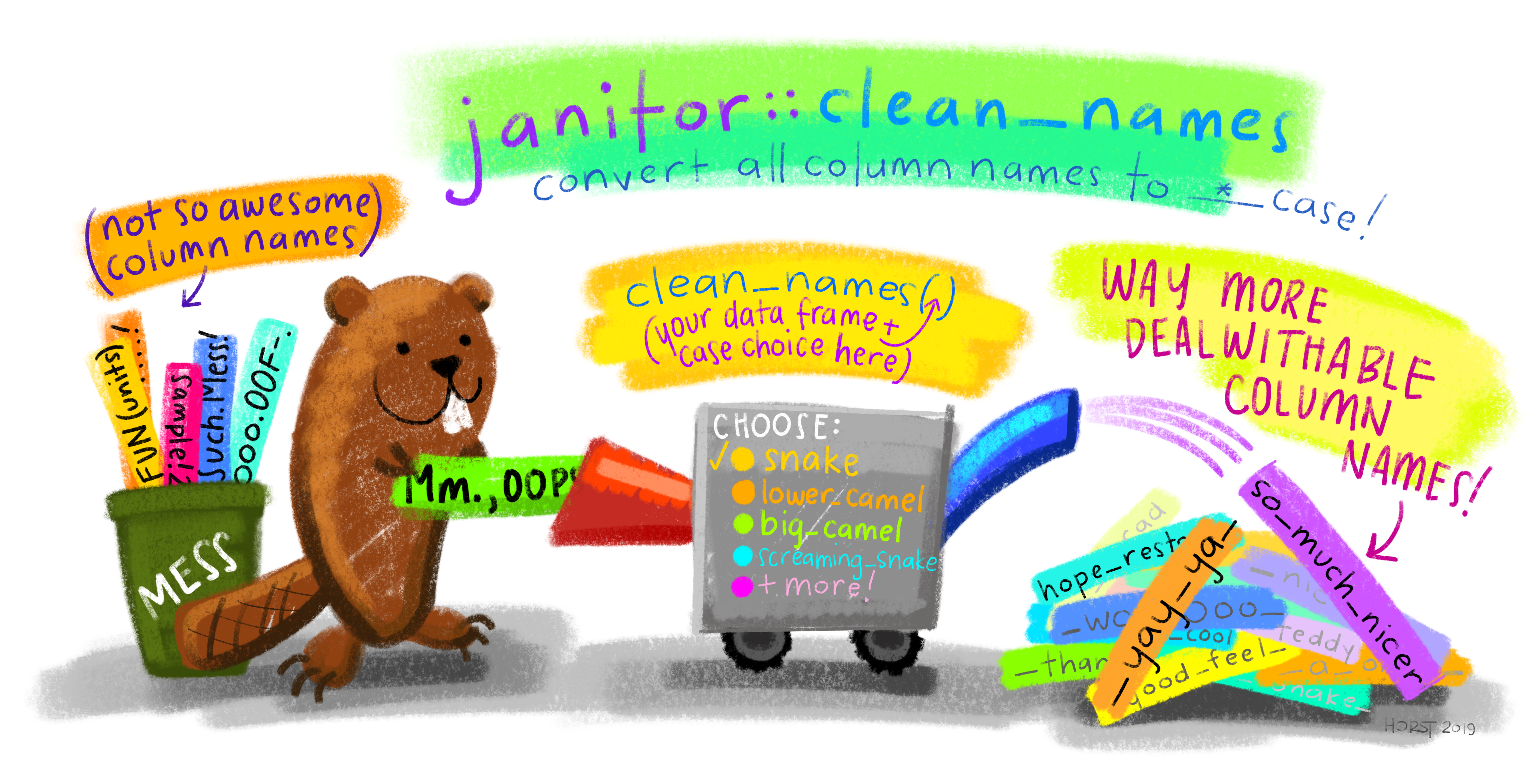
Learn More: Janitor R package
The janitor package [4] has some very convenient functions for cleaning up messy data. One of its best features is the clean_names() function, which creates names based on a capitalization/separation scheme of your choosing.
19.5 References
[1]
G. Grolemund and H. Wickham, R for Data Science, 1st ed. O’Reilly Media, 2017 [Online]. Available: https://r4ds.had.co.nz/. [Accessed: May 09, 2022]
[2]
N. Tierney, D. Cook, M. McBain, and C. Fay, Naniar: Data structures, summaries, and visualisations for missing data. 2021 [Online]. Available: https://CRAN.R-project.org/package=naniar
[3]
Daniel Bourke, “A Gentle Introduction to Exploratory Data Analysis,” Daniel Bourke. Jan. 2019 [Online]. Available: https://www.mrdbourke.com/a-gentle-introduction-to-exploratory-data-analysis/. [Accessed: Jun. 13, 2022]
[4]
S. Firke, Janitor: Simple tools for examining and cleaning dirty data. 2021 [Online]. Available: https://CRAN.R-project.org/package=janitor